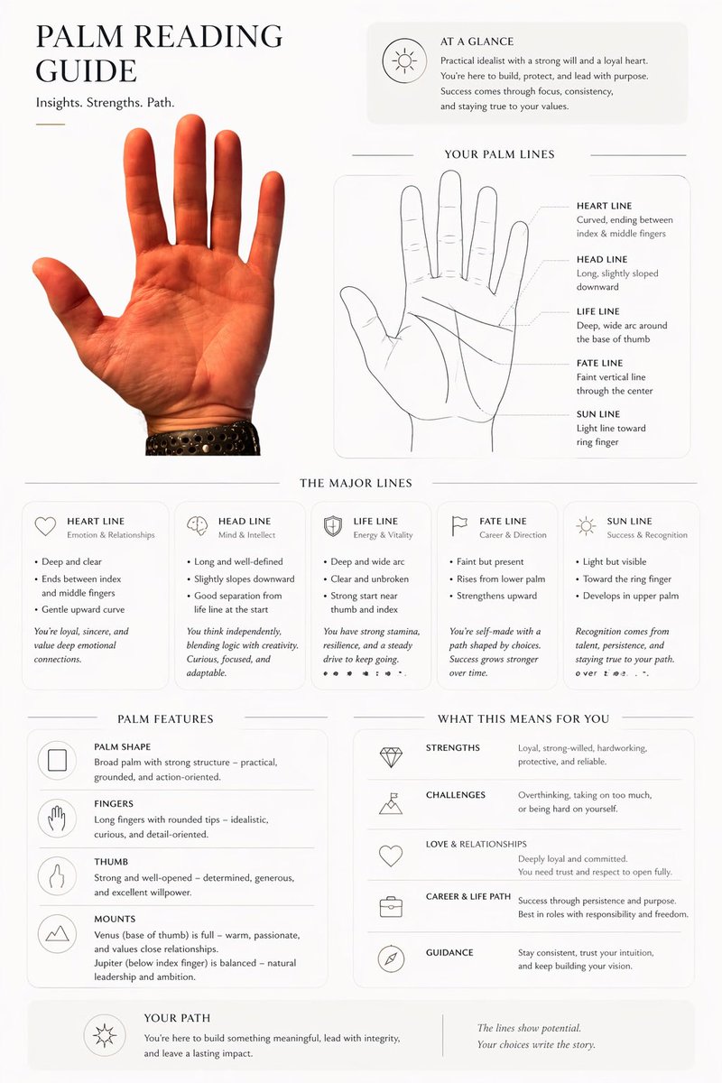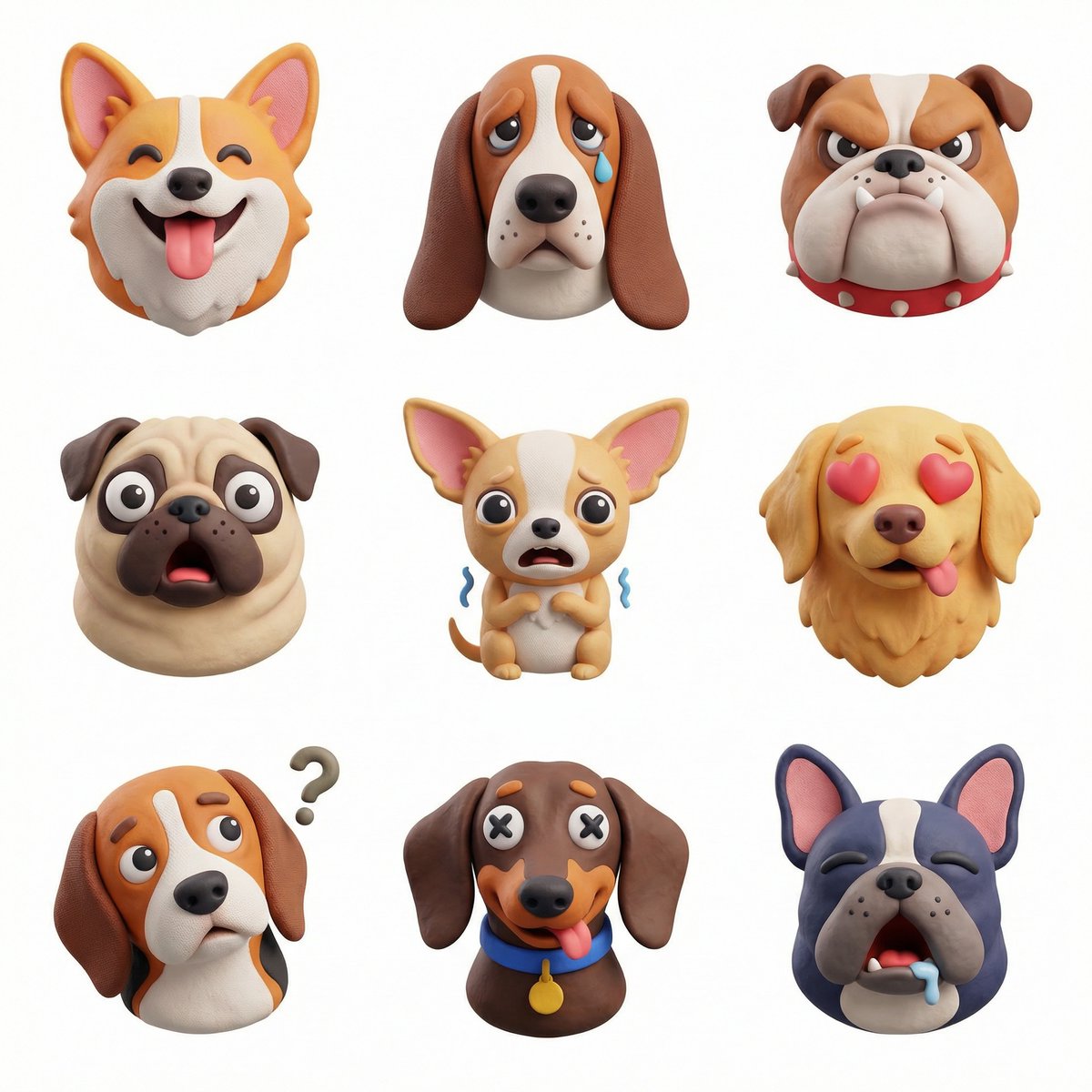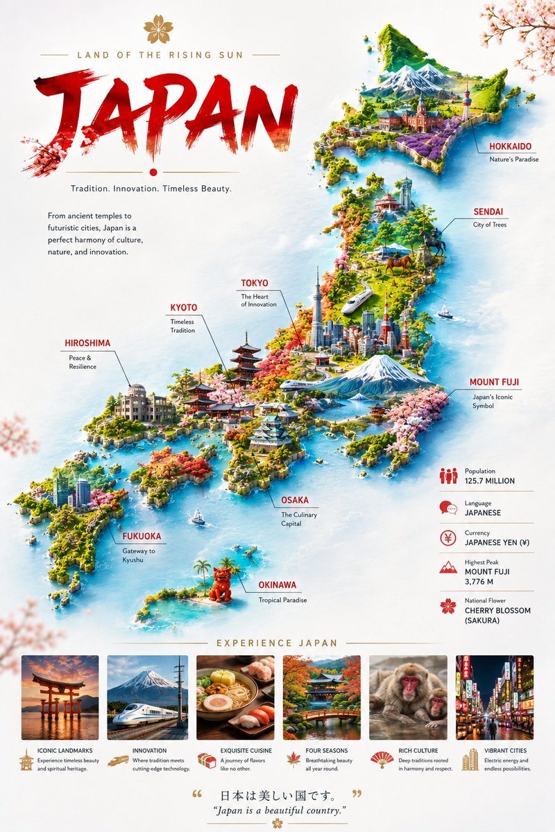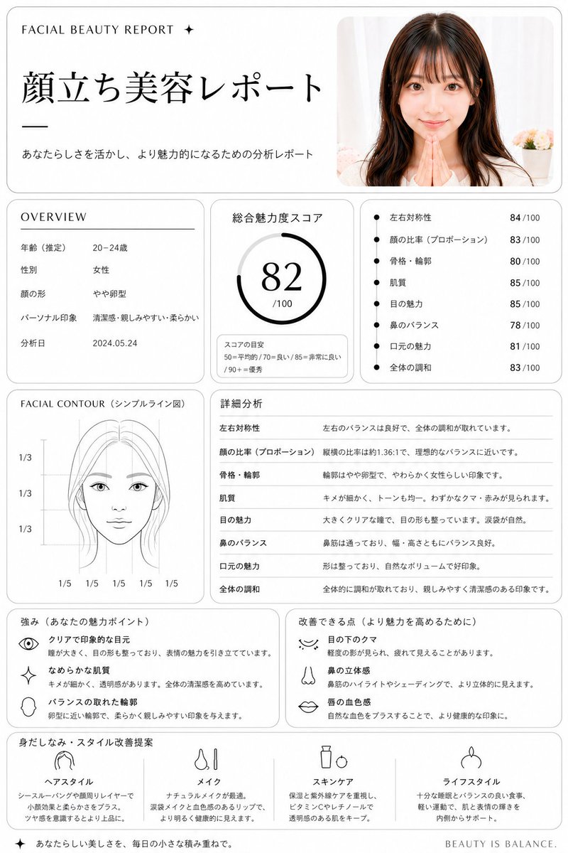
Image prompt Branding & UI Customizable
Perspective Type Poster Built Into Architecture
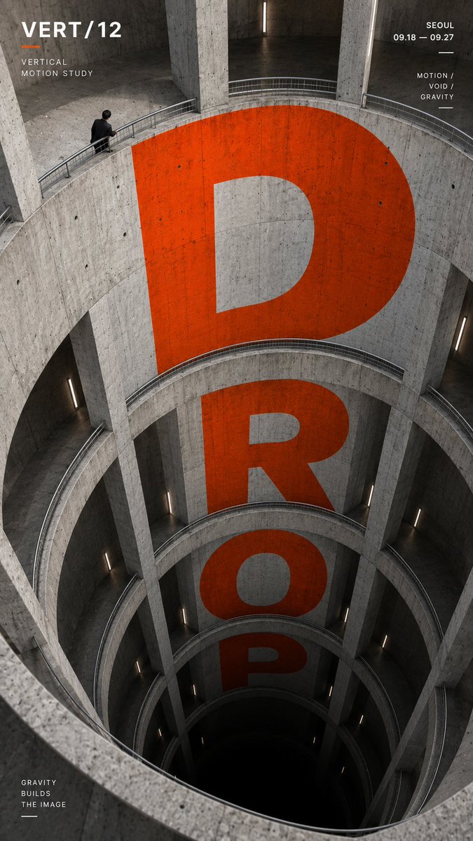
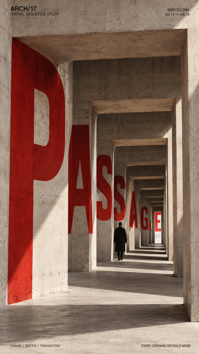
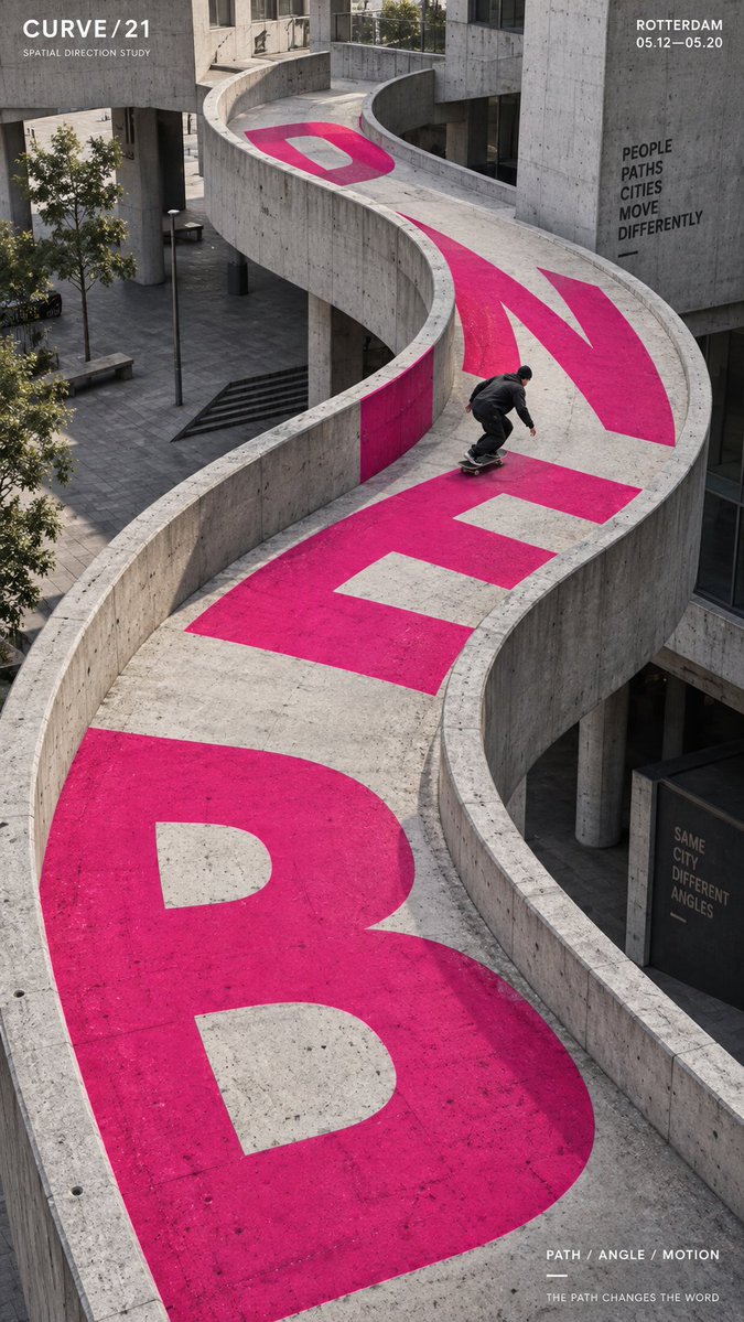
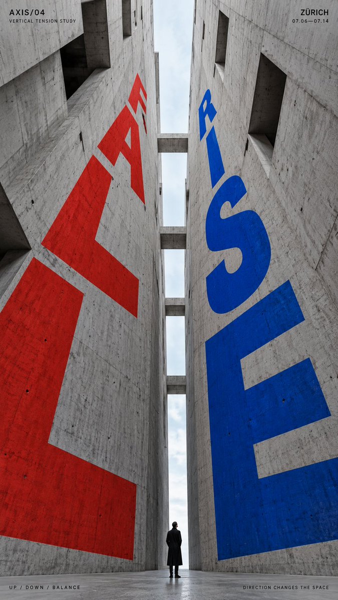
Oversized letters are set into concrete walls, ramps and openings so they bend, recede and fall along the lines of the space. The result reads as a printed poster that lives inside a real building, with strong depth and a clear focal word.

- Model
- GPT Image 2
- Type
- 4 images
- Aspect ratio
- 9:16
- Shared
- 6 Sep 2026
- Likes on X
- 22
Brand / exhibition / campaignSmall human figure / skater / noneOne or two strong accent colorsLocation / date / short tagline
Image prompt
2,226 charactersTITLE: [DROP / PASSAGE / BEND / RISE-FALL / your own text] PROJECT NAME: [brand / exhibition / campaign] ARCHITECTURAL SPACE: [atrium / passage / curved ramp / vertical canyon / other] TYPE MOTION: [fall / recede / bend / rise / opposing directions] SUBJECT: [small human figure / skater / none] MAIN COLOR: [one or two strong accent colors] SUPPORTING TEXT: [location / date / short tagline] FORMAT: 9:16 vertical poster Create a high-impact perspective typography poster where oversized type is physically integrated into architecture and uses the structure of the space to create movement, depth and direction. Build the architecture and perspective system first, then make the typography strictly follow its surfaces, curves, openings, height changes and vanishing directions. The main word should dominate the composition while remaining readable. Let the letterforms change naturally according to the selected spatial mechanism: For vertical spaces, make the type expand, compress or fall through different levels. For passages and repeating openings, let the letters appear, disappear behind structural elements and re-emerge deeper in the scene. For curved paths, bend and rotate the typography along the changing direction of the architecture. For opposing directions, use two typographic flows moving against each other within the same spatial system. Typography should feel painted, printed or embedded into real architectural surfaces, with accurate perspective, scale, occlusion and surface contact. Avoid simply placing flat text over the image. Use a restrained architectural palette with one or two strong accent colors against concrete, black, white or neutral materials. Keep the letterforms bold, geometric and visually dominant. If a person is included, keep them relatively small and use them as a scale anchor. Their movement or position should reinforce the direction of the typography rather than compete with it. Add only a small amount of editorial information such as project name, location, date and one short thematic line. Overall style: perspective typography, architectural poster, spatial graphic design, editorial composition, strong depth, clear hierarchy and bold visual impact.
How to use it
Start by choosing the architectural space and the motion, since the type follows the structure rather than the other way around. Keep the accent color count to one or two and the surrounding materials neutral so the letterforms stay dominant. It was shared as a GPT Image 2 prompt, and it works well as a vertical poster or a cover visual for a campaign.
Shared publicly on X on 6 Sep 2026. All credit for this prompt and its result goes to its creator. Is this yours? Ask for an update or removal.