Afbeeldingsprompt Branding & UI Aanpasbaar
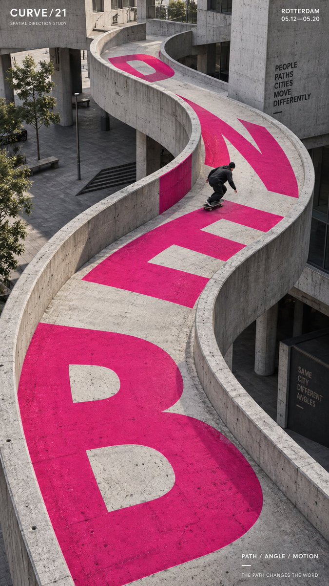
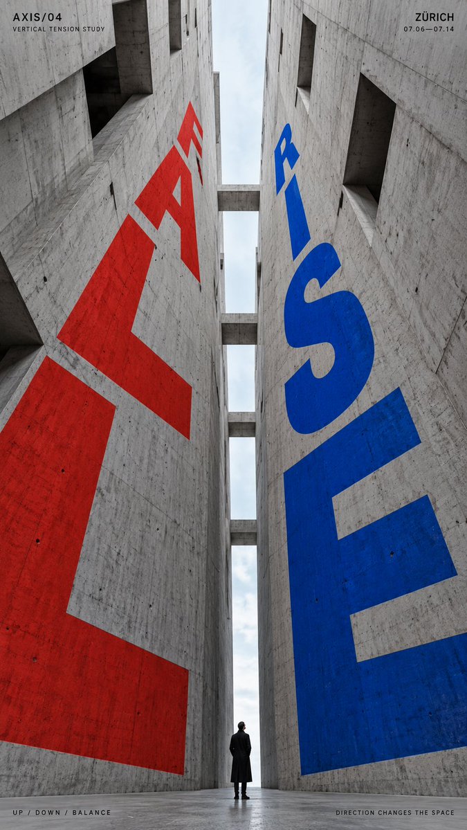
Perspectief typografie-poster ingebouwd in de architectuur
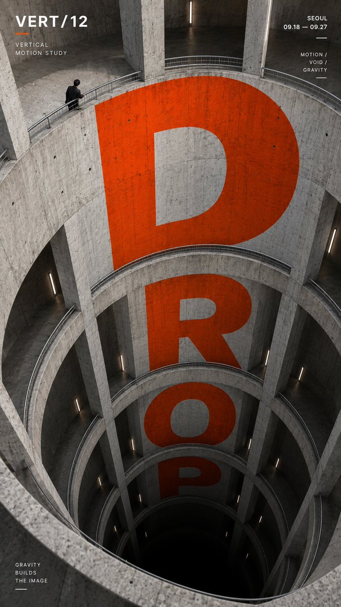
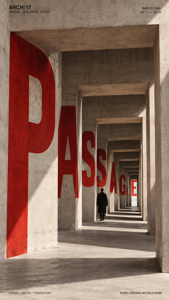
Grote letters worden in betonnen muren, hellingbanen en openingen geplaatst zodat ze buigen, terugwijken en vallen langs de lijnen van de ruimte. Het resultaat leest als een geprinte poster die in een echt gebouw leeft, met sterke diepte en een duidelijk focuswoord.

- Model
- GPT Image 2
- Type
- 4 afbeeldingen
- Beeldverhouding
- 9:16
- Gedeeld
- 6 sep 2026
- Likes op X
- 22
Merk / expositie / campagneKleine menselijke figuur / skater / geenEén of twee sterke accentkleurenLocatie / datum / korte tagline
Afbeeldingsprompt
2,226 tekensTITLE: [DROP / PASSAGE / BEND / RISE-FALL / your own text] PROJECT NAME: [brand / exhibition / campaign] ARCHITECTURAL SPACE: [atrium / passage / curved ramp / vertical canyon / other] TYPE MOTION: [fall / recede / bend / rise / opposing directions] SUBJECT: [small human figure / skater / none] MAIN COLOR: [one or two strong accent colors] SUPPORTING TEXT: [location / date / short tagline] FORMAT: 9:16 vertical poster Create a high-impact perspective typography poster where oversized type is physically integrated into architecture and uses the structure of the space to create movement, depth and direction. Build the architecture and perspective system first, then make the typography strictly follow its surfaces, curves, openings, height changes and vanishing directions. The main word should dominate the composition while remaining readable. Let the letterforms change naturally according to the selected spatial mechanism: For vertical spaces, make the type expand, compress or fall through different levels. For passages and repeating openings, let the letters appear, disappear behind structural elements and re-emerge deeper in the scene. For curved paths, bend and rotate the typography along the changing direction of the architecture. For opposing directions, use two typographic flows moving against each other within the same spatial system. Typography should feel painted, printed or embedded into real architectural surfaces, with accurate perspective, scale, occlusion and surface contact. Avoid simply placing flat text over the image. Use a restrained architectural palette with one or two strong accent colors against concrete, black, white or neutral materials. Keep the letterforms bold, geometric and visually dominant. If a person is included, keep them relatively small and use them as a scale anchor. Their movement or position should reinforce the direction of the typography rather than compete with it. Add only a small amount of editorial information such as project name, location, date and one short thematic line. Overall style: perspective typography, architectural poster, spatial graphic design, editorial composition, strong depth, clear hierarchy and bold visual impact.
Zo gebruik je hem
Begin met het kiezen van de architectonische ruimte en de beweging, want de typografie volgt de constructie en niet andersom. Houd het aantal accentkleuren op één of twee en de omringende materialen neutraal, zodat de lettervormen dominant blijven. Het werd gedeeld als GPT Image 2-prompt en werkt goed als verticale poster of coverbeeld voor een campagne.
Openbaar gedeeld op X op 6 sep 2026. Alle eer voor deze prompt en het resultaat gaat naar de maker. Is dit van jou? Vraag om een aanpassing of verwijdering.