Prompt d'image Branding et UI Personnalisables
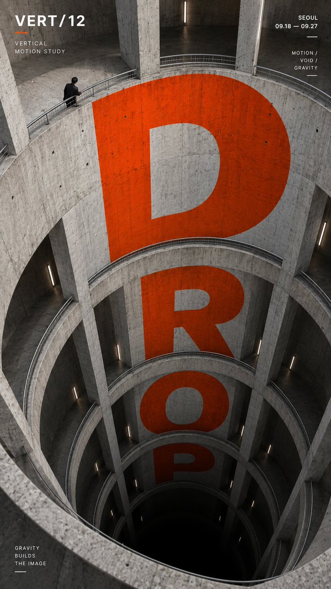
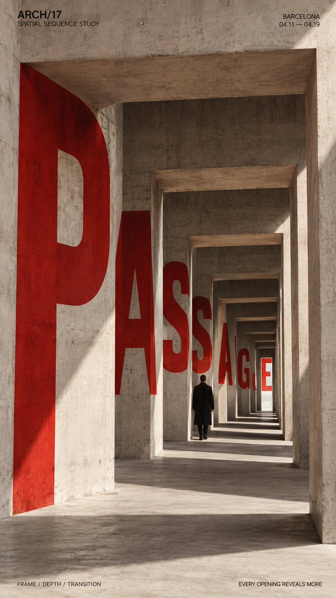
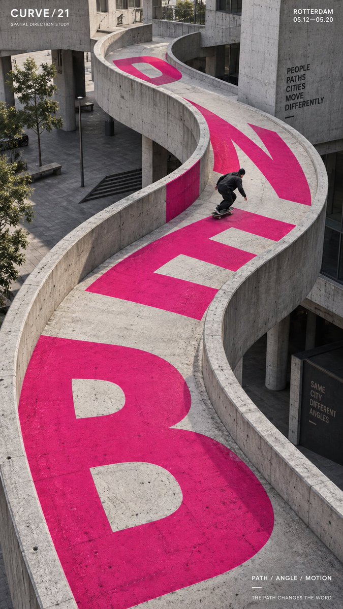
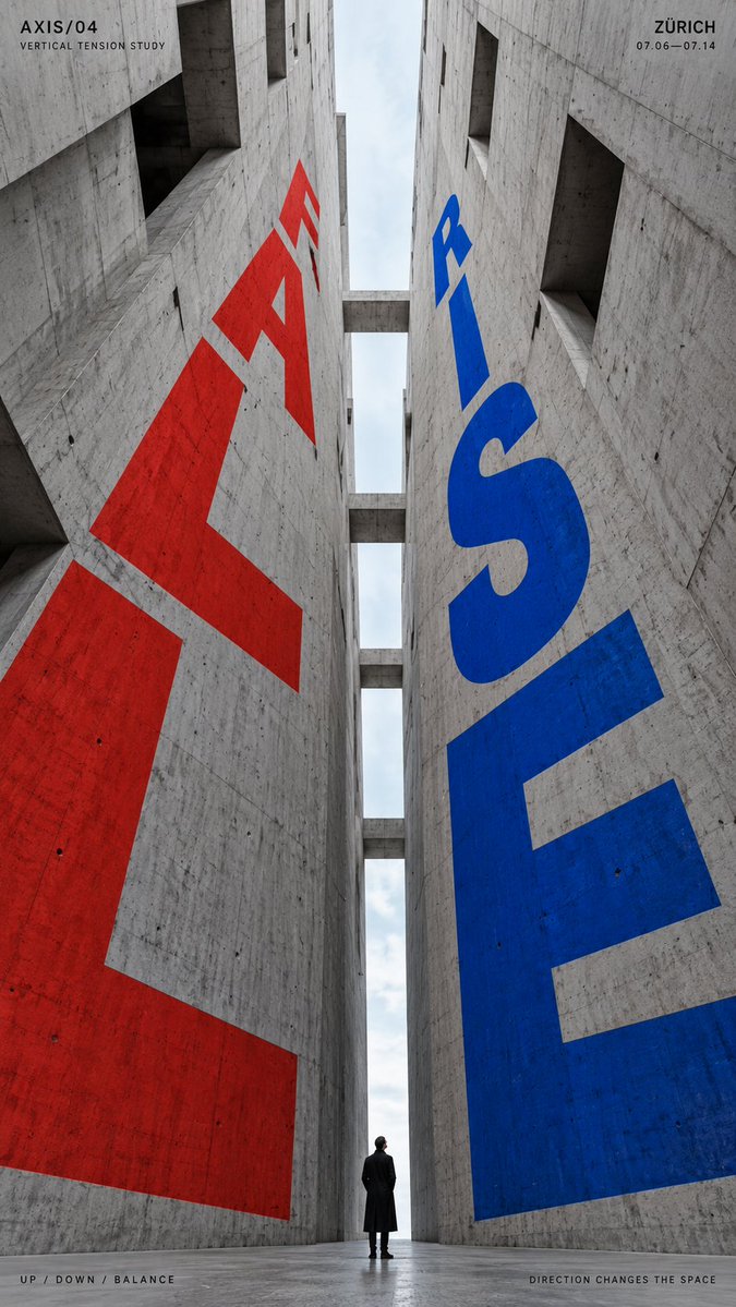
Affiche typographique en perspective intégrée à l'architecture
De grandes lettres sont posées sur des murs en béton, des rampes et des ouvertures afin de se courber, de reculer et de tomber le long des lignes de l'espace. Le résultat ressemble à une affiche imprimée qui vit dans un vrai bâtiment, avec une forte profondeur et un mot central bien visible.

- Modèle
- GPT Image 2
- Type
- 4 images
- Format d'image
- 9:16
- Partagé
- 6 sept. 2026
- J'aime sur X
- 22
Marque / exposition / campagnePetite figure humaine / skateur / aucuneUne ou deux couleurs d'accent fortesLieu / date / slogan court
Prompt d'image
2,226 caractèresTITLE: [DROP / PASSAGE / BEND / RISE-FALL / your own text] PROJECT NAME: [brand / exhibition / campaign] ARCHITECTURAL SPACE: [atrium / passage / curved ramp / vertical canyon / other] TYPE MOTION: [fall / recede / bend / rise / opposing directions] SUBJECT: [small human figure / skater / none] MAIN COLOR: [one or two strong accent colors] SUPPORTING TEXT: [location / date / short tagline] FORMAT: 9:16 vertical poster Create a high-impact perspective typography poster where oversized type is physically integrated into architecture and uses the structure of the space to create movement, depth and direction. Build the architecture and perspective system first, then make the typography strictly follow its surfaces, curves, openings, height changes and vanishing directions. The main word should dominate the composition while remaining readable. Let the letterforms change naturally according to the selected spatial mechanism: For vertical spaces, make the type expand, compress or fall through different levels. For passages and repeating openings, let the letters appear, disappear behind structural elements and re-emerge deeper in the scene. For curved paths, bend and rotate the typography along the changing direction of the architecture. For opposing directions, use two typographic flows moving against each other within the same spatial system. Typography should feel painted, printed or embedded into real architectural surfaces, with accurate perspective, scale, occlusion and surface contact. Avoid simply placing flat text over the image. Use a restrained architectural palette with one or two strong accent colors against concrete, black, white or neutral materials. Keep the letterforms bold, geometric and visually dominant. If a person is included, keep them relatively small and use them as a scale anchor. Their movement or position should reinforce the direction of the typography rather than compete with it. Add only a small amount of editorial information such as project name, location, date and one short thematic line. Overall style: perspective typography, architectural poster, spatial graphic design, editorial composition, strong depth, clear hierarchy and bold visual impact.
Comment l'utiliser
Commencez par choisir l'espace architectural et le mouvement, car la typographie suit la structure et non l'inverse. Limitez les couleurs d'accent à une ou deux et gardez les matériaux environnants neutres pour que les formes des lettres restent dominantes. Partagé comme prompt GPT Image 2, il fonctionne bien en affiche verticale ou en visuel de couverture pour une campagne.
Partagé publiquement sur X le 6 sept. 2026. Tout le mérite de ce prompt et de son résultat revient à son créateur. Ce prompt est le vôtre ? Demandez une mise à jour ou un retrait.