Image prompt Branding & UI Customizable
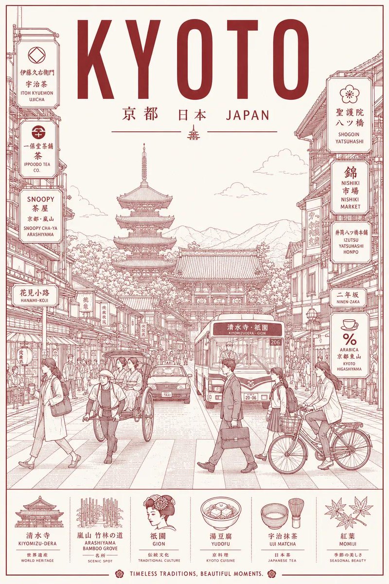
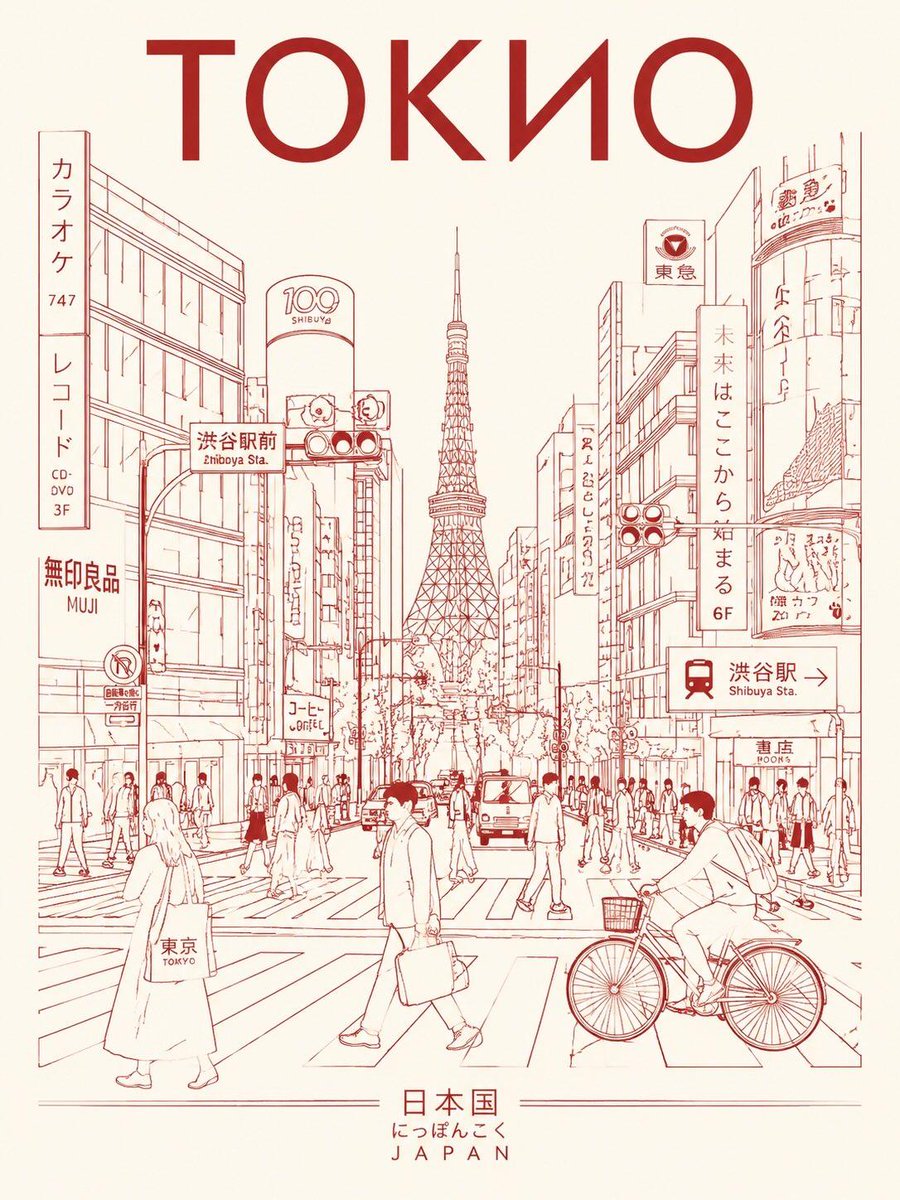
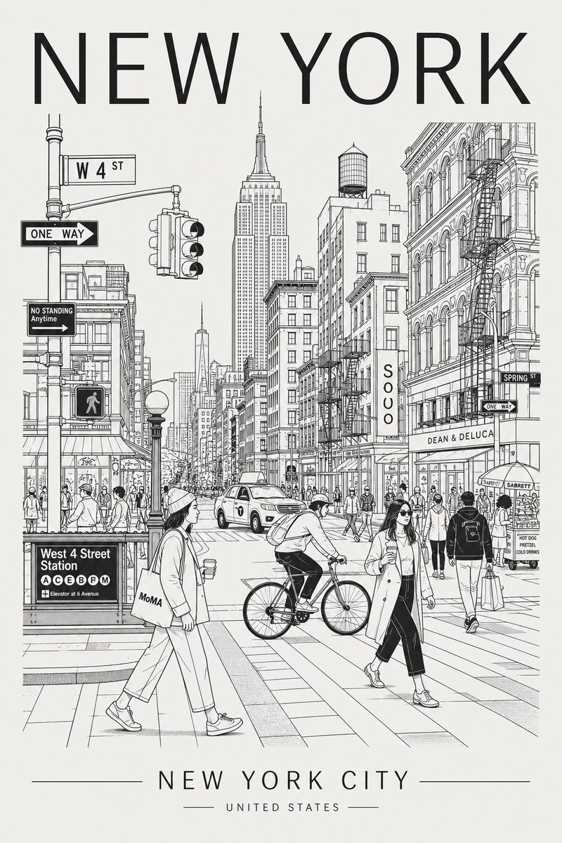
Tokyo Street Life Line-Art Travel Poster
A vertical monochrome poster of a Tokyo street crossing, with commuters, cyclists and café visitors drawn in fine monoline against signs, shopfronts and cables. Red ink on warm ivory gives it a calm, premium city-brand feel.

- Model
- GPT Image 2
- Type
- 2 images
- Aspect ratio
- 3:4
- Shared
- 9 May 2026
- Likes on X
- 1,372
Headline textSubtitle textColour palette
Image prompt
2,739 charactersCreate a minimalist ultra-high-resolution travel poster in line-art style for TOKYO, portraying the city as a stylish everyday urban scene rather than a tourist postcard. MAIN COMPOSITION: Central composition features Tokyo’s most iconic everyday street scene, intersection, alleyway, tram route, or pedestrian crossing. Foreground includes local residents, commuters, cyclists, travelers, shoppers, students, and café visitors. People should naturally reflect Tokyo street fashion, local lifestyle, and modern urban culture. Background filled with authentic Japanese signage, cafés, ramen shops, convenience stores, transport signs, storefronts, vending machines, and architectural details. Landmarks should blend subtly into daily life rather than dominate the composition. Use authentic Japanese typography and culturally recognizable visual elements. Large centered title at the top: “TOKYO” Subtitle at the bottom in Japanese: “日本” or “東京” STYLE: Ultra-clean vector illustration Swiss modernist travel poster aesthetic Minimalist line-art Monoline drawing Mid-century editorial illustration style Architectural illustration Japanese graphic poster design Crisp geometric perspective Extremely clean negative space Premium travel-brand aesthetic LINE STYLE: Monochrome line illustration only Thin, highly precise lines Minimal fill areas Intricate city-map-level detailing Rhythmic arrangement of signs, buildings, windows, cables, and street objects Visually dense yet highly organized composition COLOR SYSTEM — VERY IMPORTANT: Use only ONE primary ink color + ONE background color Automatically select the color pairing that best represents Tokyo’s atmosphere Monochrome silkscreen poster aesthetic No rainbow palettes No excessive neon Color should reflect Tokyo’s architecture, nightlife, urban energy, and cultural identity Recommended palette for Tokyo: Bright Japanese red ink on warm ivory background COMPOSITION: Vertical poster layout Frontal street-level perspective Pedestrians naturally crossing streets and moving through the scene Balanced urban rhythm and visual flow Should feel like a premium city-brand campaign poster MOOD: Stylish urban life Calm yet lively atmosphere High-end travel magazine cover aesthetic Timeless city identity Premium tourism campaign visuals Minimalist yet highly detailed TEXT QUALITY — EXTREMELY IMPORTANT: All typography must be clean, readable, and professionally designed No random symbols No broken or distorted letters Japanese signage must appear authentic and natural High-end editorial typography layout OUTPUT: Vertical poster composition Ultra-detailed 8K resolution Print-ready Ultra-precise vector-quality rendering
How to use it
If you want the city to feel like your own, swap the title word and the Japanese subtitle first, then pick a different district or scene type in the middle of the description. Keep the monoline and single-ink palette wording, since those are what make the poster read as silkscreen rather than a busy illustration. It was shared as a GPT Image 2 prompt, so it works best there. A good use is a printed wall piece or a branded social post for a neighbourhood guide.
Featured inChatGPT image prompts (GPT Image 2)
Shared publicly on X on 9 May 2026. All credit for this prompt and its result goes to its creator. Is this yours? Ask for an update or removal.