Görsel promptu Marka ve arayüz Özelleştirilebilir
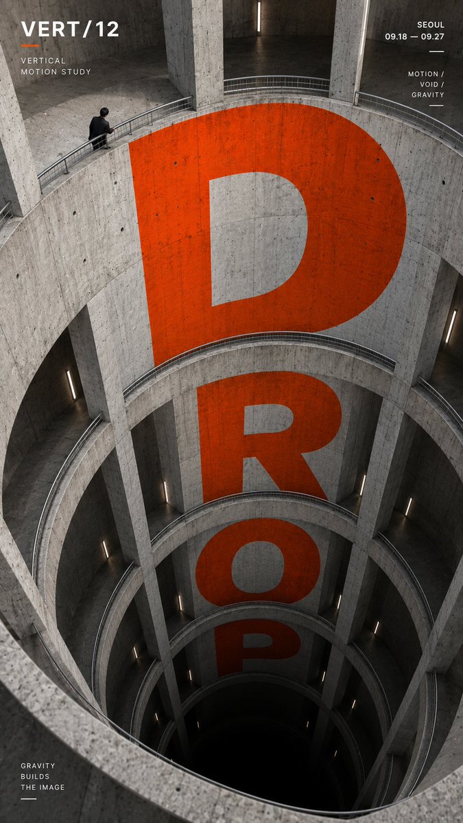
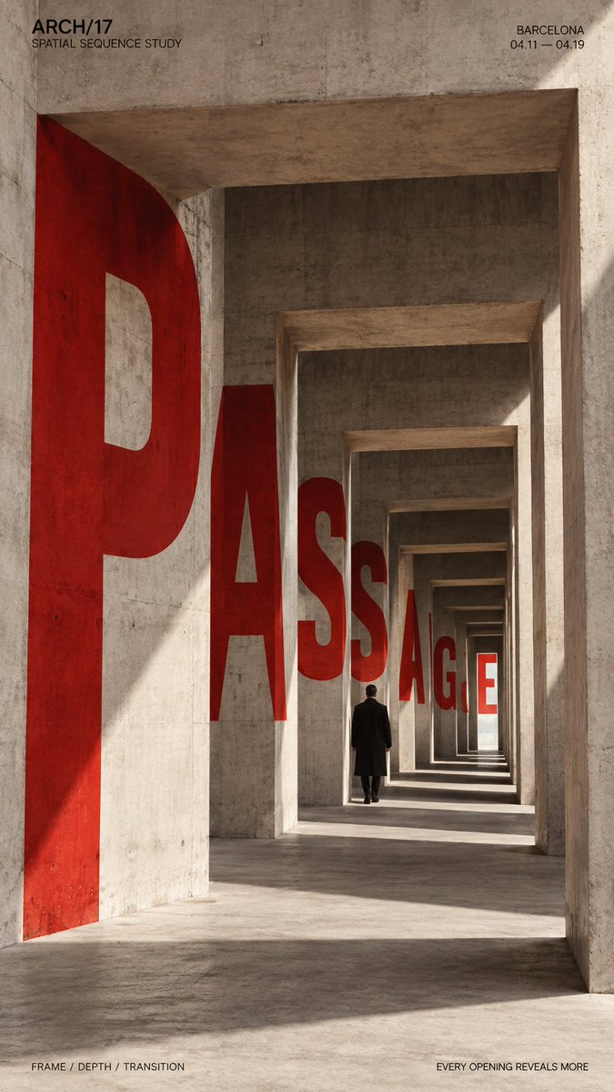
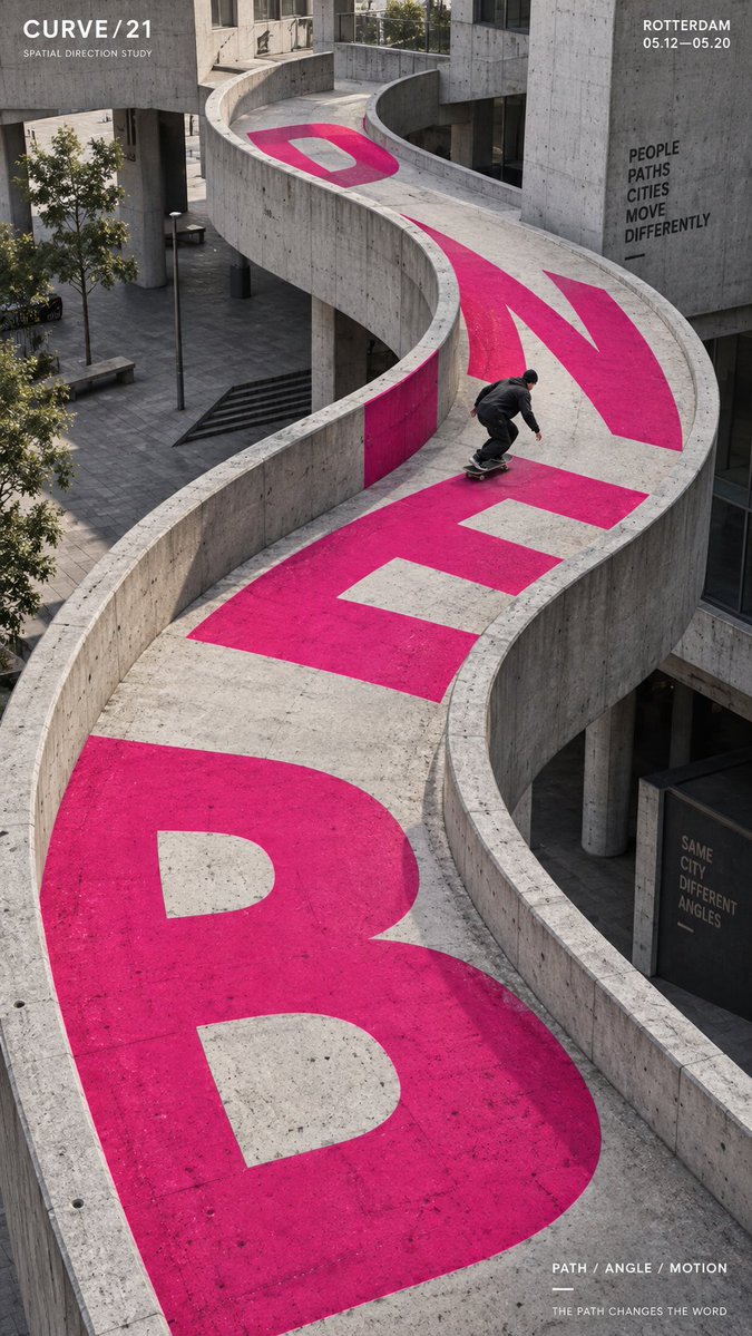
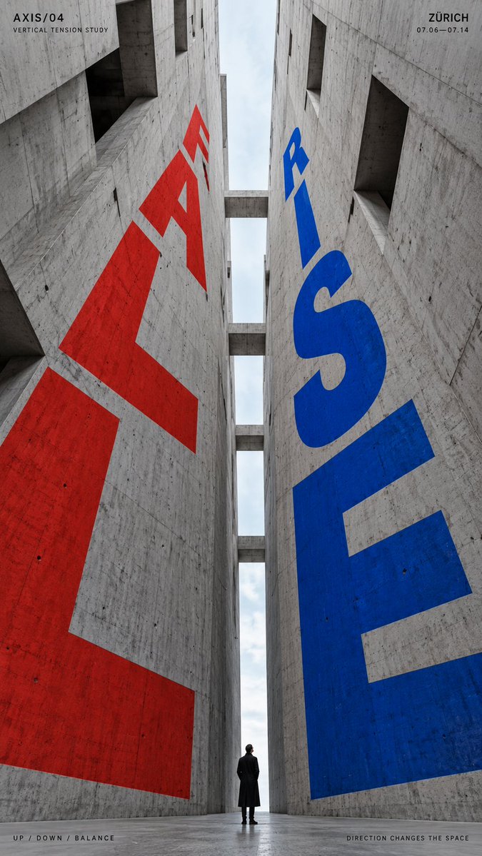
Mimariye entegre perspektif tipografi posteri
Dev harfler beton duvarlara, rampalara ve açıklıklara yerleştirilerek mekânın çizgileri boyunca eğilir, geriye çekilir ve düşer. Sonuç, gerçek bir binanın içinde yaşayan basılı bir poster gibi okunur; güçlü derinlik ve net bir odak kelimesiyle.

- Model
- GPT Image 2
- Tür
- 4 görsel
- En boy oranı
- 9:16
- Paylaşım
- 6 Eyl 2026
- X'teki beğeniler
- 22
Marka / sergi / kampanyaKüçük insan figürü / kaykaycı / yokBir ya da iki güçlü vurgu rengiKonum / tarih / kısa slogan
Görsel promptu
2,226 karakterTITLE: [DROP / PASSAGE / BEND / RISE-FALL / your own text] PROJECT NAME: [brand / exhibition / campaign] ARCHITECTURAL SPACE: [atrium / passage / curved ramp / vertical canyon / other] TYPE MOTION: [fall / recede / bend / rise / opposing directions] SUBJECT: [small human figure / skater / none] MAIN COLOR: [one or two strong accent colors] SUPPORTING TEXT: [location / date / short tagline] FORMAT: 9:16 vertical poster Create a high-impact perspective typography poster where oversized type is physically integrated into architecture and uses the structure of the space to create movement, depth and direction. Build the architecture and perspective system first, then make the typography strictly follow its surfaces, curves, openings, height changes and vanishing directions. The main word should dominate the composition while remaining readable. Let the letterforms change naturally according to the selected spatial mechanism: For vertical spaces, make the type expand, compress or fall through different levels. For passages and repeating openings, let the letters appear, disappear behind structural elements and re-emerge deeper in the scene. For curved paths, bend and rotate the typography along the changing direction of the architecture. For opposing directions, use two typographic flows moving against each other within the same spatial system. Typography should feel painted, printed or embedded into real architectural surfaces, with accurate perspective, scale, occlusion and surface contact. Avoid simply placing flat text over the image. Use a restrained architectural palette with one or two strong accent colors against concrete, black, white or neutral materials. Keep the letterforms bold, geometric and visually dominant. If a person is included, keep them relatively small and use them as a scale anchor. Their movement or position should reinforce the direction of the typography rather than compete with it. Add only a small amount of editorial information such as project name, location, date and one short thematic line. Overall style: perspective typography, architectural poster, spatial graphic design, editorial composition, strong depth, clear hierarchy and bold visual impact.
Nasıl kullanılır
Önce mimari mekânı ve hareketi seçerek başlayabilirsiniz, çünkü tipografi yapıyı takip eder, tersi değil. Vurgu renklerini bir ya da iki ile sınırlayın ve çevredeki malzemeleri nötr tutun ki harf formları baskın kalsın. GPT Image 2 promptu olarak paylaşılmış olup dikey poster ya da bir kampanya kapak görseli olarak iyi çalışır.
6 Eyl 2026 tarihinde X'te herkese açık olarak paylaşıldı. Bu prompt ve sonucunun tüm hakkı içerik üreticisine aittir. Bu sizin mi? Güncelleme veya kaldırma talep edin.