Image prompt Food & Drink Customizable
Food-Sculpted Letters Café Poster
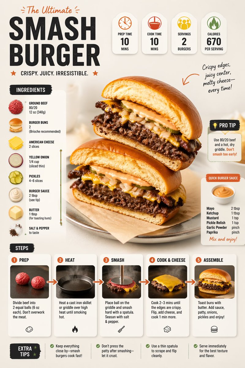
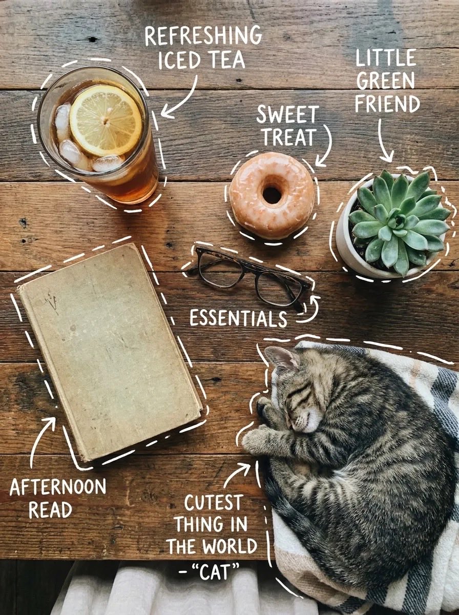
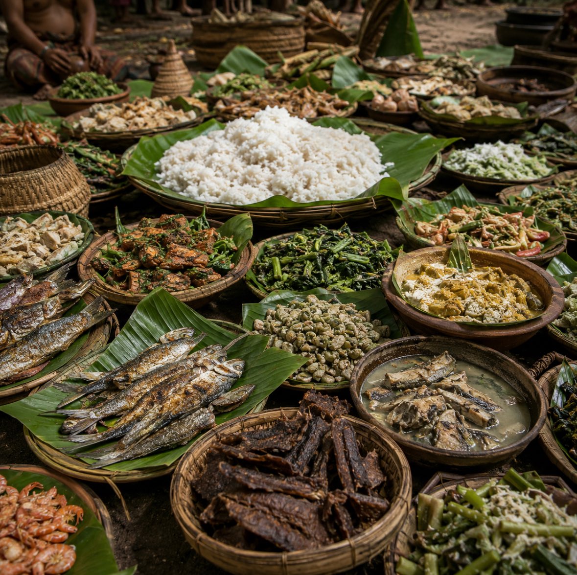
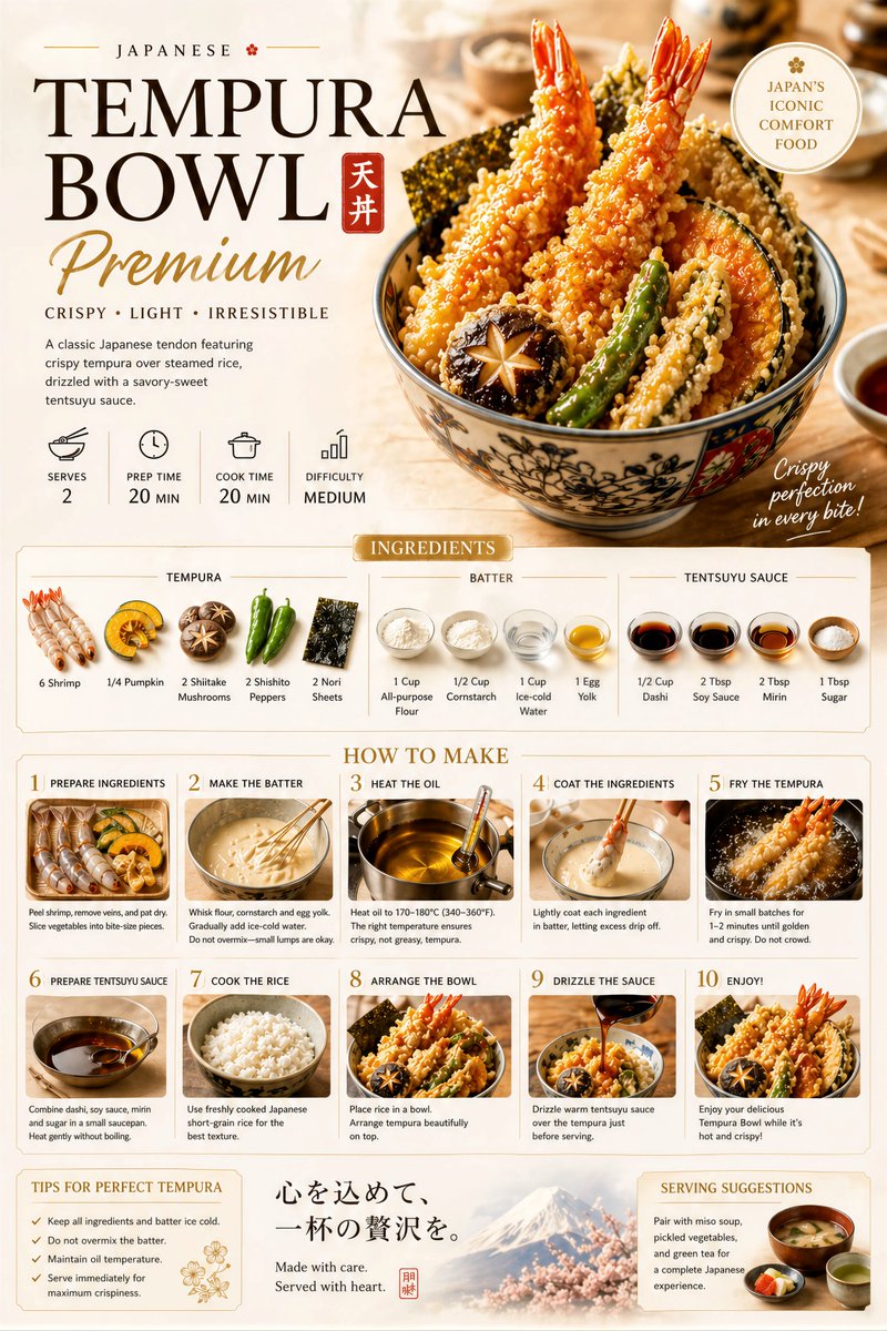
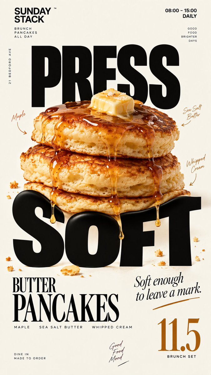
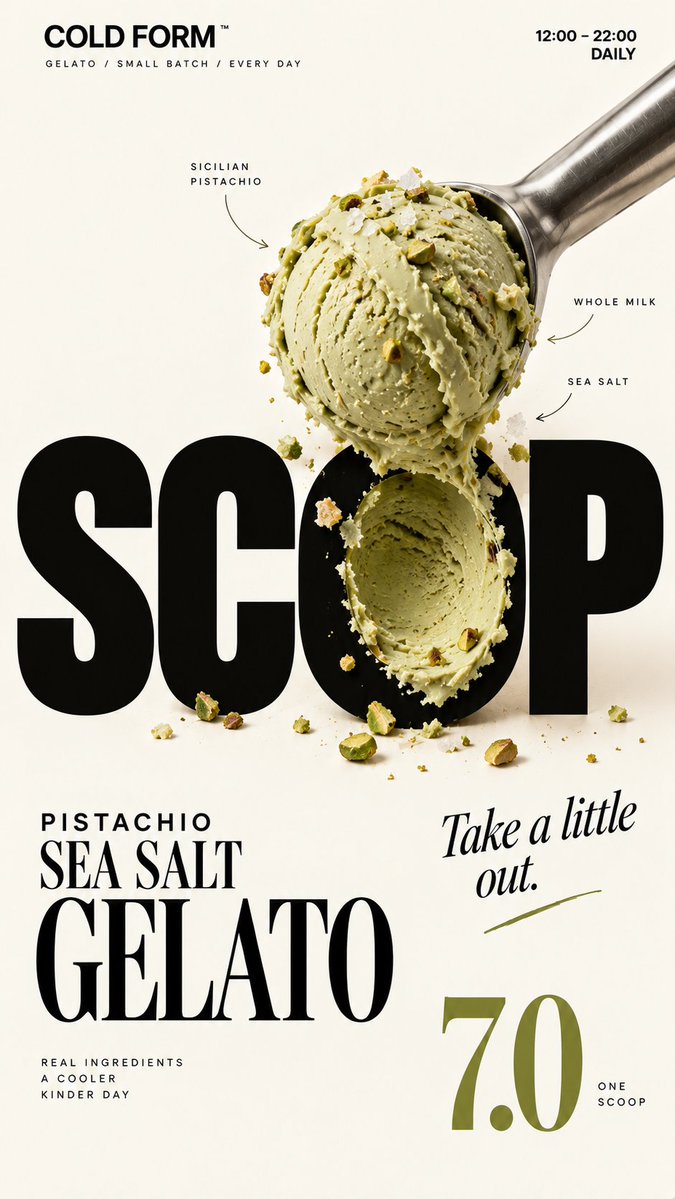
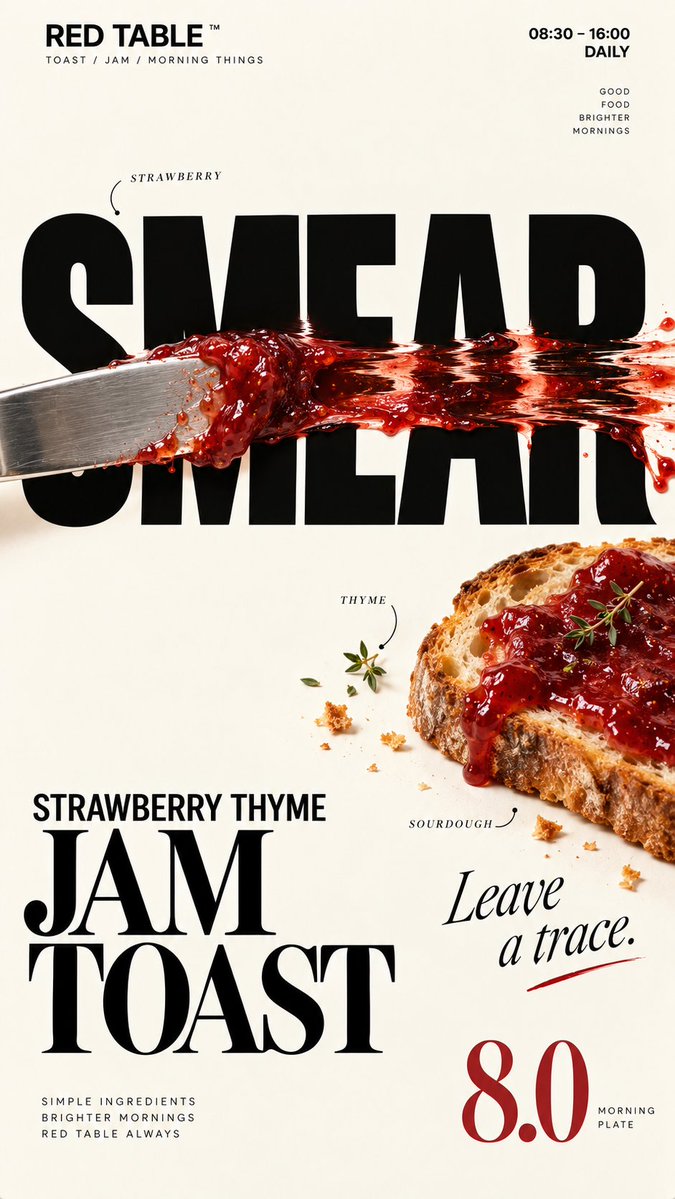
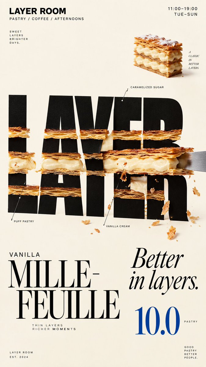
Real food presses, scoops, or smears into oversized black headline letters on a cream background, so the letters look changed by the food rather than decorated by it. The result reads clearly even at thumbnail size.

- Model
- GPT Image 2
- Type
- 4 images
- Aspect ratio
- 9:16
- Shared
- 19 Sep 2026
- Likes on X
- 15
Brand nameFood / drinkColorProduct namePrice+3 more
Image prompt
2,264 charactersBrand: [BRAND NAME] Food: [FOOD / DRINK] Headline: [1 SHORT WORD] Physical Interaction: [PRESS / SCOOP / SMEAR / LAYER / other physical action] Accent Color: [COLOR] Product Name: [PRODUCT NAME] Price: [PRICE] Aspect Ratio: 9:16 Create a premium editorial food poster where real food physically interacts with and reshapes oversized typography, using a warm cream or ivory background, bold black Heavy Grotesk typography, photorealistic food materials, generous negative space, and a broken editorial grid inspired by high-end European café branding and contemporary magazine design. The food must not simply overlap or sit beside the letters, treat the typography and food as objects inside the same physical world, the selected interaction must visibly change the structure of the letters through believable physics. Examples: PRESS, food weight compresses and locally deforms the typography; SCOOP, a real scoop removes material directly from a letter, leaving a matching cavity and revealing edible material inside; SMEAR, a knife drags food across the type, causing localized lateral stretching and shear only along the contact zone; LAYER, the typography contains real food layers, and one structural layer is physically pulled out and offset. Keep the interaction localized, clear, and physically believable, untouched parts of the typography should remain hard, clean, geometric, and readable, use only one main physical mechanism per poster, avoid random liquify effects, decorative overlap, generic 3D lettering, or digital-looking distortion. Add small editorial information such as [INGREDIENTS], [OPENING HOURS], and [ADDRESS], use strong scale contrast rather than traditional menu rows, avoid long horizontal divider lines, boxed prices, rigid bottom information bars, or template-like layouts. Use bold Grotesk Sans Serif for the main typography, high-contrast Editorial Serif or Italic Serif for product names, quotes, or prices, keep the color system minimal with a cream background, black typography, natural food colors, and one accent color. The final poster should feel clever, physical, premium, and instantly understandable at thumbnail size, the key idea is simple: food does not decorate the typography, food physically changes it.
How to use it
Replace the bracketed fields with your own brand, food, one short headline word, the physical action you want, an accent colour, product name, price, and small details like ingredients, hours, and address. Keep the single main physical action and the cream background, since they carry the idea. It was shared as a GPT Image 2 prompt, so the 9:16 ratio and layout fit a phone-sized poster or story.
Shared publicly on X on 19 Sep 2026. All credit for this prompt and its result goes to its creator. Is this yours? Ask for an update or removal.