Görsel promptu Yiyecek ve içecek Özelleştirilebilir
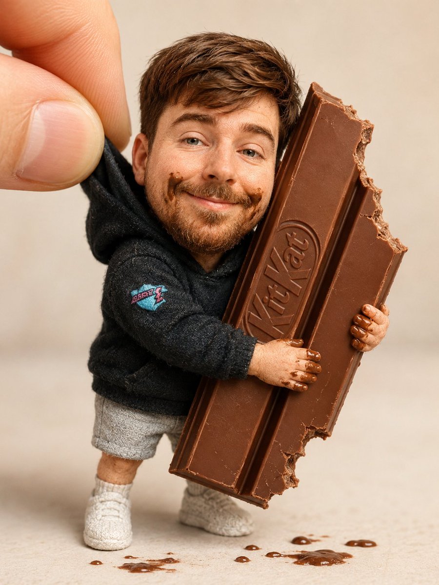
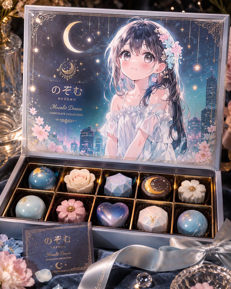
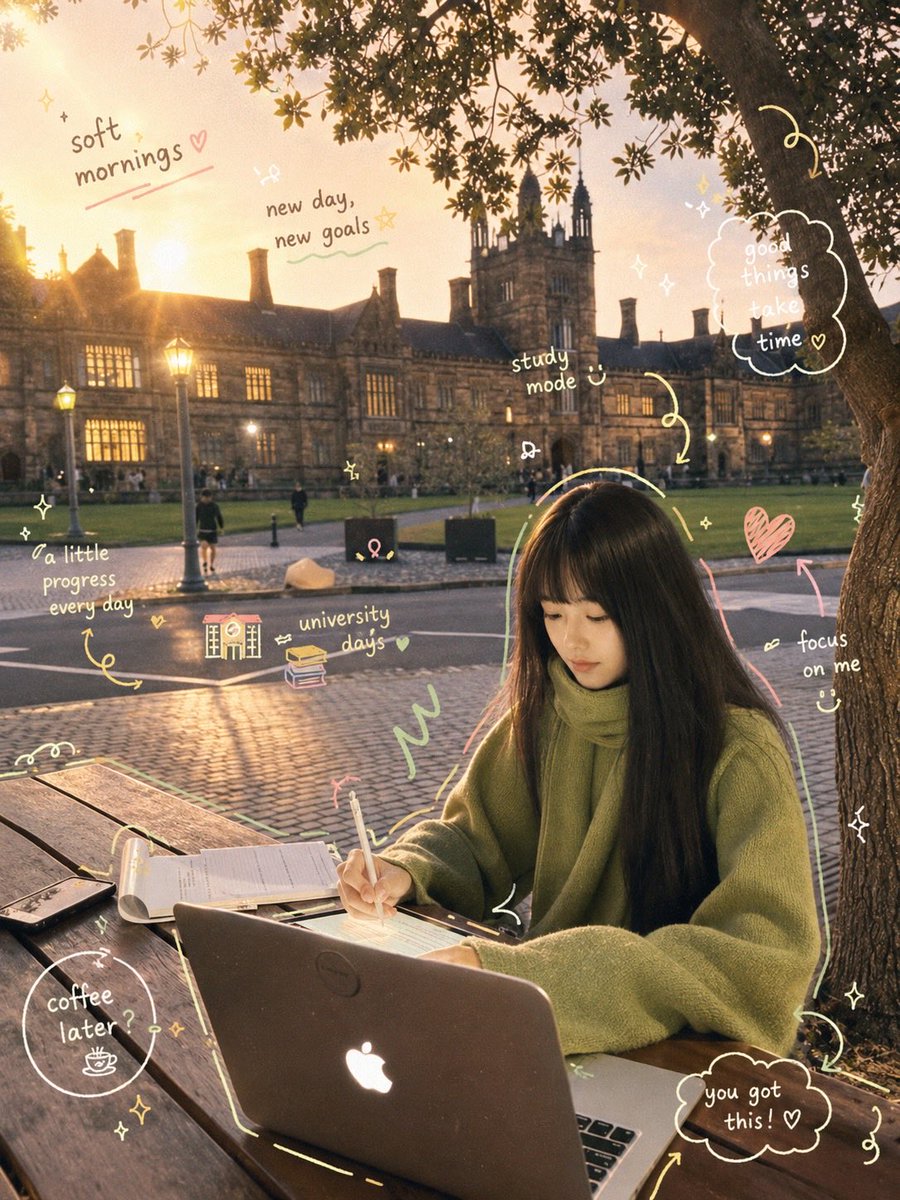
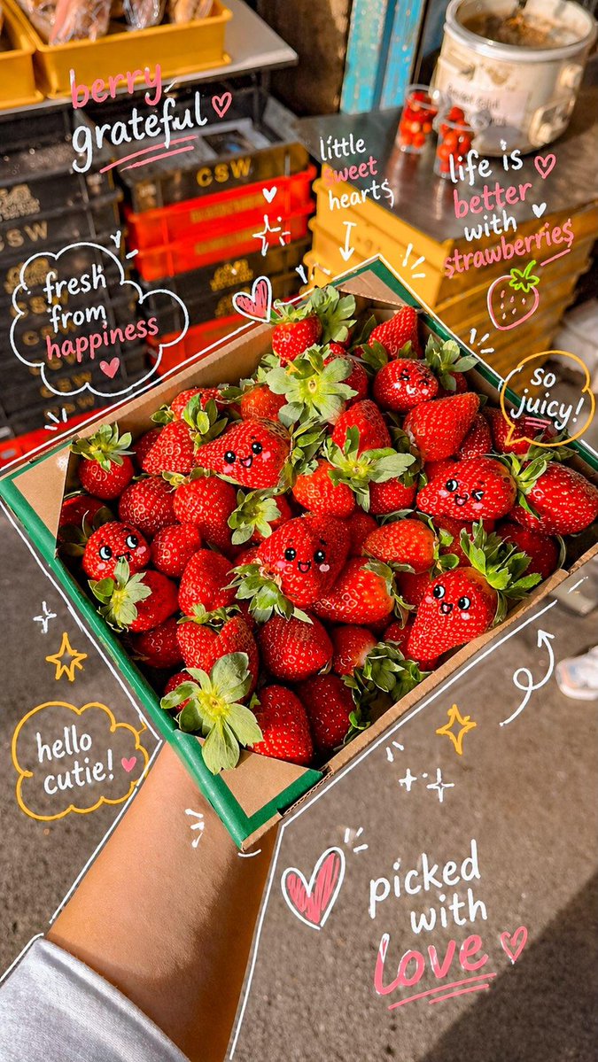
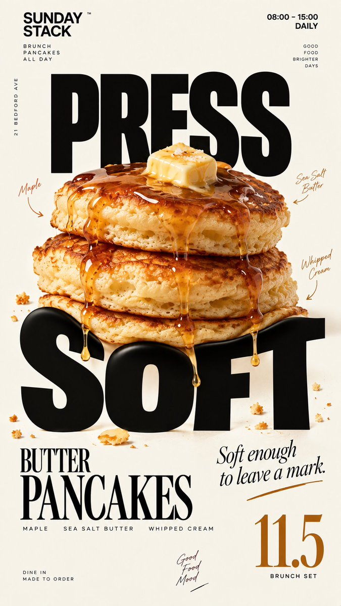
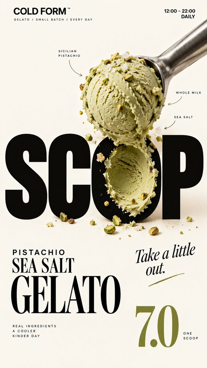
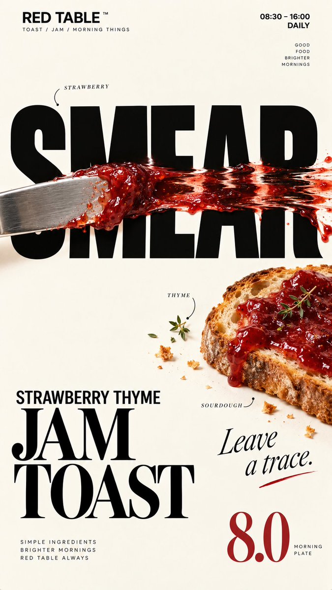
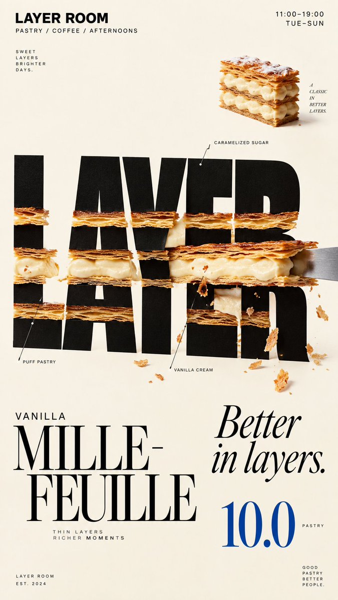
Yiyecekle şekillendirilmiş harflerle kafe posteri
Gerçek yiyecekler, krem rengi bir zemin üzerindeki büyük siyah başlık harflerine bastırılır, sıyrılır veya sürülür; böylece harfler süslenmiş gibi değil, yiyecek tarafından değişmiş gibi görünür. Sonuç, küçük önizleme boyutunda bile net okunur.

- Model
- GPT Image 2
- Tür
- 4 görsel
- En boy oranı
- 9:16
- Paylaşım
- 19 Eyl 2026
- X'teki beğeniler
- 15
Marka adıYiyecek / içecekRenkÜrün adıFiyat+3 daha fazla
Görsel promptu
2,264 karakterBrand: [BRAND NAME] Food: [FOOD / DRINK] Headline: [1 SHORT WORD] Physical Interaction: [PRESS / SCOOP / SMEAR / LAYER / other physical action] Accent Color: [COLOR] Product Name: [PRODUCT NAME] Price: [PRICE] Aspect Ratio: 9:16 Create a premium editorial food poster where real food physically interacts with and reshapes oversized typography, using a warm cream or ivory background, bold black Heavy Grotesk typography, photorealistic food materials, generous negative space, and a broken editorial grid inspired by high-end European café branding and contemporary magazine design. The food must not simply overlap or sit beside the letters, treat the typography and food as objects inside the same physical world, the selected interaction must visibly change the structure of the letters through believable physics. Examples: PRESS, food weight compresses and locally deforms the typography; SCOOP, a real scoop removes material directly from a letter, leaving a matching cavity and revealing edible material inside; SMEAR, a knife drags food across the type, causing localized lateral stretching and shear only along the contact zone; LAYER, the typography contains real food layers, and one structural layer is physically pulled out and offset. Keep the interaction localized, clear, and physically believable, untouched parts of the typography should remain hard, clean, geometric, and readable, use only one main physical mechanism per poster, avoid random liquify effects, decorative overlap, generic 3D lettering, or digital-looking distortion. Add small editorial information such as [INGREDIENTS], [OPENING HOURS], and [ADDRESS], use strong scale contrast rather than traditional menu rows, avoid long horizontal divider lines, boxed prices, rigid bottom information bars, or template-like layouts. Use bold Grotesk Sans Serif for the main typography, high-contrast Editorial Serif or Italic Serif for product names, quotes, or prices, keep the color system minimal with a cream background, black typography, natural food colors, and one accent color. The final poster should feel clever, physical, premium, and instantly understandable at thumbnail size, the key idea is simple: food does not decorate the typography, food physically changes it.
Nasıl kullanılır
Parantez içindeki alanları kendi markanız, yiyeceğiniz, kısa bir başlık kelimeniz, istediğiniz fiziksel eylem, bir vurgu rengi, ürün adı, fiyat ve içerikler, çalışma saatleri ve adres gibi küçük ayrıntılarla değiştirebilirsiniz. Fikri taşıyan tek ana fiziksel eylemi ve krem rengi zemini koruyun. Bu, bir GPT Image 2 promptu olarak paylaşıldı; 9:16 oranı ve düzen telefon boyutundaki bir poster ya da hikâye için uygundur.
19 Eyl 2026 tarihinde X'te herkese açık olarak paylaşıldı. Bu prompt ve sonucunun tüm hakkı içerik üreticisine aittir. Bu sizin mi? Güncelleme veya kaldırma talep edin.