Prompt de imagen Comida y bebida Personalizables
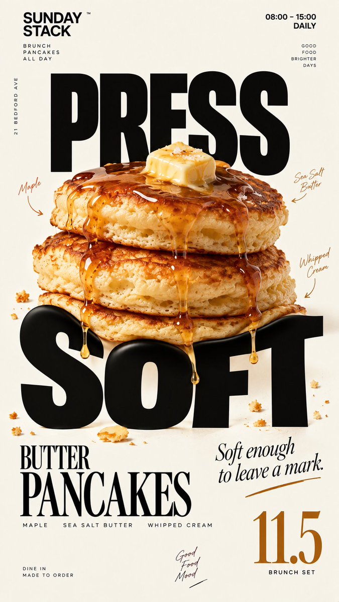
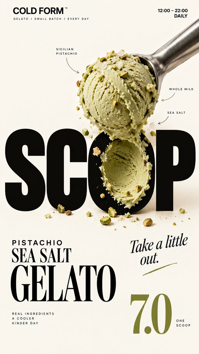
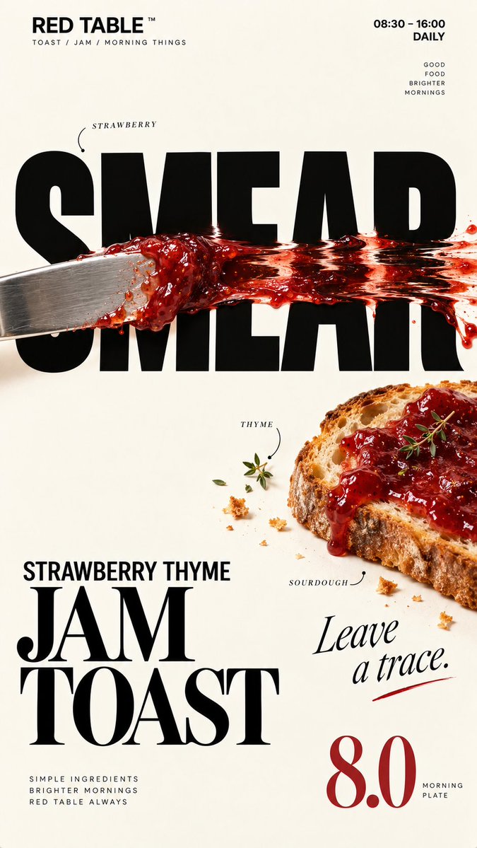
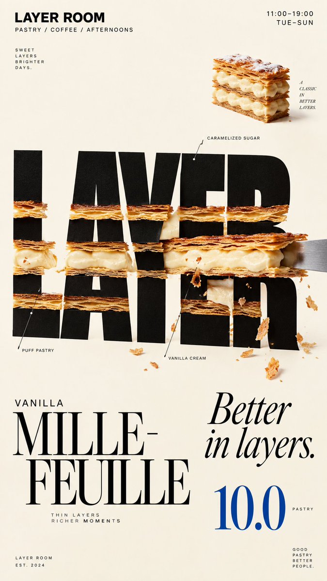
Cartel de café con letras esculpidas con comida
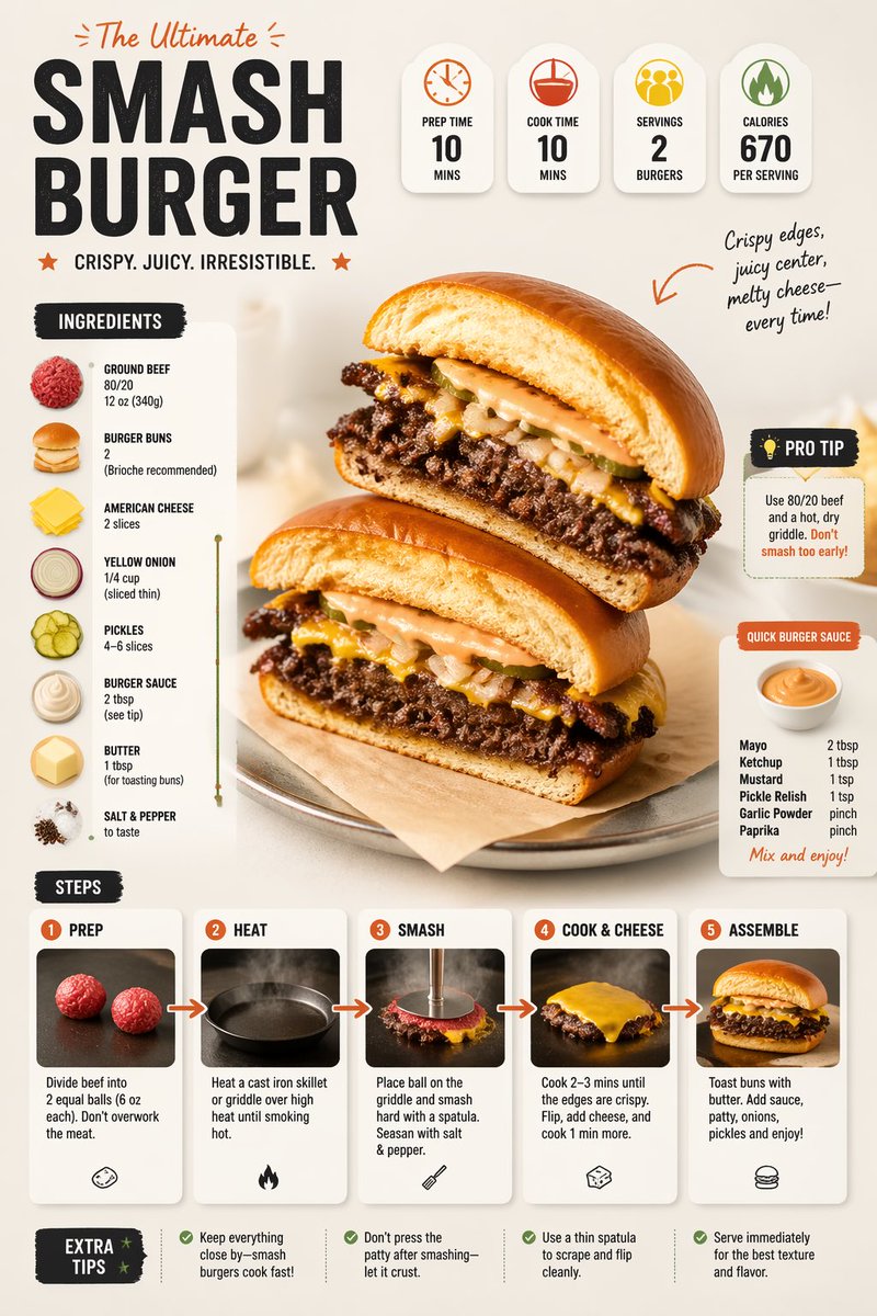
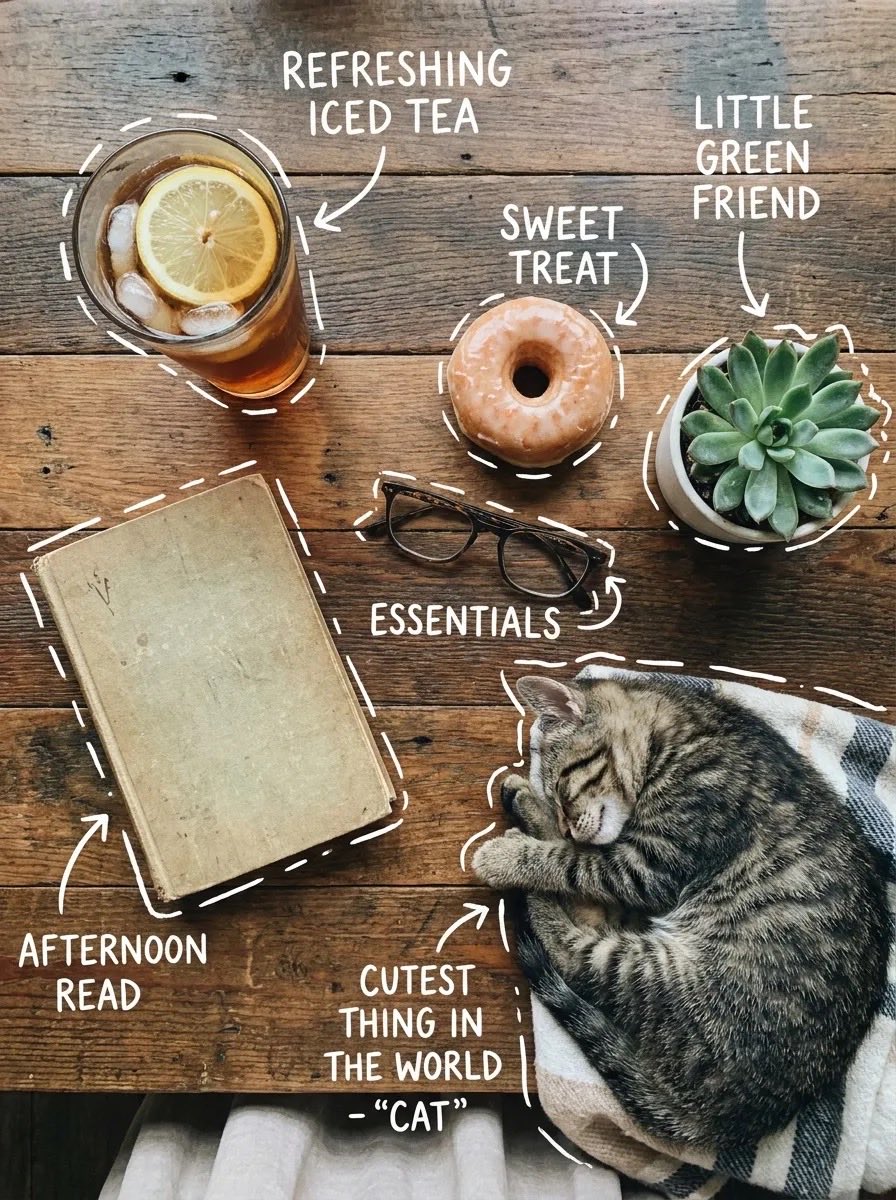
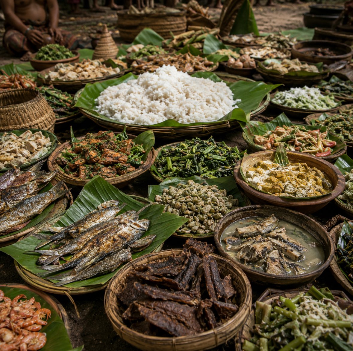
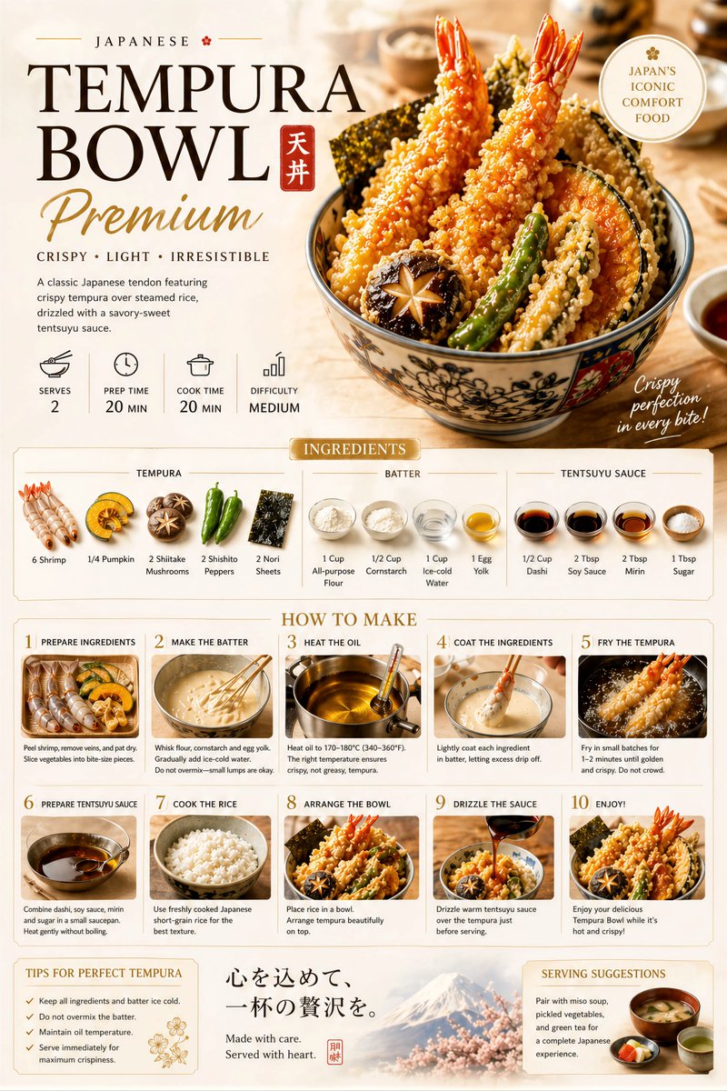
Alimentos reales se presionan, se sacan con cuchara o se extienden sobre letras de titular negras y enormes sobre un fondo crema, de modo que las letras parecen transformadas por la comida y no simplemente decoradas con ella. El resultado se lee con claridad incluso en tamaño miniatura.

- Modelo
- GPT Image 2
- Tipo
- 4 imágenes
- Relación de aspecto
- 9:16
- Compartido
- 19 sept 2026
- Me gusta en X
- 15
Nombre de la marcaComida / bebidaColorNombre del productoPrecio+3 más
Prompt de imagen
2,264 caracteresBrand: [BRAND NAME] Food: [FOOD / DRINK] Headline: [1 SHORT WORD] Physical Interaction: [PRESS / SCOOP / SMEAR / LAYER / other physical action] Accent Color: [COLOR] Product Name: [PRODUCT NAME] Price: [PRICE] Aspect Ratio: 9:16 Create a premium editorial food poster where real food physically interacts with and reshapes oversized typography, using a warm cream or ivory background, bold black Heavy Grotesk typography, photorealistic food materials, generous negative space, and a broken editorial grid inspired by high-end European café branding and contemporary magazine design. The food must not simply overlap or sit beside the letters, treat the typography and food as objects inside the same physical world, the selected interaction must visibly change the structure of the letters through believable physics. Examples: PRESS, food weight compresses and locally deforms the typography; SCOOP, a real scoop removes material directly from a letter, leaving a matching cavity and revealing edible material inside; SMEAR, a knife drags food across the type, causing localized lateral stretching and shear only along the contact zone; LAYER, the typography contains real food layers, and one structural layer is physically pulled out and offset. Keep the interaction localized, clear, and physically believable, untouched parts of the typography should remain hard, clean, geometric, and readable, use only one main physical mechanism per poster, avoid random liquify effects, decorative overlap, generic 3D lettering, or digital-looking distortion. Add small editorial information such as [INGREDIENTS], [OPENING HOURS], and [ADDRESS], use strong scale contrast rather than traditional menu rows, avoid long horizontal divider lines, boxed prices, rigid bottom information bars, or template-like layouts. Use bold Grotesk Sans Serif for the main typography, high-contrast Editorial Serif or Italic Serif for product names, quotes, or prices, keep the color system minimal with a cream background, black typography, natural food colors, and one accent color. The final poster should feel clever, physical, premium, and instantly understandable at thumbnail size, the key idea is simple: food does not decorate the typography, food physically changes it.
Cómo usarlo
Sustituye los campos entre corchetes por tu propia marca, tu comida, una palabra corta para el titular, la acción física que quieres, un color de acento, el nombre del producto, el precio y detalles pequeños como ingredientes, horario y dirección. Mantén la única acción física principal y el fondo crema, ya que sostienen la idea. Se compartió como prompt de GPT Image 2; la proporción 9:16 y el diseño encajan con un cartel o historia para el móvil.
Compartido públicamente en X el 19 sept 2026. Todo el mérito de este prompt y de su resultado es de su creador. ¿Es tuyo? Pide que se actualice o se elimine.