Image prompt Branding & UI Customizable
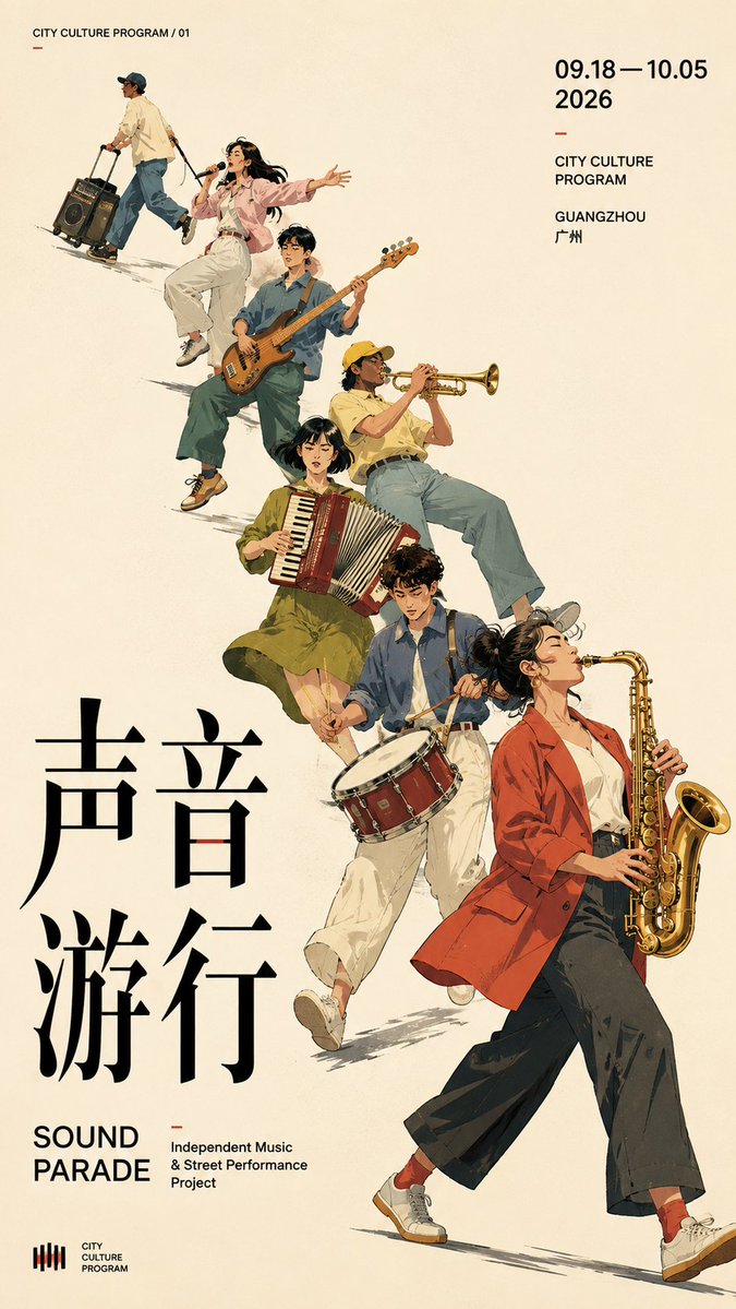
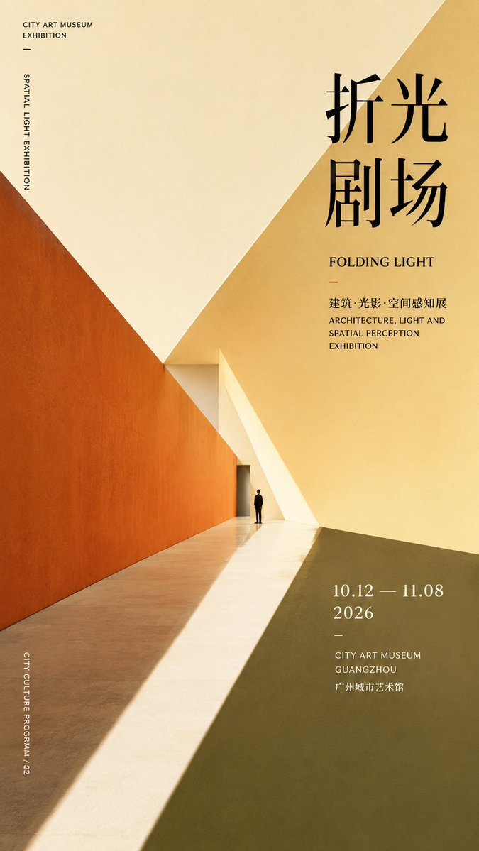
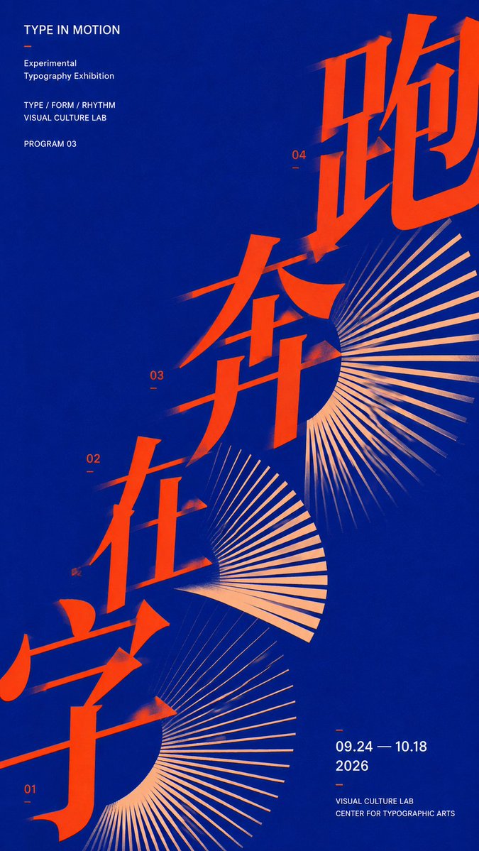
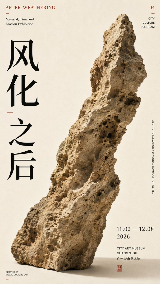
Diagonal Typography Poster for Exhibition Design
A 9:16 poster built on one strong diagonal axis, where oversized type, figures and open space lean into the same reading path. The result feels like a restrained cultural exhibition poster with real visual tension.

- Model
- GPT Image 2
- Type
- 4 images
- Aspect ratio
- 9:16
- Shared
- 7 Aug 2026
- Likes on X
- 292
ThemeChinese titleEnglish titleColor scheme
Image prompt
1,763 characters【Theme】: ____ 【Subject type】: group figures / space / typography / single object 【Subject content】: ____ 【Chinese title】: ____ 【English title】: ____ 【Diagonal mode】: group movement / spatial perspective / typographic advance / object tilt 【Main axis direction】: bottom-left→top-right / bottom-right→top-left 【Color scheme】: ____ 【Date / institution】: ____ 【Ratio】: 9:16 Generate a diagonal-composition poster with a strong sense of design. First establish a clear diagonal visual axis, then organize the subject, typography, and negative space around this axis, rather than piling up decorative elements first. Let the subject itself create the diagonal momentum: group type uses figures' action, scale, and arrangement to form continuous diagonal movement; spatial type uses architectural cuts, perspective, and light and shadow to form diagonal convergence; typography type uses large text advancing along the diagonal axis, enlarged, cropped, and overlapped; single-object type uses the object's own outline, center of gravity, and tilted posture to naturally form the diagonal. Keep only one main visual direction across the whole image; other elements only follow or balance, creating no new visual competition. The subject carries the main visual weight, keeping 25%–40% negative space. The Chinese title carries the visual center, while small English text and date info are concentrated in 1–2 information zones. Limit colors to 2–4, enhancing tension through scale, cropping, overlapping, and asymmetric layout. The point is not to "draw a diagonal line," but to have the subject, text, and negative space together form a diagonal reading path. Editorial Graphic Design: mature, restrained, clear, and tense, like a real cultural-exhibition poster.
How to use it
Decide first whether your theme is a group, a space, a typeface-led layout or a single object, then fill the bracketed fields with your own words and keep the diagonal direction as written. It was shared as a GPT Image 2 prompt, so keep the Chinese and English title lines in their blank slots so the typography stays deliberate. Keep the 25% to 40% negative space instruction, since that open area is what makes the diagonal read. This works well for event posters, branding mockups or a gallery announcement.
Shared publicly on X on 7 Aug 2026. All credit for this prompt and its result goes to its creator. Is this yours? Ask for an update or removal.













