Prompt studio
Make “Diagonal Typography Poster for Exhibition Design” yours
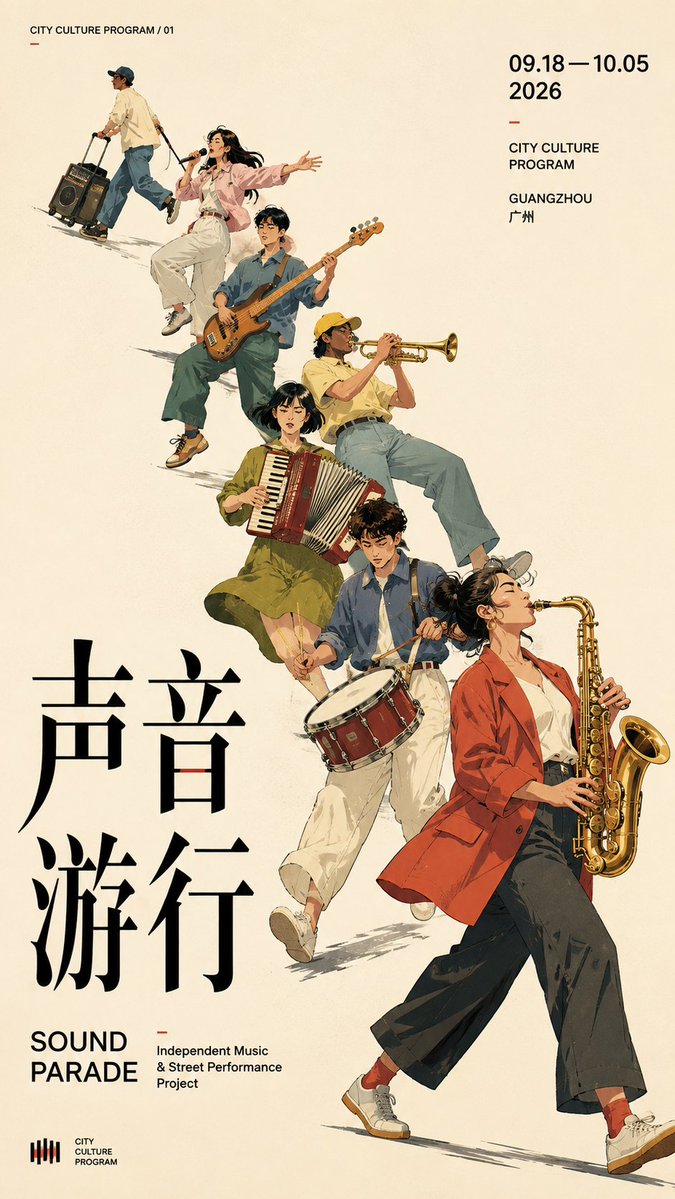
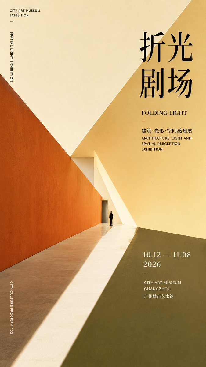
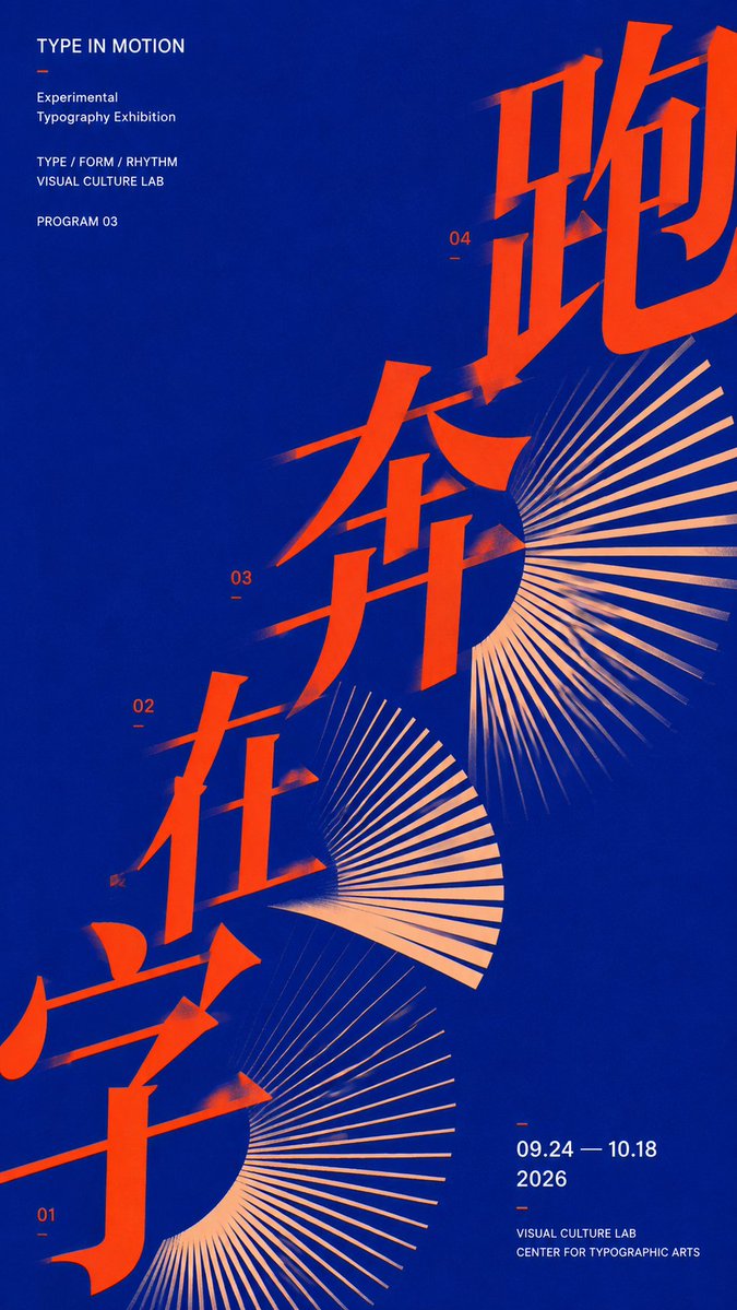
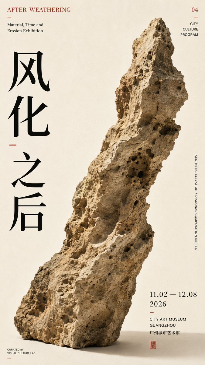
A 9:16 poster built on one strong diagonal axis, where oversized type, figures and open space lean into the same reading path. The result feels like a restrained cultural exhibition poster with real visual tension.
 Prompt by @MrLarus
- Fill in the blanks below.
- Watch the prompt update on the right.
- Copy it, or open it in an image tool.
Image prompt
【Theme】: ____ 【Subject type】: group figures / space / typography / single object 【Subject content】: ____ 【Chinese title】: ____ 【English title】: ____ 【Diagonal mode】: group movement / spatial perspective / typographic advance / object tilt 【Main axis direction】: bottom-left→top-right / bottom-right→top-left 【Color scheme】: ____ 【Date / institution】: ____ 【Ratio】: 9:16 Generate a diagonal-composition poster with a strong sense of design. First establish a clear diagonal visual axis, then organize the subject, typography, and negative space around this axis, rather than piling up decorative elements first. Let the subject itself create the diagonal momentum: group type uses figures' action, scale, and arrangement to form continuous diagonal movement; spatial type uses architectural cuts, perspective, and light and shadow to form diagonal convergence; typography type uses large text advancing along the diagonal axis, enlarged, cropped, and overlapped; single-object type uses the object's own outline, center of gravity, and tilted posture to naturally form the diagonal. Keep only one main visual direction across the whole image; other elements only follow or balance, creating no new visual competition. The subject carries the main visual weight, keeping 25%–40% negative space. The Chinese title carries the visual center, while small English text and date info are concentrated in 1–2 information zones. Limit colors to 2–4, enhancing tension through scale, cropping, overlapping, and asymmetric layout. The point is not to "draw a diagonal line," but to have the subject, text, and negative space together form a diagonal reading path. Editorial Graphic Design: mature, restrained, clear, and tense, like a real cultural-exhibition poster.
Prompt shared on X by @MrLarus. All credit goes to its creator.
More prompts you can customize
 Nordic-Style Japanese Web Studio Design Board
 Monoline City Street Travel Poster in Line Art
 Tokyo Street Life Line-Art Travel Poster
 Black-and-White Facial Beauty Report Layout
 Palm Reading Guide Outline in Black and White
 Add your photoBrand Identity System Poster on Dark Background
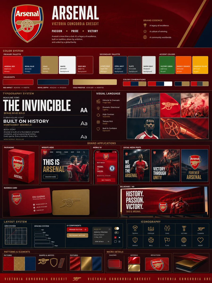 Add your photoLogo-Based Brand Identity Board With Palette and Mockups
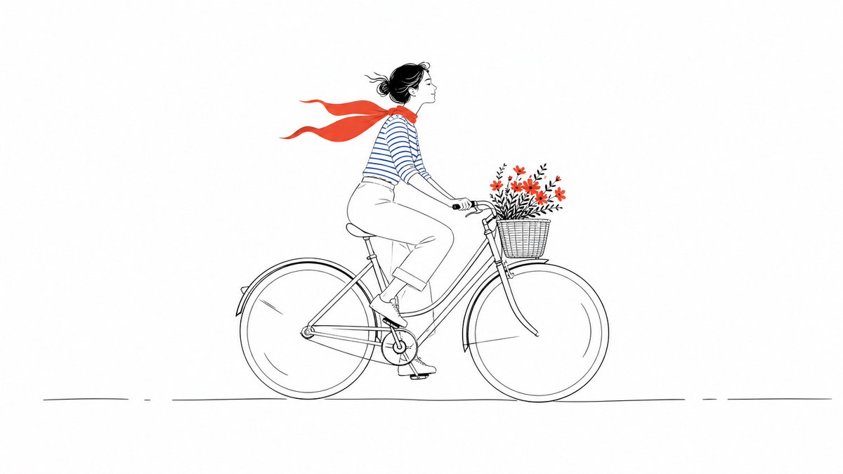 Minimal Line Illustration With Color Accents