Image prompt Branding & UI Customizable
Thin-Line Chinese Character Brand Logo
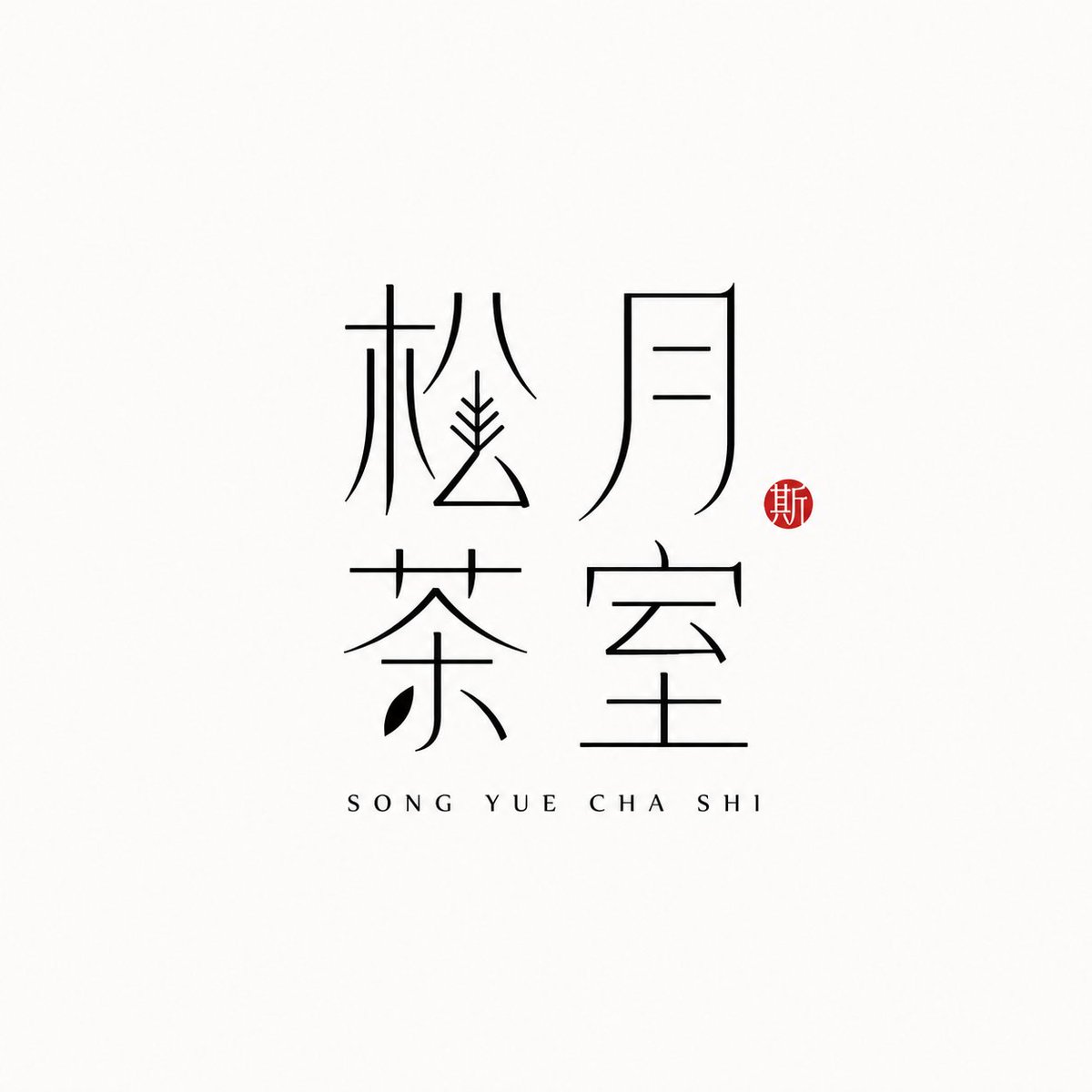
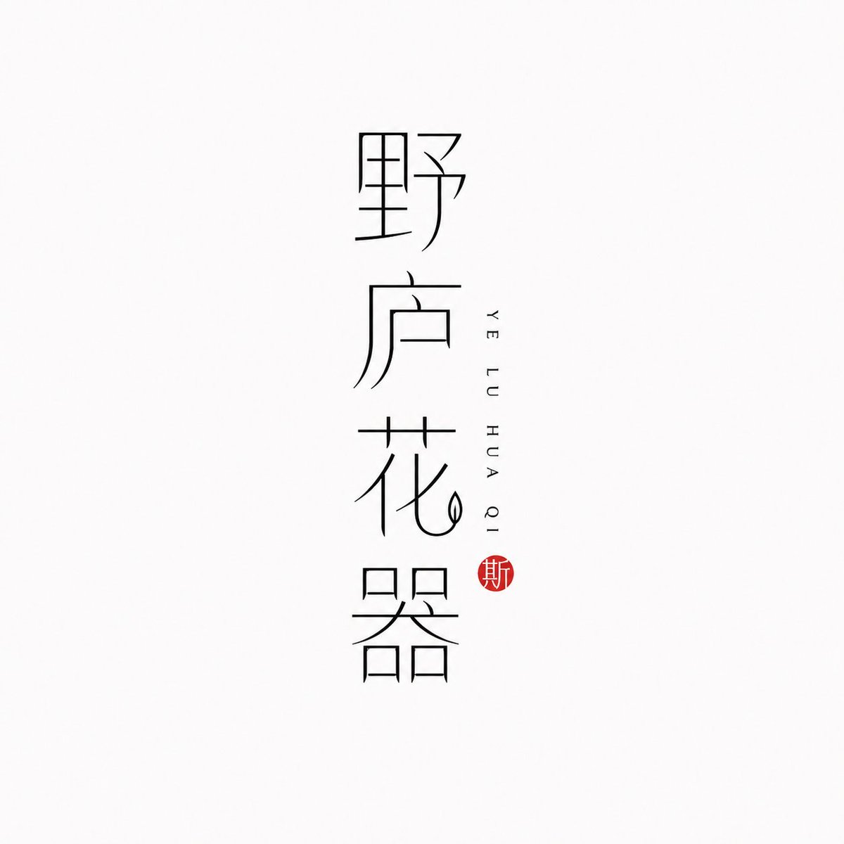
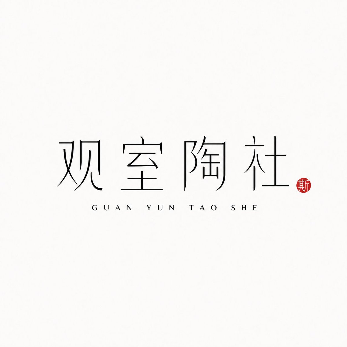
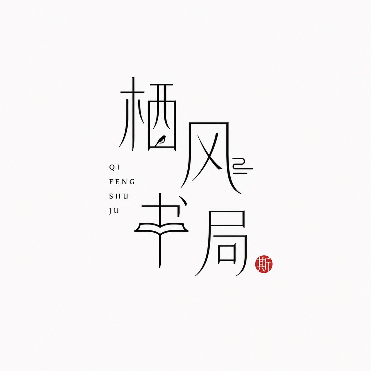
The Chinese brand name itself becomes the mark, drawn in slender black strokes on a near-white field. Pinyin sits quietly beside it and a small vermilion seal adds a single warm accent, giving a calm, modern Oriental feel.

- Model
- GPT Image 2
- Type
- 4 images
- Aspect ratio
- 1:1
- Shared
- 25 Jun 2026
- Likes on X
- 97
Brand namePinyinLayout
Image prompt
1,778 characters[Brand name]: [Auxiliary pinyin]: [Brand direction]: tea house / flower vessel / ceramics / bookstore / fragrance / objects / guesthouse / Oriental lifestyle brand [Layout structure]: 2×2 grid / vertical / horizontal / staggered interweaving [Mood keywords]: cool-serene / restrained / refined / whitespace / modern Oriental / thin-line typography Generate a "Thin-Line Oriental Typographic Logo." The whole is a minimalist Chinese typographic logo on a white or very light gray-white background with abundant whitespace. The main subject is neither an illustration nor a graphic, but the Chinese brand name itself designed as a visual mark. The main Chinese characters use black thin-line strokes — slender, light, restrained, and cool, with a modern Oriental feel. Some strokes may receive slight geometric reconstruction, elongation, broken strokes, displacement, or whitespace treatment, but the whole must keep readability and consistency and must not become illegible scrambled characters. The core is "typography as logo": the Chinese brand name itself is the main visual, while pinyin or English serve only as auxiliary layout. The pinyin can be placed below, to the side, vertically, or interwoven beside the main characters, with wide letter spacing, staying refined, quiet, and restrained. Add a small vermilion seal-carving-style stamp; its content can be a single character in an antique style or an abstract ancient seal symbol. The seal is only a finishing touch — it must not be too large nor steal the main visual. The overall effect should look like a real brand's modern Chinese typographic logo: clean, flat, design-driven, with a sense of series, suitable for brand proposals, storefronts, packaging, social media avatars, and visual system extension.
How to use it
It was shared as a GPT Image 2 prompt. Swap the bracketed brand name and pinyin fields for your own, and keep the thin-line typography, generous whitespace and the small seal, since those details carry the look. Choose a brand direction such as tea house or fragrance to steer the mood, and pick a layout like a vertical stack or a 2x2 grid. The finished mark works well as a storefront sign, packaging front or social avatar.
Shared publicly on X on 25 Jun 2026. All credit for this prompt and its result goes to its creator. Is this yours? Ask for an update or removal.












