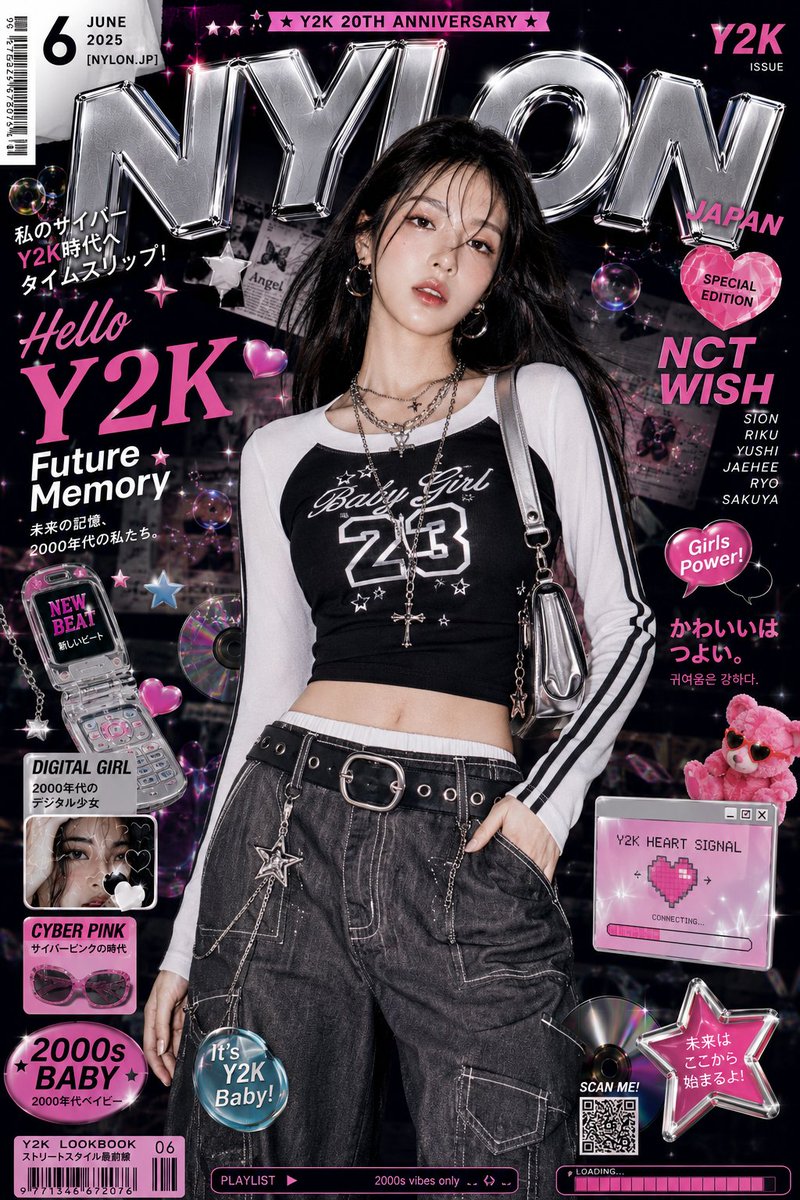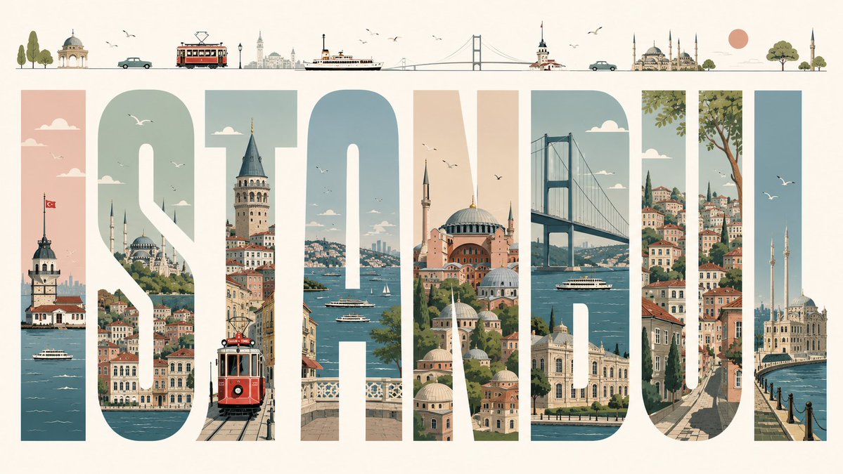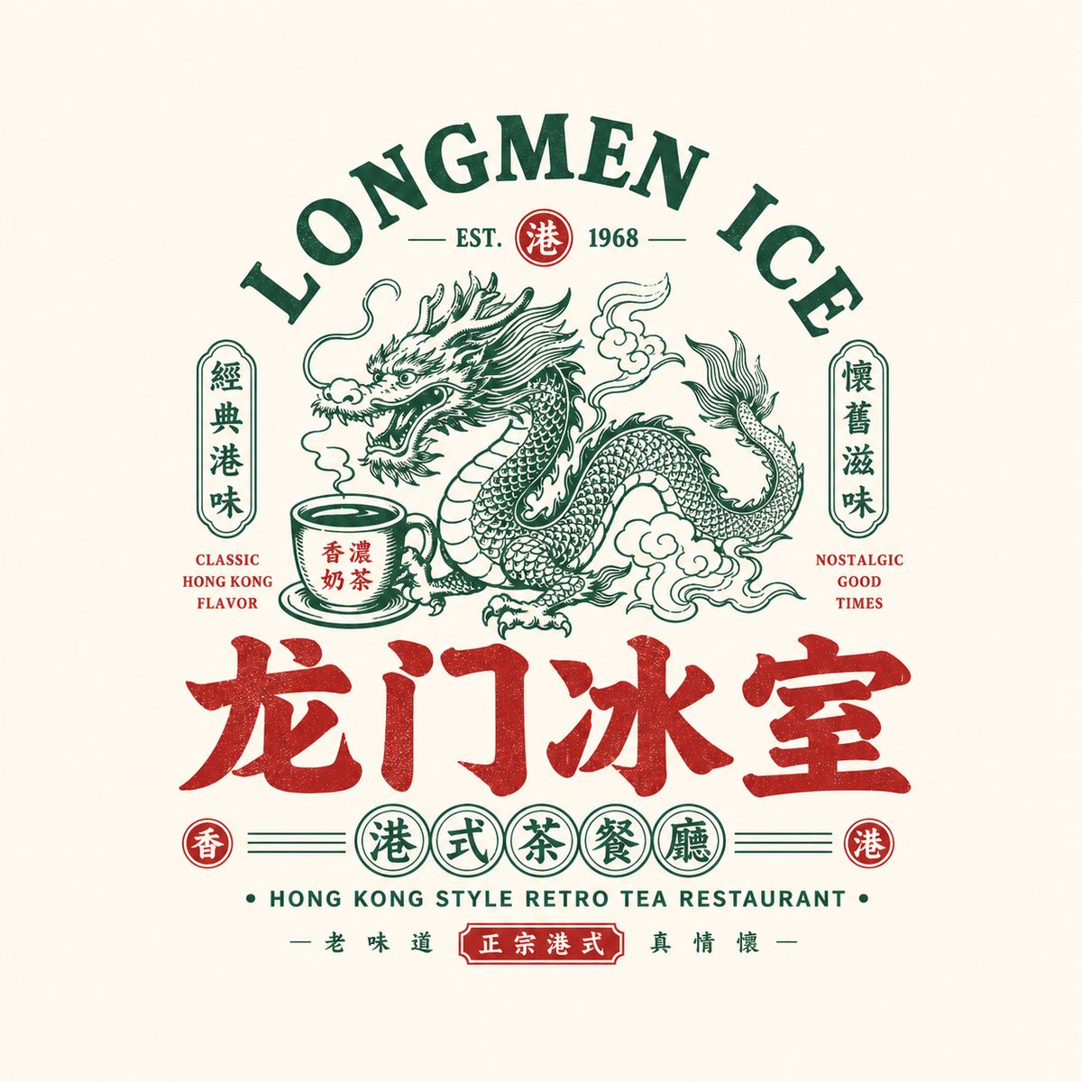
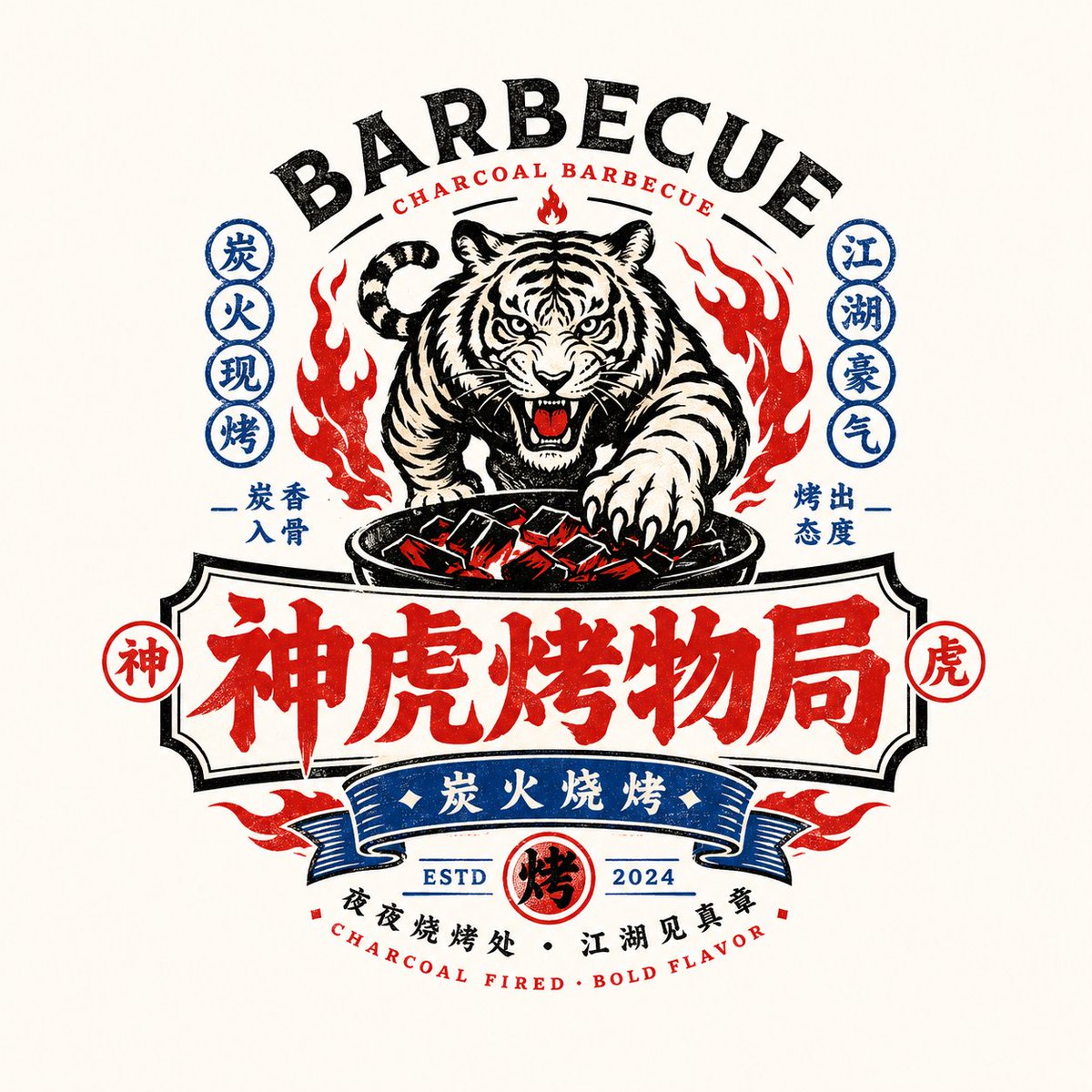
Image prompt Branding & UI Customizable
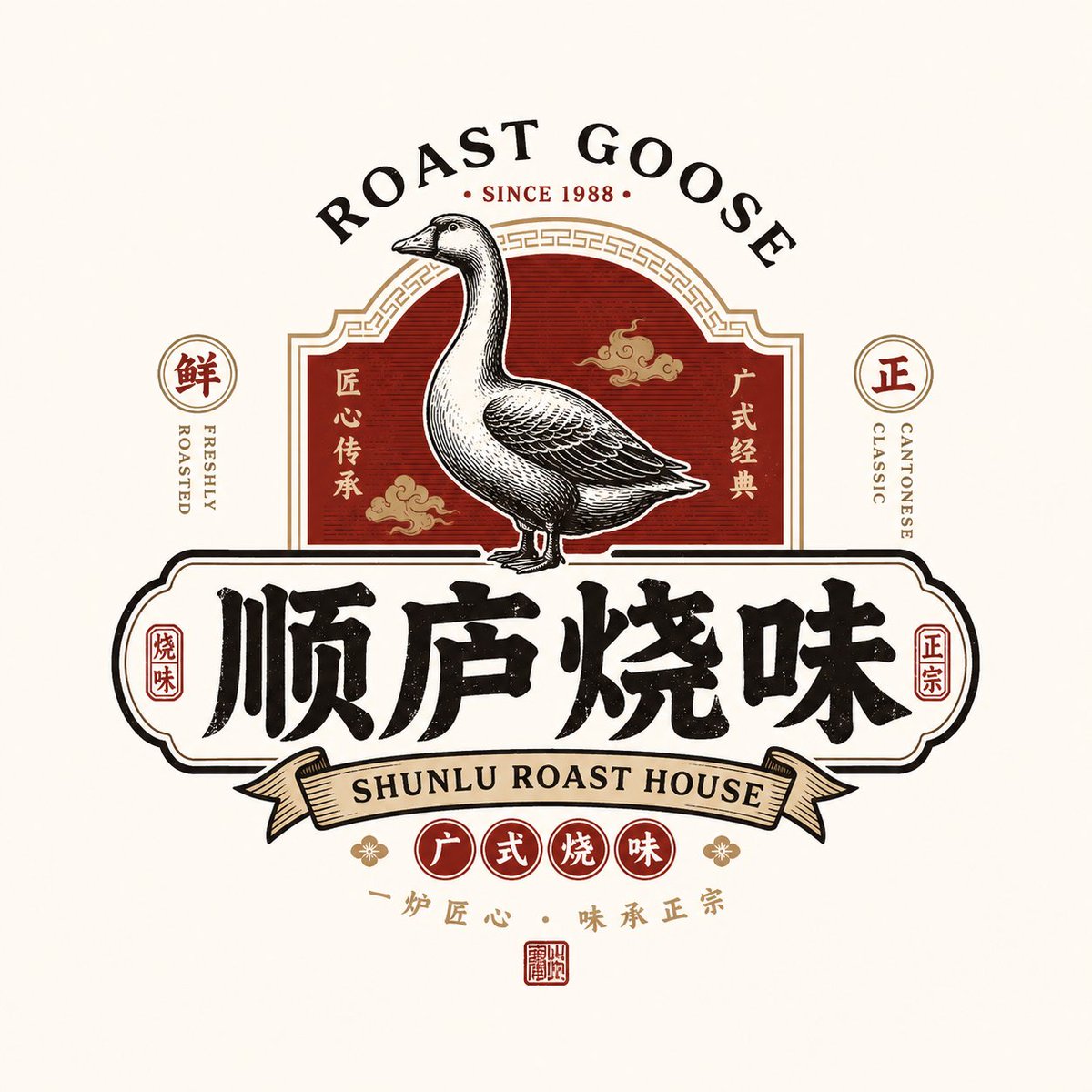
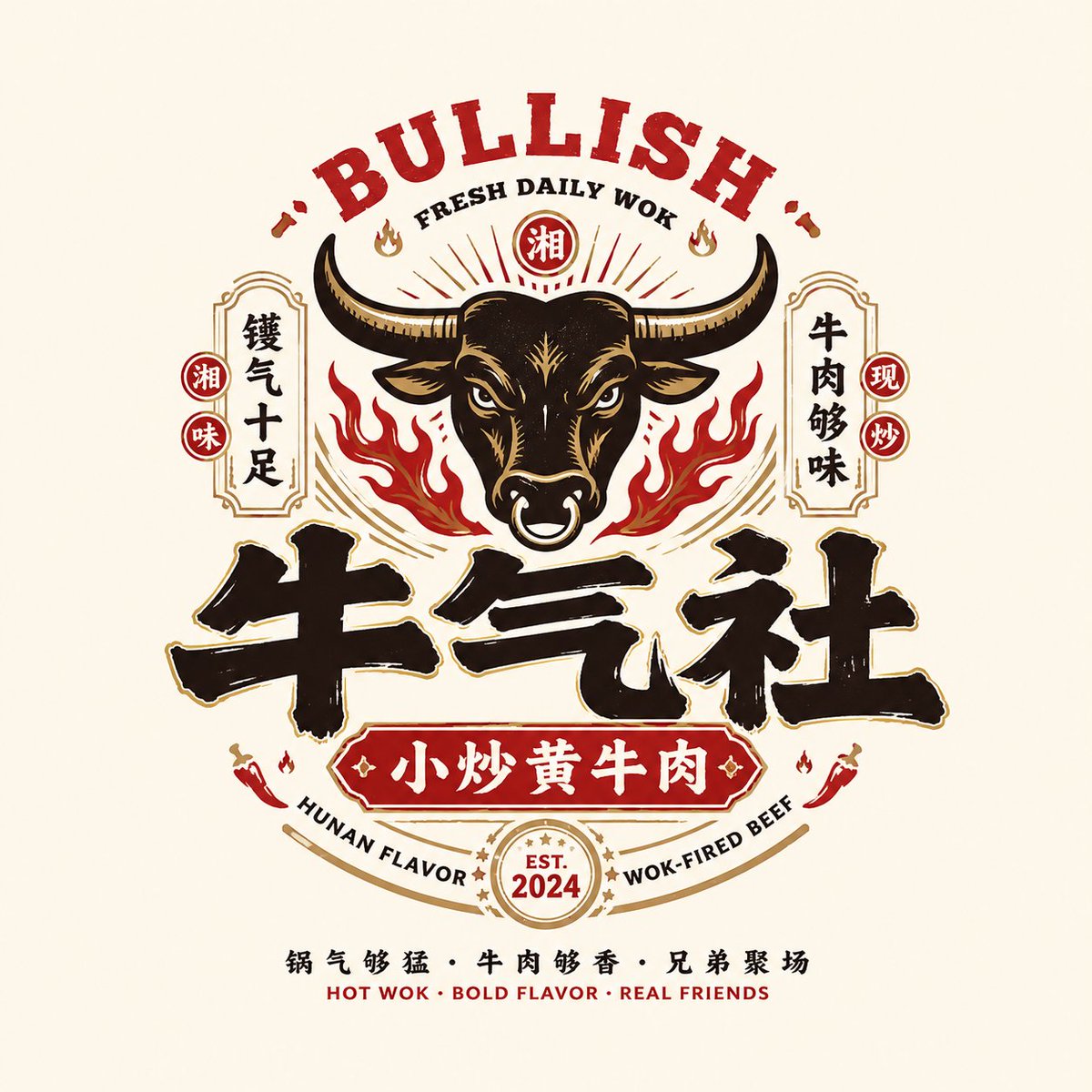
Retro Chinese Food Brand Emblem Logo Template
A complete food-brand emblem built around a bold Chinese wordmark, with a symbolic central graphic, bilingual retro lettering and a badge-style frame. It reads as a mature main logo rather than a decorative pattern, ready for storefronts and packaging.

- Model
- GPT Image 2
- Type
- 4 images
- Aspect ratio
- 1:1
- Shared
- 18 May 2026
- Likes on X
- 249
Image prompt
7,770 charactersBased on the user-provided fields — [Brand / Project Name] [Subtitle / Product Name] [Type / Industry] [Regional Flavor] [Brand Positioning] [Core Keywords] [Core Graphic] [Core Food / Category Element] [Emotional Temperament] [Primary Color] [Secondary Color] [Aspect Ratio] — design a high-quality "Chinese Retro Food Emblem Logo." [User Input] Brand / Project Name: [Brand / Project Name] Subtitle / Product Name: [Subtitle / Product Name] Type / Industry: [Type / Industry] Regional Flavor: [Hong Kong-style / Cantonese / Hunan / Sichuan / charcoal / late-night / cha chaan teng / roast meats / seafood / tavern, etc.] Brand Positioning: [Brand Positioning] Core Keywords: [retro, guochao, signboard feel, old-brand heritage, lively street vibe, jianghu spirit, new-consumer feel, etc.] Core Graphic: [dragon / phoenix / crane / tiger / ox / frog / goose / fish / lobster / utensil / totem / auspicious pattern, etc.] Core Food / Category Element: [roast goose / barbecue / tea drinks / lobster / noodles / beef / ice house / tavern, etc.] Emotional Temperament: [lively, commanding, retro, classic, regional, street-vibe, jianghu, youthful, etc.] Primary Color: [Primary Color] Secondary Color: [Secondary Color] Aspect Ratio: [Aspect Ratio] [Core Goal] The task is to design a "Chinese Retro Food Emblem Logo" truly usable for a food & beverage brand. It is not an ordinary poster, not a simple cartoon illustration, and not just a few characters. Use the Chinese main wordmark as the core, integrating a strongly identifiable graphic, food-category symbols, retro bilingual typography, and a complete emblem structure, to build a food logo with storefront presence, packaging feel, brand-system feel, and shareability. The final result should convey at a glance: 1. that this is a food & beverage brand; 2. that it has a clear category and personality; 3. that it looks like the main logo of a mature brand, not a decorative pattern. [Design Essence] The core of this kind of logo is not a single graphic or a single typeface, but the integration of five layers: 1. Chinese main wordmark: brand identification; 2. Graphic symbol: memorability and category association; 3. Emblem structure: overall integrity; 4. Bilingual typography: hierarchy and retro brand atmosphere; 5. Color system: reinforcing the food tone and category emotion. [Most Important Principles] 1. The Chinese brand name must be eye-catching, clear, and signboard-like; 2. The logo must be a complete mark, not a collage of scattered elements; 3. The graphic must relate to the brand name or category, no decoration for decoration's sake; 4. English is auxiliary, Chinese is primary; English must not overpower; 5. The whole must have food-brand attributes, suitable for storefront, menu, packaging, and social avatars; 6. It must feel retro, but not dated, messy, or lacking modern brand finish; 7. It must have the flavor of a "Chinese retro food emblem," not American cartoon or Japanese shop signage. [Chinese Main Wordmark Requirements] 1. The Chinese brand name is the absolute protagonist; 2. The typeface should have retro food-signboard feel, old-packaging feel, or guochao title feel; 3. It can be heavy, bold, with sans-serif / Song-hei / commercial handwriting feel; 4. Moderate variations are allowed, but it must remain clearly legible; 5. No minimalist thin fonts, nothing weak, nothing like a default system font; 6. It must have storefront presence and brand identity. [Graphic System Requirements] Based on the [Core Graphic] and [category elements], create a main graphic highly relevant to the brand. Possible directions: - Animals / mythical beasts: dragon, phoenix, tiger, ox, goose, fish, frog, crane, etc.; - Ingredients / dishes: lobster, roast goose, beef, noodle bowl, flames, teacup, etc.; - Traditional totems: seals, patterns, plaques, auspicious motifs; - Utensils / scene symbols: grill, fire, bowls and chopsticks, ice-house elements, etc. Graphic requirements: 1. Have a memory point; 2. Have a clear relation to category and name; 3. Not be too complex or realistic; 4. Be suitable to integrate with the wordmark into an emblem; 5. May lean toward retro illustration, woodcut feel, old trademark feel, guochao line drawing. [Emblem Structure Requirements] Design the whole as a complete "food brand emblem logo," not a simple horizontal row. Reference structures: 1. English arch on top + central graphic + Chinese main wordmark below; 2. Large central graphic + small side labels + subtitle below; 3. Round seal / oval seal / plaque composition; 4. Central main image + layered text above and below; 5. Symmetrical layout + small seals + small circular badge system; 6. Old signboard / old trademark / packaging main-label layout. [Bilingual Typography Requirements] 1. Chinese primary, English auxiliary; 2. English can be used for arched main title, category name, shop-type description, slogan, year, ESTD, etc.; 3. English participates in the composition, enhancing the retro trademark feel; 4. Not much English is needed, but it must be refined, clear, and serve the whole; 5. Usable examples: - HOUSE - TAVERN - BARBECUE - ROAST GOOSE - TEA RESTAURANT - LOBSTER HOUSE - ESTD / SINCE / CLASSIC / SPECIALTY 6. English must not overpower Chinese or turn it into a purely English brand. [Auxiliary Element Requirements] A few small elements that strengthen the brand system may be added, e.g.: - ESTD year - small seal - small icons - small labels - small stamp - regional note - category note - lines / dot grids / small borders - slogan in small type But be restrained; do not turn the image into a complex poster. [Color Requirements] Choose a retro guochao food color system more suited to the category, e.g.: 1. Black + red: barbecue, braised foods, roast meats, tavern; 2. Black + gold / bronze-gold: old brands, deli, roast goose, Cantonese dining; 3. Green + red + cream: Hong Kong ice house, cha chaan teng; 4. Blue + red + white: seafood, lobster, youthful late-night dining; 5. Black + blue: younger, more rational late-night spot or tavern; 6. Red + cream: old Changsha noodles, traditional snacks, etc. Requirements: - colors with food-signboard feel; - not too many colors, 2–4 main colors is most stable; - highly saturated accents can boost eye-catch, but unity must be maintained. [Visual Presentation Requirements] 1. This is a standalone logo display image, not a menu poster; 2. Simple background, recommended light gray-white, cream, paper white, or clean light base; 3. The logo body complete, clear, and centered; 4. Complete structure and layered information; 5. The whole should look like the main-logo proposal of a mature food brand. [Style Keywords] Chinese Retro Food Emblem Logo, food brand, retro trademark, old signboard, brand emblem, bilingual layout, guochao wordmark, food main logo, storefront presence, packaging feel, old-brand heritage, new-consumer dining. [Acceptance Criteria] Ensure the final result meets: 1. instantly recognizable as a food brand; 2. the Chinese main wordmark is eye-catching and legible; 3. the graphic has a clear relation to the name / category; 4. the emblem structure is complete; 5. the bilingual typography has hierarchy; 6. the colors have food-brand temperament; 7. suitable for storefront, menu, packaging, sticker, delivery avatar, and social main image; 8. the whole has the mature commercial feel of a "Chinese retro food emblem." [Output Requirements] Finally output a high-quality "Chinese Retro Food Emblem Logo." It must center on the Chinese brand name, combining retro graphics, a bilingual auxiliary system, emblem composition, and a clear category attribute, to form a truly brandable, shareable, and deployable food brand identity.
How to use it
This prompt is built as a fill-in template, so start by writing your brand name, category and core graphic into the bracketed fields. It was shared as a GPT Image 2 prompt, which handles the wordmark and layered badge structure well. Keep the emblem structure and the instruction that Chinese stays primary, since those details carry the look.
Featured inLogo design AI prompts
Shared publicly on X on 18 May 2026. All credit for this prompt and its result goes to its creator. Is this yours? Ask for an update or removal.