Image prompt Product & Ads Customizable
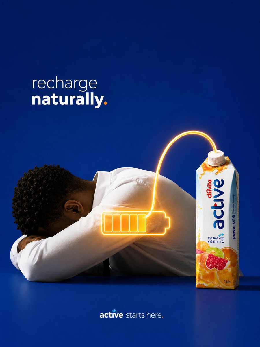
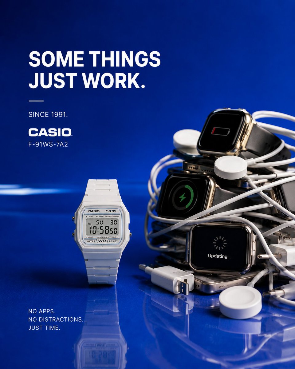
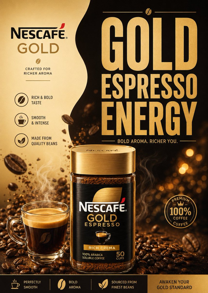
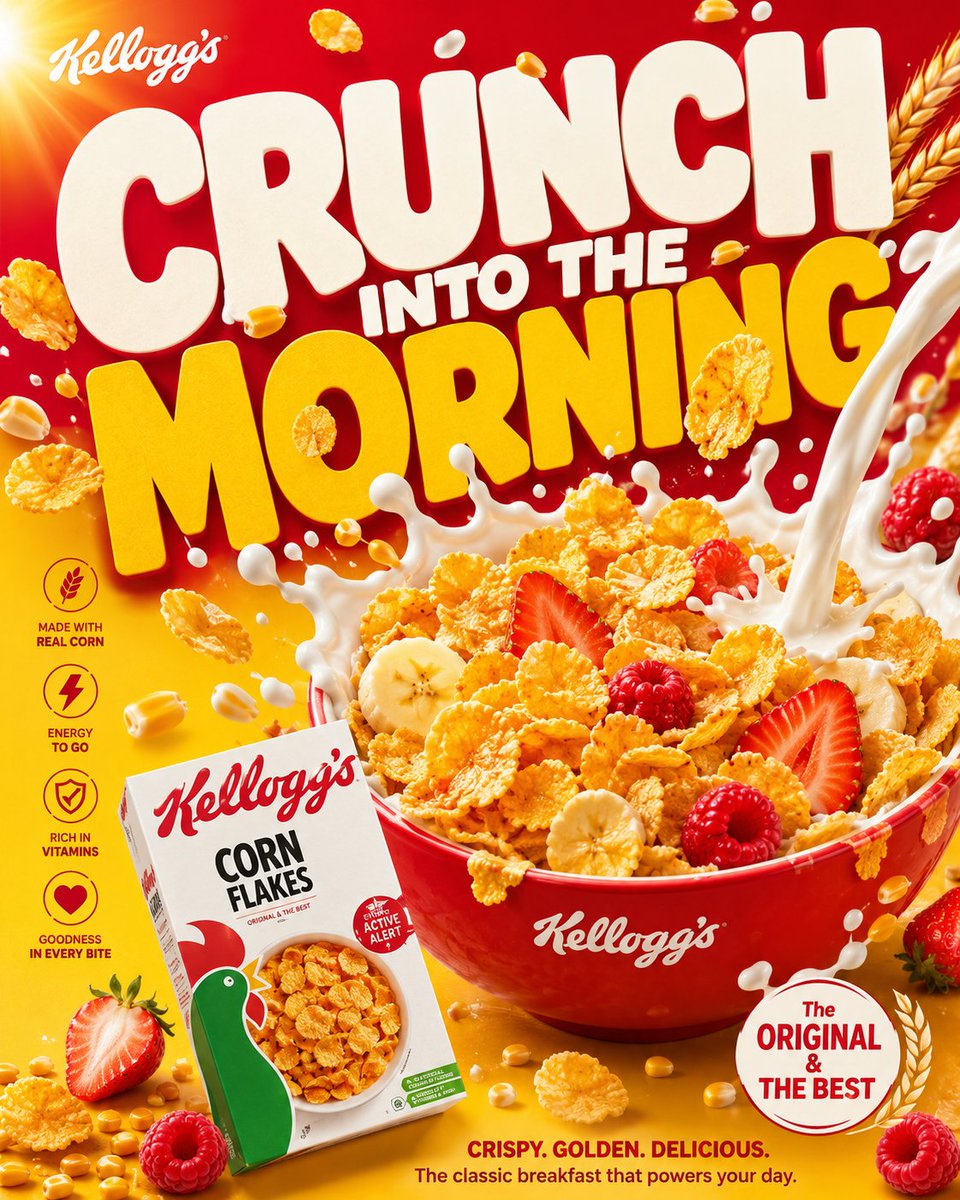
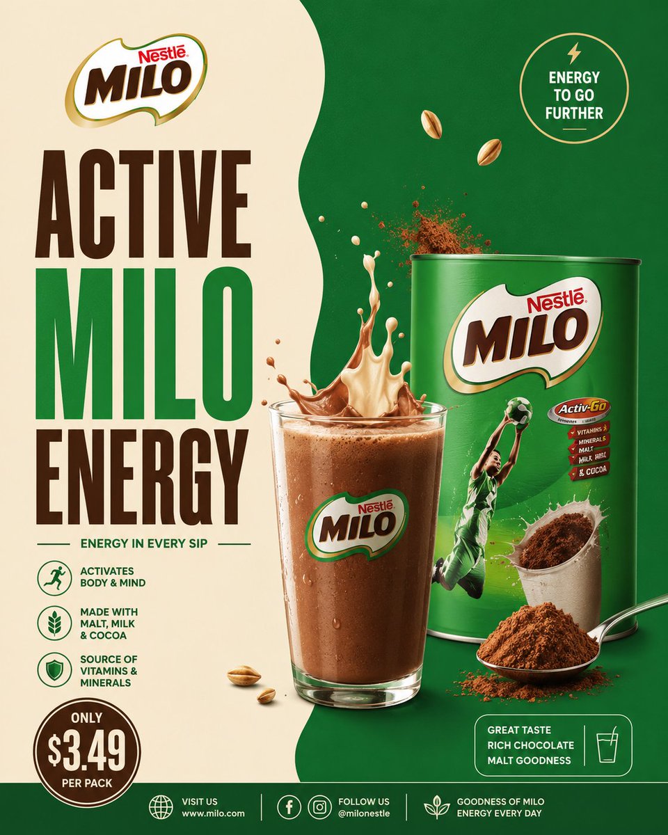
Minimal Cocoa Drink Poster With Split Background
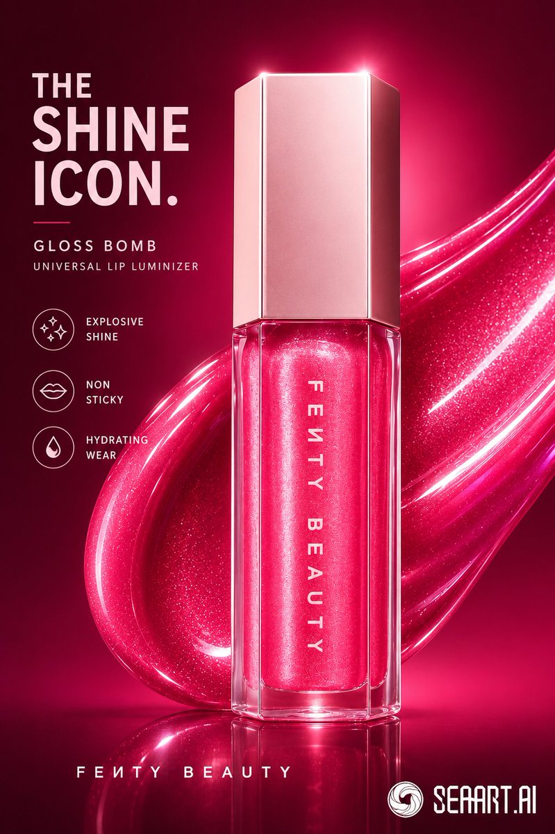
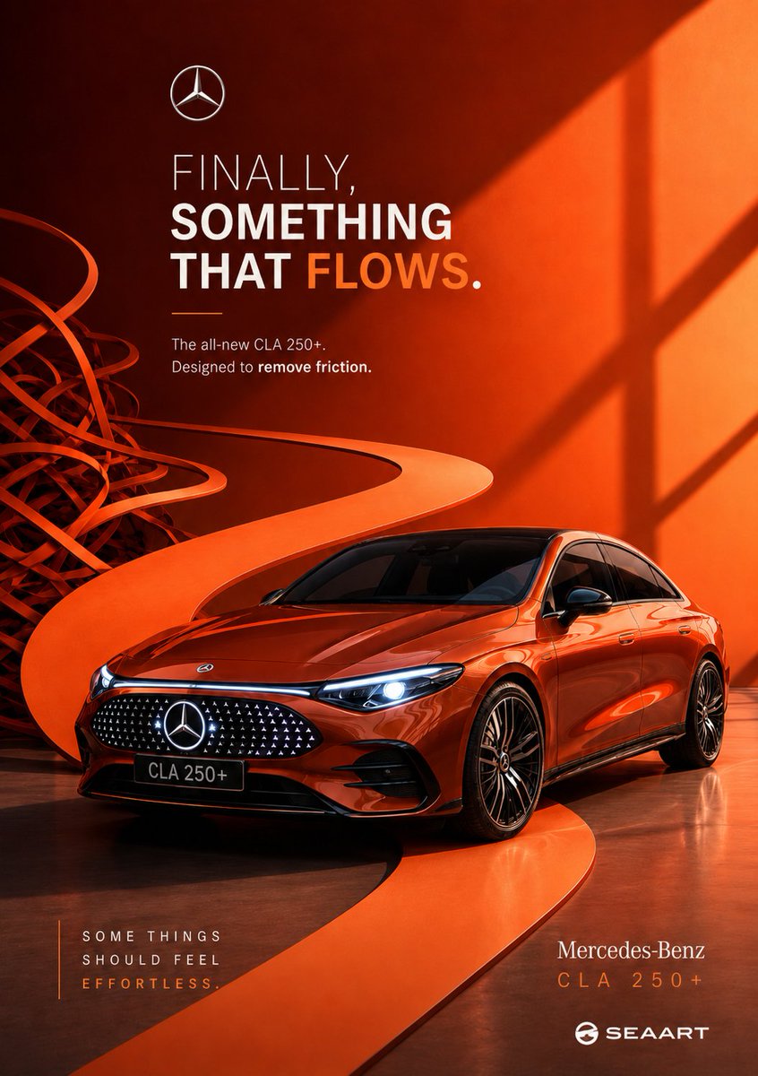
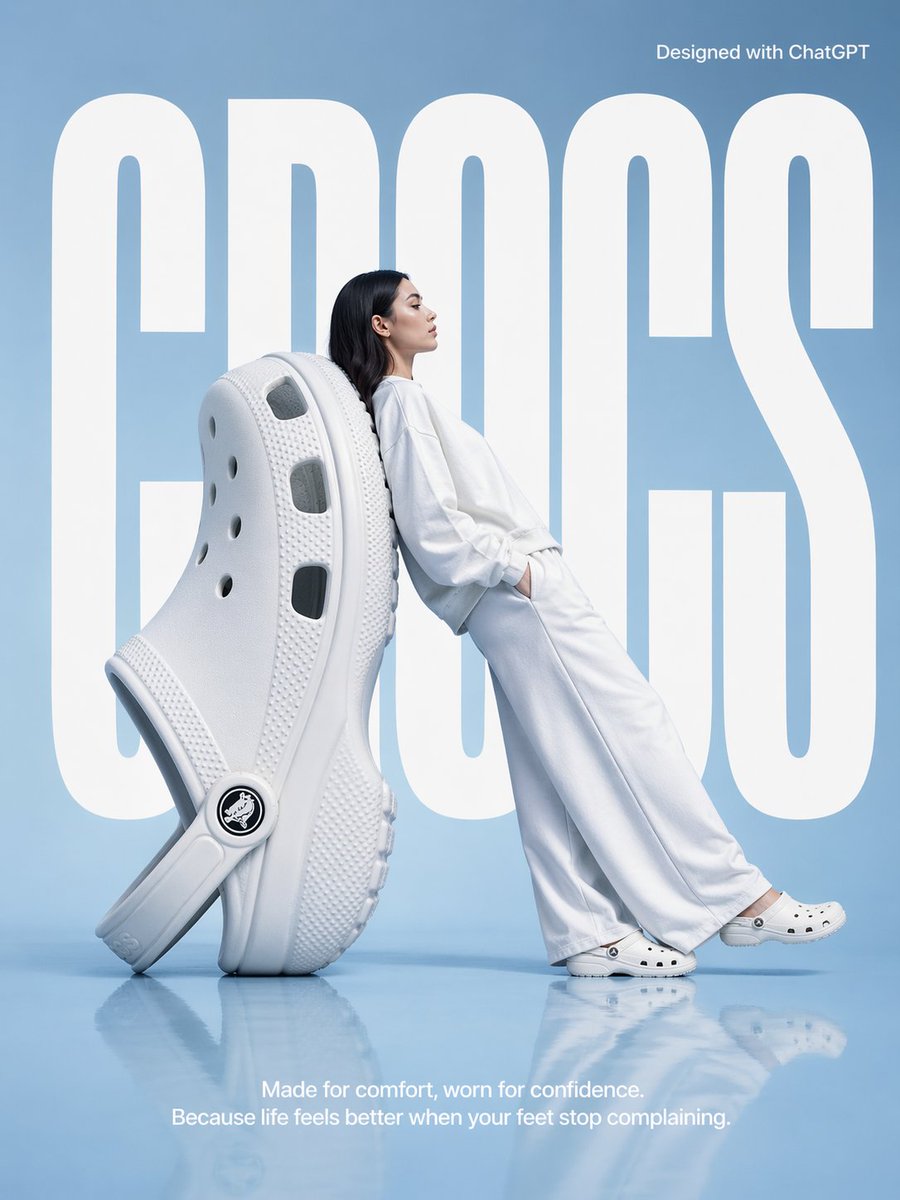
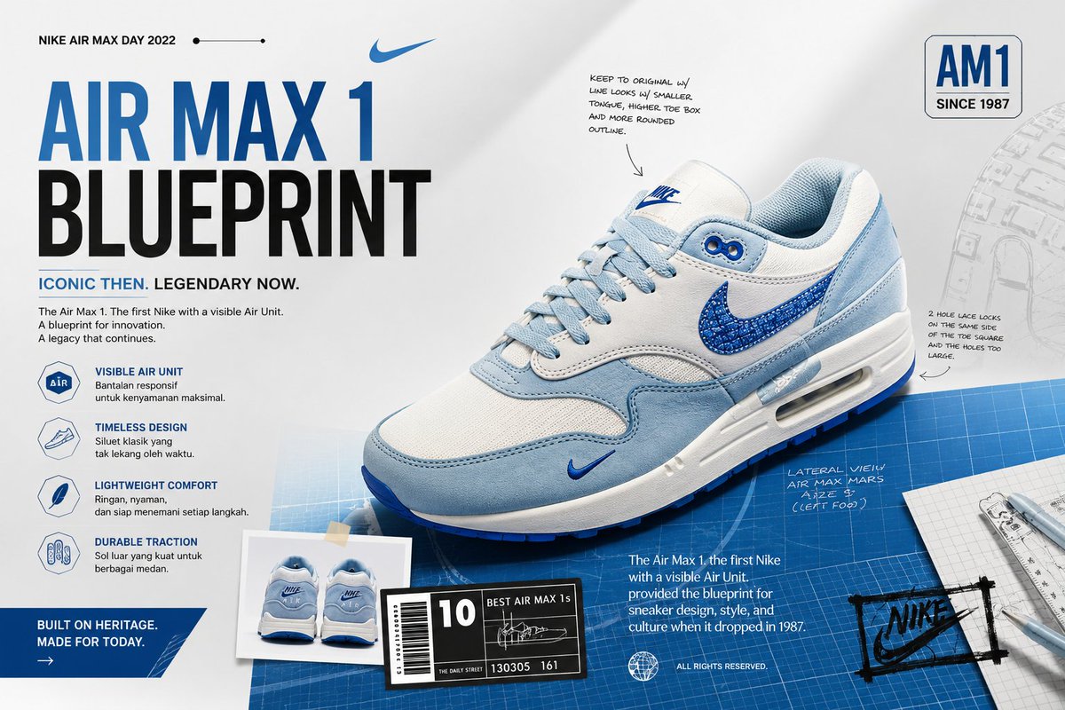
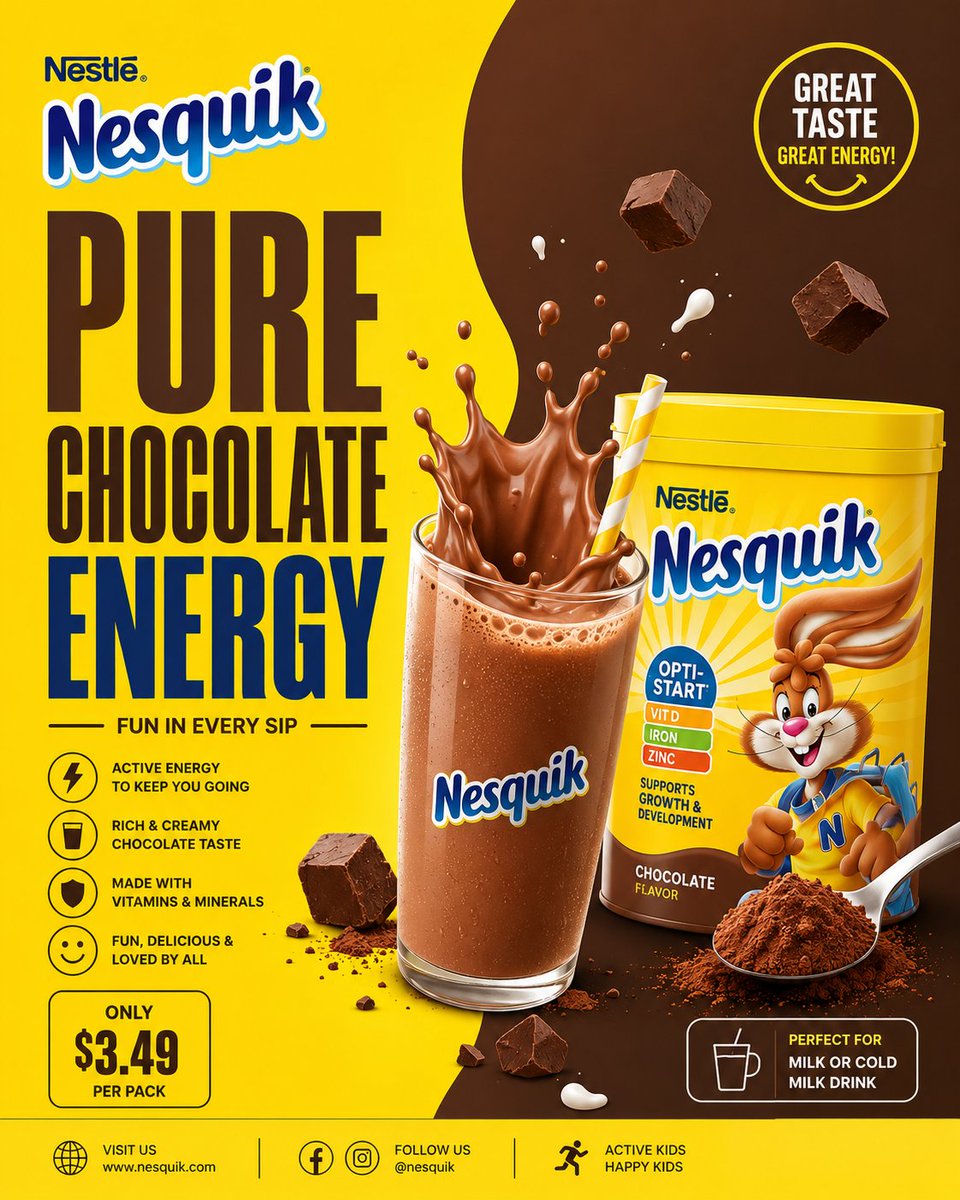
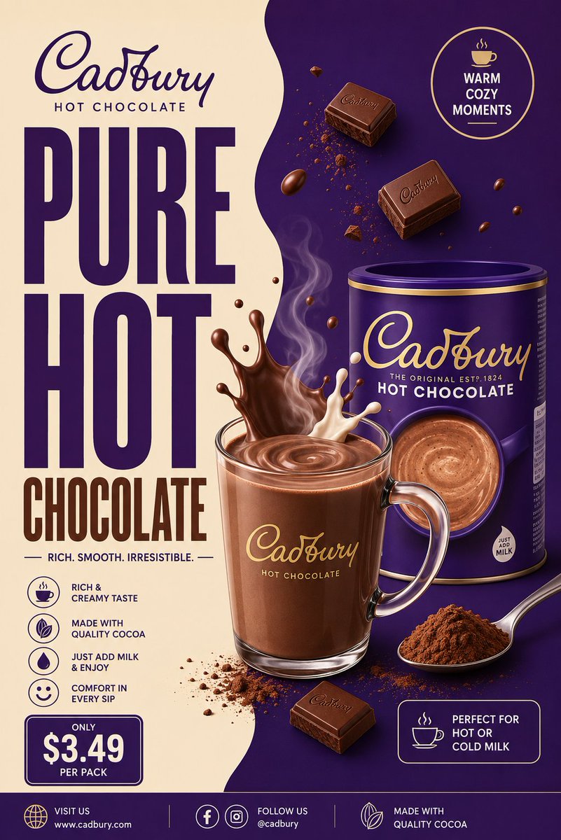
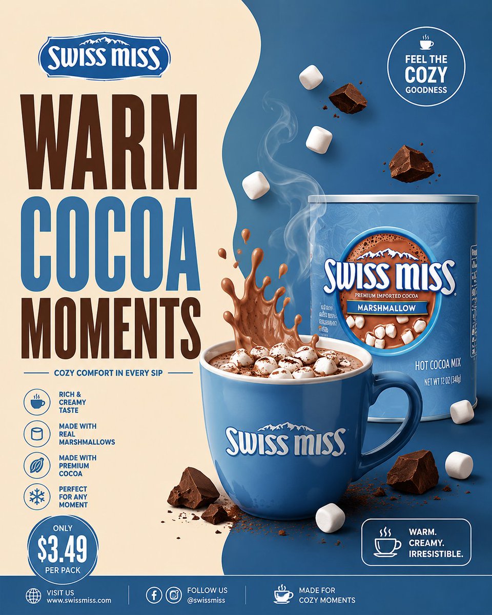
A clean FMCG-style cocoa poster split into cream and chocolate halves, with oversized condensed headline type and a semi-realistic hot chocolate drink at the centre. Restrained, graphic and easy to read.

- Model
- GPT Image 2
- Type
- 4 images
- Aspect ratio
- 4:5
- Shared
- 22 May 2026
- Likes on X
- 354
Image prompt
5,707 charactersUNIVERSAL COCOA BEVERAGE FMCG POSTER MASTER PROMPT “MINIMAL DESIGN. PREMIUM COCOA ENERGY.” Create a premium minimalist FMCG poster for a [BRAND NAME] cocoa beverage inspired by retro-modern supermarket beverage ads, clean split-layout café posters, and modern FMCG commercial print campaigns. The poster should strongly resemble a minimal commercial advertisement with bold typography, smooth split-background composition, premium beverage styling, and clean editorial spacing. The design should feel: warm, creamy, cozy, modern, graphic, premium, commercial, organized, minimal, and visually pleasing. Avoid: — cinematic realism — chaotic splash explosions — cluttered floating ingredients — glossy 3D overload — busy café environments — luxury black-and-gold overload — dark moody aesthetics — excessive particles or effects. The final result should resemble: a modern illustrated FMCG cocoa beverage campaign poster. CORE LAYOUT STYLE Create a vertical 4:5 poster with: — smooth split-background composition — oversized stacked typography — centered hero cocoa drink — minimal floating ingredients — clean promotional UI blocks — geometric spacing — strong negative space — balanced commercial hierarchy. The layout should feel: minimal, clean, bold, organized, and premium. MOST IMPORTANT FEATURE — SPLIT BACKGROUND SYSTEM Create a smooth organic TWO-TONE split background inspired by modern café posters. LEFT SIDE Use lighter tones such as: — cream — warm beige — vanilla — milk tones — soft ivory. RIGHT SIDE Use darker brand-supporting cocoa tones such as: — chocolate brown — mocha — cocoa tones — caramel brown — deep brand color accents. The split curve should feel: smooth, fluid, elegant, soft, and modern. Use only: — subtle gradients — soft shadows — faint glow accents. Avoid: — dramatic textures — smoke overload — cinematic lighting — heavy depth-of-field blur. The background should remain: flat, clean, airy, and commercially polished. TYPOGRAPHY (MOST IMPORTANT) Use HUGE ultra-bold condensed sans-serif typography occupying 40–50% of the composition. Font inspiration: — Bebas Neue — Anton — Oswald Bold — Druk Condensed — League Gothic. Typography should feel: bold, retro-modern, commercial, premium, and FMCG-focused. HEADLINE EXAMPLES “PURE COCOA COMFORT” “RICH CHOCOLATE ENERGY” “WARM EVERY SIP” “CREAMY COCOA MOMENTS” “SMOOTH HOT CHOCOLATE”. Typography styling: — tight spacing — strong vertical stacking — clean alignment — minimal captions — thin divider lines — simple white or cream text. Avoid: — decorative fonts — handwritten typography — playful bubble fonts — luxury serif overload. HERO DRINK COMPOSITION Create a semi-realistic cocoa beverage with minimalist commercial styling. Possible setups: — transparent glass mug — ceramic cocoa cup — iced cocoa glass — creamy hot chocolate drink — chocolate milkshake style beverage. Include: — rich creamy cocoa texture — smooth milk splash arcs — glossy highlights — subtle steam curves — chocolate swirl motion — clean liquid reflections. The rendering should resemble: premium vector-commercial FMCG artwork. NOT cinematic realism. FLOATING ELEMENTS Add only a FEW controlled floating elements. Examples: — cocoa powder — chocolate chunks — milk droplets — soft splash curves — marshmallows — cocoa spoon — subtle steam ribbons. Keep everything: organized, intentional, balanced, and minimal. Avoid chaotic particle explosions. PRODUCT PACKAGING Include realistic [BRAND NAME] cocoa packaging naturally integrated into the composition. Packaging should: — maintain the brand’s recognizable colors — feel clean and slightly glossy — resemble real supermarket packaging — remain secondary to the hero drink. Placement ideas: — lower foreground — beside the cup — slightly overlapping typography — integrated subtly into splash motion. Do not overpower the layout. PROMOTIONAL UI ELEMENTS Include minimal poster-style UI elements such as: — circular promo badge — outlined price box — small cocoa icon — thin divider lines — clean footer strip — minimal benefit icons. Design style: — flat graphic styling — white outlines — compact typography — minimal clutter — editorial spacing. LIGHTING Use soft commercial studio lighting with: — smooth highlights — soft reflections — minimal shadows — flat premium rendering — clean beverage shine. Avoid: — dramatic cinematic contrast — moody shadows — heavy atmospheric lighting. The lighting should resemble: modern FMCG print advertising. COLOR SYSTEM Use only 3–4 dominant colors. UNIVERSAL BASE — cream / ivory — chocolate brown — cocoa tones — white. ADD BRAND COLOR ACCENTS Examples: — Cadbury purple — Nesquik yellow — Milo green — Swiss Miss blue — Galaxy caramel brown. Colors should feel: coordinated, warm, commercial, minimal, and print-ad ready. COMPOSITION RULES Layer Order: Split background Oversized typography Cocoa splash motion Hero beverage Floating ingredients Product packaging Promotional UI blocks Footer strip. Everything should feel: balanced, minimal, premium, clean, and visually easy to read. Avoid visual overload. FINAL VISUAL STYLE The final poster should look like: — modern FMCG print advertising — minimalist supermarket beverage campaigns — retro-modern café posters — commercial vector-realism hybrid artwork — Instagram-ready commercial design. NOT cinematic luxury advertising. FINAL QUALITY Minimal premium FMCG cocoa poster aesthetic. Split-layout commercial composition. Huge condensed typography. Semi-realistic vector-commercial rendering. Controlled floating elements. Clean editorial spacing. High-detail commercial rendering. Ultra-clean poster realism. Aspect Ratio: 4:5 Ultra HD 8K Instagram-ready FMCG campaign quality
How to use it
Replace the bracketed brand placeholder with your own cocoa brand name and keep the split background and oversized condensed typography, since they carry the layout. You can swap the headline for any short line such as a flavour or a benefit. It was shared as a GPT Image 2 prompt, and the result suits a 4:5 social post or shelf-style print mockup.
Shared publicly on X on 22 May 2026. All credit for this prompt and its result goes to its creator. Is this yours? Ask for an update or removal.