Промпт для изображения Продукт и реклама Настраиваемые
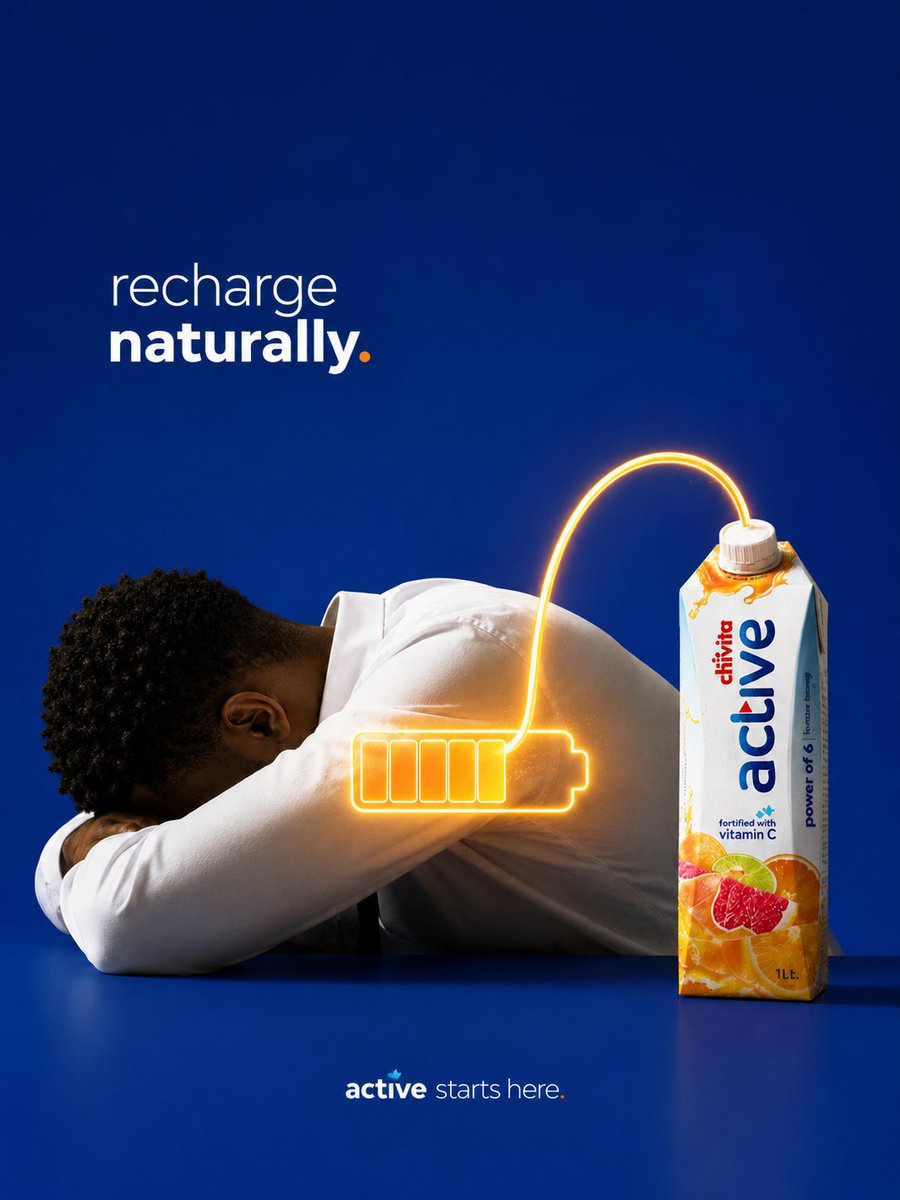
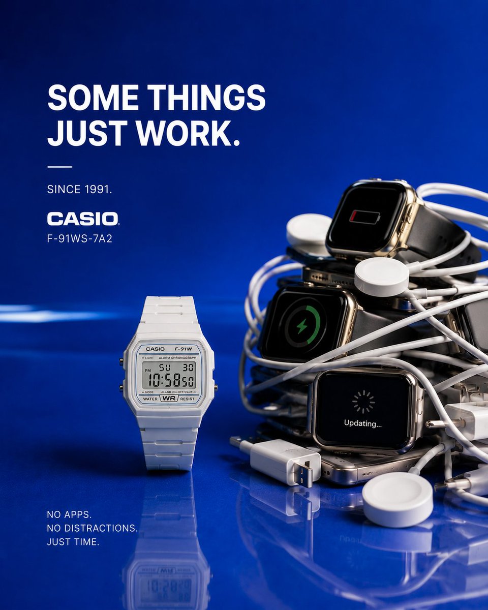
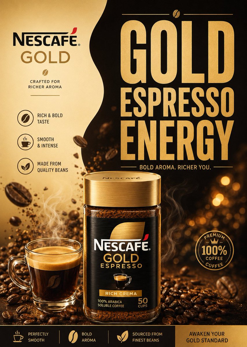
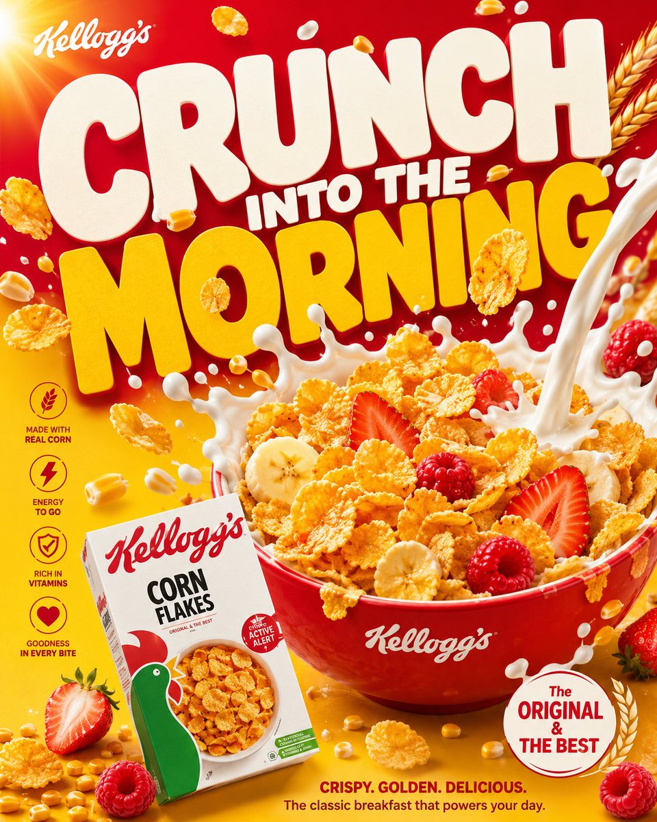
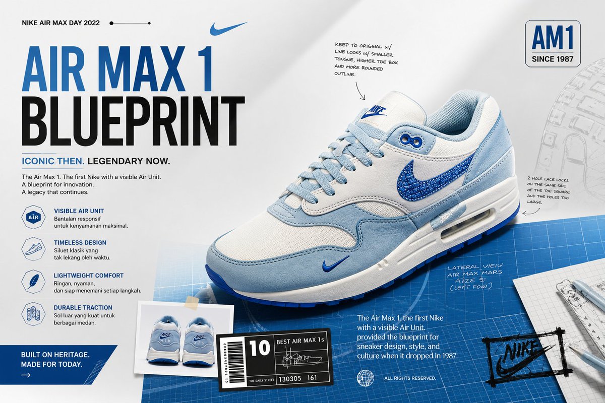
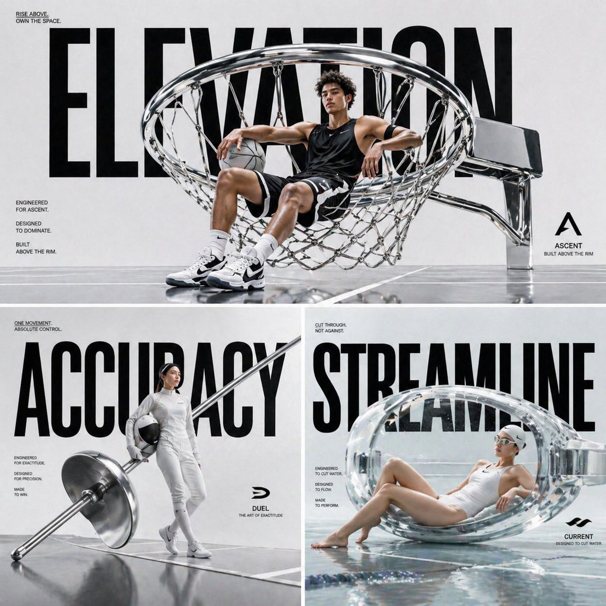
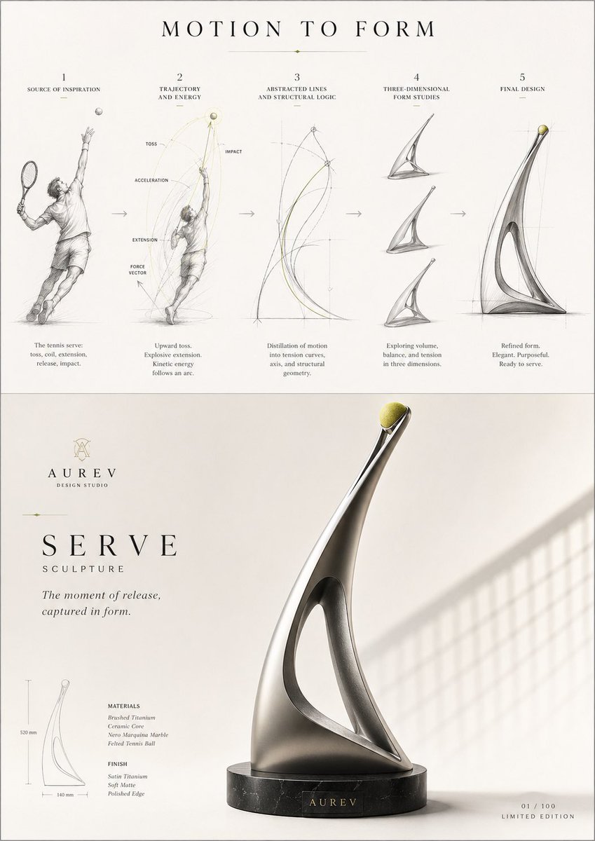
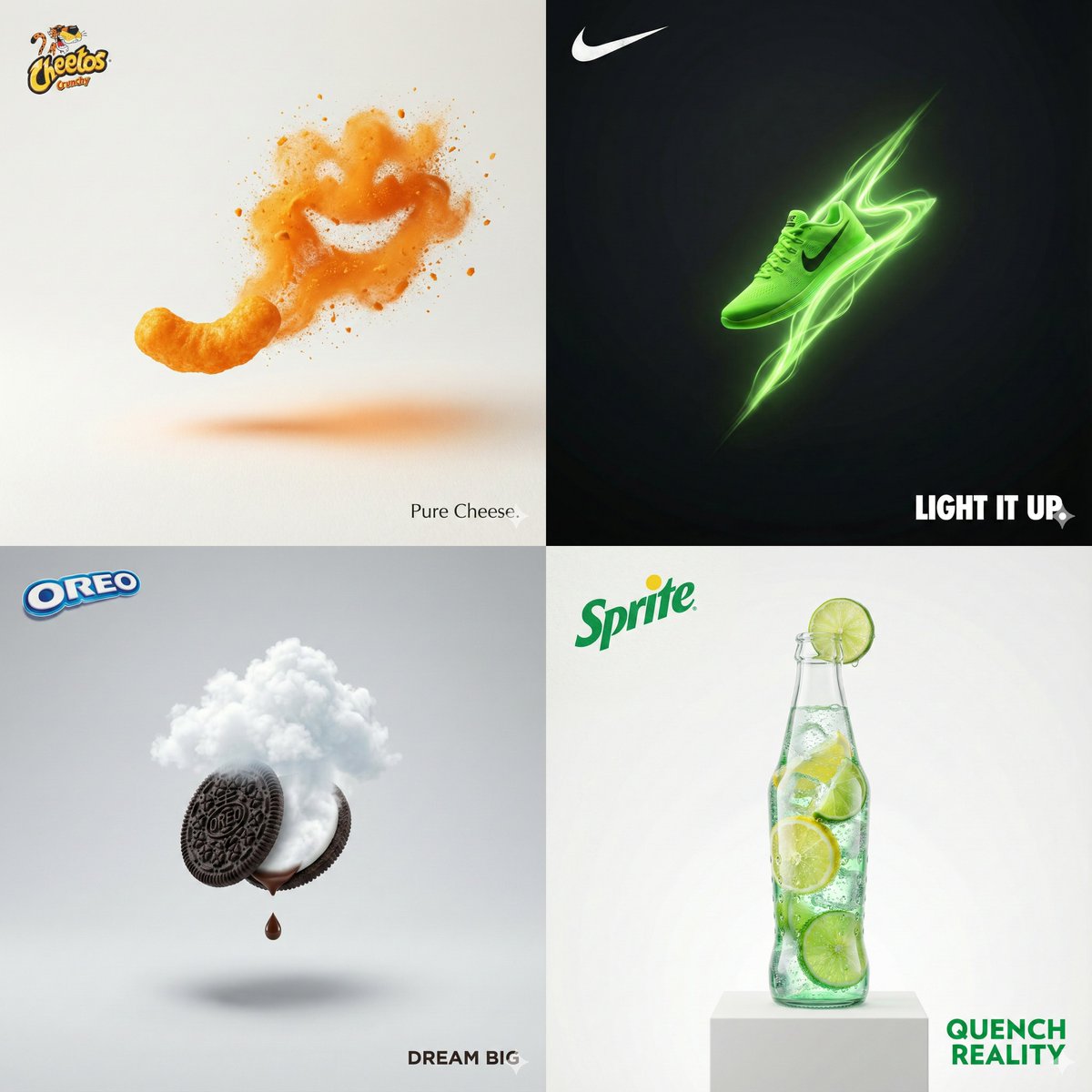
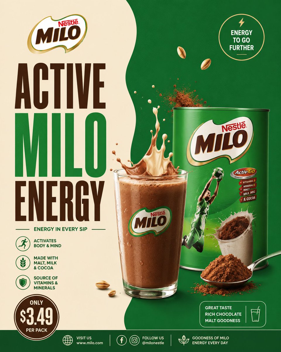
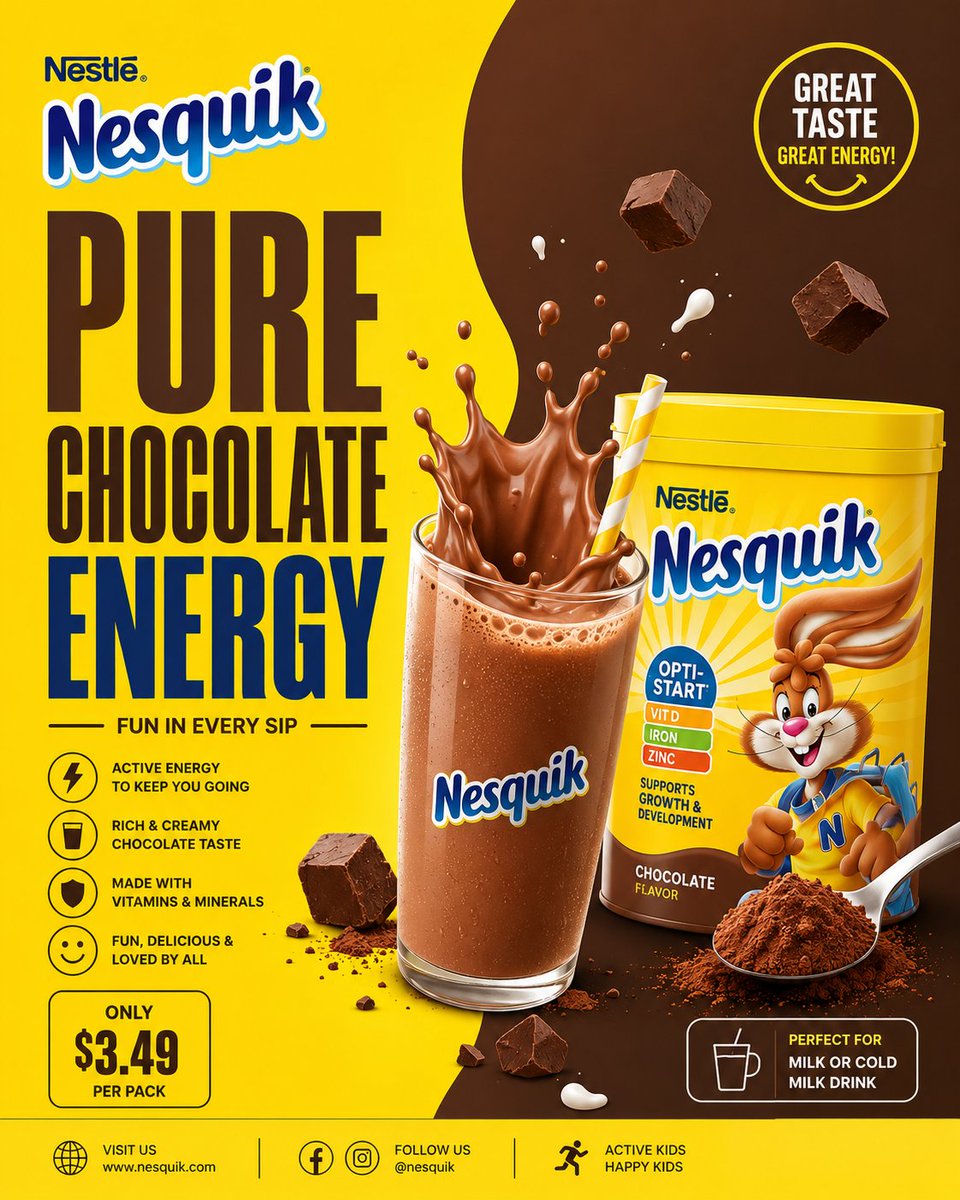
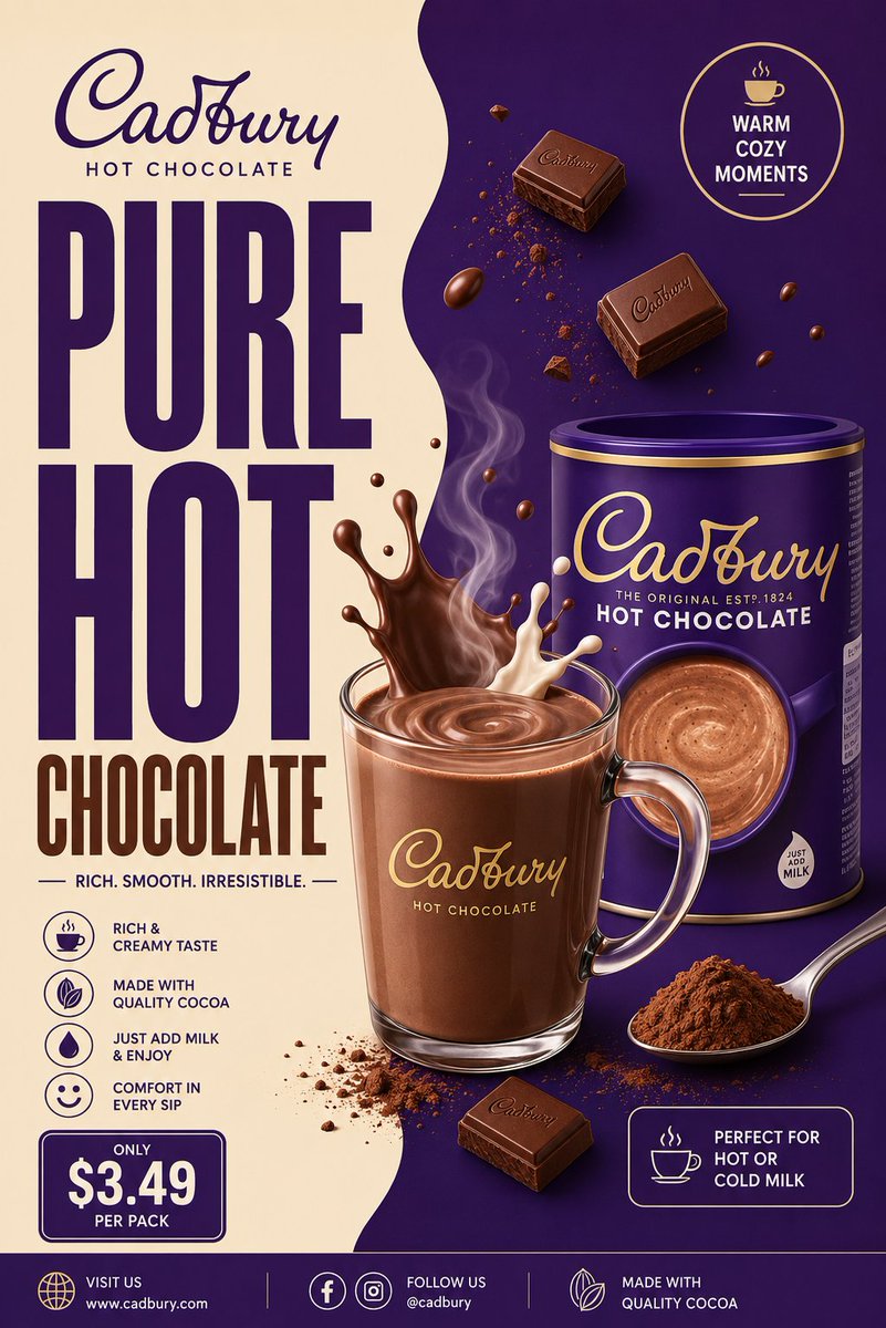
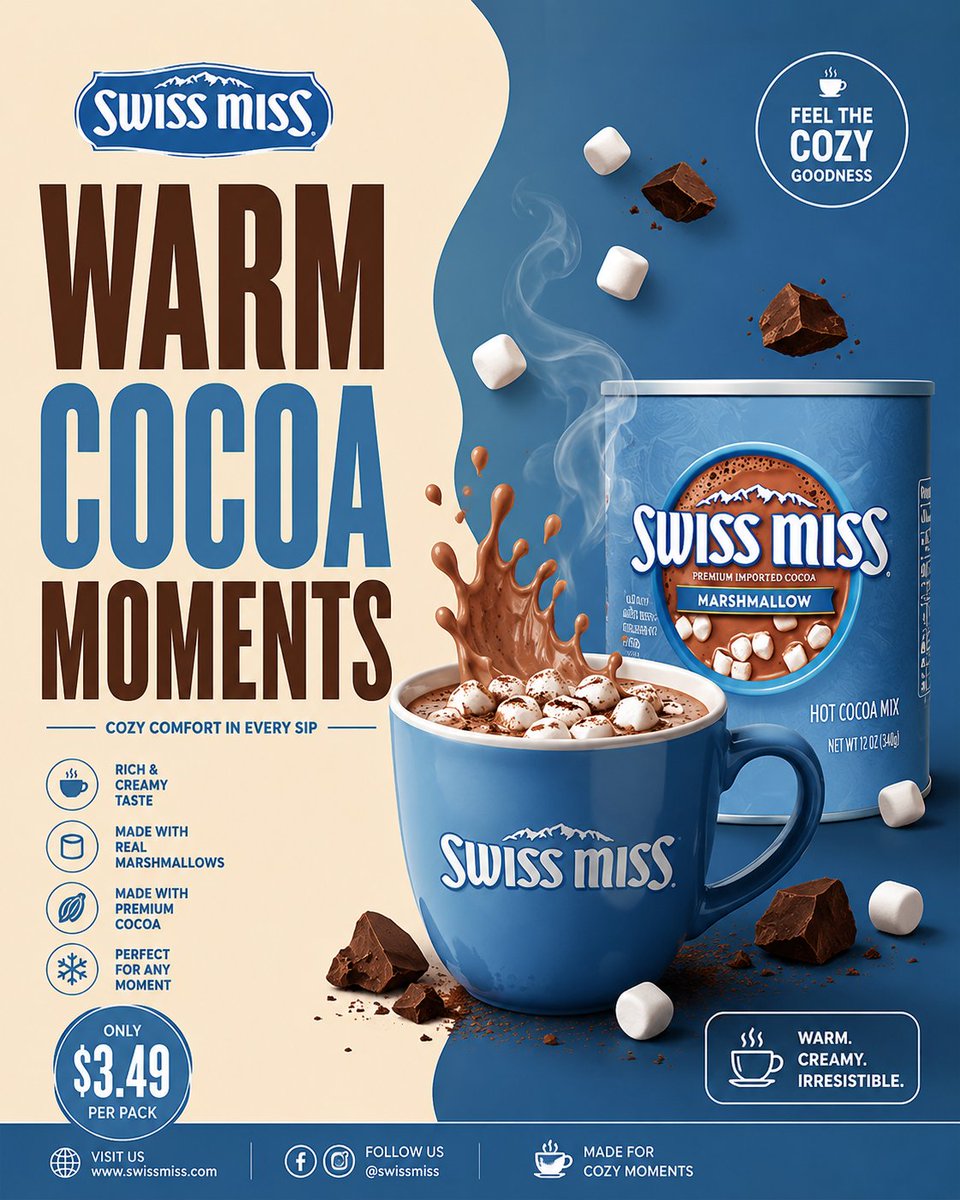
Минималистичный постер с какао-напитком и разделённым фоном
Чистый постер какао в стиле FMCG, разделённый на кремовую и шоколадную половины, с крупным узким заголовком и полуреалистичным горячим шоколадом в центре. Сдержанный, графичный и легко читаемый.

- Модель
- GPT Image 2
- Тип
- Изображений: 4
- Соотношение сторон
- 4:5
- Опубликован
- 22 мая 2026
- Лайки на X
- 354
Название бренда
Промпт для изображения
Символов: 5,707UNIVERSAL COCOA BEVERAGE FMCG POSTER MASTER PROMPT “MINIMAL DESIGN. PREMIUM COCOA ENERGY.” Create a premium minimalist FMCG poster for a [BRAND NAME] cocoa beverage inspired by retro-modern supermarket beverage ads, clean split-layout café posters, and modern FMCG commercial print campaigns. The poster should strongly resemble a minimal commercial advertisement with bold typography, smooth split-background composition, premium beverage styling, and clean editorial spacing. The design should feel: warm, creamy, cozy, modern, graphic, premium, commercial, organized, minimal, and visually pleasing. Avoid: — cinematic realism — chaotic splash explosions — cluttered floating ingredients — glossy 3D overload — busy café environments — luxury black-and-gold overload — dark moody aesthetics — excessive particles or effects. The final result should resemble: a modern illustrated FMCG cocoa beverage campaign poster. CORE LAYOUT STYLE Create a vertical 4:5 poster with: — smooth split-background composition — oversized stacked typography — centered hero cocoa drink — minimal floating ingredients — clean promotional UI blocks — geometric spacing — strong negative space — balanced commercial hierarchy. The layout should feel: minimal, clean, bold, organized, and premium. MOST IMPORTANT FEATURE — SPLIT BACKGROUND SYSTEM Create a smooth organic TWO-TONE split background inspired by modern café posters. LEFT SIDE Use lighter tones such as: — cream — warm beige — vanilla — milk tones — soft ivory. RIGHT SIDE Use darker brand-supporting cocoa tones such as: — chocolate brown — mocha — cocoa tones — caramel brown — deep brand color accents. The split curve should feel: smooth, fluid, elegant, soft, and modern. Use only: — subtle gradients — soft shadows — faint glow accents. Avoid: — dramatic textures — smoke overload — cinematic lighting — heavy depth-of-field blur. The background should remain: flat, clean, airy, and commercially polished. TYPOGRAPHY (MOST IMPORTANT) Use HUGE ultra-bold condensed sans-serif typography occupying 40–50% of the composition. Font inspiration: — Bebas Neue — Anton — Oswald Bold — Druk Condensed — League Gothic. Typography should feel: bold, retro-modern, commercial, premium, and FMCG-focused. HEADLINE EXAMPLES “PURE COCOA COMFORT” “RICH CHOCOLATE ENERGY” “WARM EVERY SIP” “CREAMY COCOA MOMENTS” “SMOOTH HOT CHOCOLATE”. Typography styling: — tight spacing — strong vertical stacking — clean alignment — minimal captions — thin divider lines — simple white or cream text. Avoid: — decorative fonts — handwritten typography — playful bubble fonts — luxury serif overload. HERO DRINK COMPOSITION Create a semi-realistic cocoa beverage with minimalist commercial styling. Possible setups: — transparent glass mug — ceramic cocoa cup — iced cocoa glass — creamy hot chocolate drink — chocolate milkshake style beverage. Include: — rich creamy cocoa texture — smooth milk splash arcs — glossy highlights — subtle steam curves — chocolate swirl motion — clean liquid reflections. The rendering should resemble: premium vector-commercial FMCG artwork. NOT cinematic realism. FLOATING ELEMENTS Add only a FEW controlled floating elements. Examples: — cocoa powder — chocolate chunks — milk droplets — soft splash curves — marshmallows — cocoa spoon — subtle steam ribbons. Keep everything: organized, intentional, balanced, and minimal. Avoid chaotic particle explosions. PRODUCT PACKAGING Include realistic [BRAND NAME] cocoa packaging naturally integrated into the composition. Packaging should: — maintain the brand’s recognizable colors — feel clean and slightly glossy — resemble real supermarket packaging — remain secondary to the hero drink. Placement ideas: — lower foreground — beside the cup — slightly overlapping typography — integrated subtly into splash motion. Do not overpower the layout. PROMOTIONAL UI ELEMENTS Include minimal poster-style UI elements such as: — circular promo badge — outlined price box — small cocoa icon — thin divider lines — clean footer strip — minimal benefit icons. Design style: — flat graphic styling — white outlines — compact typography — minimal clutter — editorial spacing. LIGHTING Use soft commercial studio lighting with: — smooth highlights — soft reflections — minimal shadows — flat premium rendering — clean beverage shine. Avoid: — dramatic cinematic contrast — moody shadows — heavy atmospheric lighting. The lighting should resemble: modern FMCG print advertising. COLOR SYSTEM Use only 3–4 dominant colors. UNIVERSAL BASE — cream / ivory — chocolate brown — cocoa tones — white. ADD BRAND COLOR ACCENTS Examples: — Cadbury purple — Nesquik yellow — Milo green — Swiss Miss blue — Galaxy caramel brown. Colors should feel: coordinated, warm, commercial, minimal, and print-ad ready. COMPOSITION RULES Layer Order: Split background Oversized typography Cocoa splash motion Hero beverage Floating ingredients Product packaging Promotional UI blocks Footer strip. Everything should feel: balanced, minimal, premium, clean, and visually easy to read. Avoid visual overload. FINAL VISUAL STYLE The final poster should look like: — modern FMCG print advertising — minimalist supermarket beverage campaigns — retro-modern café posters — commercial vector-realism hybrid artwork — Instagram-ready commercial design. NOT cinematic luxury advertising. FINAL QUALITY Minimal premium FMCG cocoa poster aesthetic. Split-layout commercial composition. Huge condensed typography. Semi-realistic vector-commercial rendering. Controlled floating elements. Clean editorial spacing. High-detail commercial rendering. Ultra-clean poster realism. Aspect Ratio: 4:5 Ultra HD 8K Instagram-ready FMCG campaign quality
Как использовать
Замените заполнитель бренда в квадратных скобках названием своей марки какао и сохраните разделённый фон и крупную узкую типографику, так как именно они держат композицию. Заголовок можно заменить любой короткой фразой, например вкусом или преимуществом. Промпт был опубликован для GPT Image 2, а результат подходит для поста в соцсетях 4:5 или для макета печатной витрины.
Опубликовано в открытом доступе на X: 22 мая 2026. Все права на этот промпт и его результат принадлежат автору. Это ваш промпт? Попросите обновить или удалить его.