Prompt studio
Make “Horizontal-Split Exhibition Poster With Layered Type” yours
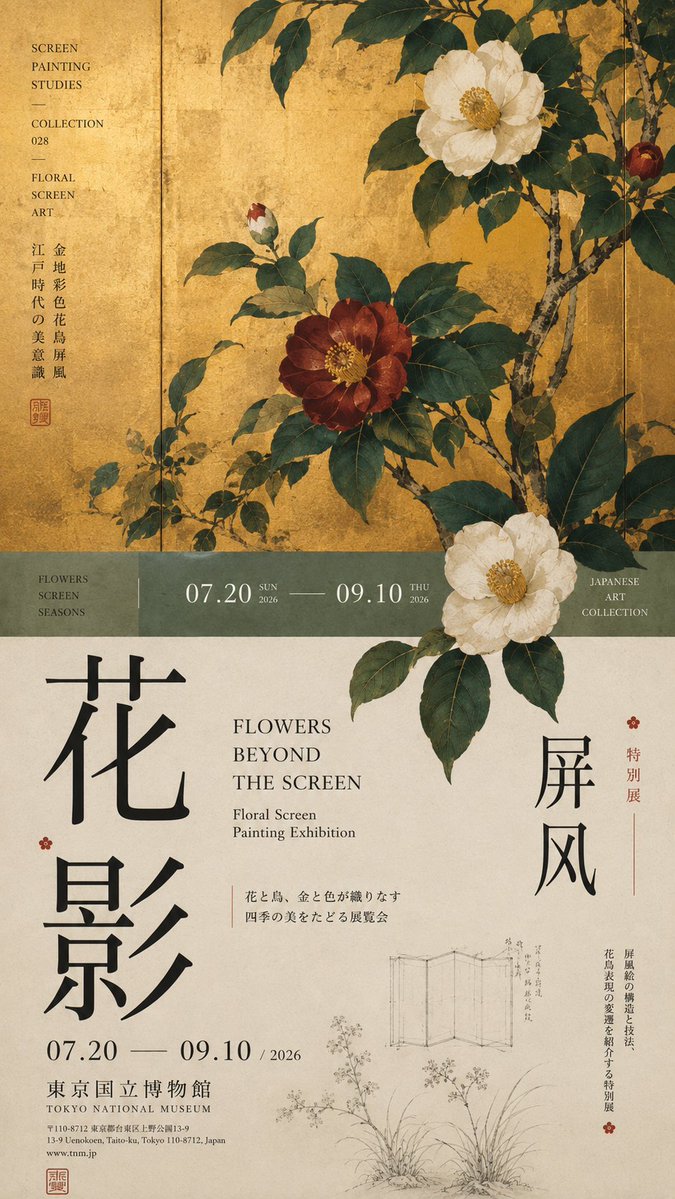
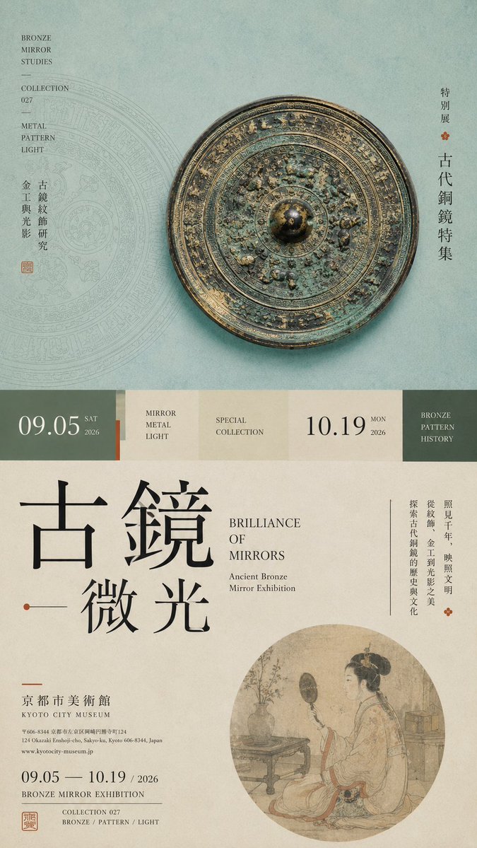
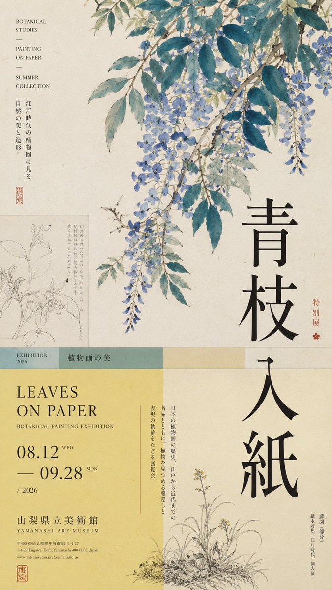
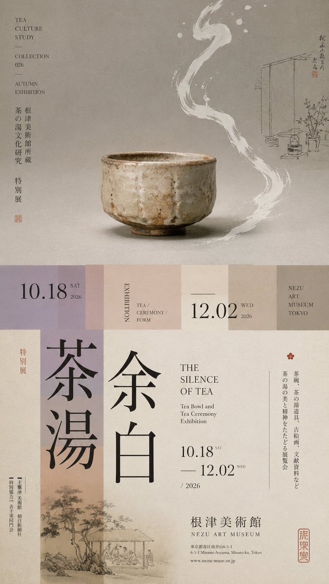
A tall 9:16 exhibition poster divided into unequal zones, with a single main visual, a narrow transition band, and oversized vertical type. The subject crosses the cut line so the upper and lower halves read as one editorial page.
 Prompt by @MrLarus
- Fill in the blanks below.
- Watch the prompt update on the right.
- Copy it, or open it in an image tool.
Image prompt
Prompt: 【Theme】: ____ 【Main visual】: ____ 【Chinese title】: ____ 【English title】: ____ 【Auxiliary visual】: ____ 【Main color】: ____ 【Secondary color】: ____ 【Date / Institution】: ____ 【Ratio】: 9:16 Generate a "horizontal-split" poster with a sophisticated Editorial Design and cultural-exhibition character. Don't simply make it "image on top, text on bottom." Divide the layout into 2–3 vertical zones of unequal proportions: main visual zone about 50%–65%, central transition cut about 8%–15%, lower information zone about 25%–40%. Keep only one primary visual core 【main visual】, then add a few low-weight details, such as line art, partial painting, patterns, study diagrams, small collection info, or vertical text, so the whitespace has design density without stealing focus from the subject. In the middle, use low-saturation color blocks, narrow color bands, or information modules to connect the upper and lower zones. The main title participates in the composition through enlargement, vertical setting, offset, or crossing zones; allow the subject to partially cross the cut boundary, creating front-back layers between the zones. Establish a clear text hierarchy: large Chinese title → English title / date → small subtitle → tiny institutional info. Group the small text together, don't scatter it. Keep colors to 3–5 tones, building hierarchy through zone proportions, visual weight, cross-zone relationships, and typography. Key point: the horizontal split is not about cutting the image into two blocks, but about giving the different zones clear roles while reconnecting them through the subject and the text. Museum Exhibition Poster × Editorial Graphic Design—rich but not chaotic, spacious but not empty, with the finish of a real museum poster and art catalogue.
Prompt shared on X by @MrLarus. All credit goes to its creator.
More prompts you can customize
 Nordic-Style Japanese Web Studio Design Board
 Add your photoBrand Identity System Poster From a Logo
 Folk Doodle Flat Illustration Style Transfer
 Flat Folk Doodle Illustration From a Photo
 Add your photoBrand Identity System Poster on Dark Background
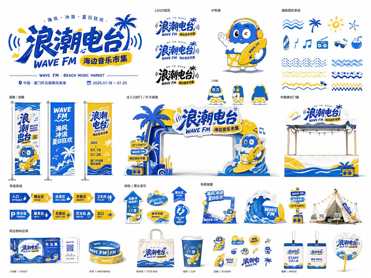 Event Visual Identity Board for Festivals and Pop-Ups
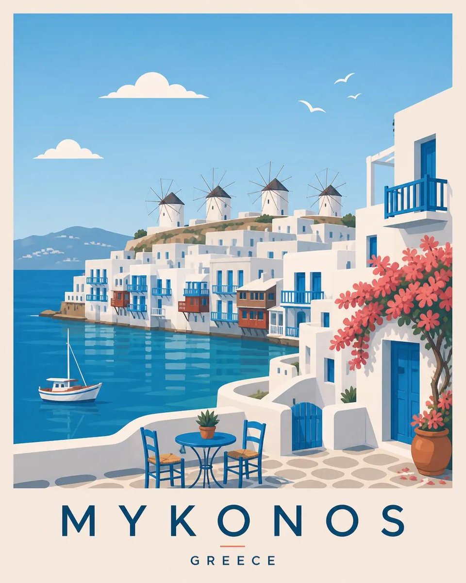 Scandinavian Travel Poster Flat Vector Illustration
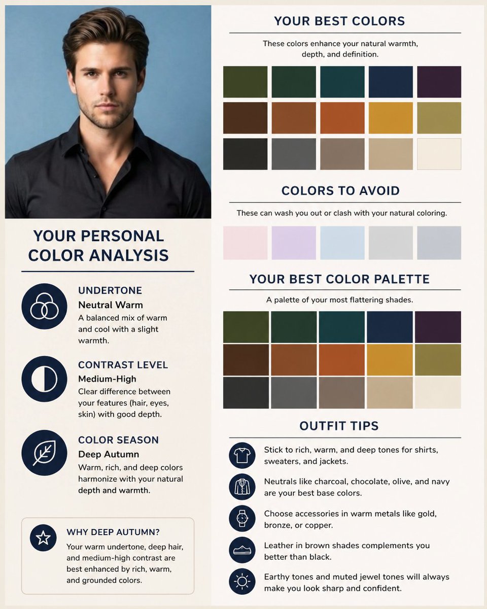 Add your photoColor Season Chart and Palette Card From a Selfie