Image prompt Branding & UI Customizable
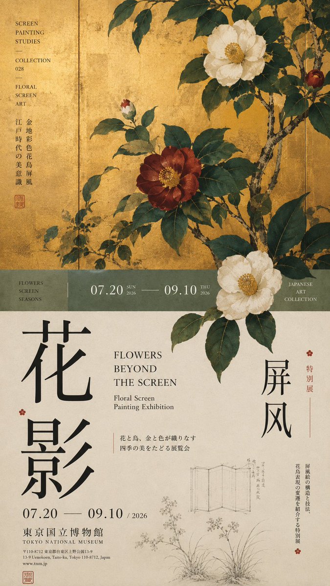
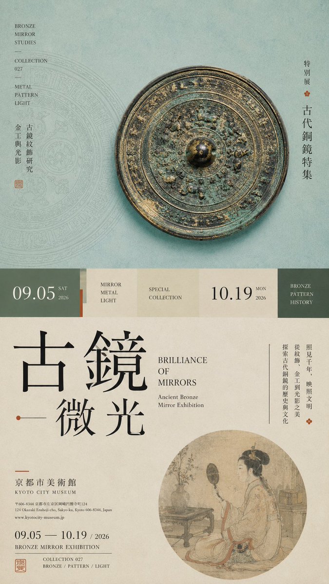
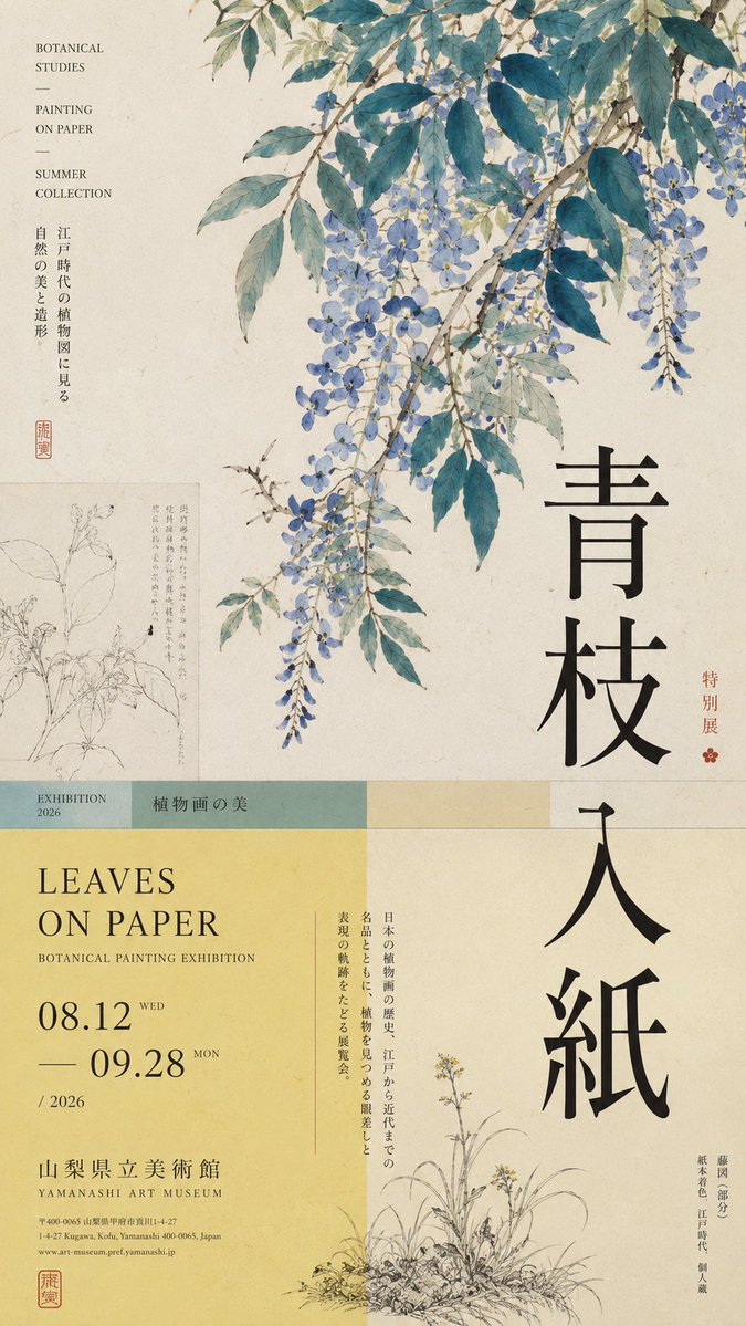
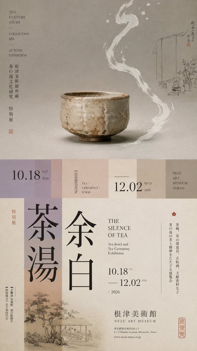
Horizontal-Split Exhibition Poster With Layered Type
A tall 9:16 exhibition poster divided into unequal zones, with a single main visual, a narrow transition band, and oversized vertical type. The subject crosses the cut line so the upper and lower halves read as one editorial page.

- Model
- GPT Image 2
- Type
- 4 images
- Aspect ratio
- 9:16
- Shared
- 18 Aug 2026
- Likes on X
- 80
Exhibition themeChinese titleEnglish titleDate and venue
Image prompt
1,789 charactersPrompt: 【Theme】: ____ 【Main visual】: ____ 【Chinese title】: ____ 【English title】: ____ 【Auxiliary visual】: ____ 【Main color】: ____ 【Secondary color】: ____ 【Date / Institution】: ____ 【Ratio】: 9:16 Generate a "horizontal-split" poster with a sophisticated Editorial Design and cultural-exhibition character. Don't simply make it "image on top, text on bottom." Divide the layout into 2–3 vertical zones of unequal proportions: main visual zone about 50%–65%, central transition cut about 8%–15%, lower information zone about 25%–40%. Keep only one primary visual core 【main visual】, then add a few low-weight details, such as line art, partial painting, patterns, study diagrams, small collection info, or vertical text, so the whitespace has design density without stealing focus from the subject. In the middle, use low-saturation color blocks, narrow color bands, or information modules to connect the upper and lower zones. The main title participates in the composition through enlargement, vertical setting, offset, or crossing zones; allow the subject to partially cross the cut boundary, creating front-back layers between the zones. Establish a clear text hierarchy: large Chinese title → English title / date → small subtitle → tiny institutional info. Group the small text together, don't scatter it. Keep colors to 3–5 tones, building hierarchy through zone proportions, visual weight, cross-zone relationships, and typography. Key point: the horizontal split is not about cutting the image into two blocks, but about giving the different zones clear roles while reconnecting them through the subject and the text. Museum Exhibition Poster × Editorial Graphic Design—rich but not chaotic, spacious but not empty, with the finish of a real museum poster and art catalogue.
How to use it
Start by filling the bracketed fields in the template, especially the theme, main visual and both titles. This is a template, so keep the zone proportions and the bracket structure, because they carry the layout; keep the phrase about allowing the subject to cross the cut boundary too. It was shared as a GPT Image 2 prompt. The result works well as a gallery or museum poster mock-up, or as a cover for an exhibition catalogue.
Shared publicly on X on 18 Aug 2026. All credit for this prompt and its result goes to its creator. Is this yours? Ask for an update or removal.