Промпт для изображения Брендинг и UI Настраиваемые
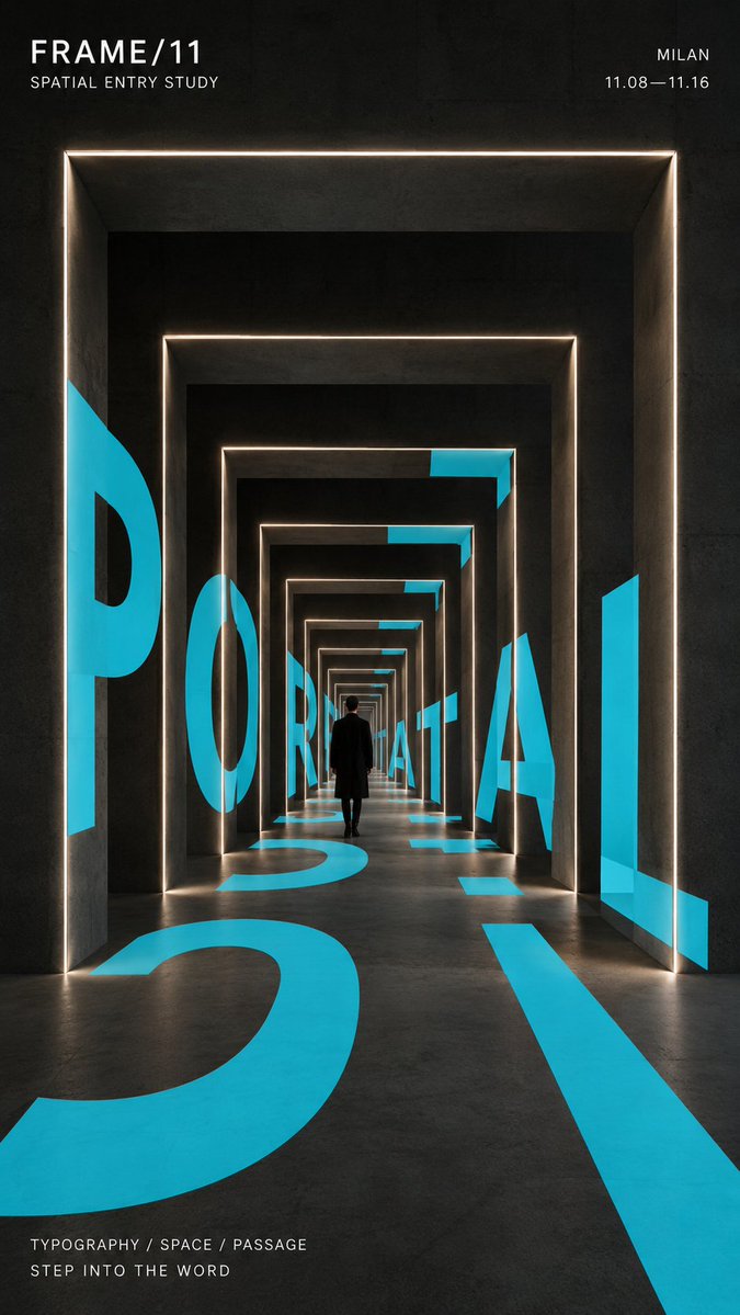
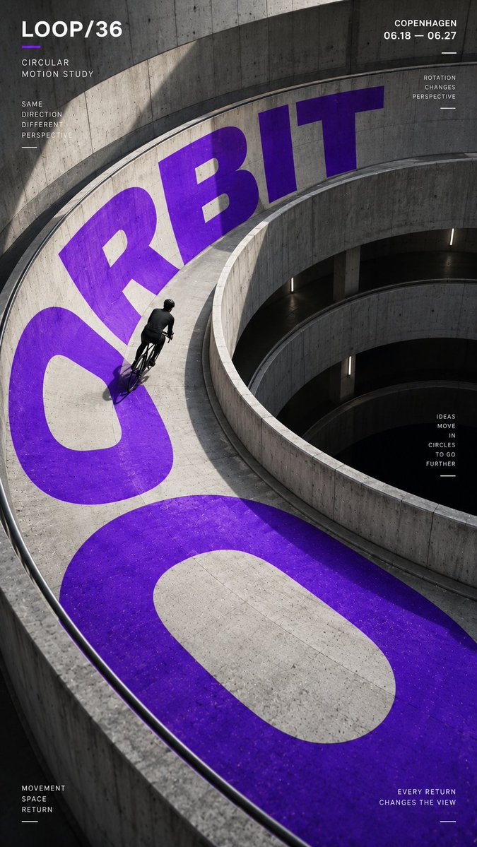
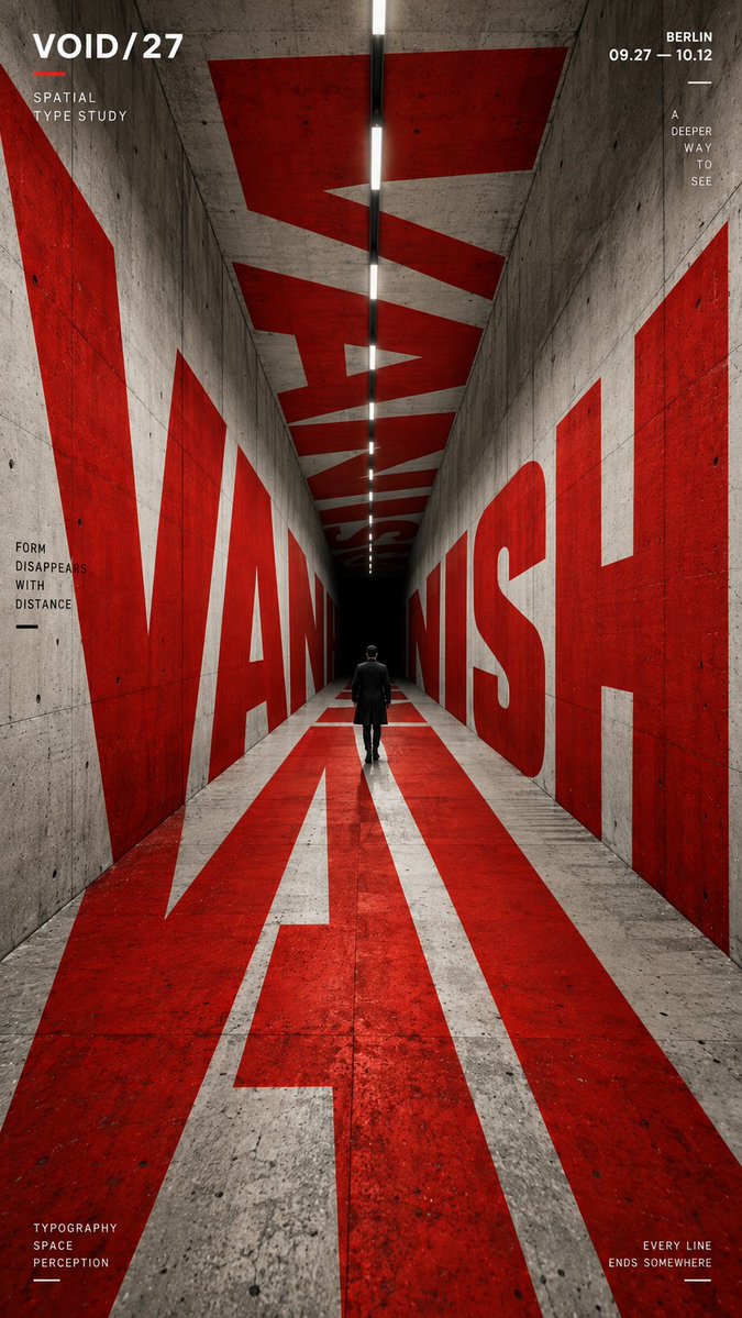
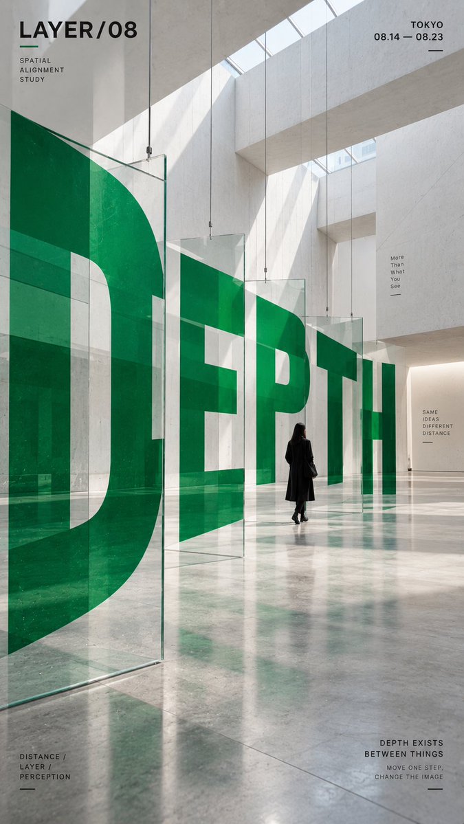
Пространственный типографический постер с крупными буквами в архитектуре
Крупные буквы обвивают, изгибают и уходят вглубь реалистично выглядящего здания, так что слово хорошо читается с одной точки обзора. Единственный акцентный цвет выделяется на фоне нейтрального бетона и черного, а маленькая фигура задает масштаб.

- Модель
- GPT Image 2
- Тип
- Изображений: 4
- Соотношение сторон
- 9:16
- Опубликован
- 4 сент. 2026
- Лайки на X
- 5
Название бренда / выставки / кампанииАрхитектурная средаНебольшая фигура человека / велосипедист / нетОдин яркий акцентный цветДата / место / короткий слоган
Промпт для изображения
Символов: 2,105CORE WORD: [e.g. ORBIT / PORTAL / VANISH / DEPTH] PROJECT NAME: [brand / exhibition / campaign name] SPATIAL STRUCTURE: [spiral ramp / nested frames / tunnel / layered panels / other] SCENE: [architectural environment] SUBJECT: [small human figure / cyclist / none] MAIN COLOR: [one strong accent color] SUPPORTING TEXT: [date / location / short tagline] FORMAT: 9:16 vertical poster Create a contemporary perspective typography poster where oversized type becomes part of the physical space instead of simply sitting on top of the image. Build one clear spatial system first, then make the typography strictly follow its geometry, perspective, curvature, depth and surface changes. The main word should occupy roughly 35–55% of the composition and act as the primary visual structure. Depending on the chosen spatial structure, allow the letterforms to: * wrap around curved architecture, * continue across floors and walls, * pass through repeated frames, * or split across multiple depth layers and visually realign from one specific viewpoint. The typography must feel physically integrated into the environment, with correct scale, perspective, occlusion and surface contact. From the intended camera angle, the word should remain recognizable and visually powerful even if individual letterforms are distorted by the architecture. Use a restrained palette with one strong accent color against neutral concrete, black, white or architectural materials. Keep the color fields clean, solid and graphic rather than glossy, neon or heavily textured. If a person is included, keep them relatively small and use them as a scale reference. They should naturally walk, ride or move through the typographic space rather than pose for the camera. Add only a small amount of secondary editorial information such as project name, location, date and one short thematic line. Keep it clearly subordinate to the main word. Overall style: experimental typography, spatial graphic design, contemporary architecture, editorial poster, installation art, strong depth, clean hierarchy, high-impact composition.
Как использовать
Сначала замените основное слово, название проекта и акцентный цвет: именно они задают иерархию постера. Сохраните строку о пространственной структуре и инструкции по перспективе, потому что без четкой геометрии буквы не будут следовать архитектуре. Промпт был опубликован для GPT Image 2, а формат 9:16 подойдет для постера, сториз или настенного экрана.
Опубликовано в открытом доступе на X: 4 сент. 2026. Все права на этот промпт и его результат принадлежат автору. Это ваш промпт? Попросите обновить или удалить его.