Görsel promptu Marka ve arayüz Özelleştirilebilir
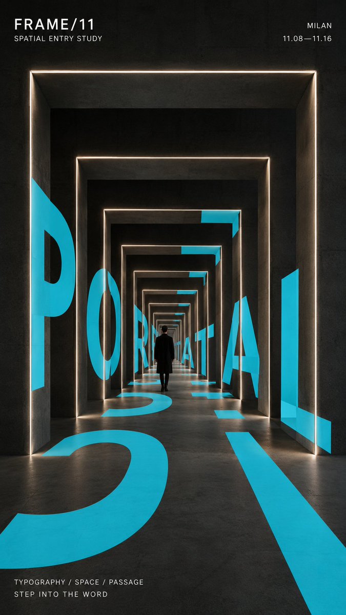
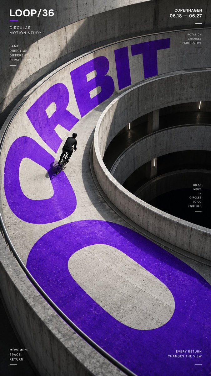
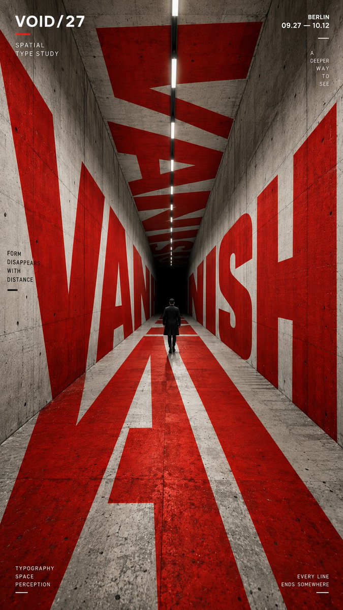
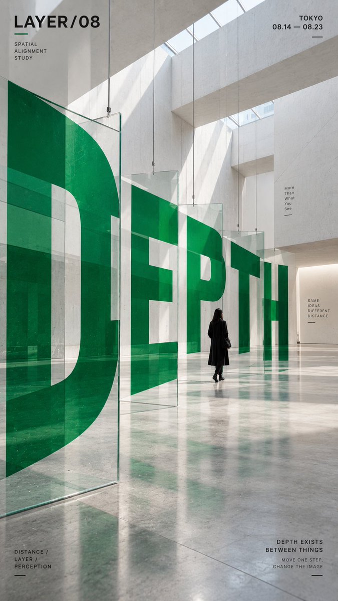
Mimariyle bütünleşen iri harfli mekânsal tipografi posteri
İri harfler gerçek görünümlü bir binanın içinde kıvrılır, dönerek geri çekilir; böylece kelime tek bir bakış açısından temiz biçimde okunur. Tek bir vurgu rengi nötr beton ve siyahın arasından sıyrılır, küçük bir figür ise ölçeği verir.

- Model
- GPT Image 2
- Tür
- 4 görsel
- En boy oranı
- 9:16
- Paylaşım
- 4 Eyl 2026
- X'teki beğeniler
- 5
Marka / sergi / kampanya adıMimari ortamKüçük insan figürü / bisikletçi / yokBir güçlü vurgu rengiTarih / konum / kısa slogan
Görsel promptu
2,105 karakterCORE WORD: [e.g. ORBIT / PORTAL / VANISH / DEPTH] PROJECT NAME: [brand / exhibition / campaign name] SPATIAL STRUCTURE: [spiral ramp / nested frames / tunnel / layered panels / other] SCENE: [architectural environment] SUBJECT: [small human figure / cyclist / none] MAIN COLOR: [one strong accent color] SUPPORTING TEXT: [date / location / short tagline] FORMAT: 9:16 vertical poster Create a contemporary perspective typography poster where oversized type becomes part of the physical space instead of simply sitting on top of the image. Build one clear spatial system first, then make the typography strictly follow its geometry, perspective, curvature, depth and surface changes. The main word should occupy roughly 35–55% of the composition and act as the primary visual structure. Depending on the chosen spatial structure, allow the letterforms to: * wrap around curved architecture, * continue across floors and walls, * pass through repeated frames, * or split across multiple depth layers and visually realign from one specific viewpoint. The typography must feel physically integrated into the environment, with correct scale, perspective, occlusion and surface contact. From the intended camera angle, the word should remain recognizable and visually powerful even if individual letterforms are distorted by the architecture. Use a restrained palette with one strong accent color against neutral concrete, black, white or architectural materials. Keep the color fields clean, solid and graphic rather than glossy, neon or heavily textured. If a person is included, keep them relatively small and use them as a scale reference. They should naturally walk, ride or move through the typographic space rather than pose for the camera. Add only a small amount of secondary editorial information such as project name, location, date and one short thematic line. Keep it clearly subordinate to the main word. Overall style: experimental typography, spatial graphic design, contemporary architecture, editorial poster, installation art, strong depth, clean hierarchy, high-impact composition.
Nasıl kullanılır
Önce ana kelimeyi, proje adını ve vurgu rengini değiştirin; posterin hiyerarşisini bu öğeler taşır. Mekânsal yapı satırını ve perspektif talimatlarını koruyun, çünkü net bir geometri olmadan harfler mimariyi takip etmez. GPT Image 2 promptu olarak paylaşılmış; poster, hikâye ya da duvar ekranı için 9:16 kare idealdir.
4 Eyl 2026 tarihinde X'te herkese açık olarak paylaşıldı. Bu prompt ve sonucunun tüm hakkı içerik üreticisine aittir. Bu sizin mi? Güncelleme veya kaldırma talep edin.













