Afbeeldingsprompt Branding & UI Aanpasbaar
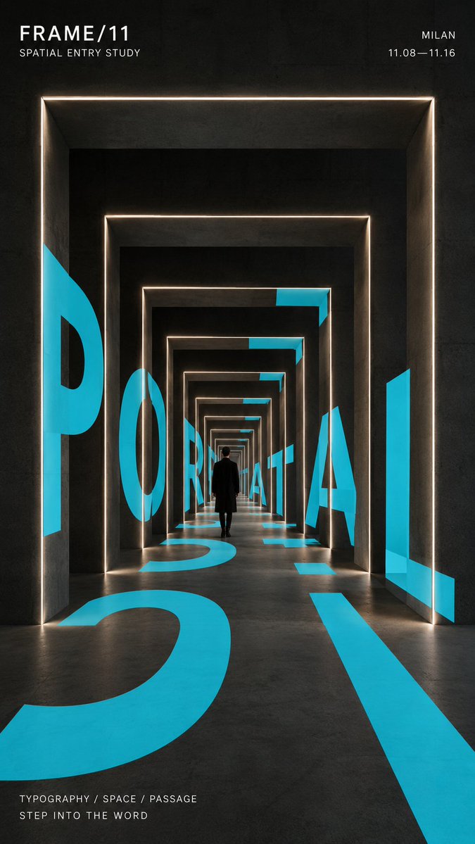
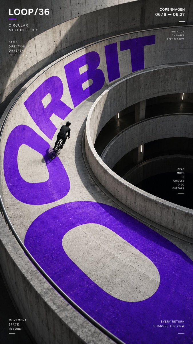
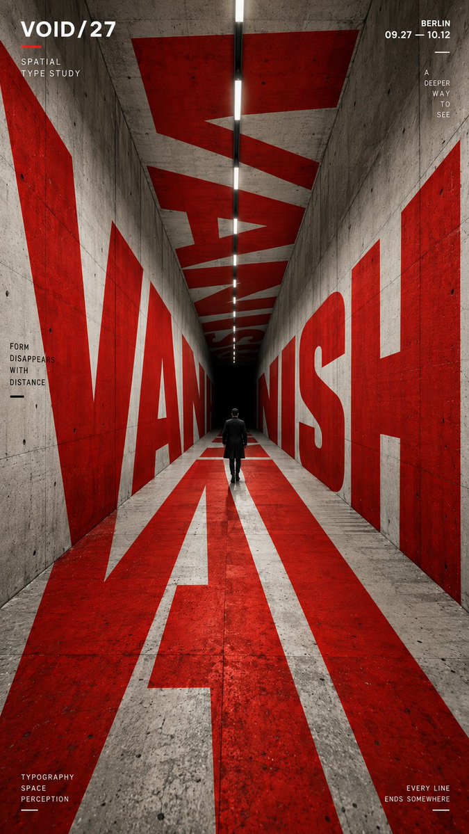
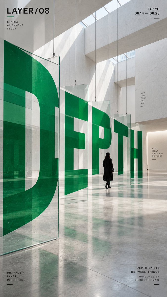
Ruimtelijke typografie-poster met grote letters in de architectuur
Grote letters draaien, buigen en wijken terug door een echt ogend gebouw, zodat het woord vanuit één kijkpunt helder leesbaar blijft. Eén accentkleur steekt af tegen neutraal beton en zwart, en een kleine figuur geeft de schaal aan.

- Model
- GPT Image 2
- Type
- 4 afbeeldingen
- Beeldverhouding
- 9:16
- Gedeeld
- 4 sep 2026
- Likes op X
- 5
Merk- / expo- / campagnenaamArchitectonische omgevingKleine menselijke figuur / fietser / geenEén sterke accentkleurDatum / locatie / korte tagline
Afbeeldingsprompt
2,105 tekensCORE WORD: [e.g. ORBIT / PORTAL / VANISH / DEPTH] PROJECT NAME: [brand / exhibition / campaign name] SPATIAL STRUCTURE: [spiral ramp / nested frames / tunnel / layered panels / other] SCENE: [architectural environment] SUBJECT: [small human figure / cyclist / none] MAIN COLOR: [one strong accent color] SUPPORTING TEXT: [date / location / short tagline] FORMAT: 9:16 vertical poster Create a contemporary perspective typography poster where oversized type becomes part of the physical space instead of simply sitting on top of the image. Build one clear spatial system first, then make the typography strictly follow its geometry, perspective, curvature, depth and surface changes. The main word should occupy roughly 35–55% of the composition and act as the primary visual structure. Depending on the chosen spatial structure, allow the letterforms to: * wrap around curved architecture, * continue across floors and walls, * pass through repeated frames, * or split across multiple depth layers and visually realign from one specific viewpoint. The typography must feel physically integrated into the environment, with correct scale, perspective, occlusion and surface contact. From the intended camera angle, the word should remain recognizable and visually powerful even if individual letterforms are distorted by the architecture. Use a restrained palette with one strong accent color against neutral concrete, black, white or architectural materials. Keep the color fields clean, solid and graphic rather than glossy, neon or heavily textured. If a person is included, keep them relatively small and use them as a scale reference. They should naturally walk, ride or move through the typographic space rather than pose for the camera. Add only a small amount of secondary editorial information such as project name, location, date and one short thematic line. Keep it clearly subordinate to the main word. Overall style: experimental typography, spatial graphic design, contemporary architecture, editorial poster, installation art, strong depth, clean hierarchy, high-impact composition.
Zo gebruik je hem
Pas eerst het kernwoord, de projectnaam en de accentkleur aan, want die dragen de hiërarchie van de poster. Behoud de regel over de ruimtelijke structuur en de perspectiefinstructies, want zonder duidelijke geometrie volgen de letters de architectuur niet. Gedeeld als GPT Image 2-prompt, en een 9:16-formaat past bij een poster, story of wandscherm.
Openbaar gedeeld op X op 4 sep 2026. Alle eer voor deze prompt en het resultaat gaat naar de maker. Is dit van jou? Vraag om een aanpassing of verwijdering.













