Промпт для изображения Брендинг и UI Настраиваемые
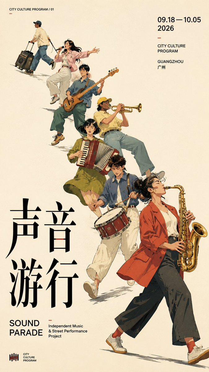
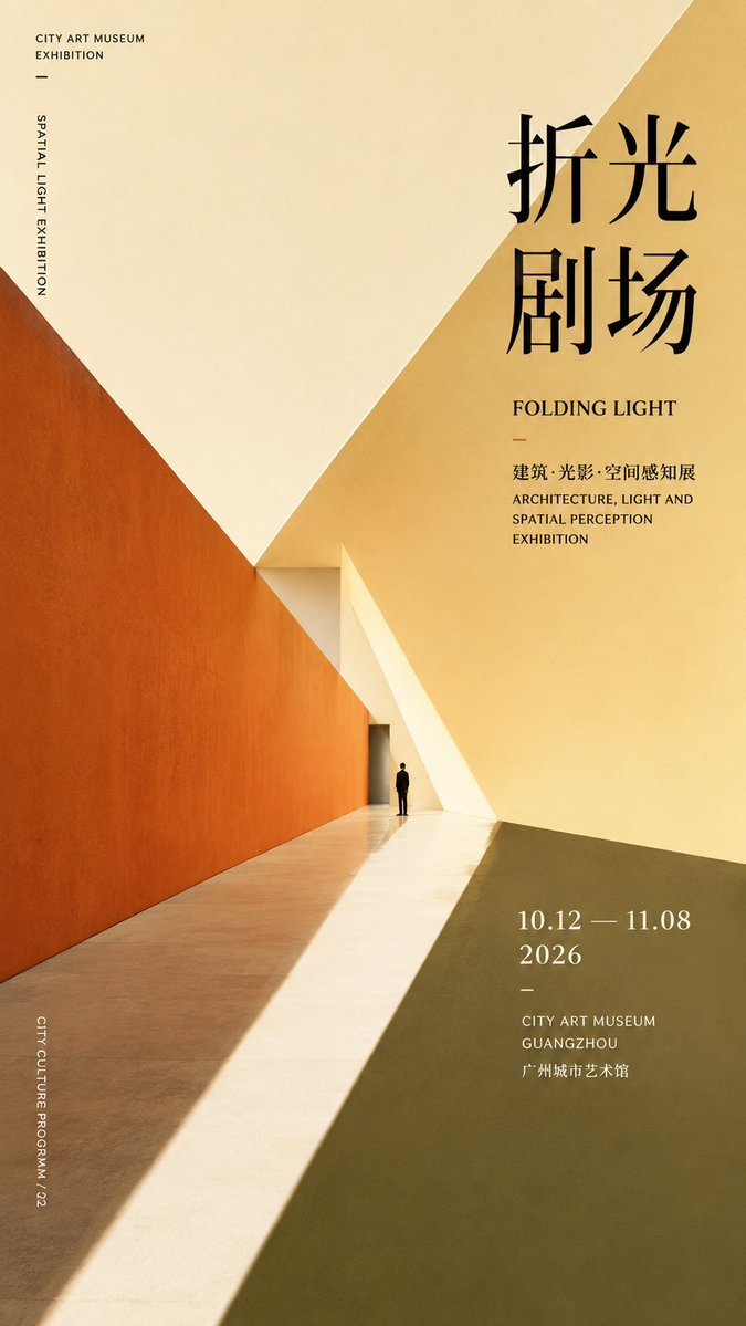
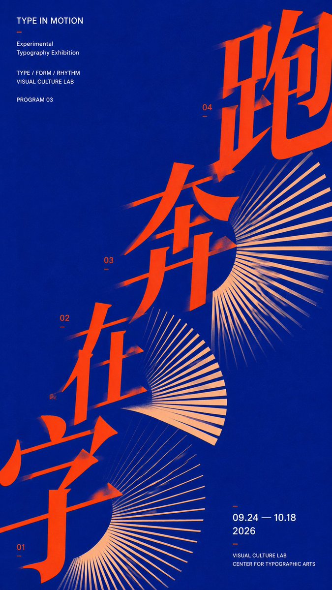
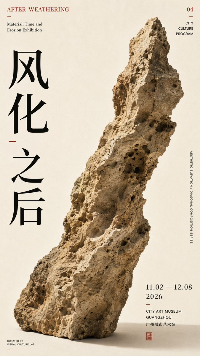
Диагональный типографический постер для дизайна выставок
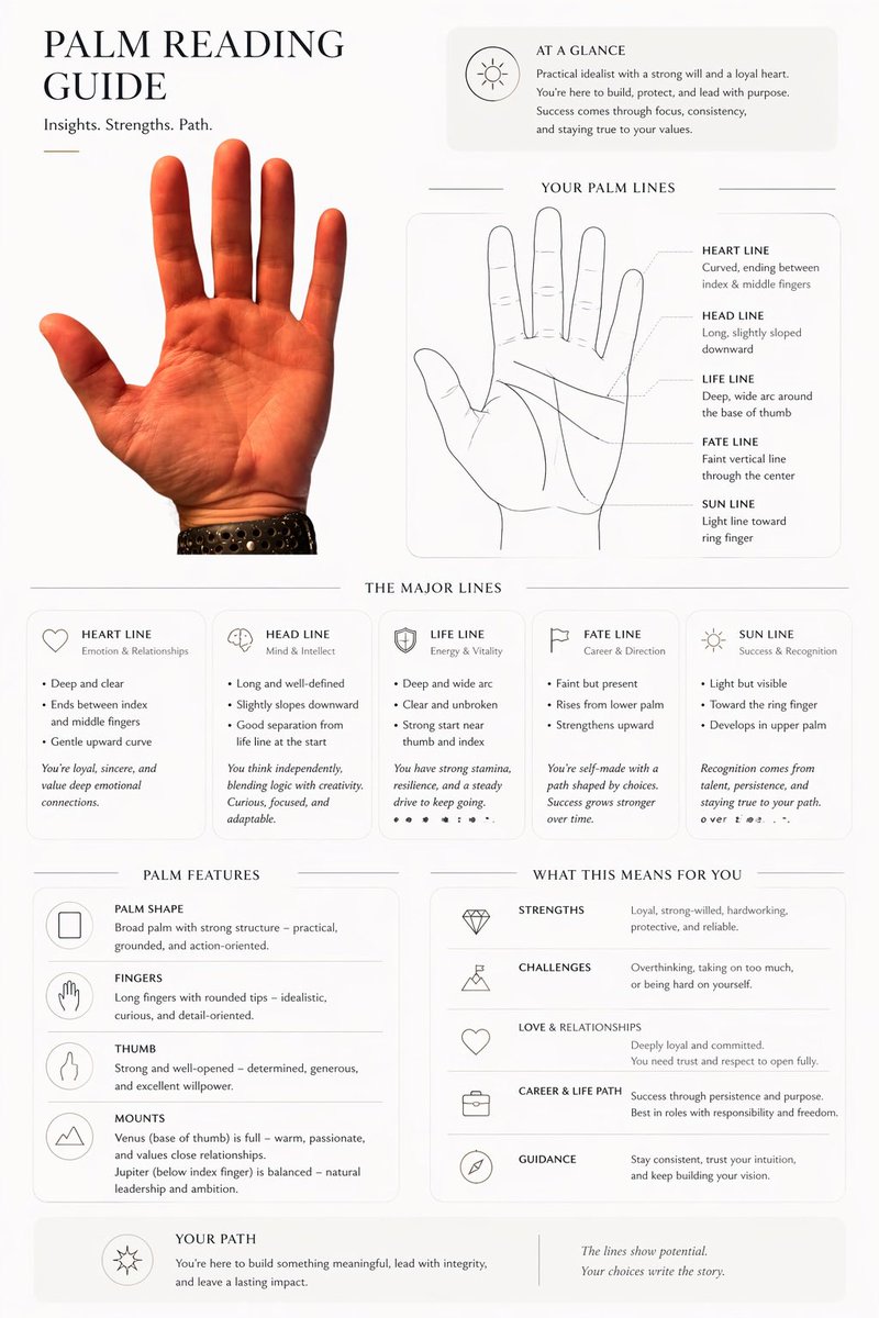
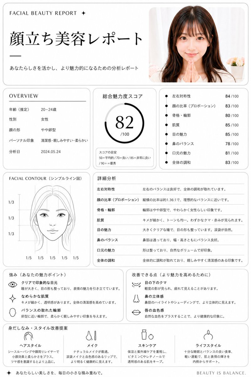
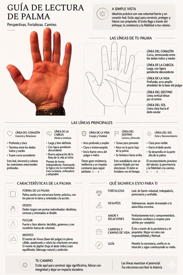
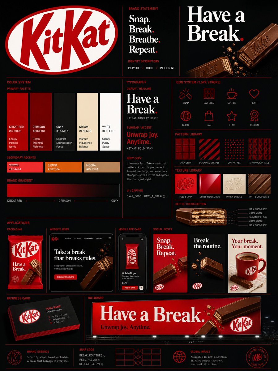
Постер формата 9:16, построенный на одной сильной диагональной оси, где крупный шрифт, фигуры и свободное пространство движутся по одному пути чтения. Результат выглядит как сдержанный постер культурной выставки с настоящим визуальным напряжением.

- Модель
- GPT Image 2
- Тип
- Изображений: 4
- Соотношение сторон
- 9:16
- Опубликован
- 7 авг. 2026
- Лайки на X
- 292
ТемаКитайский заголовокАнглийский заголовокЦветовая схема
Промпт для изображения
Символов: 1,763【Theme】: ____ 【Subject type】: group figures / space / typography / single object 【Subject content】: ____ 【Chinese title】: ____ 【English title】: ____ 【Diagonal mode】: group movement / spatial perspective / typographic advance / object tilt 【Main axis direction】: bottom-left→top-right / bottom-right→top-left 【Color scheme】: ____ 【Date / institution】: ____ 【Ratio】: 9:16 Generate a diagonal-composition poster with a strong sense of design. First establish a clear diagonal visual axis, then organize the subject, typography, and negative space around this axis, rather than piling up decorative elements first. Let the subject itself create the diagonal momentum: group type uses figures' action, scale, and arrangement to form continuous diagonal movement; spatial type uses architectural cuts, perspective, and light and shadow to form diagonal convergence; typography type uses large text advancing along the diagonal axis, enlarged, cropped, and overlapped; single-object type uses the object's own outline, center of gravity, and tilted posture to naturally form the diagonal. Keep only one main visual direction across the whole image; other elements only follow or balance, creating no new visual competition. The subject carries the main visual weight, keeping 25%–40% negative space. The Chinese title carries the visual center, while small English text and date info are concentrated in 1–2 information zones. Limit colors to 2–4, enhancing tension through scale, cropping, overlapping, and asymmetric layout. The point is not to "draw a diagonal line," but to have the subject, text, and negative space together form a diagonal reading path. Editorial Graphic Design: mature, restrained, clear, and tense, like a real cultural-exhibition poster.
Как использовать
Сначала решите, является ли ваша тема группой людей, пространством, композицией с акцентом на типографику или отдельным объектом, затем заполните квадратные скобки своими словами и сохраните диагональное направление как написано. Промпт был опубликован для GPT Image 2, поэтому оставьте китайскую и английскую строки заголовка в их полях, чтобы типографика выглядела продуманной. Сохраните инструкцию про 25–40% негативного пространства: именно эта открытая зона делает диагональ читаемой. Подходит для афиш мероприятий, брендинговых макетов и анонсов галерей.
Опубликовано в открытом доступе на X: 7 авг. 2026. Все права на этот промпт и его результат принадлежат автору. Это ваш промпт? Попросите обновить или удалить его.