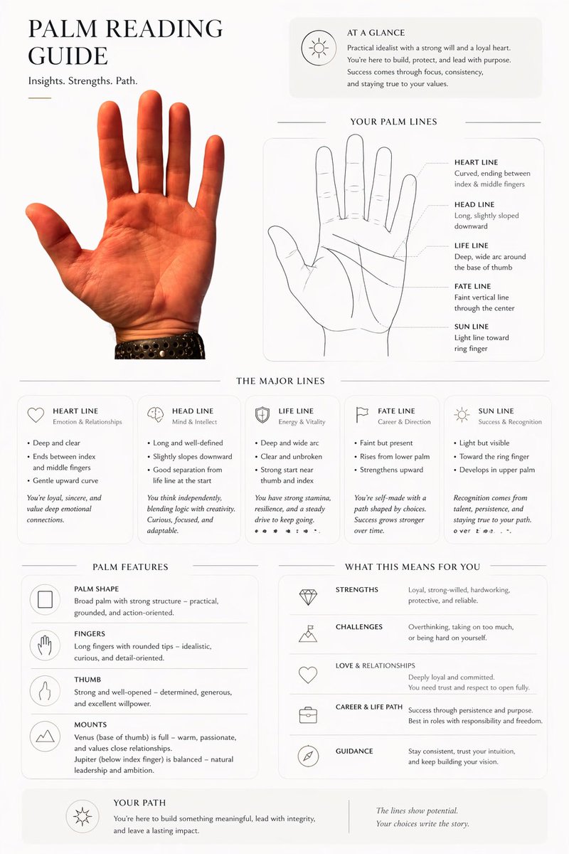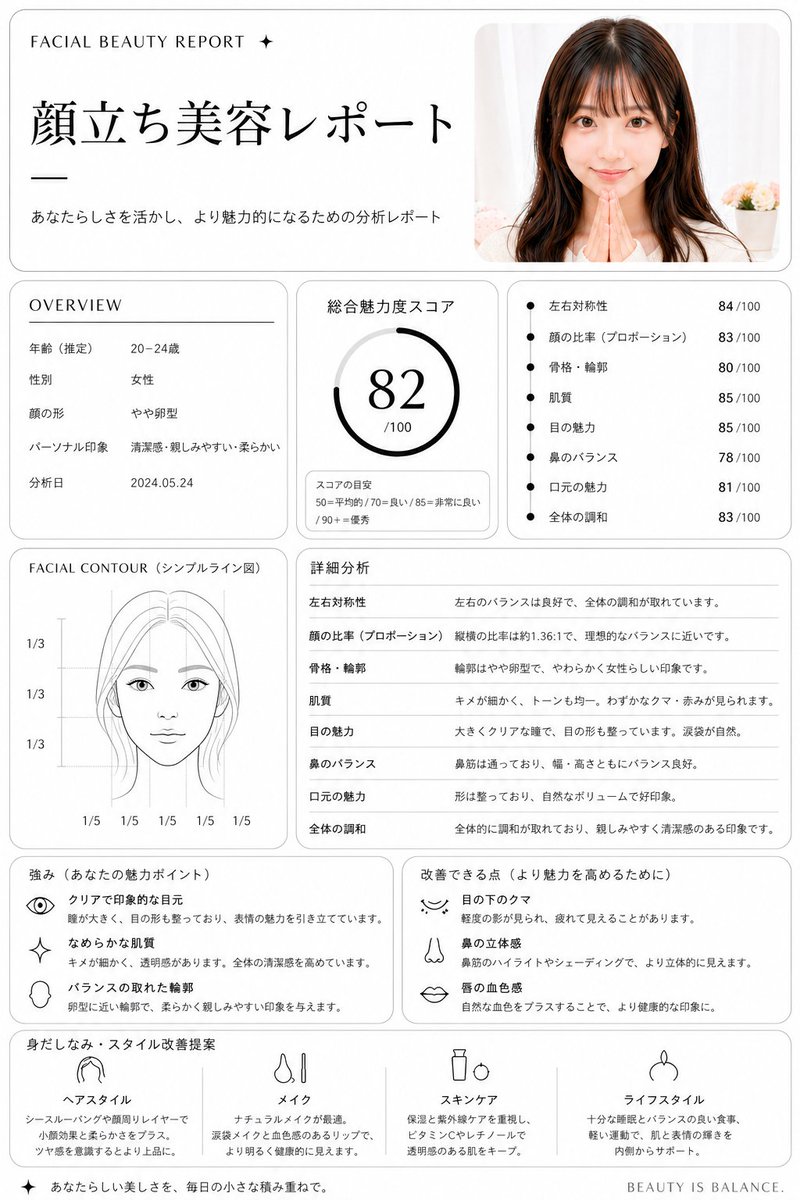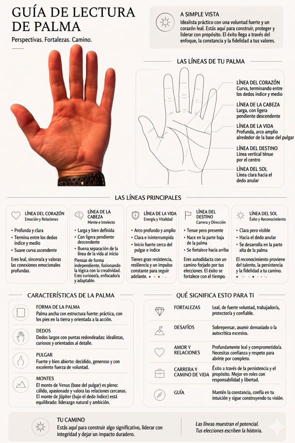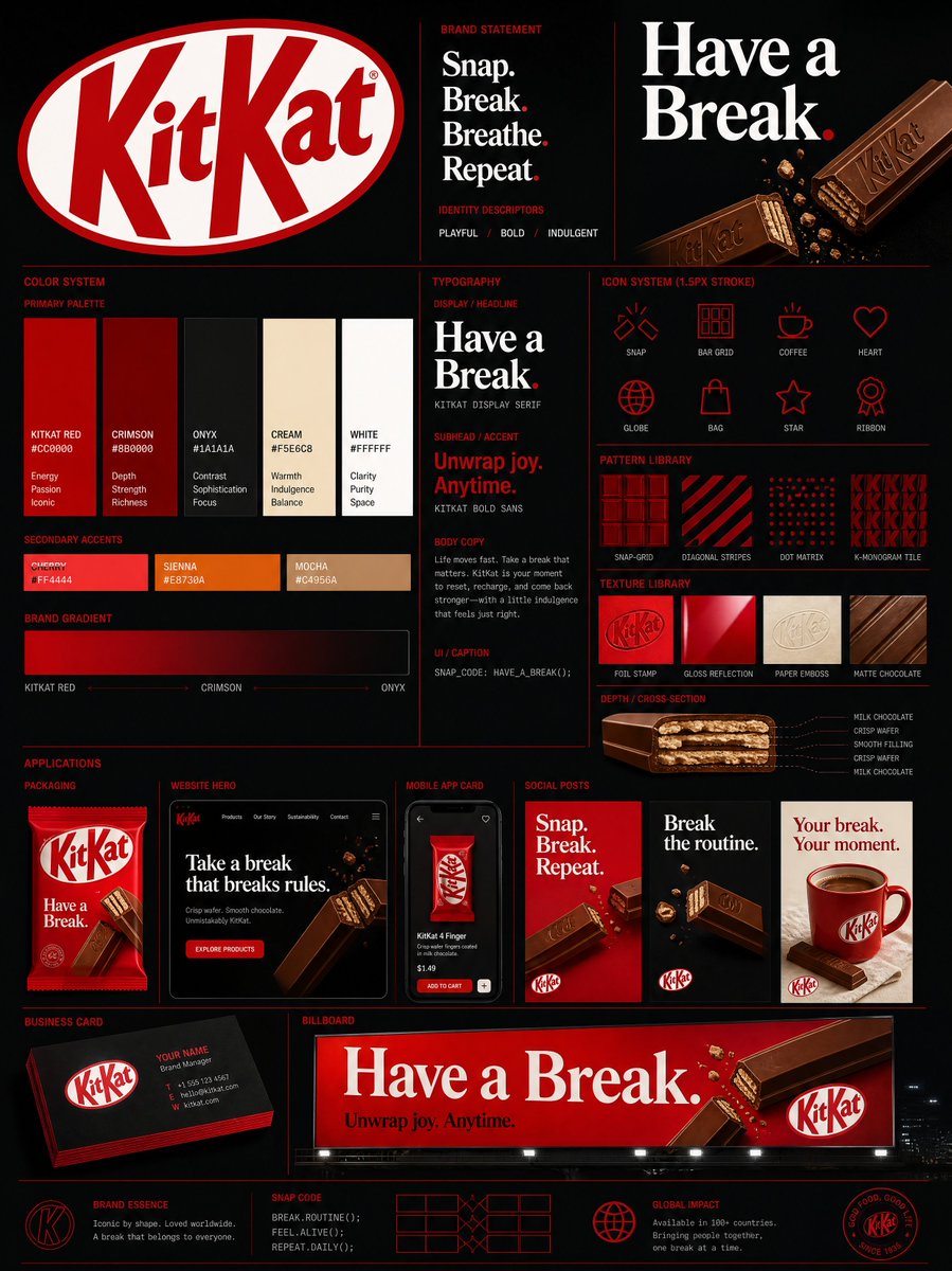
Bild-Prompt Branding & UI Anpassbar
Diagonales Typografie-Poster für Ausstellungsdesign
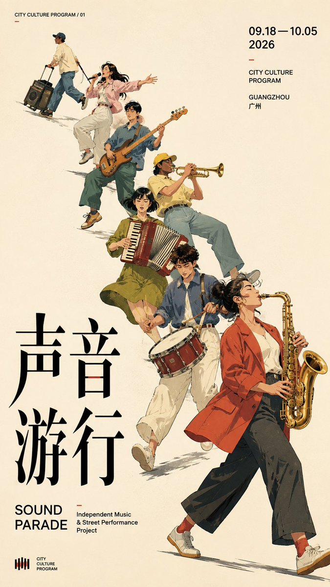
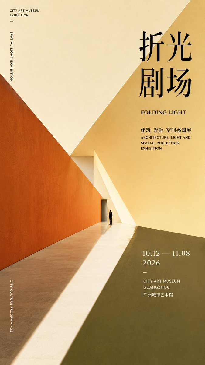
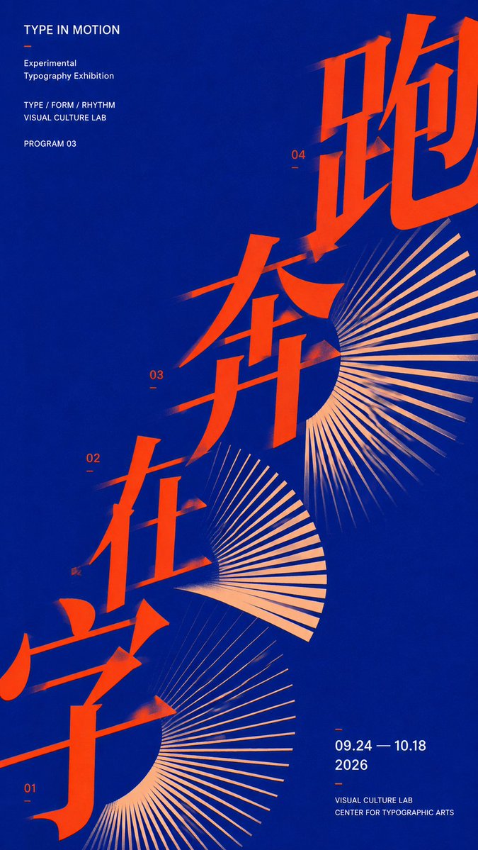
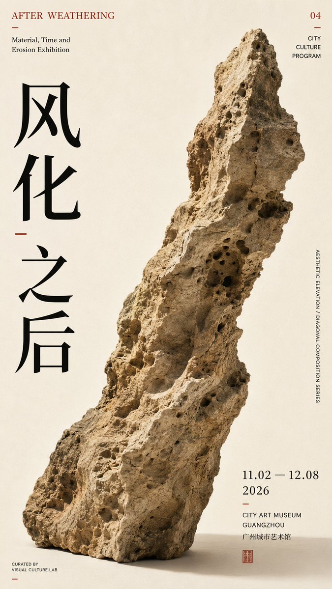
Ein 9:16-Poster, das auf einer starken diagonalen Achse aufgebaut ist. Überdimensionale Typografie, Figuren und offene Fläche folgen demselben Leseweg. Das Ergebnis wirkt wie ein zurückhaltendes Kulturausstellungsplakat mit echter visueller Spannung.

- Modell
- GPT Image 2
- Typ
- 4 Bilder
- Seitenverhältnis
- 9:16
- Geteilt
- 7. Aug 2026
- Likes auf X
- 292
ThemaChinesischer TitelEnglischer TitelFarbschema
Bild-Prompt
1,763 Zeichen【Theme】: ____ 【Subject type】: group figures / space / typography / single object 【Subject content】: ____ 【Chinese title】: ____ 【English title】: ____ 【Diagonal mode】: group movement / spatial perspective / typographic advance / object tilt 【Main axis direction】: bottom-left→top-right / bottom-right→top-left 【Color scheme】: ____ 【Date / institution】: ____ 【Ratio】: 9:16 Generate a diagonal-composition poster with a strong sense of design. First establish a clear diagonal visual axis, then organize the subject, typography, and negative space around this axis, rather than piling up decorative elements first. Let the subject itself create the diagonal momentum: group type uses figures' action, scale, and arrangement to form continuous diagonal movement; spatial type uses architectural cuts, perspective, and light and shadow to form diagonal convergence; typography type uses large text advancing along the diagonal axis, enlarged, cropped, and overlapped; single-object type uses the object's own outline, center of gravity, and tilted posture to naturally form the diagonal. Keep only one main visual direction across the whole image; other elements only follow or balance, creating no new visual competition. The subject carries the main visual weight, keeping 25%–40% negative space. The Chinese title carries the visual center, while small English text and date info are concentrated in 1–2 information zones. Limit colors to 2–4, enhancing tension through scale, cropping, overlapping, and asymmetric layout. The point is not to "draw a diagonal line," but to have the subject, text, and negative space together form a diagonal reading path. Editorial Graphic Design: mature, restrained, clear, and tense, like a real cultural-exhibition poster.
So geht's
Entscheiden Sie zuerst, ob Ihr Thema eine Gruppe, ein Raum, ein typografisch geprägtes Layout oder ein einzelnes Objekt ist, und füllen Sie dann die Felder in eckigen Klammern mit Ihren eigenen Worten. Die diagonale Richtung belassen Sie wie beschrieben. Der Prompt wurde als GPT-Image-2-Prompt geteilt, daher lassen Sie die chinesische und englische Titelzeile in ihren Lücken, damit die Typografie bewusst wirkt. Behalten Sie die Anweisung zu 25 bis 40 Prozent Negativraum bei, denn genau diese offene Fläche lässt die Diagonale lesbar werden. Das eignet sich gut für Veranstaltungsplakate, Markenmockups oder Galerieankündigungen.
Am 7. Aug 2026 öffentlich auf X geteilt. Alle Rechte an diesem Prompt und seinem Ergebnis liegen beim Creator. Ist das Ihr Werk? Bitten Sie um Aktualisierung oder Entfernung.