

Image prompt Product & Ads Customizable
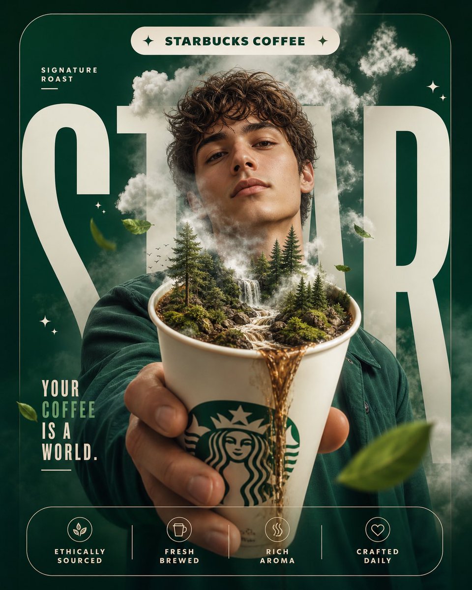
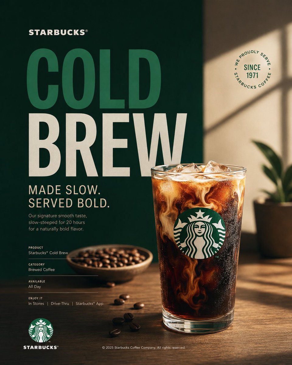
Starbucks Campaign Poster With Hero Coffee Product
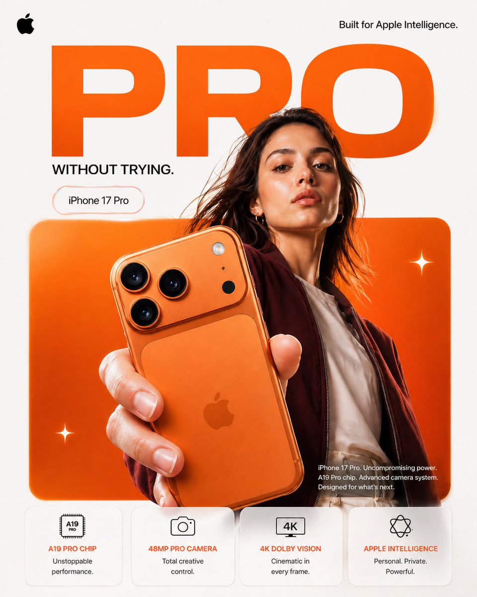
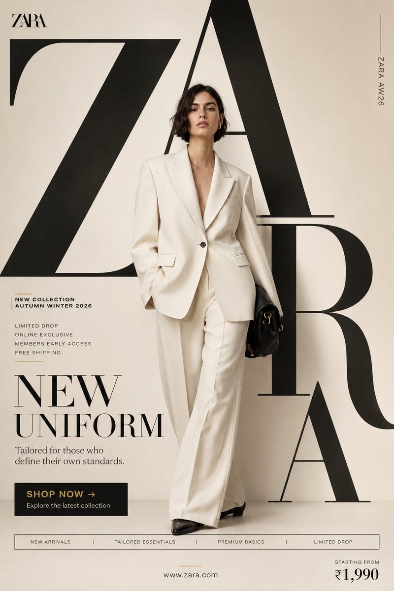
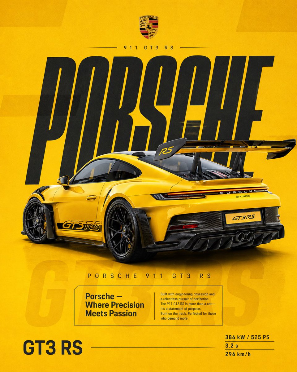
A vertical campaign poster built around a single hero coffee product in Starbucks green, white and black. Editorial type sits beside clean studio photography, so the piece reads as a restrained, premium ad rather than a busy sales flyer.

- Model
- GPT Image 2
- Type
- 3 images
- Aspect ratio
- 4:5
- Shared
- 16 Aug 2026
- Likes on X
- 42
Image prompt
1,773 charactersAct as a Senior Brand Art Director, Editorial Poster Designer, and award-level Visual Identity Designer creating a premium vertical promotional poster for Starbucks. The final artwork must feel like a professionally art-directed advertising campaign and a Behance-featured graphic design project — sophisticated, concept-driven, commercially believable, visually restrained, and executed with exceptional typography, photography, composition, and brand consistency. The poster must be deeply rooted in Starbucks’ real brand identity — its documented colors, typography character, Siren identity, coffee culture, packaging language, campaign history, product presentation, and contemporary visual expression. IMPORTANT LIMITATION: Do not attempt to generate real identifiable people by name. Use a realistic fictional figure only when a human presence strengthens the concept. The figure must look natural, contemporary, and completely consistent with Starbucks’ visual world. [Includes PHASES 0–11: brand intelligence with strict brandbook accuracy; color system using Starbucks Green #006241, White #FFFFFF, Black #000000; typography character; real campaign language only; documented brand facts; 4:5 vertical poster architecture with NO split screen, NO vertical division, NO two-panel composition, as ONE unified visual composition; hero product at 35–55%; conceptual art direction; 2–5 word headline typography; product+typography integration; informational micro-typography; logo signature and placement; premium commercial photography and material rendering; composition principles with clear hierarchy; Behance-featured quality; tech specs — 4:5 vertical aspect ratio, no fake slogans, no invented brand facts, no identifiable real people, no excessive effects.]
How to use it
Swap the headline and the product name first, keeping the short two to five word line so the typography stays strong. The green, white and black palette and the restrained layout carry the look, so keep them if you want the brand feel. It was shared as a GPT Image 2 prompt, and it works well as a social post, print mock-up or portfolio piece in 4:5.
Shared publicly on X on 16 Aug 2026. All credit for this prompt and its result goes to its creator. Is this yours? Ask for an update or removal.