Prompt studio
Make “Spatial Typography Poster With Oversized Letters in Architecture” yours
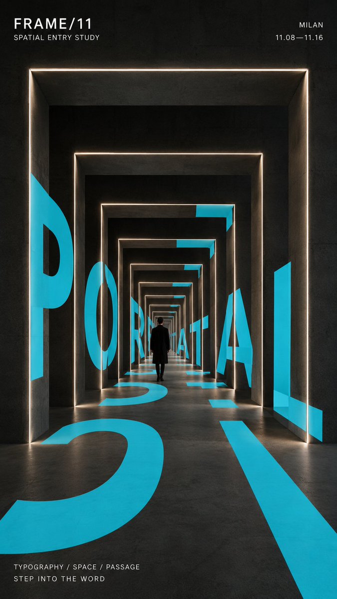
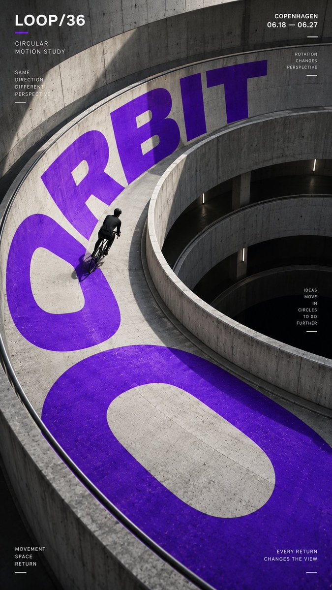
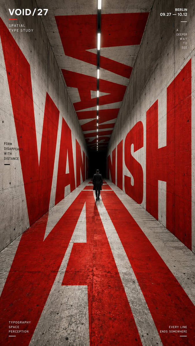
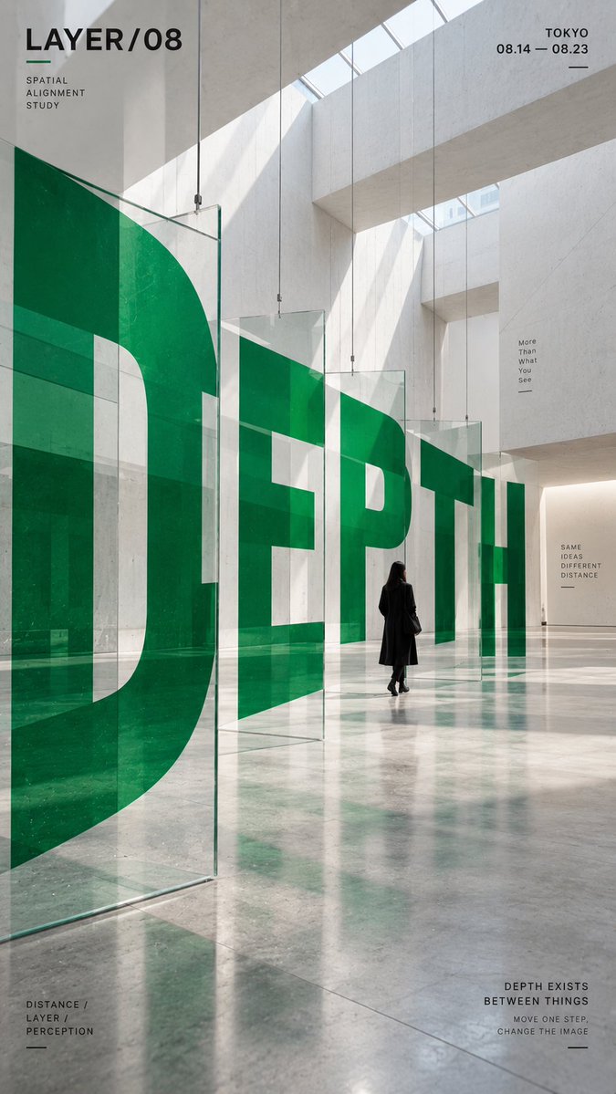
Oversized letters wrap, curve and recede through a real-looking building so the word reads cleanly from one viewpoint. A single accent color cuts through neutral concrete and black, and a small figure gives the scale.
 Prompt by @MrLarus
- Fill in the blanks below.
- Watch the prompt update on the right.
- Copy it, or open it in an image tool.
Image prompt
CORE WORD: [e.g. ORBIT / PORTAL / VANISH / DEPTH] PROJECT NAME: [brand / exhibition / campaign name] SPATIAL STRUCTURE: [spiral ramp / nested frames / tunnel / layered panels / other] SCENE: [architectural environment] SUBJECT: [small human figure / cyclist / none] MAIN COLOR: [one strong accent color] SUPPORTING TEXT: [date / location / short tagline] FORMAT: 9:16 vertical poster Create a contemporary perspective typography poster where oversized type becomes part of the physical space instead of simply sitting on top of the image. Build one clear spatial system first, then make the typography strictly follow its geometry, perspective, curvature, depth and surface changes. The main word should occupy roughly 35–55% of the composition and act as the primary visual structure. Depending on the chosen spatial structure, allow the letterforms to: * wrap around curved architecture, * continue across floors and walls, * pass through repeated frames, * or split across multiple depth layers and visually realign from one specific viewpoint. The typography must feel physically integrated into the environment, with correct scale, perspective, occlusion and surface contact. From the intended camera angle, the word should remain recognizable and visually powerful even if individual letterforms are distorted by the architecture. Use a restrained palette with one strong accent color against neutral concrete, black, white or architectural materials. Keep the color fields clean, solid and graphic rather than glossy, neon or heavily textured. If a person is included, keep them relatively small and use them as a scale reference. They should naturally walk, ride or move through the typographic space rather than pose for the camera. Add only a small amount of secondary editorial information such as project name, location, date and one short thematic line. Keep it clearly subordinate to the main word. Overall style: experimental typography, spatial graphic design, contemporary architecture, editorial poster, installation art, strong depth, clean hierarchy, high-impact composition.
Prompt shared on X by @MrLarus. All credit goes to its creator.
More prompts you can customize
 Nordic-Style Japanese Web Studio Design Board
 Monoline City Street Travel Poster in Line Art
 Tokyo Street Life Line-Art Travel Poster
 Black-and-White Facial Beauty Report Layout
 Palm Reading Guide Outline in Black and White
 Add your photoBrand Identity System Poster on Dark Background
 Add your photoLogo-Based Brand Identity Board With Palette and Mockups
 Minimal Line Illustration With Color Accents