

Prompt studio
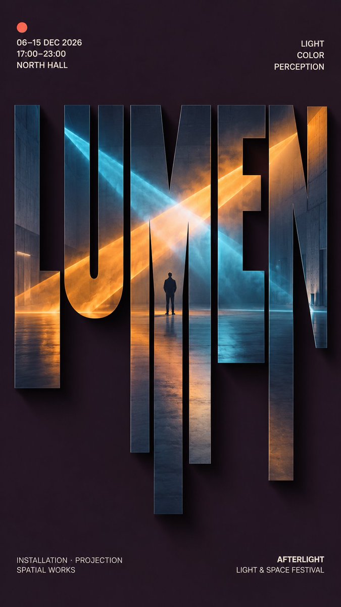
Make “Sliced Photo Typography Poster for Editorial Events” yours
A tall editorial poster where one large centered word is filled with a single continuous photograph. Lower strokes stretch into vertical slices that carry the same scene downward, so the letters read as a landscape of image and type.
 Prompt by @MrLarus
- Fill in the blanks below.
- Watch the prompt update on the right.
- Copy it, or open it in an image tool.
Image prompt
【MAIN WORD】: {4–8 letter uppercase keyword} 【PROJECT】: {exhibition / festival / cultural event / editorial} 【SUBJECT】: {one complete photographic scene} 【BACKGROUND】: {color} 【PALETTE】: {main colors} 【TYPE STYLE】: {bold grotesk / geometric sans / slab serif} 【TOP LEFT】: {date / time / venue} 【TOP RIGHT】: {3 short concept words} 【BOTTOM LEFT】: {supporting information} 【BOTTOM RIGHT】: {organization / event name} 【FORMAT】: 9:16 vertical Create a high-end editorial poster using vertical sliced typography. Place 【MAIN WORD】 large at the center, occupying about 75–85% of the width. Keep the word bold, clearly readable, and visually dominant. Embed one single continuous photograph of 【SUBJECT】 inside the entire word. Every letter must reveal a different part of the same image, with major visual lines such as light beams, coastlines, architecture, circular forms, roads or objects continuing naturally across the letters. Keep roughly the upper 40–45% of the letterforms intact. Extend selected lower strokes downward into 5–7 vertical sections with varied short, medium and long lengths. The extensions must grow naturally from the original letters and should never look like random rectangles or barcode strips. Continue the same photograph through all extended sections. Place the strongest visual focus around the central letters and use one clear continuous feature to connect the whole composition. Add a subtle soft shadow behind the typography, slightly offset to the lower right, creating a restrained floating-paper effect. Use a clean 【BACKGROUND】 with generous negative space and keep most visual complexity inside the type. Apply 【PALETTE】 to the embedded photography with one small accent color if needed. Arrange supporting information around the composition: Top left: 【TOP LEFT】 Top right: 【TOP RIGHT】 Bottom left: 【BOTTOM LEFT】 Bottom right: 【BOTTOM RIGHT】 Use small, precise modern typography for all secondary information. The final piece should feel like a finished exhibition, festival or cultural editorial poster, not a template demonstration.
Prompt shared on X by @MrLarus. All credit goes to its creator.
More prompts you can customize
 Nordic-Style Japanese Web Studio Design Board
 Monoline City Street Travel Poster in Line Art
 Tokyo Street Life Line-Art Travel Poster
 Black-and-White Facial Beauty Report Layout
 Palm Reading Guide Outline in Black and White
 Add your photoBrand Identity System Poster on Dark Background
 Add your photoLogo-Based Brand Identity Board With Palette and Mockups
 Minimal Line Illustration With Color Accents