Image prompt Product & Ads Customizable
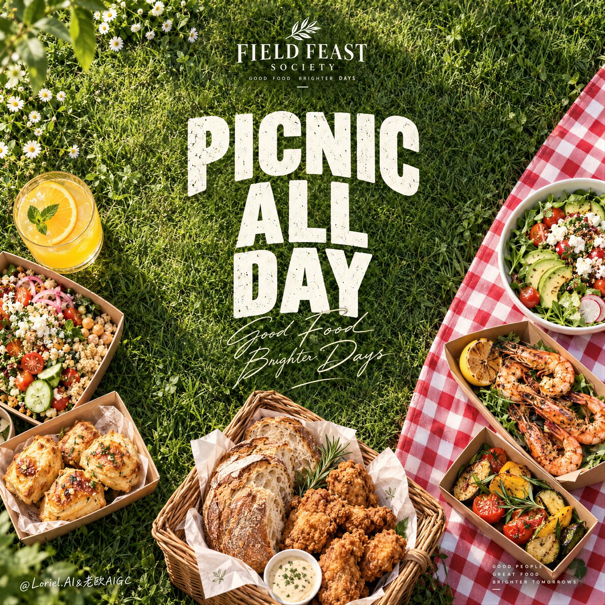
Overhead Picnic Food Ad Poster With Lawn Headline Space
A top-down summer picnic poster with a wide, sunlit grass field left open for a bold headline. Curated food clusters frame the edges, and a red-and-white checked cloth adds one graphic accent.

- Model
- GPT Image 2
- Type
- Image
- Aspect ratio
- 1:1
- Shared
- 14 Sep 2026
- Likes on X
- 4
Brand nameHeadline textHeadline text
Image prompt
5,541 charactersCreate a Cannes-level ultra-premium lifestyle food advertising poster for a fictional outdoor dining house called FIELD FEAST SOCIETY, preserving the exact structural logic of a top-down picnic campaign while merging narrative warmth, forensic food realism, and curatorial restraint. The composition is vertical and highly controlled: a lush overhead grass field fills most of the frame as a generous negative-space canvas, one bold central headline occupies the open lawn, curated food clusters frame the lower left and lower right edges, a red-and-white picnic cloth enters from the right as a strong graphic accent, and a minimal brand signature sits near the top. The final image must feel social, sunlit, and elevated, not casual clutter. Core composition: use a strict top-down overhead camera angle so the grass reads as one continuous living backdrop. Reserve the central lawn area as a clean typography field, framed naturally by the food groupings below. On the lower-left side, arrange a refined picnic spread built from takeaway trays, bowls, small boxes, and a glass of citrus juice. On the lower-right side, let a folded red-and-white checked picnic cloth enter the composition diagonally, supporting a second cluster of fresh prepared dishes. Near the lower center, place one basket or tray containing rustic bread and golden fried comfort-food pieces, bridging the two sides. Keep the composition open and breathable, with the title space remaining dominant. Orbit atmosphere: the poster should feel like an invitation into a carefully staged summer gathering. The empty grass in the center is not blankness; it is social anticipation. The food clusters should suggest warmth, sharing, and open-air pleasure without feeling noisy. The scene must carry the emotional tone of an ideal afternoon picnic remembered at its most beautiful: fresh light, relaxed abundance, and a sense of togetherness designed with editorial precision. Transit realism: render every material with premium commercial accuracy. The grass must show layered blade direction, subtle shadowing, natural density variation, and healthy sunlit green tones. Fried items should have crisp irregular crusts with believable oil sheen. Bread must show rustic crust cracking and soft interior crumb. Salads should look fresh and hydrated, with visible vegetable cuts, dressing gloss, herb textures, and chilled bowl surfaces. Pastries or baked bites should show flaky layers, browned edges, and soft fillings where visible. The juice glass should carry clean reflections, liquid density, and soft refraction. The picnic cloth must show cotton weave, fold memory, and soft daylight shadowing. Port restraint: simplify the picnic abundance into two primary curated clusters plus one bridging bread-and-fried-food basket. Avoid too many bowls, utensils, napkins, and decorative extras. Let the grass field, the graphic cloth accent, the central headline, and the premium food styling do the work. Keep all secondary elements tightly edited so the poster feels luxury rather than busy. Typography and layout: in the center field of grass, place a large stacked English headline such as “PICNIC / ALL / DAY” or “GATHER / OUT / HERE,” rendered in bold distressed white display type, with one elegant handwritten script word or phrase crossing the lower portion for softness. The typography must feel sunlit, tactile, and art-directed, not like a generic flyer. At the top center, place a small premium logo lockup for FIELD FEAST SOCIETY. If any extra text exists, keep it to one restrained supporting line or an ultra-minimal descriptor set near the lower edge. The composition must remain image-led and typography-led, not overloaded with copy. Lighting: use bright natural sunlight from the upper left, with crisp but soft-edged outdoor shadows. The grass should show depth without going muddy. The food must feel freshly lit and appetizing, with delicate highlights on sauces, crisp coatings, pastry tops, salad moisture, juice glass, and ceramic or paper containers. Maintain a clean, optimistic daylight language with no heavy artificial contrast and no black dead zones. Color hierarchy: 60% natural grass green and botanical tones; 30% warm beige breads, golden fried food, neutral takeaway packaging, and white headline lettering; 10% red-and-white cloth accents, citrus yellow juice, and small vegetable highlights. The palette must feel fresh, summery, generous, and premium. Design intent: the final poster must preserve the exact impact logic of the source image—overhead grass field, central text void, edge-framed picnic abundance, one strong picnic-cloth accent, and a minimal logo zone—while merging Orbit atmosphere, Transit realism, and Port minimal curation into one resolved luxury outdoor dining campaign. The grass field becomes the stage, the food frames the invitation, and the typography turns the picnic into a lifestyle statement. Rendering style: ultra-photoreal lifestyle food advertising, overhead picnic editorial poster, premium outdoor dining campaign, natural sunlight realism, elegant negative space, curated abundance, world-class commercial retouching, immaculate print-ready finish. Negative prompt: copied original text, real brand names, cluttered picnic mess, low-detail food, muddy grass texture, flat overhead lighting, warped bowls, plastic-looking bread, fake fried texture, unreadable typography, cheap flyer styling, too many props, random cutlery, distorted perspective, dirty blanket, black blotches, watermark
How to use it
Start with the prompt's core layout: the overhead camera and the empty central lawn are what make the poster work, so keep them. It was shared as a GPT Image 2 prompt. To make it yours, swap the headline words in the stacked text or the fictional house name, and adjust the food list to match a cuisine you like while keeping the two framing clusters and the bread basket in the middle.
Shared publicly on X on 14 Sep 2026. All credit for this prompt and its result goes to its creator. Is this yours? Ask for an update or removal.