Image prompt Product & Ads Customizable
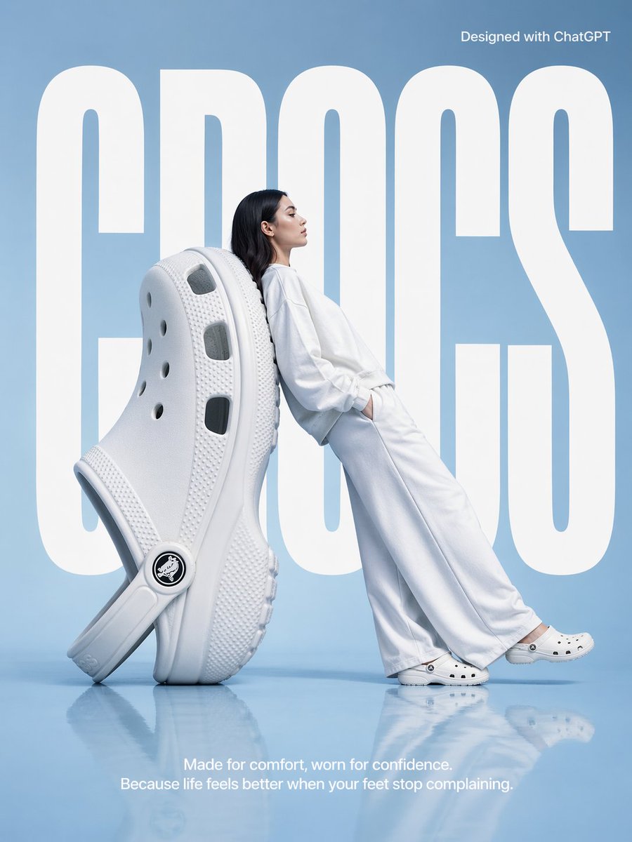
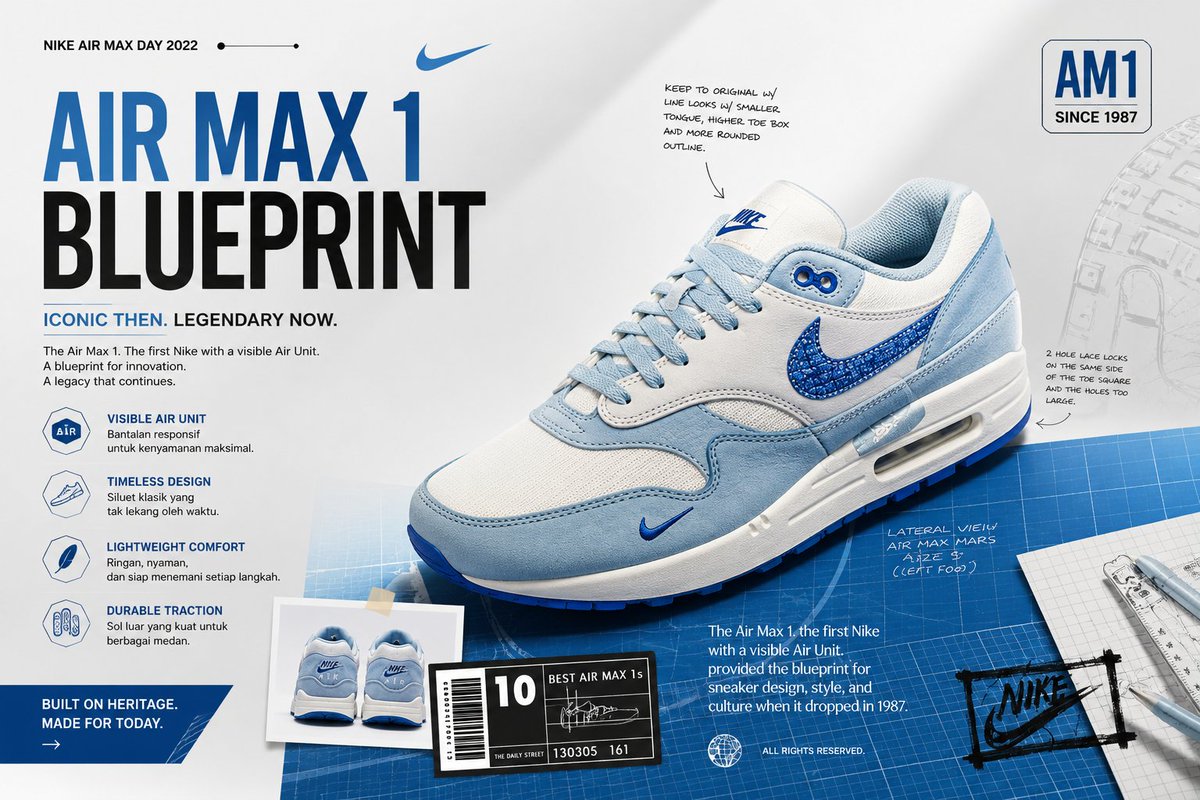
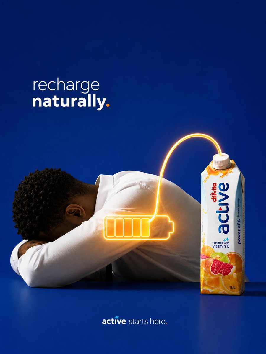
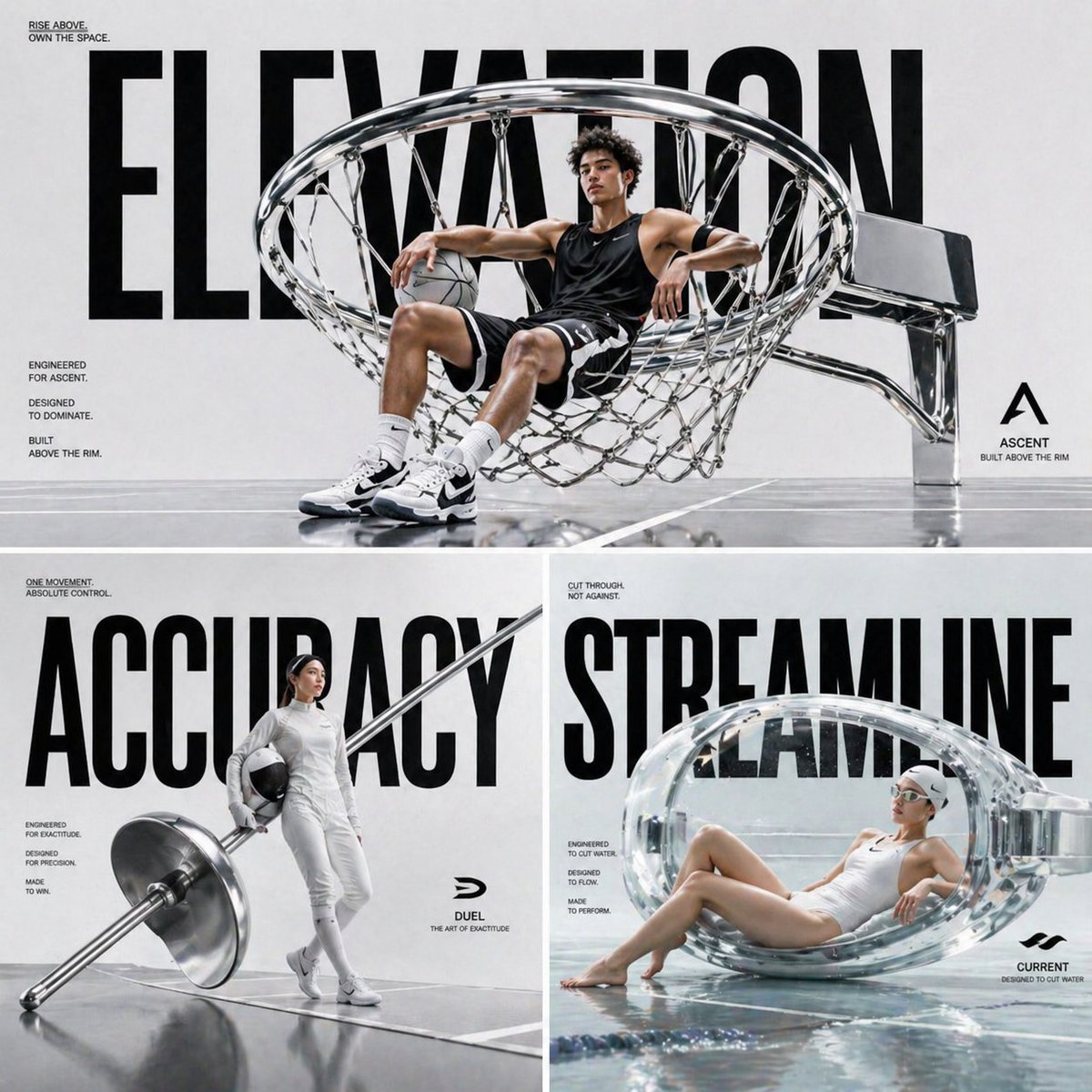
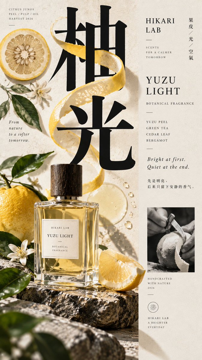
Off-Axis Brand Editorial Poster With Giant Headline
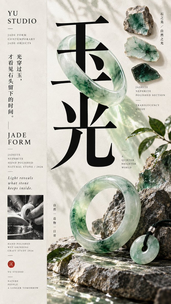
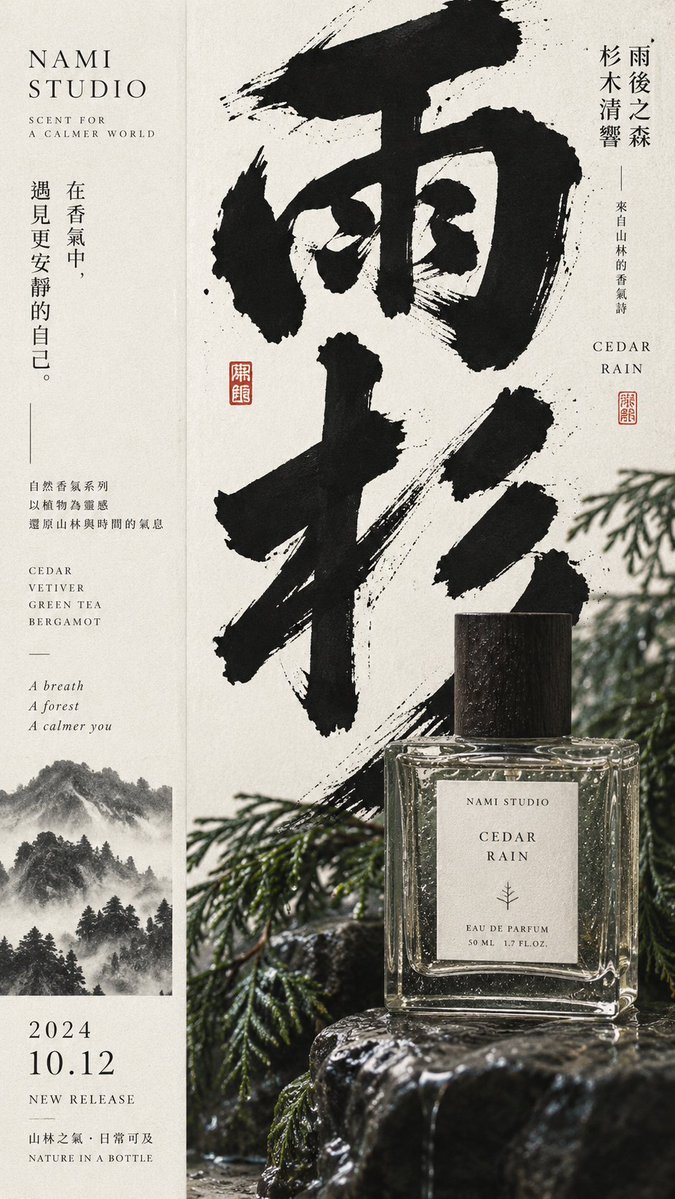
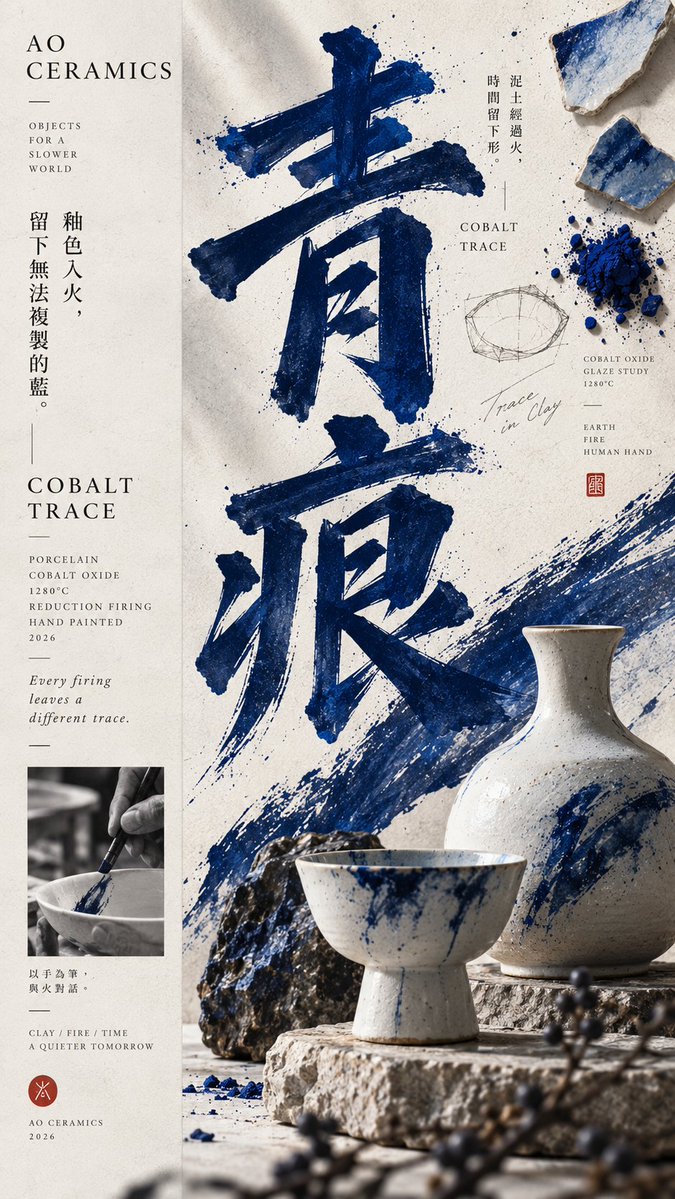
A tall poster split roughly one third quiet information and two thirds dense visual field, where an oversized headline, a product, and raw materials overlap in layers. The result reads as a campaign poster from a distance and a material study up close.

- Model
- GPT Image 2
- Type
- 4 images
- Aspect ratio
- 9:16
- Shared
- 11 Sep 2026
- Likes on X
- 76
Image prompt
2,853 characters【Theme】{fill in, e.g.: Pomelo Light / Jade Light / Green Trace} 【Brand Name】{fill in} 【Product / Subject】{fill in, e.g.: perfume, jade bracelet, ceramics, tea set} 【Main Color】{fill in} 【Auxiliary Materials】{fill in, e.g.: plants, raw stone, glaze shards, peel, wood} 【Large Headline】{fill in, 2–4 characters} 【Composition Direction】{1:2 / 2:1} 【Aspect Ratio】{default 9:16} Generate a high-end contemporary graphic editorial poster with a distinct 1:2 off-axis composition: roughly 1/3 is a low-density information axis and about 2/3 is a high-density main visual field, which can also be mirrored left-right. Both sides share the same background and visual world; do not use obvious borders, hard-cut color blocks, or traditional two-column templates. The main visual area contains a giant typography anchor, a real product or core subject, 1–2 auxiliary material elements, a small material study or process sample, and a few dynamic elements that connect text and object. Let text, product, and materials naturally overlap, interweave, and form front-back relationships, rather than simply placing image and text side by side. The giant headline must carry the primary compositional role, large enough to stay clear when scaled down; the product or subject acts as the second visual layer, forming a clear scale difference and spatial interaction with the headline. Raw material slices, process samples, raw stone, plants, glaze shards, and process photography may be added, but must be clearly weaker than the main headline and subject, never forming a third column or even distribution. Keep the information axis restrained, with only brand name, product name, material, craft, year, and one or two real thematic copy lines. Avoid lorem ipsum, random text, numbering, copyright info, and meaningless decorative text. Follow the principle of "strong form from afar, rich information up close": at first glance you see the headline, subject, and main color; only when enlarged do you discover material, craft, process, and detail. Information can be rich, but visual weight must have a clear hierarchy. Keep colors within 2–4 core hues, using one dominant color to build a memory point; a clean background with slight paper or print texture, but no yellowing, mottling, heavy grain, or aging. The final image should sit between a premium brand campaign, a contemporary East Asian editorial poster, product photography, and a material research manual, with real commercial application value and a sense of a complete work. Avoid: central symmetry, even column splits, obvious hard left-right cuts, three-column structure, PPT feel, card UI, piling up small images, excessive decorative elements, meaningless text, over-aging, cheap e-commerce feel, CGI plastic material, over-sharpening, star flares, numbering, watermarks, and copyright marks.
How to use it
This prompt is built around placeholders in curly braces, so fill in the theme, brand, product, main color, materials and a two to four character headline before you run it. It was shared as a GPT Image 2 prompt. Keep the 1:2 off-axis layout and the instruction that headline, product and materials interweave, since that layering is what makes the poster feel editorial rather than flat. The result suits a brand launch, a seasonal campaign or a product line sheet.
Shared publicly on X on 11 Sep 2026. All credit for this prompt and its result goes to its creator. Is this yours? Ask for an update or removal.