Image prompt Product & Ads Customizable
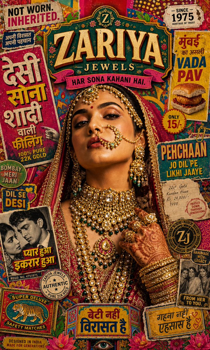
Maximalist Indian Bridal Jewellery Poster Design
A bride in heavy gold jewellery stands sharp against a loud collage of hand-painted Hindi type, truck art and halftone posters. The raw, printed backdrop makes the jewellery look more precious.

- Model
- GPT Image 2
- Type
- Image
- Shared
- 4 May 2026
- Likes on X
- 79
Brand nameTaglineCampaign line
Image prompt
3,511 charactersFORMAT: 4:5 vertical SMM poster, ultra-high resolution (8K), 300 DPI, luxury jewellery × desi maximalism hybrid campaign (print + digital) STYLE: Desi street maximalism × Indian pop culture collage × vintage bazaar posters × truck art × halftone print × bold color blocking × chaotic layering × luxury editorial fusion BRAND NAME: ZARIYA JEWELS TAGLINE: “Not worn. Inherited.” CAMPAIGN LINE: “Har sona kahani hai.” PHASE 1 — CONCEPT REFRAME: Luxury doesn't always whisper. In India, it celebrates loudly. Concept: high jewellery meets street nostalgia. Narrative: a bride is not just royal — she is rooted in culture, chaos, memory, and everyday India. Emotion: nostalgia × boldness × cultural pride × loud beauty. PHASE 2 — SUBJECT & VISUAL MIX: Primary subject: Indian bride (strong gaze, slightly rebellious, non-traditional attitude). Styling: full bridal jewellery but styled slightly raw (less “perfect”, more real). Jewellery: heavy choker (hero), long haar (vertical anchor), nath + matha patti (face framing), bangles stacked aggressively. Pose: close-up, slightly tilted, fills frame (editorial crop). PHASE 3 — DESI MAXIMALISM COLLAGE (KEY): Background becomes a CULTURE WALL: hand-painted Indian typography (देसी, सोना, शादी), street food posters, truck art motifs, matchbox graphics / calendar art, old Bollywood poster textures, religious icon frames (subtle, respectful), bazaar price tags / stamps, halftone dots + offset print misalignment. IMPORTANT: overlap aggressively — nothing feels “clean”. PHASE 4 — COLOR EXPLOSION SYSTEM: Palette: haldi yellow (#E6B800), sindoor red (#C1121F), mehndi green (#386641), indigo blue (#1D3557), hot pink (#FF4D6D), gold (#C9A227). Behavior: flat bold backgrounds + layered textures. Gold rule: jewellery remains the ONLY photorealistic premium element; everything else can feel printed / tactile / slightly imperfect. PHASE 5 — TYPOGRAPHY: Primary: bold Indian display fonts (inspired by street posters). Mix: Latin bold condensed + Devanagari hand-painted style. Text ideas: “ZARIYA”, “SONA”, “PEHCHAAN”, “NOT WORN”, “INHERITED”. Style: slight misalignment, layer overlaps, drop shadows, color blocks behind text. Add sticker-style text labels (cutout feel). PHASE 6 — COMPOSITION CHAOS CONTROL: CENTER: bride + jewellery (anchor). AROUND: explosion of cultural elements. EDGES: text, motifs, posters bleeding out of frame. Depth: foreground → stickers/typography, mid → bride, background → poster collage. Balance: chaos around, clarity at center. PHASE 7 — TEXTURE & PRINT FEEL: Textures: offset print grain, paper folds, ink bleed, dust + scratches, poster tearing edges. Add slight misregistration (CMYK shift effect). But: jewellery stays sharp → contrast = premium. PHASE 8 — LIGHTING STRATEGY: Subject: soft studio lighting (luxury beauty). Background: flat/printed (non-realistic). Effect: bride pops out from chaos. PHASE 9 — BRAND INTEGRATION: Logo: embedded like a stamp or signboard. Placement: top or layered within collage (not floating clean). Add a “Since 1975” style badge. Brand feel: premium but culturally rooted, not distant. PHASE 10 — FINAL OUTPUT: Resolution: 7680 × 9600 px. Hybrid finish: luxury subject × raw desi backdrop. FINAL DIRECTION: “Create a bold desi maximalist jewellery campaign where a powerful Indian bride emerges from a chaotic explosion of street culture, vintage posters, and color — contrasting raw Indian visual energy with hyper-luxurious gold, making heritage feel loud, proud, and alive.”
How to use it
Start with a clear photo of a person or swap in your own subject, since the look depends on a close, tilted crop. It was shared as a GPT Image 2 prompt. Keep the layered backdrop, the halftone and misregistration texture, and the bold colour blocks, because they create the contrast with the sharp jewellery. Swap the brand name and tagline for your own to use it as a campaign poster or social ad.
Shared publicly on X on 4 May 2026. All credit for this prompt and its result goes to its creator. Is this yours? Ask for an update or removal.