Image prompt Product & Ads Customizable
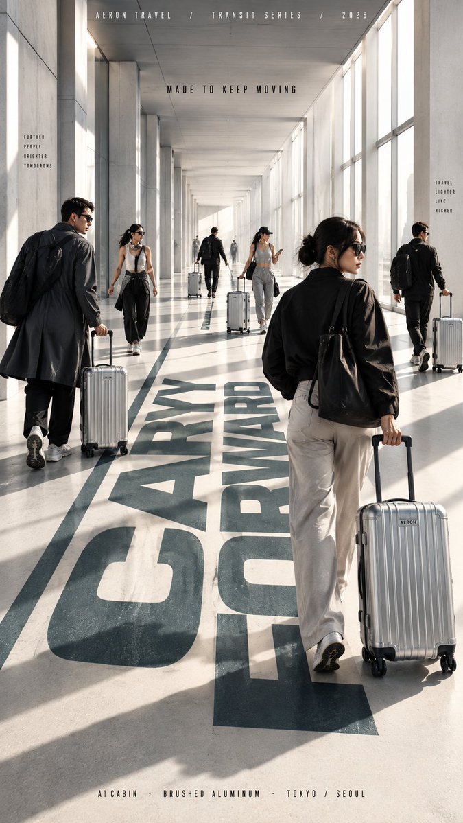
Fashion Campaign Poster With Walking Figures in Architecture
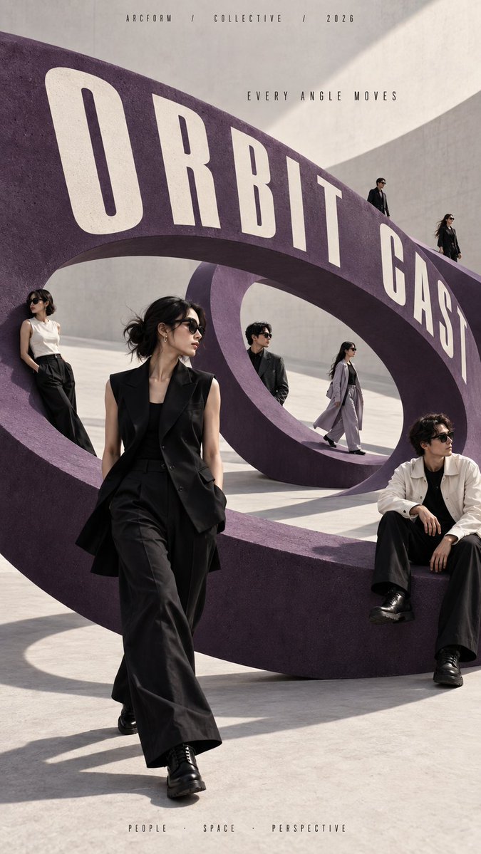
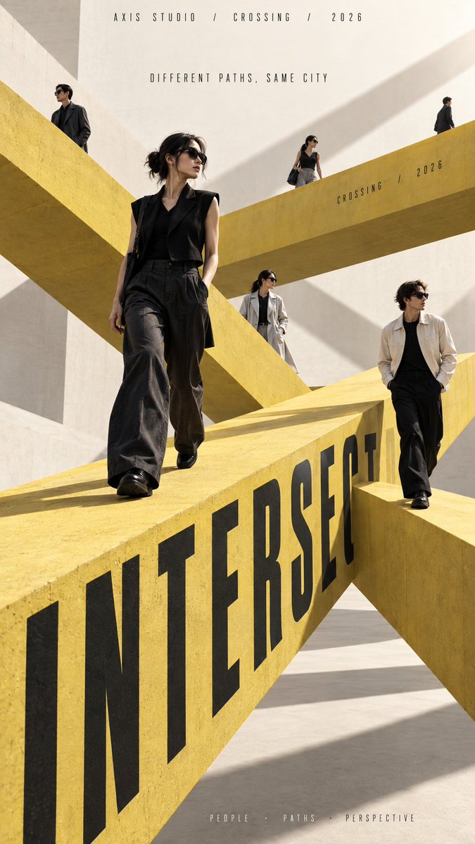
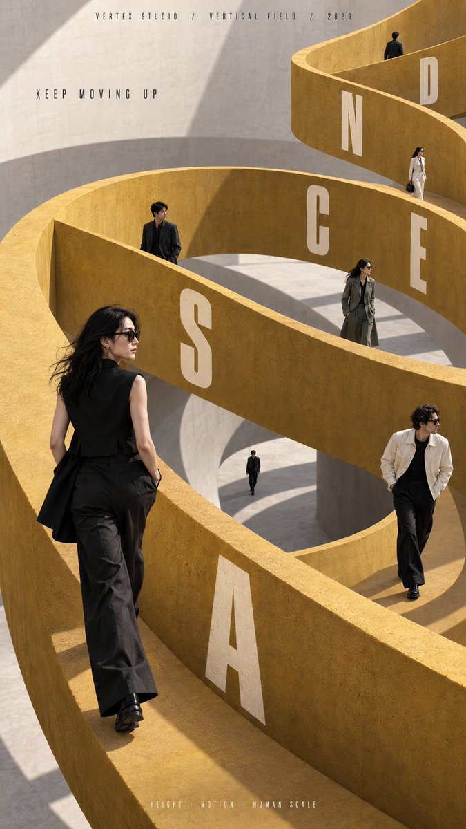
Several people move through a single sculptural path, some close, some far, some half hidden by walls. The architecture ties the crowd, the motion and the headline into one spatial system that reads clearly even at thumbnail size.

- Model
- GPT Image 2
- Type
- 4 images
- Aspect ratio
- 9:16
- Shared
- 15 Sep 2026
- Likes on X
- 32
Brand nameFill inCampaign / seriesMain titleTagline+6 more
Image prompt
2,307 characters[BRAND NAME]: {fill in} [CAMPAIGN / SERIES]: {fill in} [MAIN TITLE]: {fill in} [TAGLINE]: {fill in} [SPATIAL PATH SYSTEM]: {circular ring / crossing paths / spiral ramp / long corridor} [PRIMARY COLOR]: {fill in} [SECONDARY COLOR]: {fill in} [OPTIONAL PRODUCT / PROP]: {none / luggage / fashion accessory / other} [NUMBER OF PEOPLE]: {6–8 adults} [ASPECT RATIO]: {9:16} Create a high-end multi-person editorial campaign poster built around one strong architectural path system. The main idea is movement through space: people should walk, pause, cross, climb, or travel along a circular structure, intersecting paths, a spiral ramp, or a long perspective corridor. All figures must belong to the same coherent perspective field. Place them at different distances, heights, and depths so their scale changes naturally. Avoid evenly spaced people, grids, lineups, or team-photo compositions. Use foreground, midground, and distant figures with clear variation in size and visibility. Make the architecture actively organize the cast. Some figures should appear in front of the path, some behind it, some partially hidden by walls or platforms, and others visible through openings or deeper layers. The space should feel physically connected, not like separate people pasted onto a background. Keep the environment minimal and sculptural. Use one dominant architectural gesture, large clean color fields, strong negative space, realistic daylight, and consistent shadows. The composition should remain bold and readable at thumbnail size. Integrate the main title naturally into the architecture when appropriate: along a curved ring, across a walkway edge, following a spiral wall, or receding into a corridor. Typography must obey real perspective and surface direction rather than floating over the image. Use realistic fashion photography: natural skin texture, believable anatomy, real hair, accurate feet and hands, natural fabric folds, and varied everyday movement. If a product or prop is included, repeat it naturally through the depth of the scene without turning the image into a product catalog. The final result should feel like a real contemporary fashion, travel, lifestyle, or cultural campaign where people, movement, architecture, and typography all belong to the same spatial system.
How to use it
Fill the bracketed fields with your brand, title and palette, and keep the path system line intact so the figures stay locked to one structure. Keep the instruction about varied distances and partial occlusion, since that depth is what makes the crowd feel physical instead of pasted on. The result suits a campaign mockup, a store window concept or a lookbook cover. It was shared as a GPT Image 2 prompt, and the 9:16 ratio fits phone screens and posters.
Shared publicly on X on 15 Sep 2026. All credit for this prompt and its result goes to its creator. Is this yours? Ask for an update or removal.