Prompt studio
Make “Experimental Typography Poster With Layered Geometric Words” yours
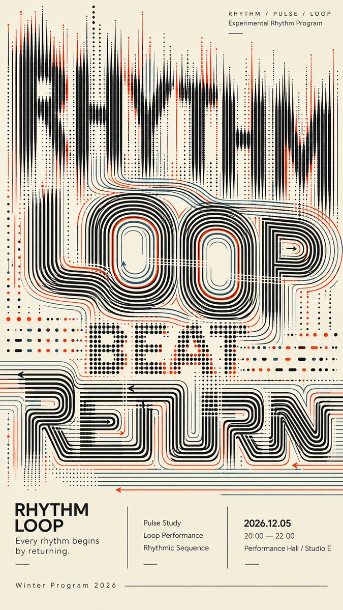
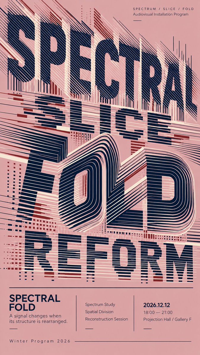
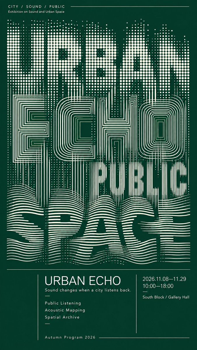
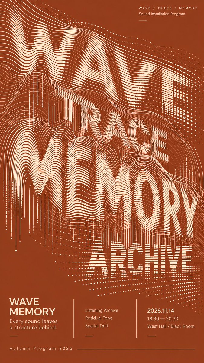
Oversized words are built from loops, sliced bands, dot grids and flowing lines rather than solid letters. Letters stay partly readable while the structures overlap and pass into one another across a restrained two-tone palette.
 Prompt by @MrLarus
- Fill in the blanks below.
- Watch the prompt update on the right.
- Copy it, or open it in an image tool.
Image prompt
TITLE: [poster title] CONCEPT WORDS: [3–4 related words] BACKGROUND COLOR: [color] PRIMARY COLOR: [color] ACCENT COLOR: [color] TYPOGRAPHIC STRUCTURES: [loops / sliced bands / contour lines / dot grids / flowing lines / return paths] EVENT TYPE: [exhibition / cultural program / sound installation / live performance] EVENT INFO: [date / time / venue] FORMAT: 9:16 vertical poster Create a sophisticated experimental typography poster where oversized English words become the main visual composition. Use 3–4 conceptually related words and build each text layer from a different geometric structure rather than applying effects to normal solid typography. Explore systems such as continuous loop contours, sliced horizontal bands, folded line fields, regular dot grids, architectural contour structures, flowing parallel waves, and long return paths. Let the typography overlap, compress, crop, and pass through neighboring layers. Different systems should transition naturally into one another: dots can extend into lines, lines can bend into loops, sliced bands can become folded contours, and flowing traces can gradually dissolve or reorganize. The letterforms should remain partially readable while also functioning as abstract graphic structures. Slightly reduced readability is acceptable when it creates stronger visual design. Use strong density hierarchy: combine highly concentrated regions, medium-density transitions, and deliberate negative space. Avoid filling the entire poster with the same texture. Keep every line, dot, curve, and contour clean, sharp, smooth, and intentional. Maintain consistent spacing and clear directional logic. Avoid accidental broken lines, fuzzy edges, random noise, messy moiré, glitch artifacts, or low-quality AI rendering. Use a restrained color palette with one dominant background color, one primary typography color, and only limited accent colors. Reserve the lower 25%–30% for a refined editorial information section containing the title, a short concept sentence, 2–3 program items, date, time, venue, and program name. Use clean modern sans-serif typography, thin divider lines, asymmetric columns, and a cultural-poster editorial grid. The final poster should work at three distances: a strong abstract composition at thumbnail size, recognizable layered typography at medium distance, and rich line-based detail up close.
Prompt shared on X by @MrLarus. All credit goes to its creator.
More prompts you can customize
 Nordic-Style Japanese Web Studio Design Board
 Monoline City Street Travel Poster in Line Art
 Tokyo Street Life Line-Art Travel Poster
 Black-and-White Facial Beauty Report Layout
 Palm Reading Guide Outline in Black and White
 Add your photoBrand Identity System Poster on Dark Background
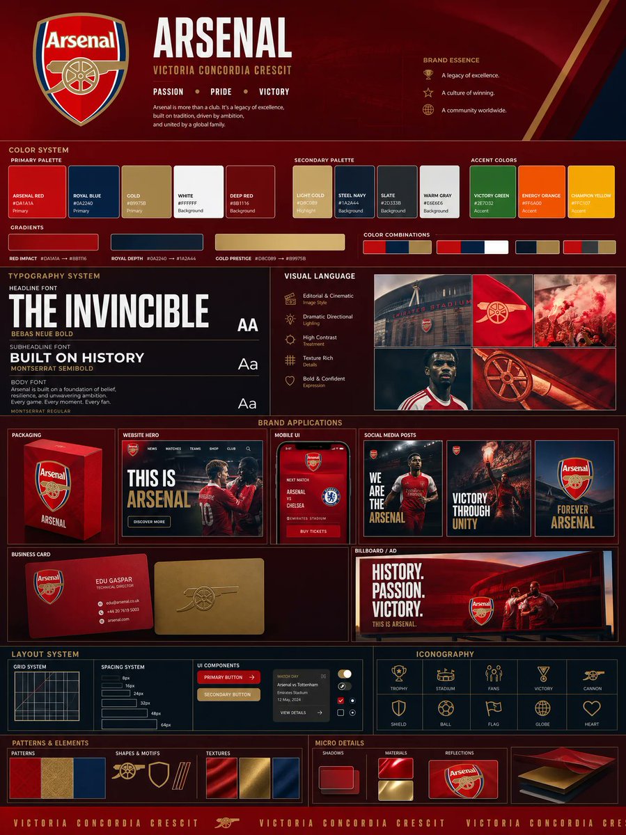 Add your photoLogo-Based Brand Identity Board With Palette and Mockups
 Minimal Line Illustration With Color Accents