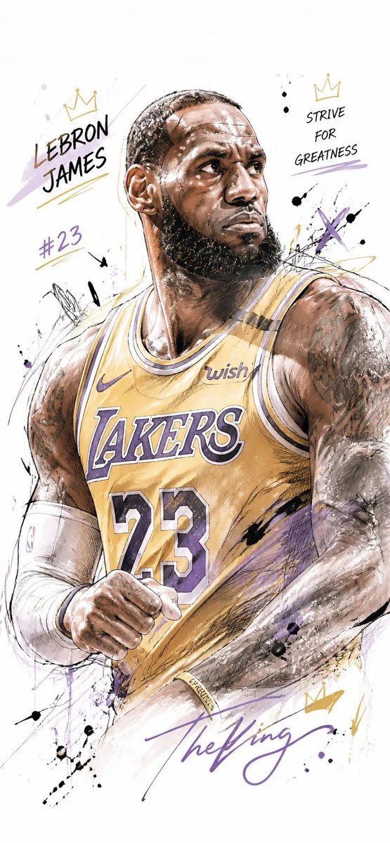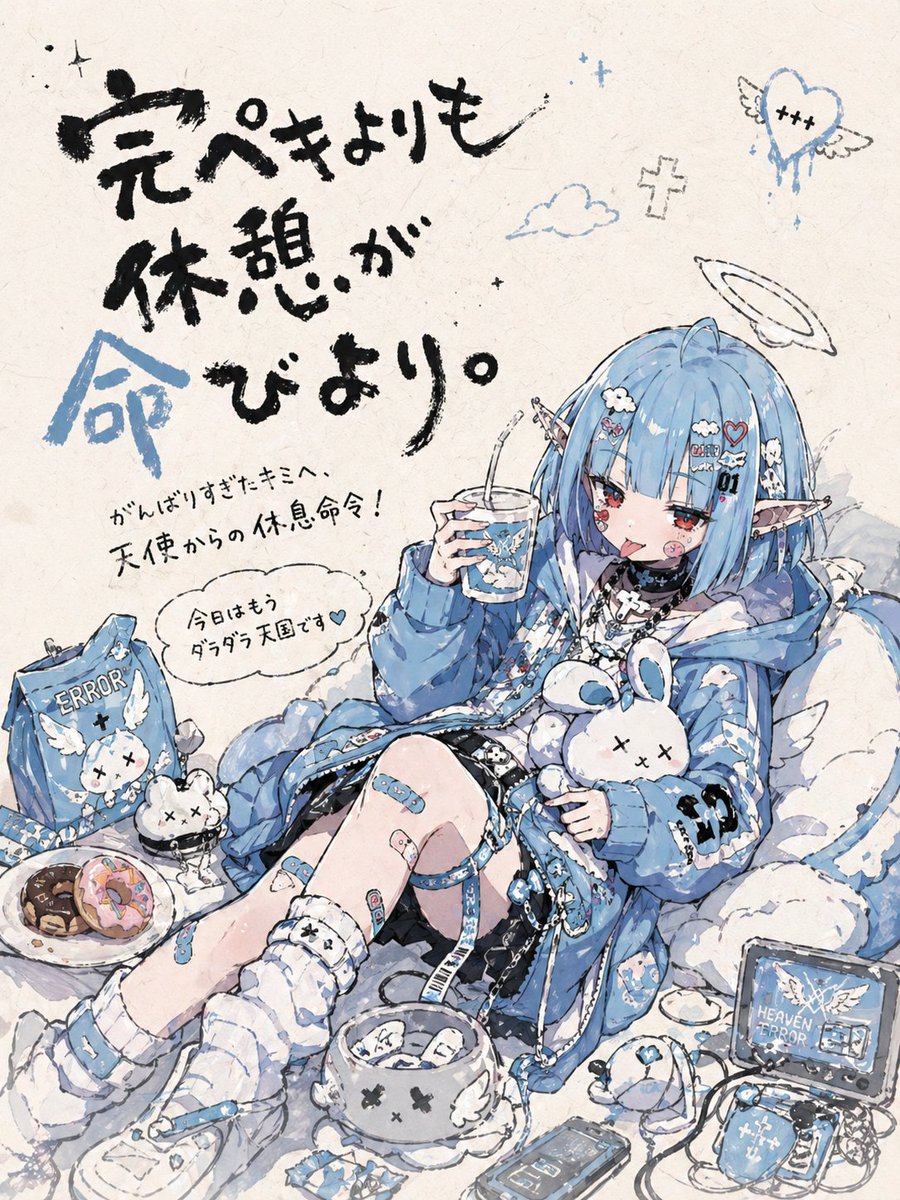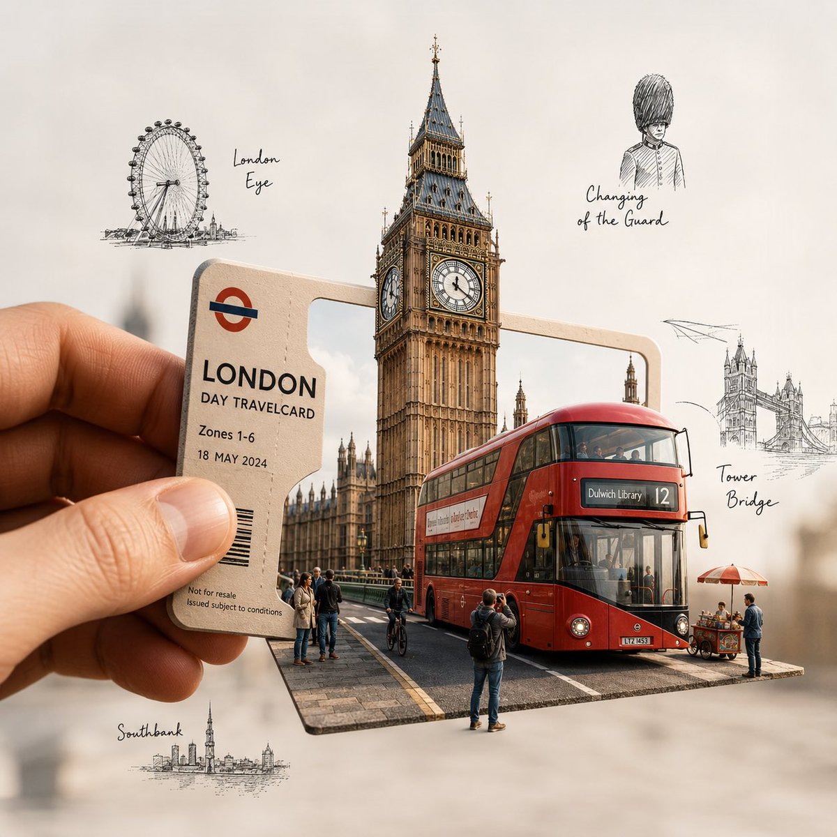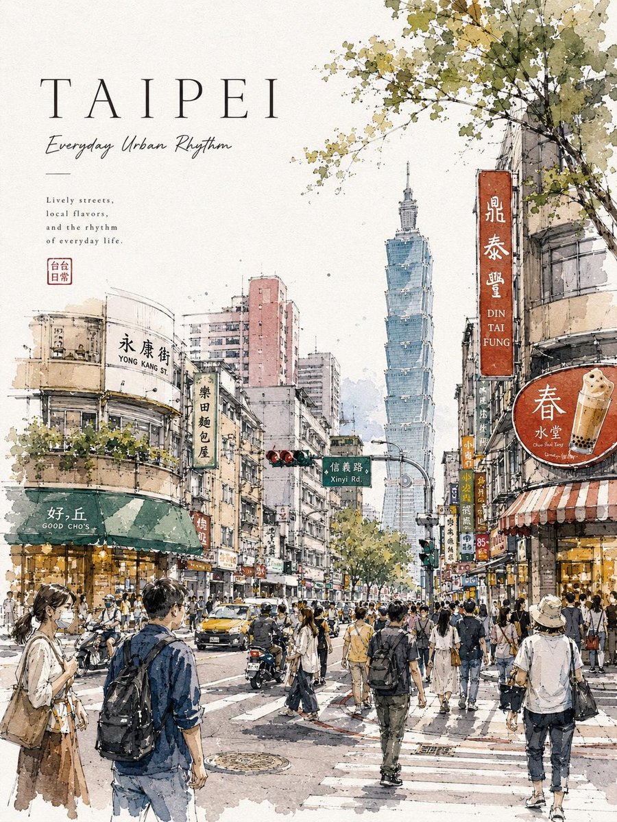
Image prompt Posters & Typography Customizable Add your photo
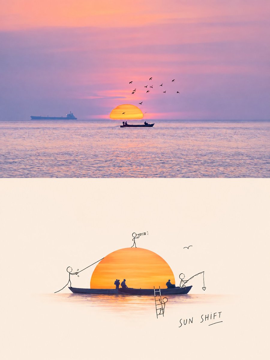
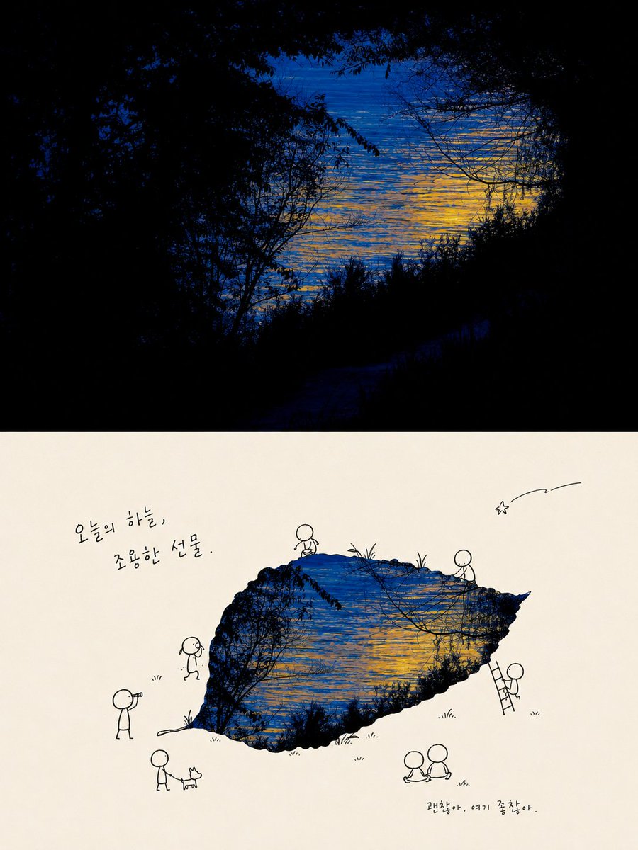
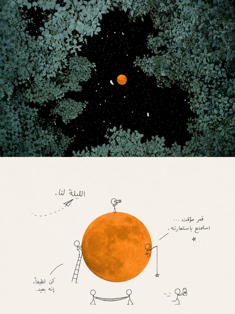
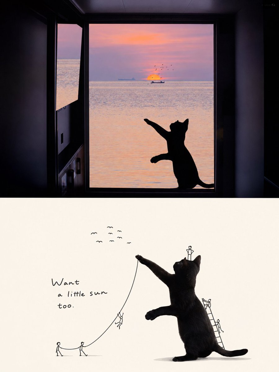
Doodle Stick-Figure Editorial Poster Split Layout
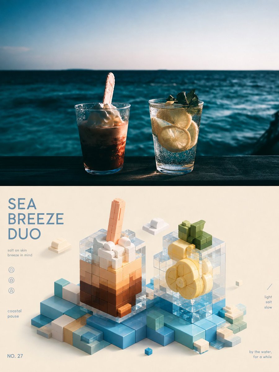
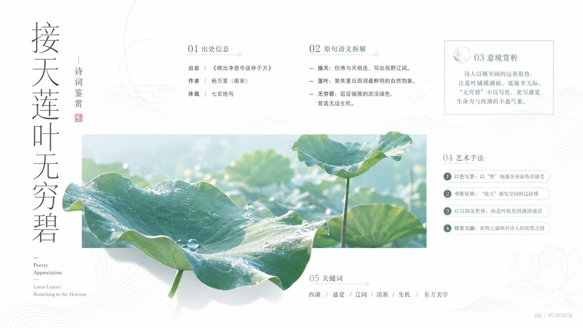
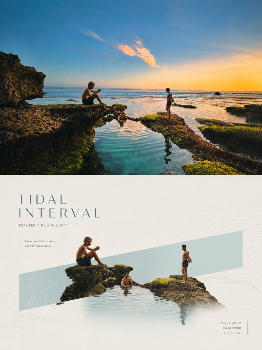
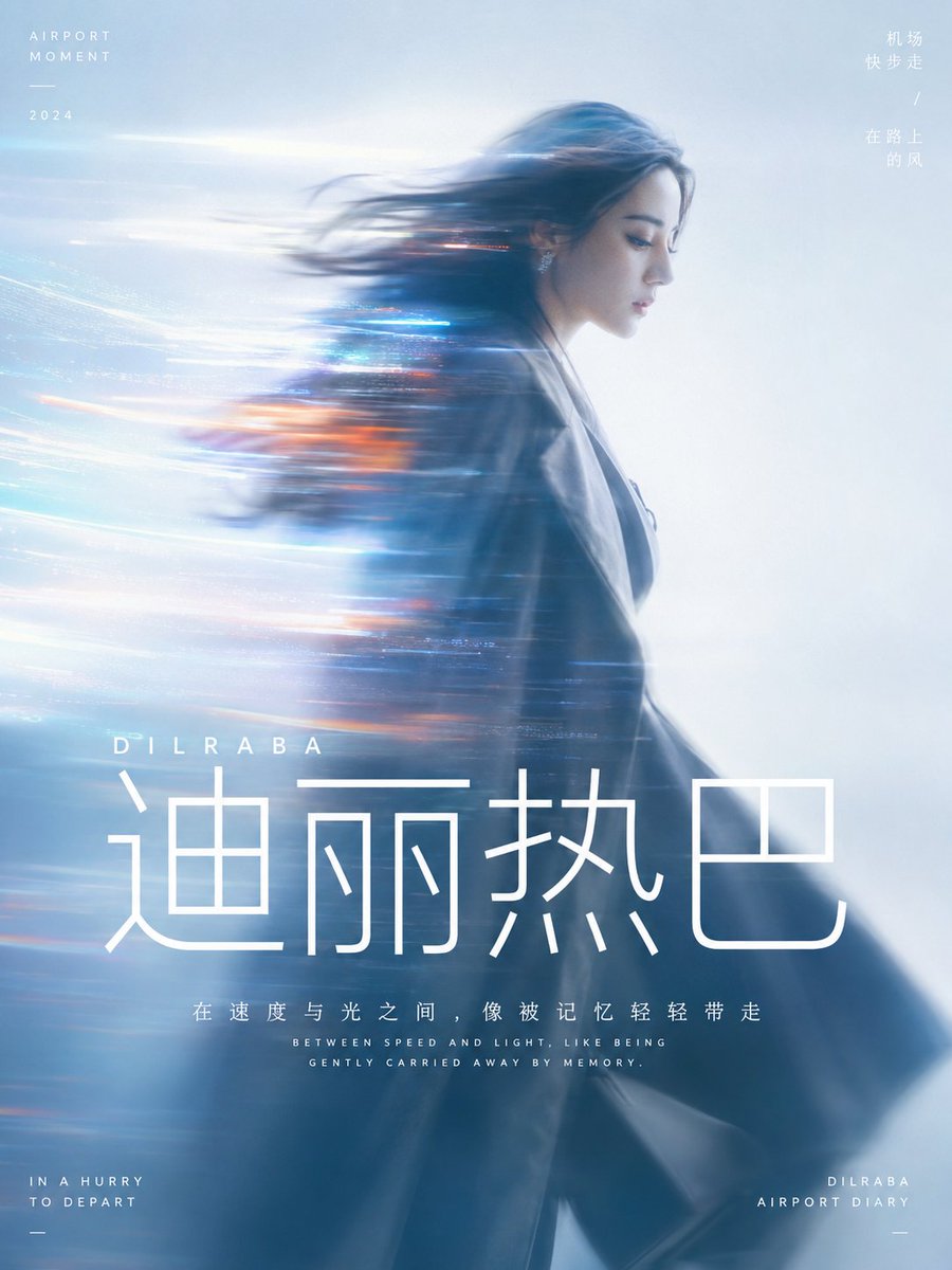
A vertical poster split in half: a softly graded real photo on top, and below it the same subject reimagined with a few thin black stick figures and a short handwritten line. The result reads like a clever magazine annotation on the photo.

- Model
- GPT Image 2
- Type
- 4 images
- Aspect ratio
- 3:4
- Shared
- 21 Aug 2026
- Likes on X
- 1,038
Image prompt
3,687 charactersSame treatment: Turn each photo I uploaded into a separate, high-end design poster—no multi-image collage; each photo is output individually. Use an overall 3:4 vertical composition, with the top and bottom areas at a strict 1:1 height ratio, each occupying 50% of the frame. The top half retains the original photo, preserving the subject's structure, real texture, natural light and shadow, and original color atmosphere, with only a slight high-end photographic color grade, giving it the quality of a lifestyle magazine, independent publication, and art photography. To fit the frame, the environmental background may be naturally expanded, but the subject must not be stretched, distorted, or altered. The bottom half first understands the original image's true **visual core and meaning**: decide that what matters most is not "what's there" but "what most deserves to be remembered"—it could be a subject, an action, a set of relationships, a contrast, an emotional moment, or some symbolic meaning. Then extract the most recognizable **subject, silhouette, posture, spatial relationships, and narrative clues**, reconstructing them into a playful editorial poster of "real subject + black-line doodle stick figures." Do not mechanically crop out the largest object in the original, but preserve the visual anchor that best represents the photo's spirit and narrativity, so the bottom half both corresponds to the original at a glance and looks like a clever reinterpretation of it. The real subject keeps its material and identity features, and may moderately optimize angle, proportion, light, and color to make the core features sharper; information in the original unrelated to the meaning can be discarded, but the key relationships supporting the theme must be preserved. Around the subject, add a few minimalist black-line doodle stick figures whose actions, positions, and interactions are generated entirely naturally based on the original's form, context, and potential meaning, making them seem to respond to, amplify, or invert the photo's original story, rather than making random gestures. The color scheme extracts the most recognizable and spirited colors from the top photo, which can be moderately purified, brightened, and reorganized. The background is mainly ivory, light tones, or the most comfortable light color from the original, keeping plenty of white space; the real subject carries the main color, while the stick figures and text form contrast with thin black or dark-gray lines, the whole being clean, light, and restrained. The text likewise grows naturally from the original's **core meaning, emotion, and visual relationships**, without directly naming the object or applying a fixed copy template. Turn the photo's most memorable layer of meaning into extremely short, light, clever, slightly humorous or punning handwritten text, making it like an annotation, a thought, or an off-screen line left by the stick figures. The text can be freely arranged along the subject's contour, the figures' actions, or the rhythm of the white space, completing the narrative together with the stick figures and subject, rather than being a title pasted on afterward. Overall, maintain the balance among **real subject, core meaning, micro-narrative, naive lines, and plenty of white space**. Whether the original is people, animals, plants, food, architecture, objects, vehicles, or natural scenes, first grasp "what this photo is really about," then decide how to reconstruct, avoiding capturing objects without relationships, doing cute interactions without a theme, cartoon-sticker feel, complex decoration, and a template look. 💣language: english
How to use it
This prompt needs an uploaded photo, because the top half keeps your own image and only adds a light magazine-style color grade. It was shared as a GPT Image 2 prompt. Keep the instruction for a strict 50/50 split and the thin black doodle line style, since those carry the editorial look. To make it yours, swap the handwritten text for a line that fits your photo and use the poster as a social post or print.
Shared publicly on X on 21 Aug 2026. All credit for this prompt and its result goes to its creator. Is this yours? Ask for an update or removal.