Prompt studio
Make “Curved Fan Editorial Poster Collage Layout” yours
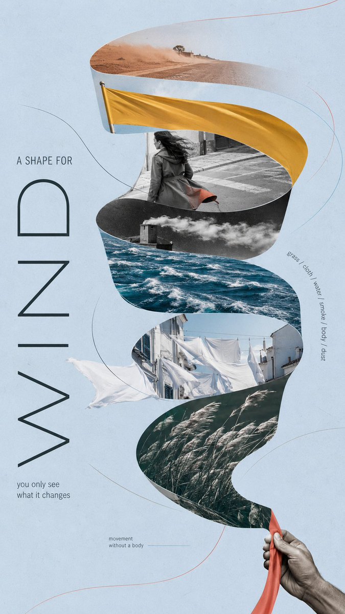
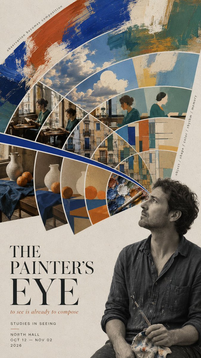
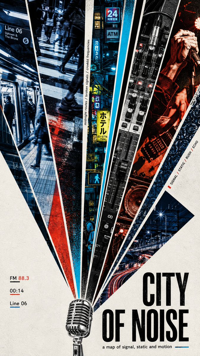
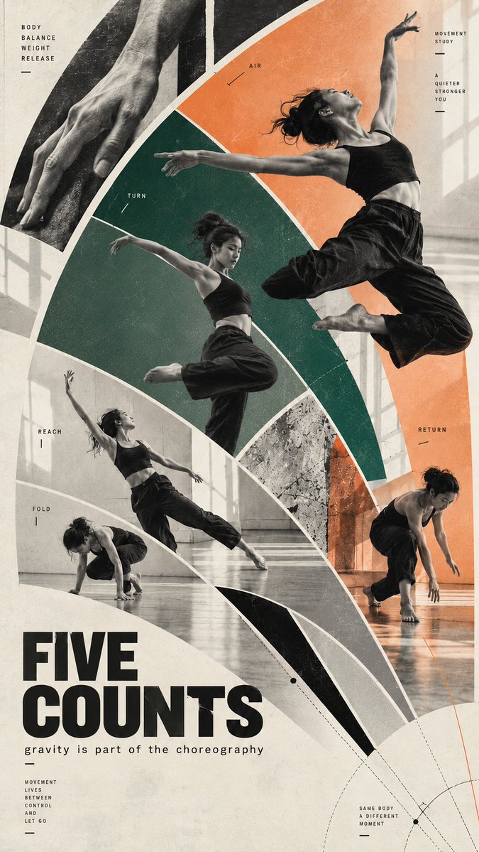
A tall 9:16 poster built from arcs and flowing curved sections that sweep the eye down the page. Photography, pure color panels and open negative space sit inside one large silhouette, giving it movement up close and bold impact from a distance.
 Prompt by @MrLarus
- Fill in the blanks below.
- Watch the prompt update on the right.
- Copy it, or open it in an image tool.
Image prompt
Create a 9:16 editorial poster based on a fan-shaped composition, with an emphasis on curved structures, flowing movement, and strong visual rhythm. SUBJECT: [your subject] TITLE: [main title] CONCEPT: [core idea or mood] FAN LOGIC: [flowing ribbon / offset arcs / radial burst / motion arcs / mixed curved fan structure] VISUAL MATERIALS: [photography / collage / textures / painting / architecture / people / objects] COLOR SYSTEM: [2–4 main colors] TYPOGRAPHY: [serif / grotesk / condensed sans / editorial mix] BACKGROUND: [paper texture / flat tone / minimal backdrop] TEXT DETAILS: [optional short meaningful phrases] Use the fan-shaped composition as the main visual language, but do not limit it to straight wedges. The structure can bend, arc, curve, flow, expand, compress, or rotate depending on the concept. Prioritize graceful visual movement. Let the composition guide the eye through the poster with ribbons, arcs, layered curved sections, or a single radial burst used in a more expressive way. The shape should help express the idea: * a flowing ribbon can suggest wind, motion, transition, or invisible force * offset arcs can suggest observation, rhythm, memory, or layered perception * a radial burst can suggest sound, signal, speed, or urban energy * motion arcs can suggest body movement, choreography, or time unfolding Build a strong large silhouette first, then fill it with controlled visual variety. Mix image sections, pure color areas, negative space, and small editorial details so the poster feels designed rather than template-based. Allow some elements to break across the fan boundaries when useful. Curves should feel intentional and elegant, not decorative for their own sake. Typography should feel integrated into the composition. Use one clear title, a short supporting line, and a small amount of editorial text. Keep the copy meaningful and concise. The final poster should feel like an art-forward editorial collage: visually striking from a distance, but richer and more layered up close.
Prompt shared on X by @MrLarus. All credit goes to its creator.
More prompts you can customize
 Add your photoSplit Poster with Photo and Paper Isometric Miniature
 Layered 26 World Cup Football Poster
 Yellow and Black Anime Fashion Magazine Illustration
 Minimalist Japanese Fashion Magazine Cover Illustration
 Add your photoMinimalist Fashion Magazine Cover Poster With Serif Type
 Add your photoGestalt Silkscreen Poster Split with Morandi Figure
 Relief City Atlas Poster With Seasonal Miniature Map
 Pastel Risograph Print Poster Style