Image prompt Product & Ads Customizable
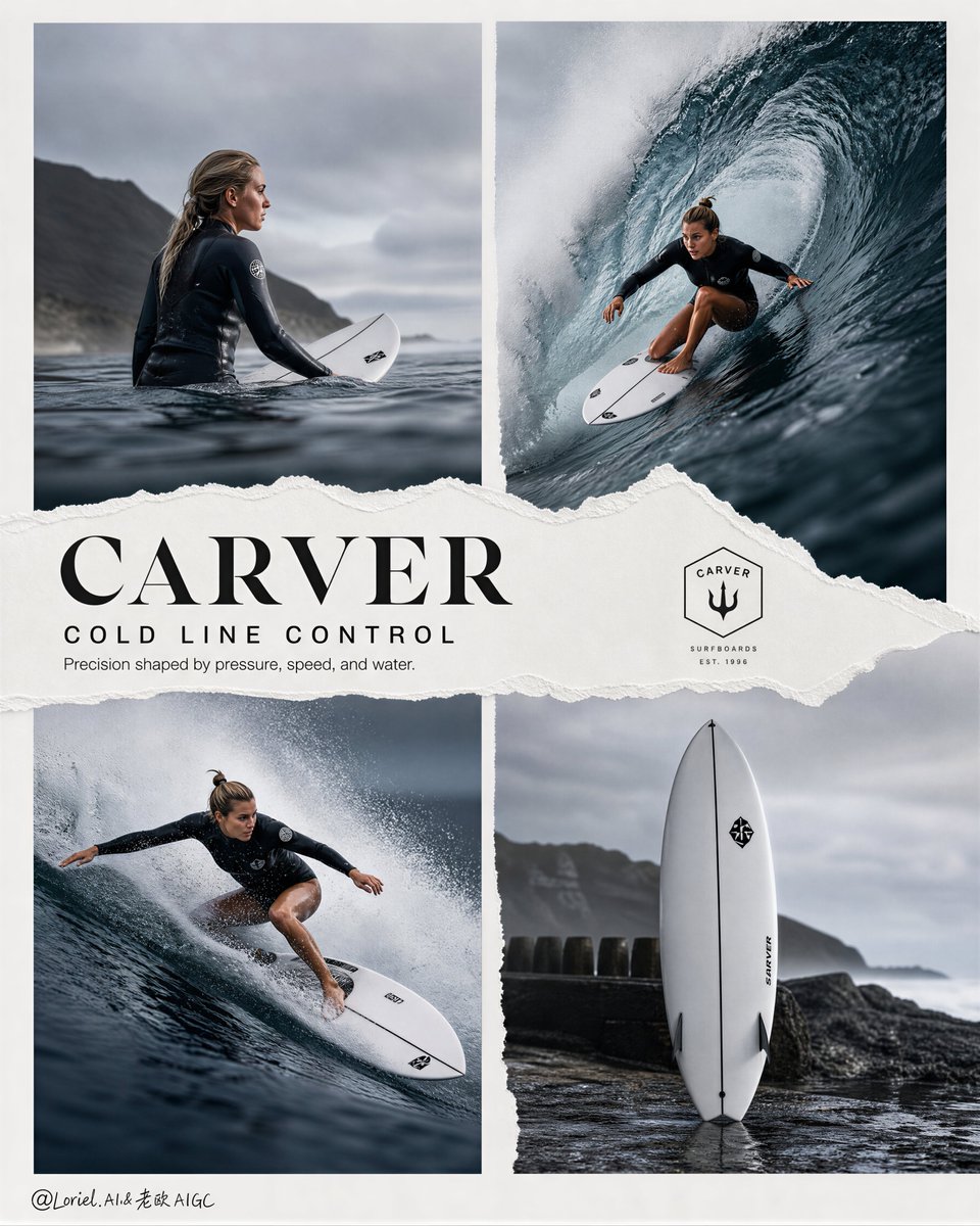
Cold-Water Surfboard Four-Panel Ad Layout
A four-panel advertising board in cool blue-gray tones, showing a female surfer carving through heavy competition waves beside a close product view of a true surfboard. Torn-paper edges and sparse English type give it a collectible, editorial finish.

- Model
- GPT Image 2
- Type
- Image
- Aspect ratio
- 4:5
- Shared
- 19 Jul 2026
- Likes on X
- 23
Brand nameHeadline textSupporting line
Image prompt
7,382 charactersCreate an ultra-premium four-panel advertising campaign board for Carver, designed as a high-impact cold-water surf campaign where professional wave-riding action, deep blue-gray competition sea conditions, and board-led performance culture are fused into one refined editorial layout. The composition must follow a premium 2x2 grid structure with strong off-white negative space, elegant spacing, torn-paper graphic intervention, and a world-class sports-fashion campaign sensibility. The final image must feel hyper-real, sharp, cold, technical, and unmistakably brand-led, while keeping the surfboard as the true visual hero. Core concept: The campaign should present Carver through a surf-rooted visual language of carving precision, line control, wave-reading instinct, and board performance. The board is not a wheeled skateboard in this campaign. It must be a true surfboard with no wheels, no trucks, and no street-skate hardware, fully integrated into real ocean wave action. The four-panel structure should feel like a flagship brand collage where disciplined motion, colder ocean power, and refined product identity merge into one clean visual system. The sea must feel like a serious contest zone rather than a tropical vacation image, with deeper blue-gray water, denser wave walls, cooler air, and more focused athletic intensity. 4-panel structure: Use a clean 2x2 four-panel board placed on a refined off-white or subtly textured poster background. top-left: cold pre-action ocean-entry or lineup moment top-right: hero surfing action inside or against a deep blue-gray wave wall bottom-left: another hard, aggressive surfing action panel with stronger speed and lower-angle pressure bottom-right: a product-led surfboard hero or cold-shore board environment panel All four panels must feel unified in climate, color temperature, brand attitude, and layout logic, while creating rhythm between calm focus, explosive carving, and product precision. Action direction: Show professional female surfing action with authentic athletic control, believable body mechanics, and competition-level seriousness. Use a healthy Western female athlete with strong posture, real muscle engagement, and sharp technical form. No influencer energy, no soft travel mood. The movement must feel decisive, skilled, and fast. In the main action panels, the surfer should carve with clean rail pressure, compressed center of gravity, strong shoulder alignment, and convincing wave-reading instinct. The surfboard must remain clearly visible and important, never swallowed by spray. Board realism: The board must be a true surfboard: no wheels, no trucks, no axle hardware, no street-skate deck shape, no land-based skate details. Use a believable high-performance surfboard silhouette with realistic rails, rocker, tail shape, deck wax, fin system where visible, wet surface reflections, and true ocean-use proportions. The board should feel premium, fast, and technically respected, with a clean surf-performance identity. Carver brand integration: The campaign should preserve Carver identity through carving attitude, surf-driven board culture, and product-led athletic storytelling rather than literal wheeled hardware. Possible visual logic: clear premium surfboard silhouette, refined board graphics or deck treatment, strong carving line through wave face, a dedicated product-led panel where the surfboard reads as the hero object, and a visual language of precision, speed, and ocean control. The brand should feel performance-led, premium, and deeply connected to surf movement. Wave and water direction: Render giant competition-sea waves with extreme realism and colder tonal authority: deep blue-gray wave walls, dense steel-blue shadows, clean barrel curvature, precise lip tension, hyper-detailed spray, fine white foam breakup, and highly believable water mass. The waves must feel harder, heavier, and more serious than tropical surf imagery. Water should look cold, clean, and powerful, with subtle mist and fine airborne droplets amplifying speed and force without visual chaos. Torn-paper layout logic: Integrate an elegant torn-paper graphic system so the campaign feels intentionally designed rather than simply tiled. Use: a ripped-paper arc, strip, or diagonal path crossing between panels, subtle rough paper edge texture, clean editorial collage logic, and premium typography placement aligned with the paper-tear structure. The hand-torn effect should feel crisp, modern, and collectible, not crafty or messy. Typography: Use an English-led premium surf campaign typography system with strong but restrained hierarchy. Main English title: “CARVER” Secondary campaign line: “COLD LINE CONTROL” Supporting English copy: “Precision shaped by pressure, speed, and water.” Typography should be sparse, sharp, premium, and integrated into the torn-paper composition with refined spacing. Include a minimal official-style brand mark treatment and clean hierarchy. Avoid bulky copy or crude heavy lettering. Panel directions: Panel 1: A poised cold-water lineup or ocean-entry moment, showing focus before action, darker water surface texture, disciplined stillness, and the athlete’s relationship to the contest sea. Panel 2: The main hero image, with a professional female surfer carving through or under a deep blue-gray wave wall, body fully committed, surfboard clearly visible, the whole moment feeling elite and controlled. Panel 3: A more aggressive low-angle surfing shot with stronger pressure, tighter turn, denser spray, and immediate speed, making the surfboard feel fast and technically alive. Panel 4: A colder product-led panel showing the surfboard as hero, placed on wet rock, dark sand, shoreline concrete, or beside disciplined cold-shore gear, keeping the product visually dominant and premium. Lighting: Use refined coastal daylight with cool atmospheric control and luxury-commercial tonal precision. Skin, water, and board surfaces must all feel sharply resolved and expensive. Highlights should be crisp but restrained. Shadows must stay open, cool, and breathable. The overall light should feel clear, cold, premium, and highly photographic, with no muddy blacks and no warm tropical wash. Color direction: Use a colder premium surf palette: deep blue-gray, steel blue, slate teal, white spray, cool skin highlights, wet graphite, soft off-white poster background, and restrained board accent colors. Keep the palette serious, elegant, and competition-driven. Avoid tropical cyan, golden warmth, or playful beach saturation. Mood: technical, cold, athletic, premium, cinematic, controlled, surf-driven, serious, collectible, globally branded Rendering style: ultra-premium Carver campaign board, four-panel editorial sports collage, deep blue-gray competition waves, professional female surfing action, true surfboard with no wheels, torn-paper graphic structure, premium English typography, hyper-real cold-water atmosphere, 8k, world-class commercial image quality Negative prompt: wheels, trucks, axle hardware, land skateboard, street-skate deck, cheap surf poster, weak board visibility, tropical vacation mood, muddy waves, low-detail spray, messy torn-paper effect, bulky typography, influencer pose, plastic skin, cartoon water, weak product hierarchy, low-resolution sports ad, cluttered layout, warm beach postcard color
How to use it
If you want to use your own surfer or brand, swap the brand name and the female athlete description, and keep the wheel-free surfboard, the deep blue-gray water and the 2x2 torn-paper grid, since those carry the look. It was shared as a GPT Image 2 prompt, so the layout and type will be most reliable in that model. The result suits a product launch deck, a retail window concept or a moodboard for a surf brand pitch.
Shared publicly on X on 19 Jul 2026. All credit for this prompt and its result goes to its creator. Is this yours? Ask for an update or removal.