Prompt studio
Make “Anamorphic Typography Poster With Reflective Planes” yours
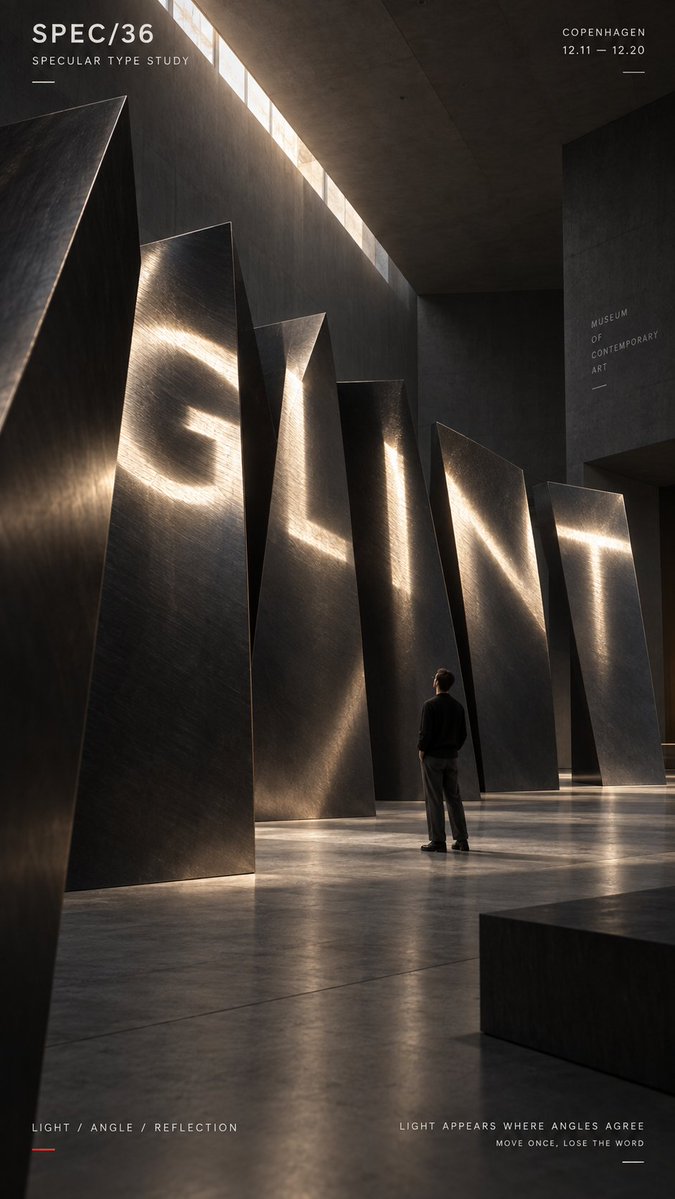
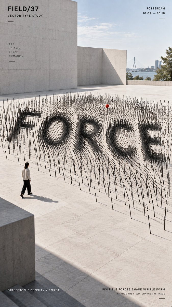
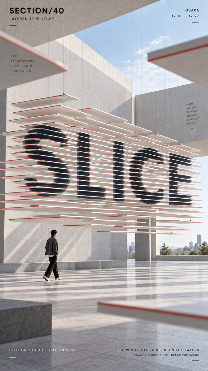
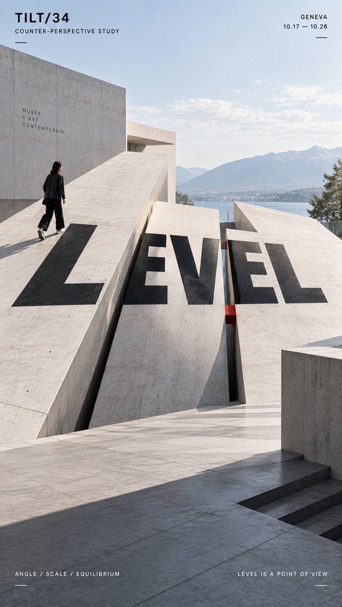
A vertical poster in which a large word only resolves when the reflective surfaces line up from one exact viewpoint. From other angles the letters scatter into separate slices and tilted panels, showing the spatial system behind the illusion.
 Prompt by @MrLarus
- Fill in the blanks below.
- Watch the prompt update on the right.
- Copy it, or open it in an image tool.
Image prompt
TITLE: [your word] PROJECT: [brand / exhibition / campaign] SPATIAL MECHANISM: [specular reflection / vector field / layered sections / counter-tilt / other] STRUCTURE: [metal surfaces / directional rods / sliced planes / tilted platforms / other] SUBJECT: [small human figure / none] MAIN COLORS: [2–3 colors] FORMAT: 9:16 vertical poster Create a contemporary perspective typography poster where the main word is revealed through spatial alignment rather than simply printed onto the scene. The title should occupy roughly 35–55% of the composition and become readable only when the physical structure, viewpoint and visual conditions align correctly. For specular typography, use separate reflective surfaces whose highlights visually connect into the word from one precise viewpoint. For a vector field, use the direction, density and depth of repeated elements to make the typography emerge from their spatial orientation. For layered sections, split the word across multiple separated horizontal planes so the slices visually reconnect into one complete title only from the correct viewing height. For counter-tilt typography, distribute the letterforms across physically sloped surfaces while making the complete word appear visually level from the intended camera position. Keep perspective, depth, lighting, occlusion and material behavior physically believable. From another angle or viewing height, the word should begin to break apart and reveal the real spatial system behind it. Use bold geometric sans-serif typography, a restrained architectural environment and a controlled high-contrast palette. Keep the composition clean and strong enough to read at thumbnail size. If a person is included, keep them relatively small and use them mainly as a scale reference or observer interacting naturally with the installation. Add only minimal editorial information such as project name, location, date and one short thematic line. Overall style: perspective typography, anamorphic installation, spatial graphic design, contemporary architecture, editorial poster, clean hierarchy and strong visual impact.
Prompt shared on X by @MrLarus. All credit goes to its creator.
More prompts you can customize
 Add your photoSplit Poster with Photo and Paper Isometric Miniature
 Layered 26 World Cup Football Poster
 Yellow and Black Anime Fashion Magazine Illustration
 Minimalist Japanese Fashion Magazine Cover Illustration
 Add your photoMinimalist Fashion Magazine Cover Poster With Serif Type
 Add your photoGestalt Silkscreen Poster Split with Morandi Figure
 Relief City Atlas Poster With Seasonal Miniature Map
 Pastel Risograph Print Poster Style