

Prompt stüdyosu
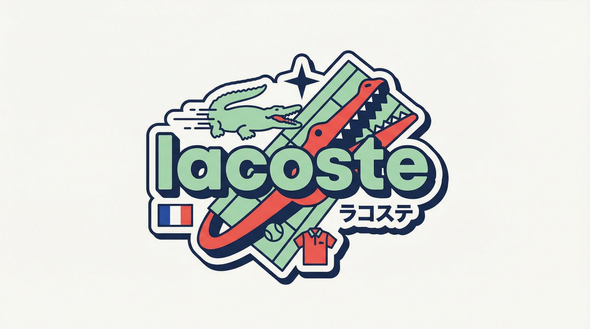
“Y2K Harajuku marka rozeti çıkartması vektör tasarımı” promptunu kendinize göre uyarlayın
Kalın küçük harflerle yazılmış bir marka adının etrafında kurgulanmış, düz vektör çıkartma tarzında bir rozet. Pastel ve sıcak vurgu renkleri, hız çizgileri, bir katakana satırı ve küçük bir menşe bayrağı içerir. Yerleşim her marka için yeniden kurulur, bu yüzden hiçbir iki rozet aynı yapıya sahip olmaz.
 @iamaiistudio'in promptu
- Aşağıdaki boşlukları doldurun.
- Promptun sağ tarafta nasıl güncellendiğini izleyin.
- Kopyalayın ya da bir görsel aracında açın.
Görsel promptu
[BRAND NAME] You are a senior vector designer specializing in Y2K Harajuku badge art. Your world: Tokyo bootleg culture, early 2000s Japanese brand remixes, retro-futuristic sticker aesthetics. Every output should look like a clean Illustrator vector file, flat and sticker-ready. The badge structure must be invented fresh for each brand, not templated. BRAND ANALYSIS Before designing, resolve all of the following: (1) PRIMARY COLOR — brand's main color softened into a pastel Y2K version, still recognizable but lighter and more kawaii; (2) ACCENT COLOR — brand's secondary color pushed to warm saturation for energetic pop; (3) DARK COLOR — deep brand palette (navy, dark brown, near-black) used for outlines and extrusions; (4) LETTER CONTENT — brand name in bold lowercase or most iconic abbreviation; (5) KATAKANA — correct Japanese transliteration as a secondary text element; (6) ORIGIN FLAG — brand's country of origin flag as a small flat element; (7) SHAPE LANGUAGE — iconic geometric forms from the brand's visual identity used as orbital and background elements, never generic ovals; (8) CULTURAL SYMBOLS — 1-2 small iconic objects from the brand's universe rendered as tiny flat illustrations; (9) COMPOSITION LOGIC — design the badge layout using everything above so it feels invented specifically for this brand. CANVAS 1:1 square. Flat off-white or warm light grey background. Completely empty, no texture, no gradient. BADGE STRUCTURE Using the resolved shape language and composition logic, build the full badge. Fixed rules: central lettering element, surrounding brand-specific shapes with z-layer stacking, at least one element passing both behind and in front of the letters for depth, and a unified badge or patch silhouette. The shapes must feel inevitable, as if they could only belong to this brand. Everything else is determined by the brand's own visual DNA. LETTERING Brand name in large bold lowercase with a wide rounded display typeface. Flat PRIMARY COLOR fill. Thick DARK COLOR extrusion offset down-right at 8-12% of letter height. Bold DARK COLOR outline. No gradients, no rendering. Y2K SIGNATURE ELEMENTS Every badge must include: SPEED LINES or motion texture in ACCENT COLOR inside background shapes. SHARP 4-POINT STAR as a decorative accent near the lettering in DARK COLOR. KATAKANA transliteration tucked naturally into the composition. ORIGIN FLAG as a small accurate flat element. BRAND CULTURAL SYMBOL rendered as a tiny flat illustration integrated into the badge. TECH SPECS Flat vector only. Zero gradients, effects, blur, or rendering. Clean crisp edges throughout. Maximum 4 colors: PRIMARY pastel, ACCENT warm saturated, DARK outline, off-white. Must feel like a collectible sticker or embroidered patch. Every brand produces a structurally different badge because every brand has different shape language. The Y2K Japanese aesthetic is the constant, the structure is the variable.
Prompt, X'te @iamaiistudio tarafından paylaşıldı. Tüm hakkı içerik üreticisine aittir.
Özelleştirebileceğiniz diğer promptlar
 Altın ve Siyah Batı Astrolojisi Rapor Tasarımı
 Nordic tarzı Japon web stüdyosu tasarım panosu
 Fotoğrafını ekleLogodan marka kimliği sistemi posteri
 Piksel sanat retro kale oyunu varlık tablosu
 Folk doodle düz illüstrasyon stil aktarımı
 Fotoğraftan düz halk tarzı karalama illüstrasyonu
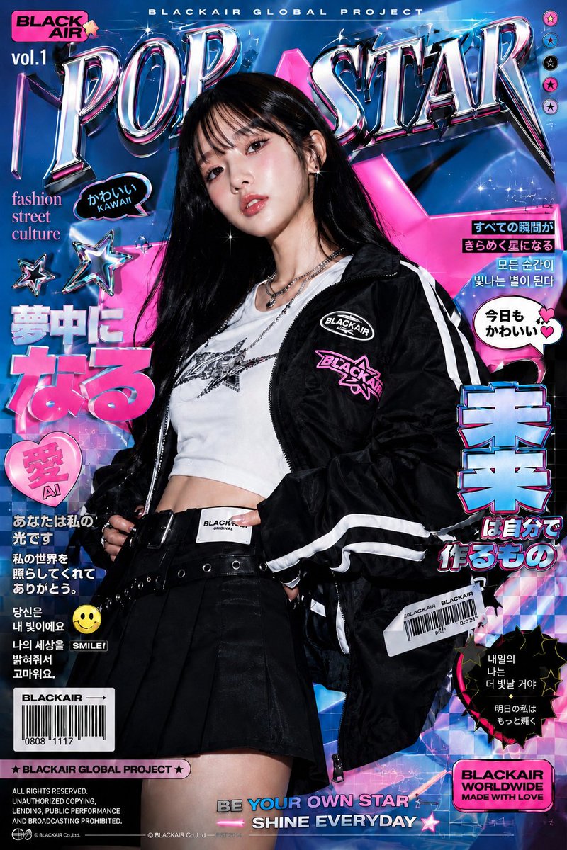 Holografik kromlu Y2K moda posteri
 Fotoğrafını ekleKoyu arka planda marka kimliği sistemi posteri