Görsel promptu Marka ve arayüz Özelleştirilebilir
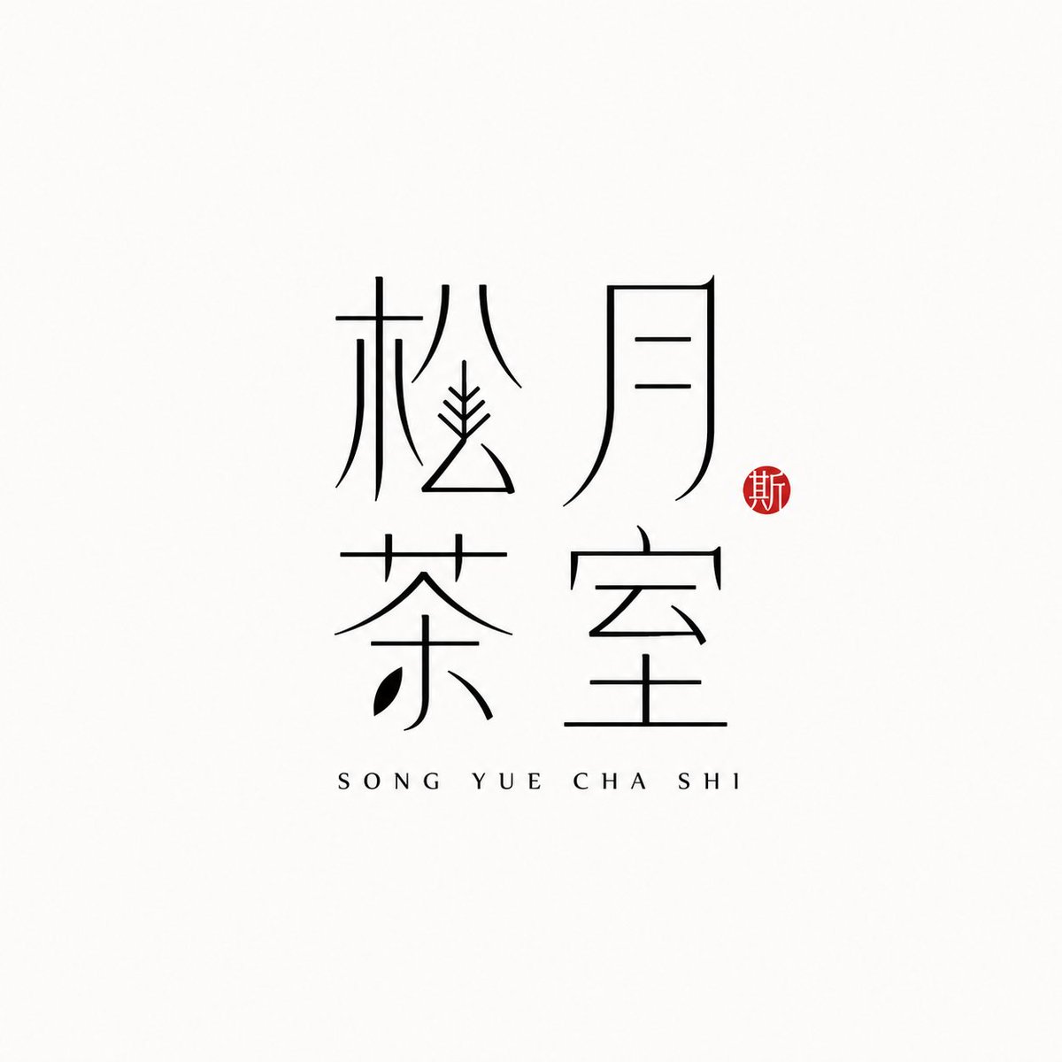
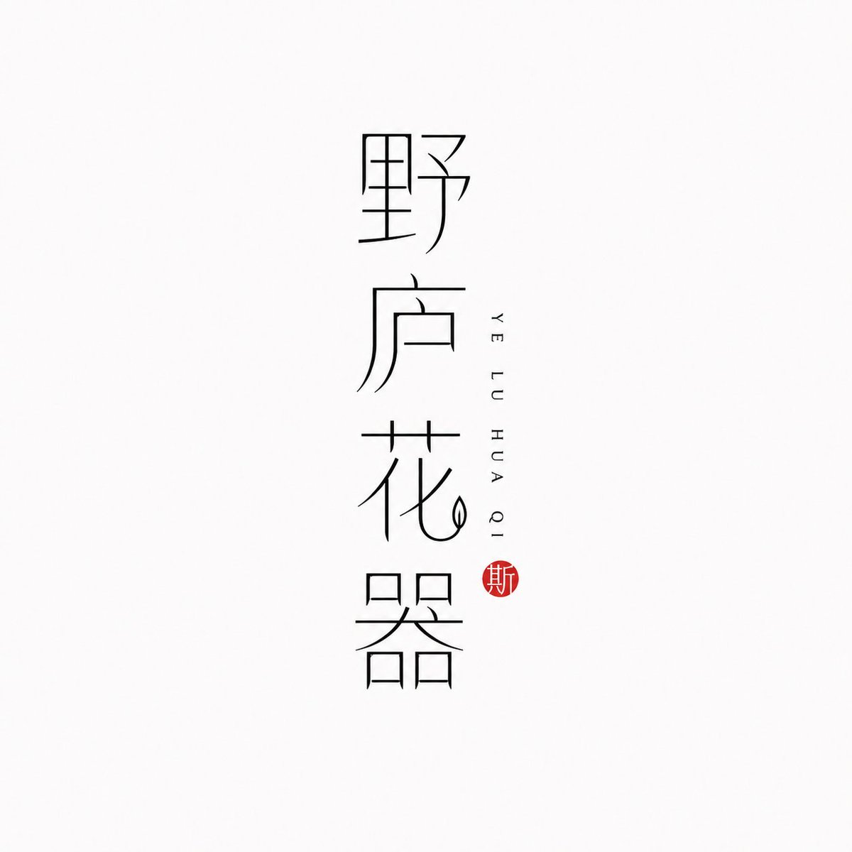
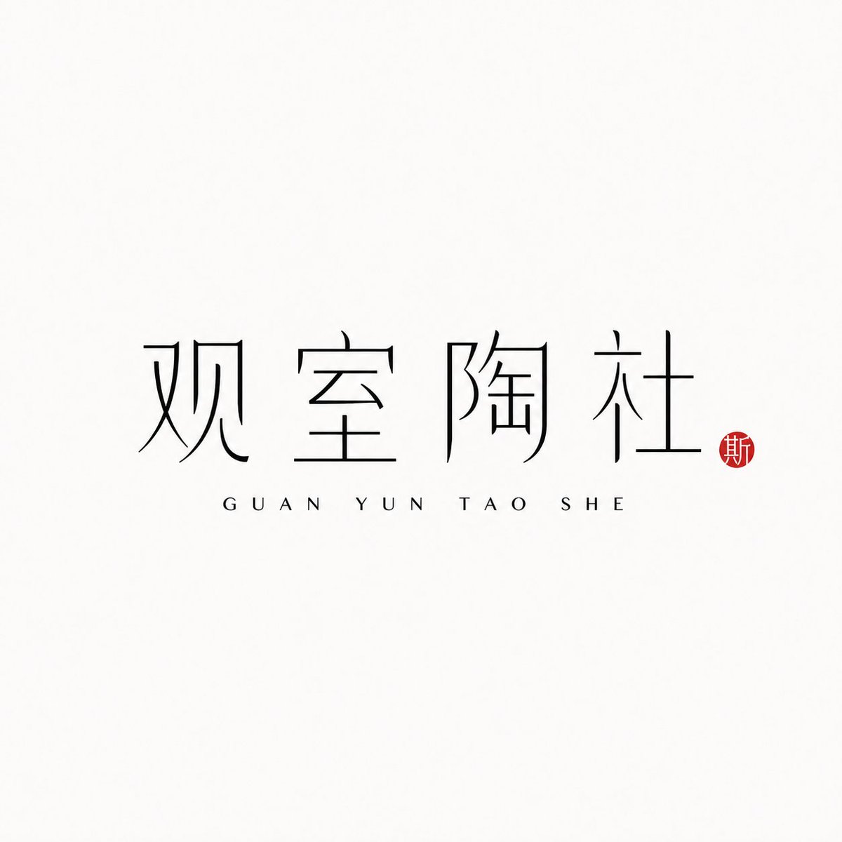
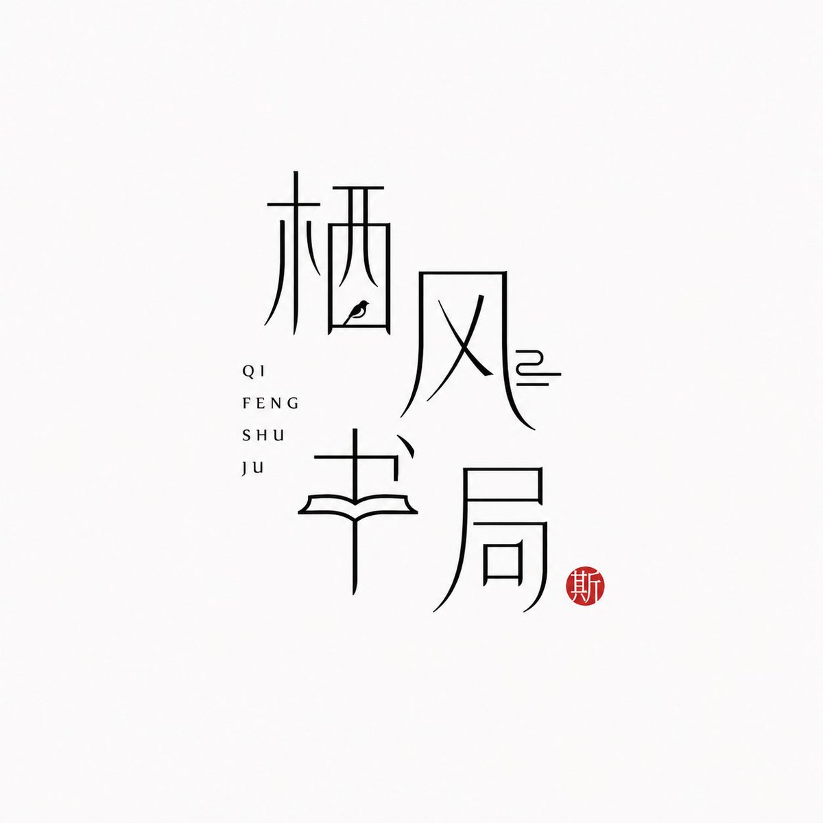
İnce çizgili Çince karakter marka logosu
Çince marka adının kendisi işarete dönüşüyor; neredeyse beyaz bir zeminde ince siyah çizgilerle çizilmiş. Yanında pinyin sessizce duruyor, küçük bir cinnabar kırmızısı mühür ise tek bir sıcak vurgu katıyor ve sakin, modern bir Doğu estetiği sunuyor.

- Model
- GPT Image 2
- Tür
- 4 görsel
- En boy oranı
- 1:1
- Paylaşım
- 25 Haz 2026
- X'teki beğeniler
- 97
Marka adıPinyinDüzen
Görsel promptu
1,778 karakter[Brand name]: [Auxiliary pinyin]: [Brand direction]: tea house / flower vessel / ceramics / bookstore / fragrance / objects / guesthouse / Oriental lifestyle brand [Layout structure]: 2×2 grid / vertical / horizontal / staggered interweaving [Mood keywords]: cool-serene / restrained / refined / whitespace / modern Oriental / thin-line typography Generate a "Thin-Line Oriental Typographic Logo." The whole is a minimalist Chinese typographic logo on a white or very light gray-white background with abundant whitespace. The main subject is neither an illustration nor a graphic, but the Chinese brand name itself designed as a visual mark. The main Chinese characters use black thin-line strokes — slender, light, restrained, and cool, with a modern Oriental feel. Some strokes may receive slight geometric reconstruction, elongation, broken strokes, displacement, or whitespace treatment, but the whole must keep readability and consistency and must not become illegible scrambled characters. The core is "typography as logo": the Chinese brand name itself is the main visual, while pinyin or English serve only as auxiliary layout. The pinyin can be placed below, to the side, vertically, or interwoven beside the main characters, with wide letter spacing, staying refined, quiet, and restrained. Add a small vermilion seal-carving-style stamp; its content can be a single character in an antique style or an abstract ancient seal symbol. The seal is only a finishing touch — it must not be too large nor steal the main visual. The overall effect should look like a real brand's modern Chinese typographic logo: clean, flat, design-driven, with a sense of series, suitable for brand proposals, storefronts, packaging, social media avatars, and visual system extension.
Nasıl kullanılır
GPT Image 2 promptu olarak paylaşıldı. Parantez içindeki marka adı ve pinyin alanlarını kendi bilgilerinizle değiştirebilirsiniz; ince çizgili tipografi, geniş boşluklar ve küçük mühür gibi detaylar görünümü belirlediği için bunları koruyun. Ruhu yönlendirmek için çay evi ya da parfüm gibi bir marka yönü seçebilir, dikey sıralama veya 2x2 ızgara gibi bir düzen belirleyebilirsiniz. Ortaya çıkan işaret mağaza tabelası, ambalaj ön yüzü veya sosyal medya avatarı olarak iyi çalışır.
25 Haz 2026 tarihinde X'te herkese açık olarak paylaşıldı. Bu prompt ve sonucunun tüm hakkı içerik üreticisine aittir. Bu sizin mi? Güncelleme veya kaldırma talep edin.












