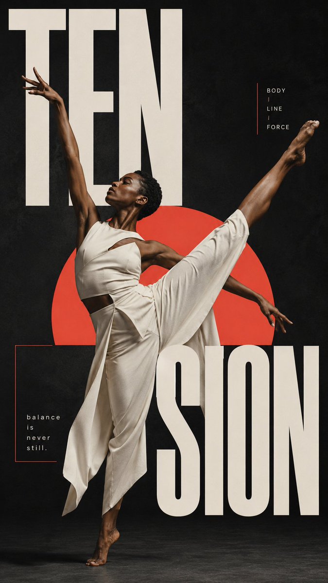


Prompt stüdyosu
“Harflerin İçinden Geçen Figürlü Dev Tipografi Posteri” promptunu kendinize göre uyarlayın
Gerçekçi bir figür, devasa kırpılmış başlık harflerinin arasında hareket eder; vücut bazı çizgilerin önünden, bazılarının arkasından geçer. Nötr bir zeminde tek bir vurgu rengi yer alır, böylece sayfa bitmiş bir kültür posteri gibi okunur.
 @MrLarus'in promptu
- Aşağıdaki boşlukları doldurun.
- Promptun sağ tarafta nasıl güncellendiğini izleyin.
- Kopyalayın ya da bir görsel aracında açın.
Görsel promptu
Subject = [person / artist / dancer / musician / fashion model] Action = [running / playing an instrument / dancing / posing / interacting with an object] Headline = [a short meaningful word or phrase] Accent color = [cobalt blue / coral red / amber / burgundy / custom color] Type interaction = [body through letters / object through negative space / motion across type / color field cutting through type] Create a 9:16 editorial poster built around the physical relationship between the subject and oversized typography. Start with a strong, realistic photograph. The person should have a clear identity, expressive body language and an action that naturally connects to the theme. Keep skin, hair, clothing and props realistic and detailed. Treat the headline as part of the composition rather than text added afterward. Make the letters extremely large, crop them at the edges and let the subject move in front of some parts and behind others. Use letter openings, strokes and negative space to frame the body, limbs or objects. Choose one dominant interaction for each poster. A runner can break through oversized letters, a musician and instrument can occupy the negative space of the type, a dancer can extend limbs through letterforms, or a fashion subject can cross between contrasting color fields while the typography changes with the background. Use one strong accent color against a mostly neutral palette. Geometric elements such as a circle, arc, bar or large color field can help anchor the subject, but they should support the main interaction rather than decorate the page. Keep supporting text minimal. One short line or small editorial label is enough. Every word should relate to the subject or concept instead of acting as filler. The final image should feel like a finished fashion or culture poster with strong scale, depth, movement and graphic tension — not a portrait with text placed around it.
Prompt, X'te @MrLarus tarafından paylaşıldı. Tüm hakkı içerik üreticisine aittir.
Özelleştirebileceğiniz diğer promptlar
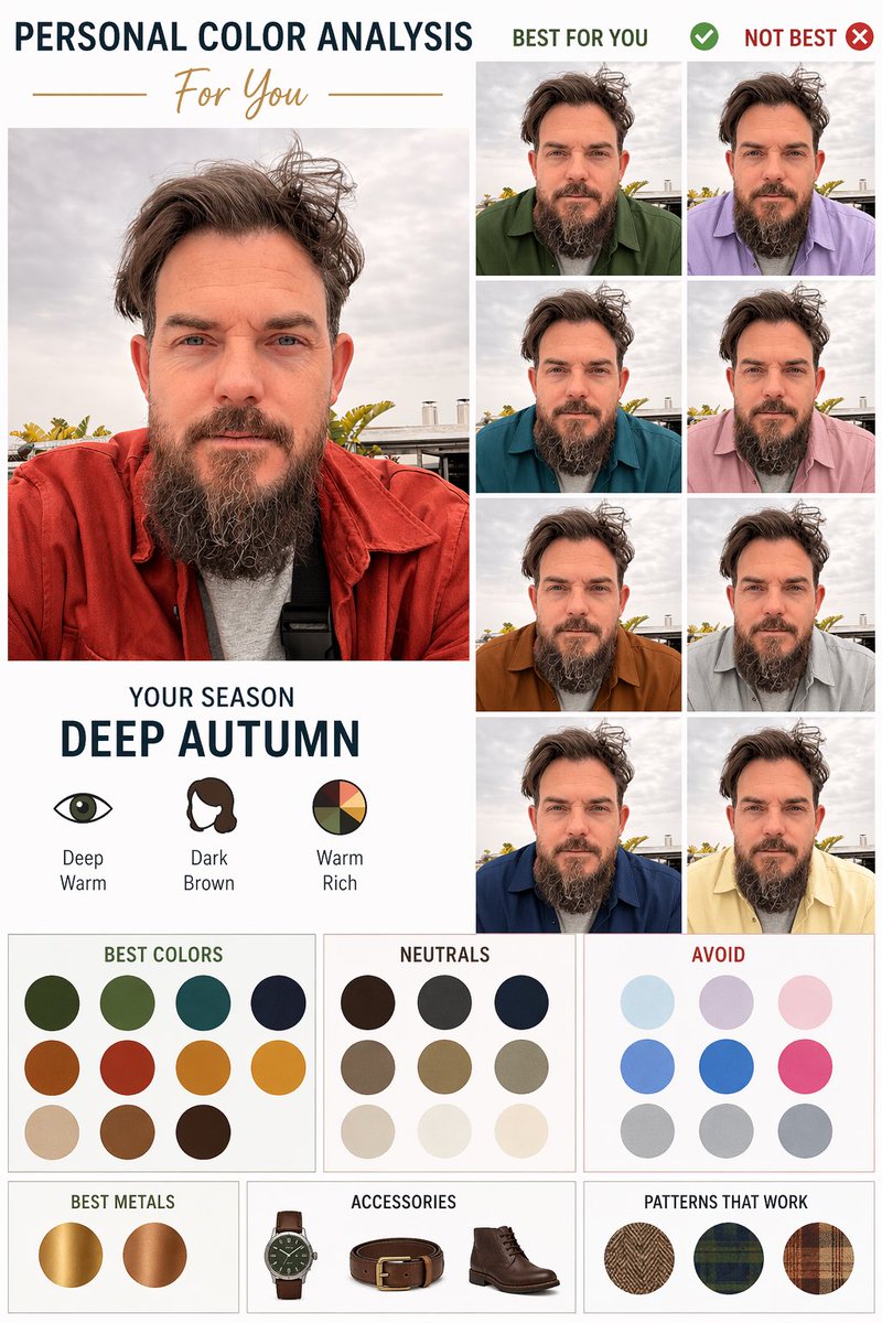 Portreden kişisel renk analizi diyagramı
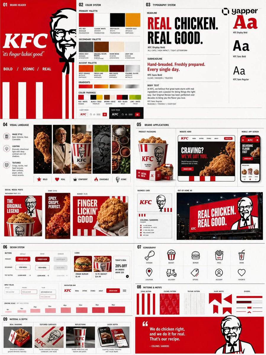 Fotoğrafını ekleLogodan marka kimliği sistem panosu
 Nordic tarzı Japon web stüdyosu tasarım panosu
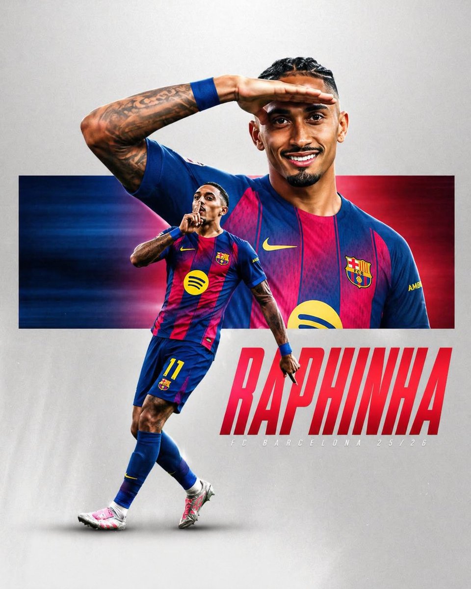 Çizgili forma giyen futbolcu spor posteri
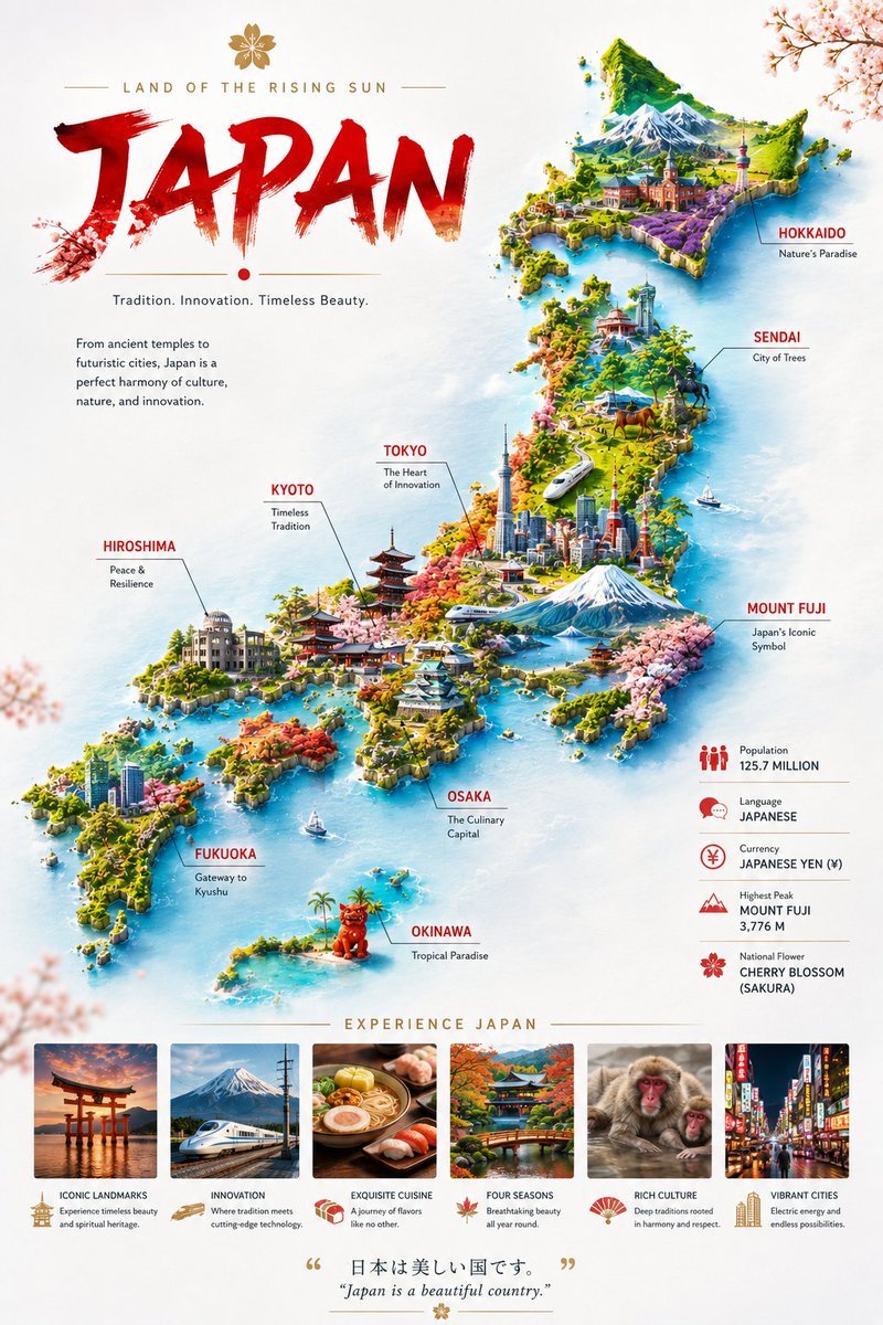 Bulut üzerinde yüzen ülke minyatür harita posteri
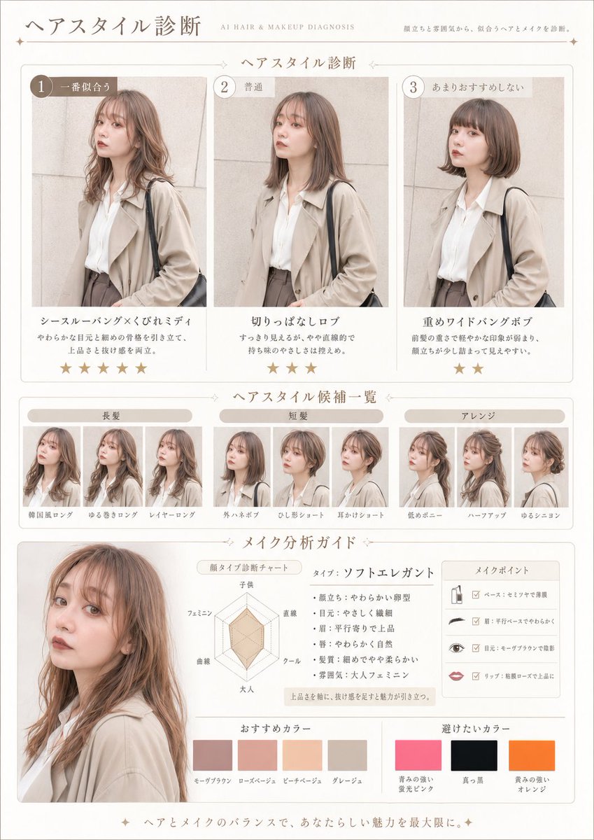 Fotoğrafını ekleSaç ve makyaj analizi dergi sayfası promptu
 Çizgi sanatı tarzında tek çizgili şehir sokağı seyahat posteri
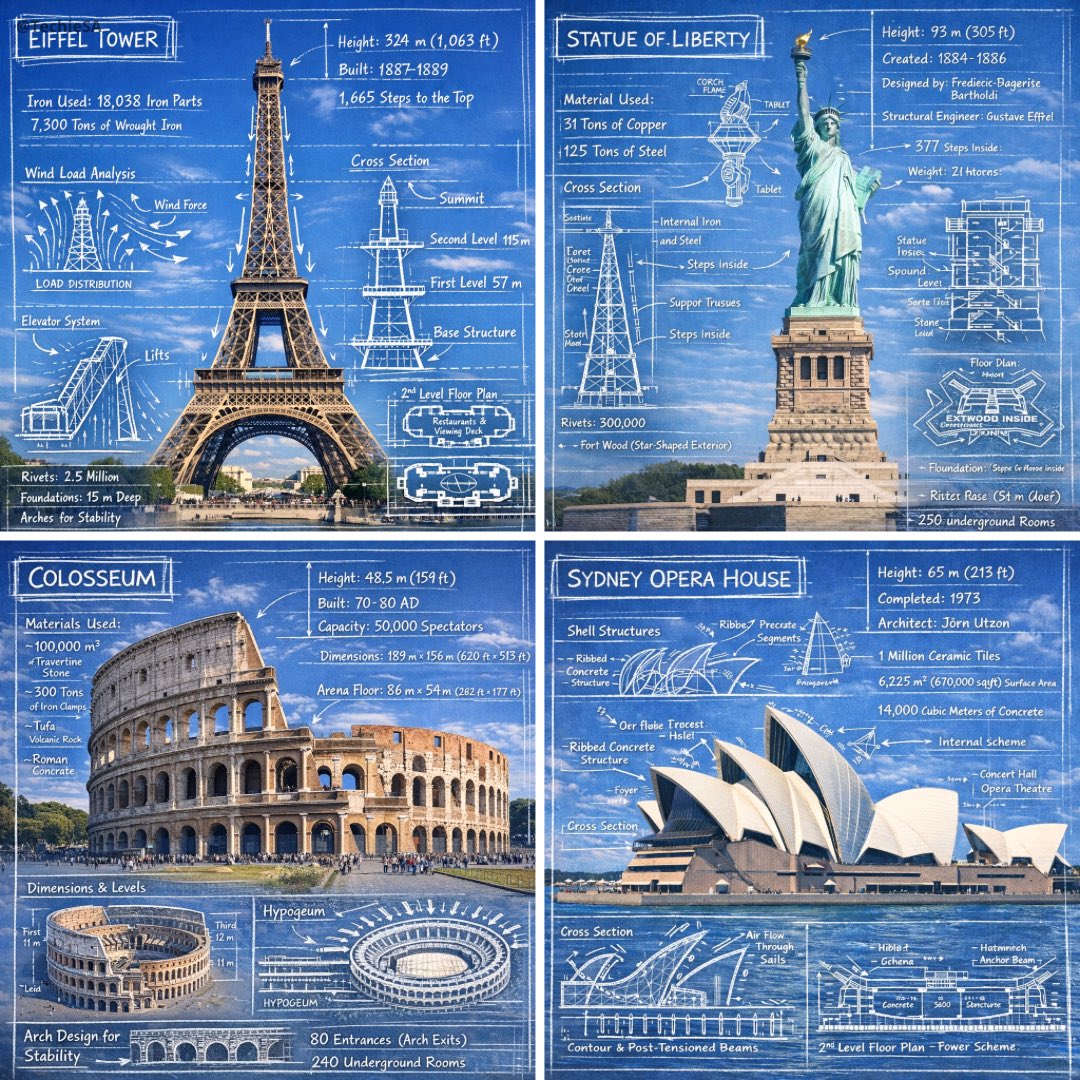 Anıt fotoğraflarında tebeşir eskiz notları