
Prompt stüdyosu
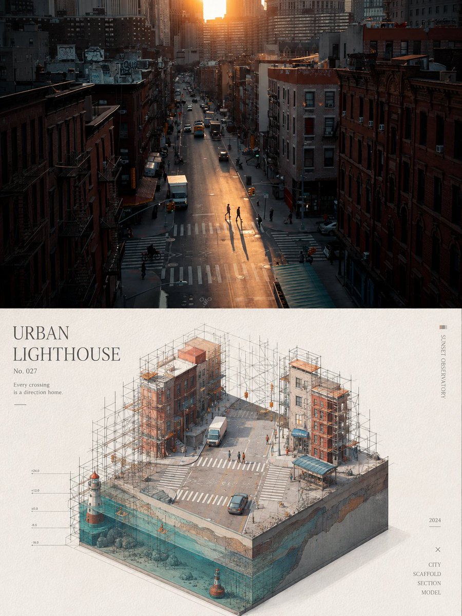
“Yapı iskeleli minyatür deniz feneri posteri, izometrik görünüm” promptunu kendinize göre uyarlayın
Bir fotoğraf iki yarıya ayrılır: üst yarıda hafif renk düzenlemesiyle orijinal görüntü, alt yarıda ise soluk kâğıt üzerinde ince iskelelerle sarılmış, temiz bir izometrik minyatür deniz feneri manzarası yer alır. Canlı turkuaz, mercan ve sarı tonlar ferah ve sakin bir hava katar.
 @xiaoxiaodong01'in promptu
- Aşağıdaki boşlukları doldurun.
- Promptun sağ tarafta nasıl güncellendiğini izleyin.
- Kopyalayın ya da bir görsel aracında açın.
Görsel promptu
Turn each photo I upload into a separate, high-end design poster—no multi-image collages; output each photo individually. Use an overall 3:4 vertical composition, with the top and bottom regions strictly 1:1 in height, each occupying 50% of the frame. The top half keeps the original photo, preserving the subject's identity, structure, pose, real texture, natural light and shadow, and original color atmosphere, with only slight high-end color grading, giving it the quality of an art magazine, independent publication, and exhibition image. To fit the frame, the environmental background may be naturally extended, but the subject must not be stretched, distorted, or altered. The bottom half extracts the subject's most recognizable **outline, structure, pose, and narrative relationships** and reconstructs them into a minimalist art scene in the style of a **3D miniature architectural landscape**: presented via **isometric view / cut cube composition / perspective of an underwater continental shelf**, with the subject like a cut-open miniature three-dimensional scene, with a correct isometric view and clear spatial hierarchy. The core semantic is a **miniature lighthouse landscape**, which can be flexibly translated according to the original subject's features, but must retain instantly recognizable identity and the original narrative relationship. The bottom half is not a realistic illustration, but compresses the subject into an abstract expression of **simple geometric shapes, flat color blocks, fine lines, and negative space**; on a minimalist basis it retains moderately rich structural detail, so the image combines a sense of architectural diagram and art poster. The subject should look like a miniature three-dimensional model placed on white textured paper, with the character of a **hand-drawn architectural illustration**: fine lines, clear layers, restrained yet accurate detail, avoiding heavy realistic rendering. Add clear **scaffolding logic** into the image, referring to the image you provided: the scaffolding is not arbitrary decoration, but should act as a rational system that wraps, supports, builds, or intervenes in the subject's structure, forming a spatial order together with the subject. The scaffolding may consist of dense horizontal and vertical members and localized connection nodes, unfolding around the subject's outer contour, key inflection points, or three-dimensional cross-sections, conveying a sense of "being constructed, repaired, surveyed, or displayed"; the view must be accurate, with clear perspective relationships—do not draw it as a floating collage. The composition keeps the **subject centered, the frame balanced, the order restrained**, and enhances the sense of space through a few horizontal lines, vertical composition lines, ring elements, or section boundaries. The background uses **white textured paper or very pale off-white paper**, clean, quiet, with no shadows or only very faint structural layers, no heavy cast shadows. Keep large areas of negative space, so the subject seems to float in the layout of an exhibition catalog or architectural research poster. The color scheme draws inspiration from the photo above, but must be reprocessed into a high-end color system that is **more vivid, clear, healing, and full of life**, rather than directly copying the original color values. After keeping the hue clues of the original image, moderately brighten, purify, and de-gray, making the colors more vivid and light; you can form soft and bright comprehensive color relationships such as clear blue, lake teal, tender green, bright yellow, coral orange, peach pink, and light lilac, establishing refined layers through warm-cool contrast and brightness rhythm. Avoid dirty, dull, aged, Morandi-ized tones, cheap candy colors, and a plastic feel. Text may intervene in small amounts—add a concise English title, number, or year, forming a natural typographic relationship with the subject, scaffolding, or negative space. The text should be refined, modern, and restrained, like an editorial annotation in international design studios, architectural posters, art exhibition posters, and high-end brand visual systems, not stealing the show. The overall style presents a **high-end, modern, elegant, restrained, and artistic** visual effect, blending miniature three-dimensional landscape, architectural section, isometric view, scaffolding system, and minimalist poster layout. Avoid excessive filters, cheap plastic texture, cartoon feel, strong computer-generated look, templated effects, incorrect views, and illogical decorative structures.
Prompt, X'te @xiaoxiaodong01 tarafından paylaşıldı. Tüm hakkı içerik üreticisine aittir.
Özelleştirebileceğiniz diğer promptlar
 Fotoğrafını ekleFotoğraf ve kâğıt izometrik minyatürlü bölünmüş poster
 Katmanlı 26 Dünya Kupası futbol posteri
 Sarı ve siyah anime moda dergisi illüstrasyonu
 Minimalist Japon moda dergisi kapak illüstrasyonu
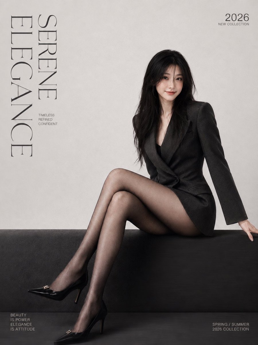 Fotoğrafını ekleMinimalist moda dergisi kapak posteri, serif yazı tipiyle
 Fotoğrafını ekleMorandi serigrafi tonlarında gestalt siluetli bölünmüş poster
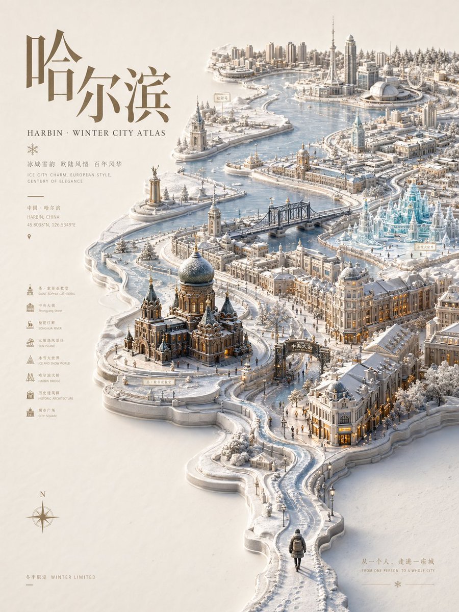 Kabartmalı şehir atlası posteri, mevsimlik minyatür harita
 Pastel risograf baskı poster stili