Görsel promptu Posterler ve tipografi
Fotoğrafınızdan impasto mikro manzara posteri
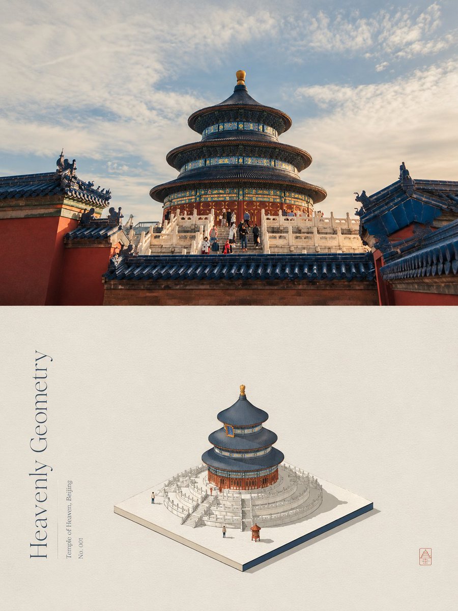
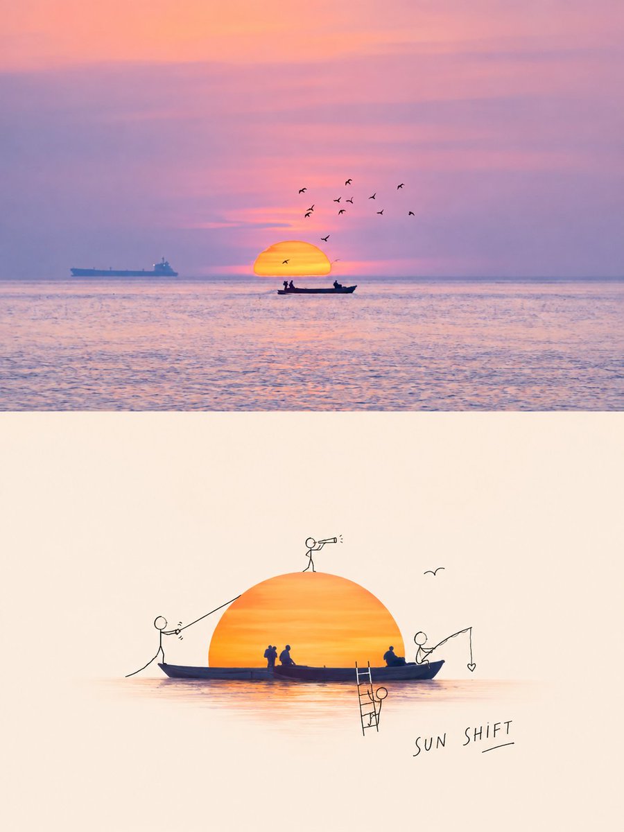
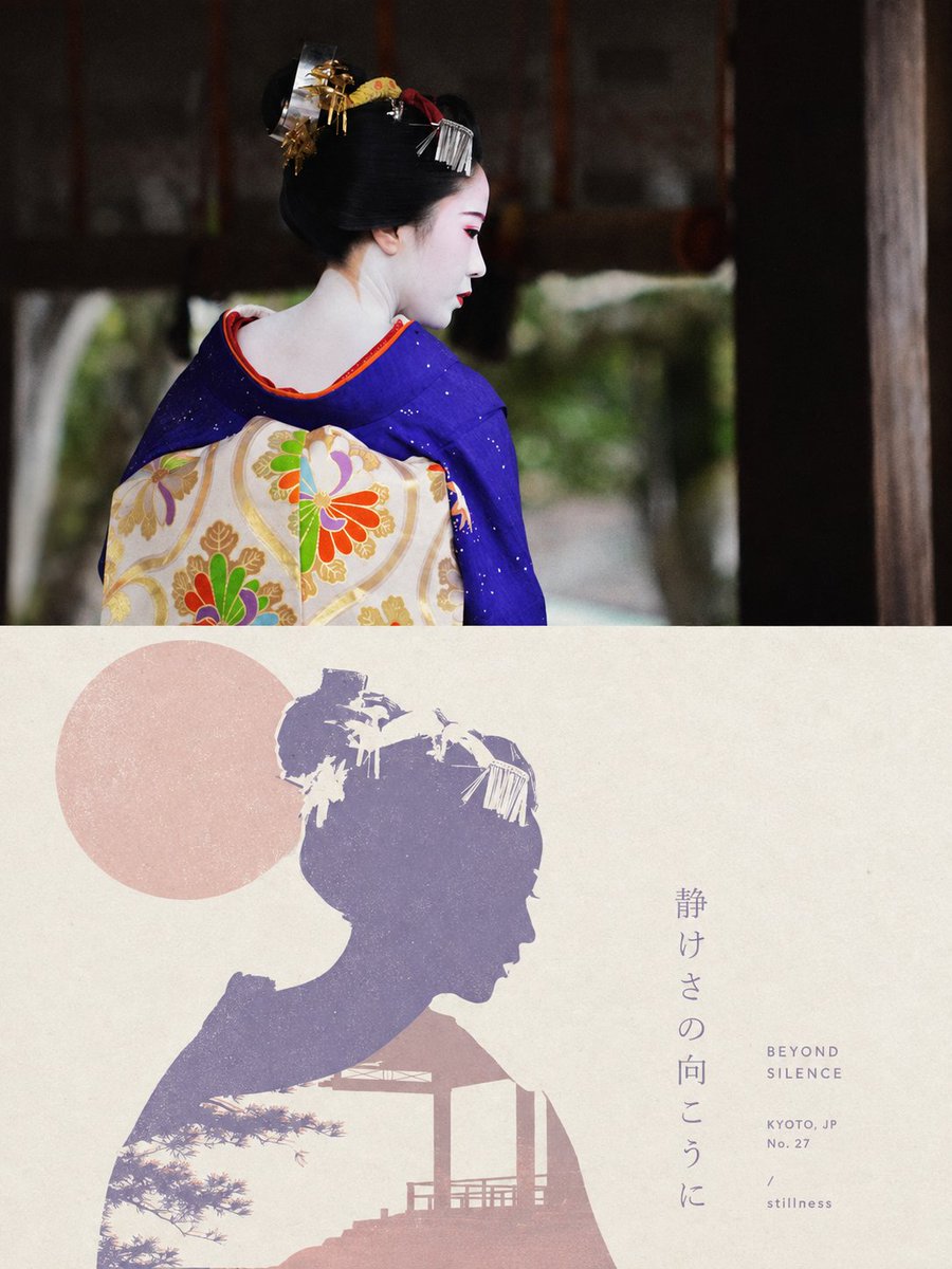
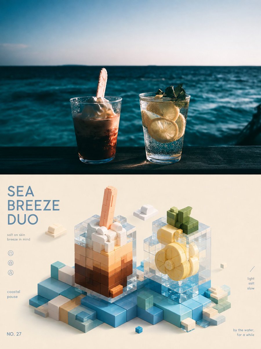
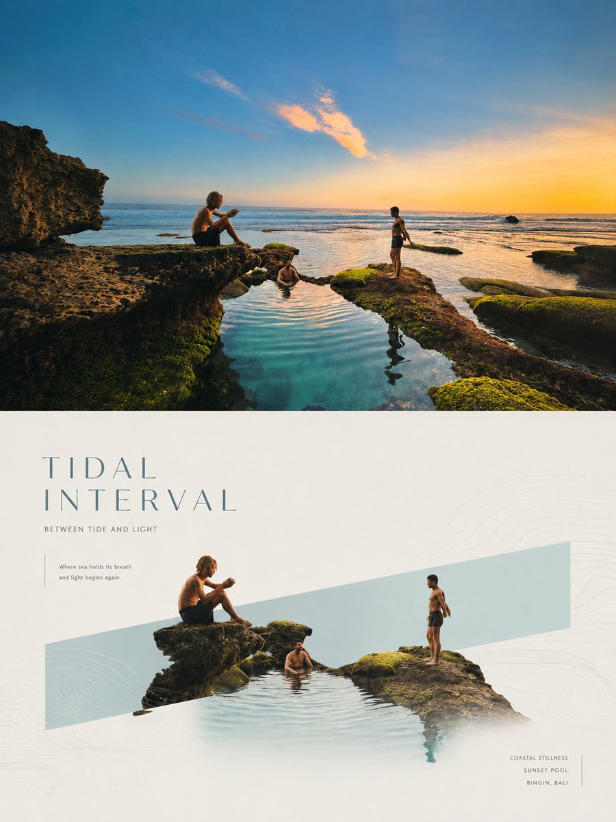
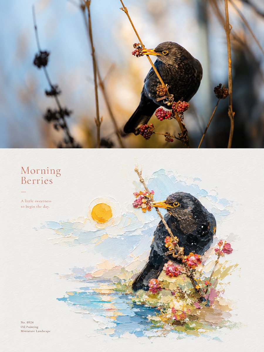
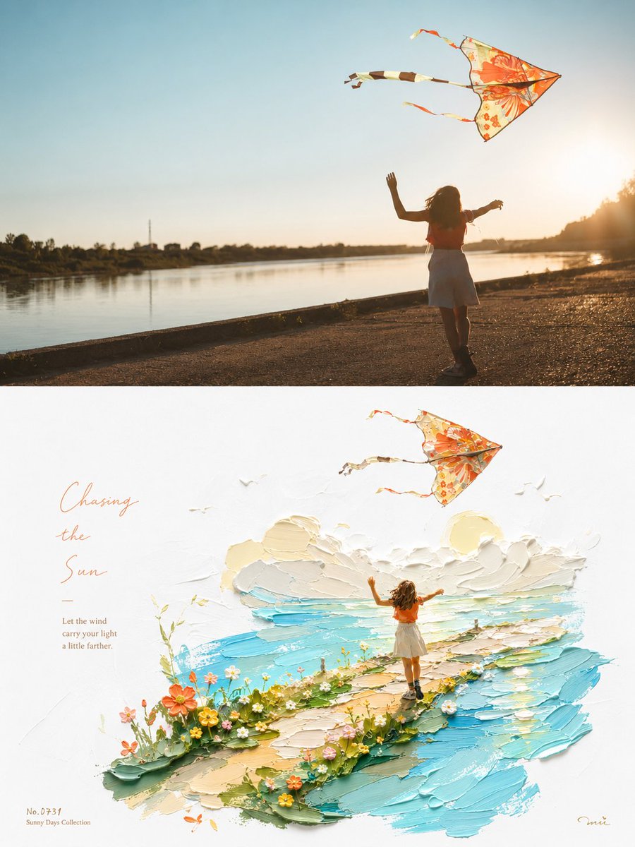
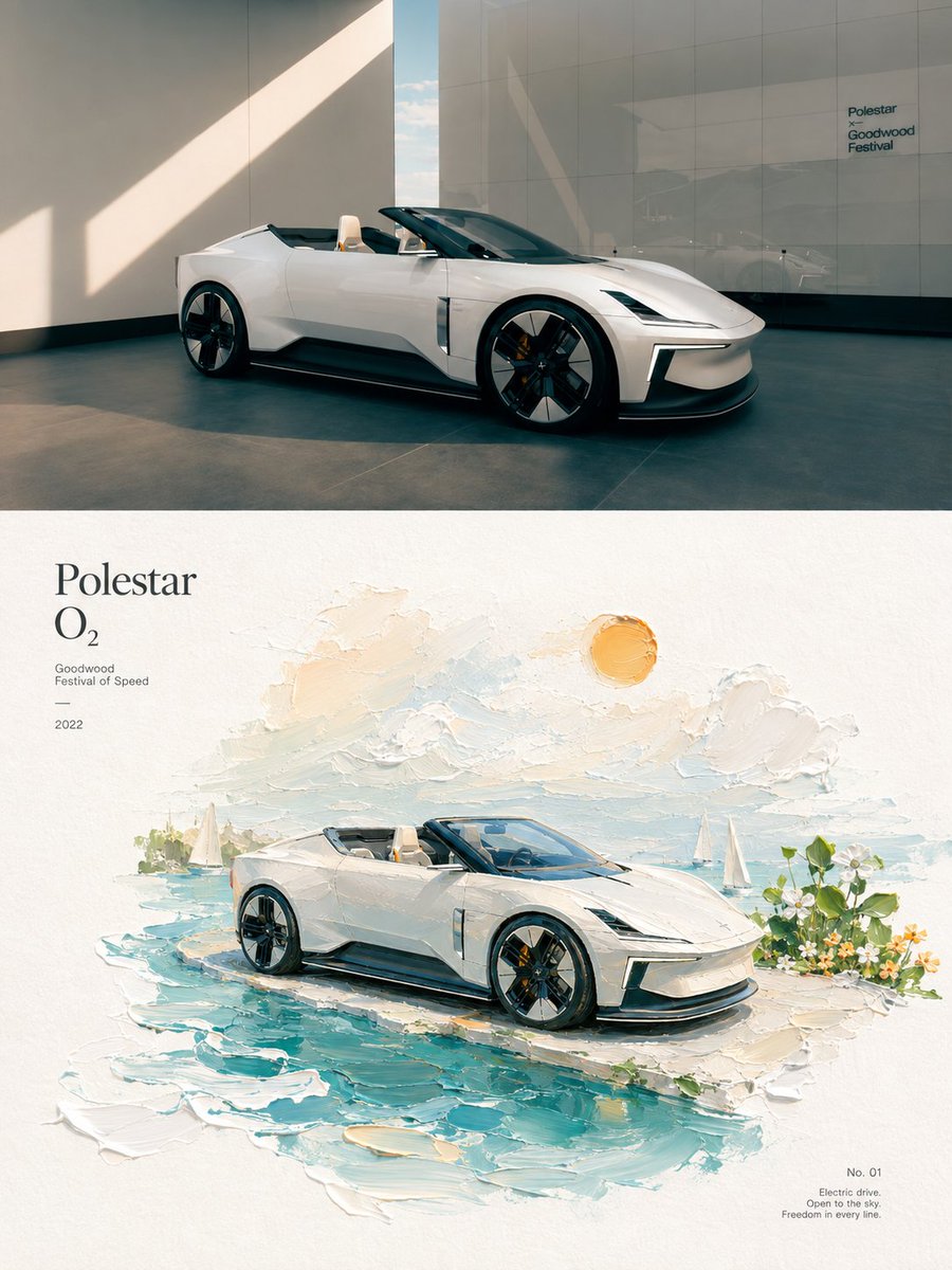
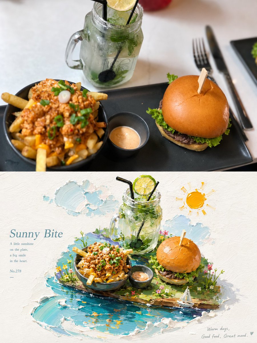
Fotoğrafınız iki yarıya ayrılır: üst kısım hafifçe renk düzenlenmiş bir fotoğraf olarak kalır, alt kısımda ise konu, parlak beyaz kâğıt üzerinde impasto yağlı boya bir minyatür olarak yeniden kurulur. Ortaya çıkan sonuç güneşli, ferah ve heykelsi bir his veriyor.

- Model
- GPT Image 2
- Tür
- 4 görsel
- En boy oranı
- 3:4
- Paylaşım
- 23 Ağu 2026
- X'teki beğeniler
- 157
Görsel promptu
3,747 karakter🪁 Turn each photo I upload into a separate premium design poster; no multi-image collage, output each photo individually. Use an overall 3:4 vertical composition, with the top and bottom areas strictly at a 1:1 height ratio, each taking up 50% of the frame. In the top half, keep the original photo, preserving the subject's identity, structure, proportions, real texture, natural light and shadow, and original color atmosphere, applying only light premium photographic grading so it has the quality of an art magazine, independent publication, and exhibition photography. To fit the frame, you may naturally extend the sky, ground, or environmental background, but must not stretch, distort, or alter the subject. In the bottom half, extract the most recognizable subject, contour, pose, and narrative relationship from the photo and reconstruct them into a 3D impasto oil-painting-style micro-scenery illustration poster. Do not mechanically replicate the photo; instead transform the subject into a refined, three-dimensional, touchable miniature landscape, reshaped with impasto brushwork, layered color, and sculptural volume; keep the subject's core identity and key features while moderately optimizing angle, proportion, and detail for better micro-scenery presentation. Use a composition with large white space + a centered or slightly off-center diagonal main axis. On a bright white textured paper surface, support the subject with a clear impasto color band related to the original theme, which can become water, ground, a path, a light band, or an abstract landscape slice; the subject and band interact naturally, adding reflections, ripples, light spots, or extended brushstrokes as suited to the content. In the background, keep only a few impasto clouds, sun, mist, or theme-related natural motifs, forming light and poetic spatial layers. The painterly language emphasizes impasto oil painting × physical miniature × clear luminosity. Preserve obvious paint buildup, palette-knife marks, undulating edges, paper texture, and a semi-handmade shaping feel; concentrate the impasto on water, clouds, the color band, and local highlights, so the subject is both refined and three-dimensional, with the real materiality of oil paint. For the palette, extract the brightest, most vivid, most alive colors from the top photo to re-blend, rather than averaging colors. Raise overall brightness and color purity, using clear sky blue, lake teal, tender green, warm yellow, coral orange, and peach pink—bright hues naturally derived from the original image—forming a healing feel through fresh warm-cool relationships. Use plenty of pure warm white as breathing space; the main colors are vivid but not harsh, and local warm orange, gold, or pink can serve as a sunlight-like accent, giving the image a sunny, vivid, warm, light, alive color spirit. Avoid dirty, aged, muted-Morandi, dark-brown filter, fluorescent colors, and cheap candy feel. Let text intervene sparingly: distill a short title from the subject's identity, location, emotion, or symbolic meaning, paired with very little subtext, numbering, or micro-annotation. Keep the text refined, restrained, and airy, cleverly arranging it along the diagonal axis, the subject's edges, or large white space, like the refined annotation in an art publication. The overall result should convey a premium, healing quality composed of bright white ground, vivid impasto, clear colors, a miniature subject, large white space, and warm luminosity. Whether the subject is architecture, a person, animal, plant, object, vehicle, or natural landscape, it should keep a clear identity and vivid colors, avoiding a dirty, dull, cartoon-toy, plastic-CG, e-commerce, or template feel. 🪁
Nasıl kullanılır
Önce bir fotoğraf yükleyin, çünkü üst yarı gerçek resminizi korur ve alt yarı bu fotoğraftan oluşturulur. GPT Image 2 promptu olarak paylaşılmıştır. Düzenin ve ışığın net kalması için 1:1 bölme ve parlak beyaz kâğıt talimatlarını koruyun; konuyu ya da başlığı dilediğiniz gibi değiştirebilirsiniz.
23 Ağu 2026 tarihinde X'te herkese açık olarak paylaşıldı. Bu prompt ve sonucunun tüm hakkı içerik üreticisine aittir. Bu sizin mi? Güncelleme veya kaldırma talep edin.