Görsel promptu Marka ve arayüz Özelleştirilebilir
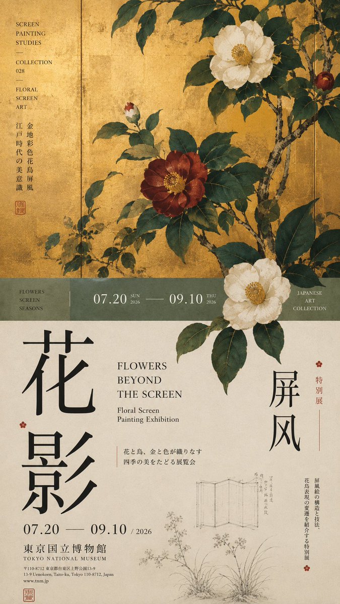
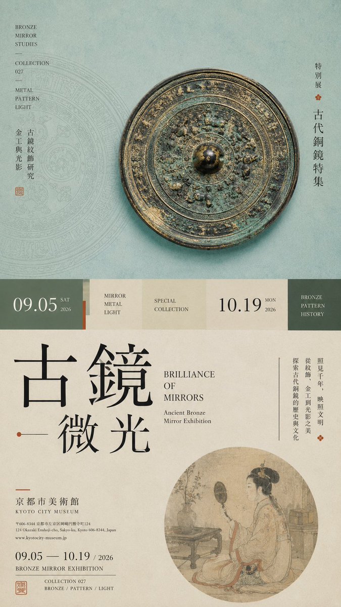
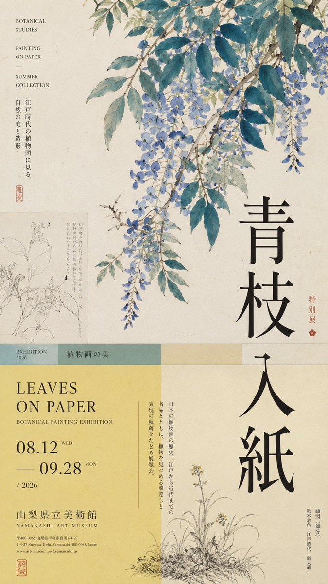
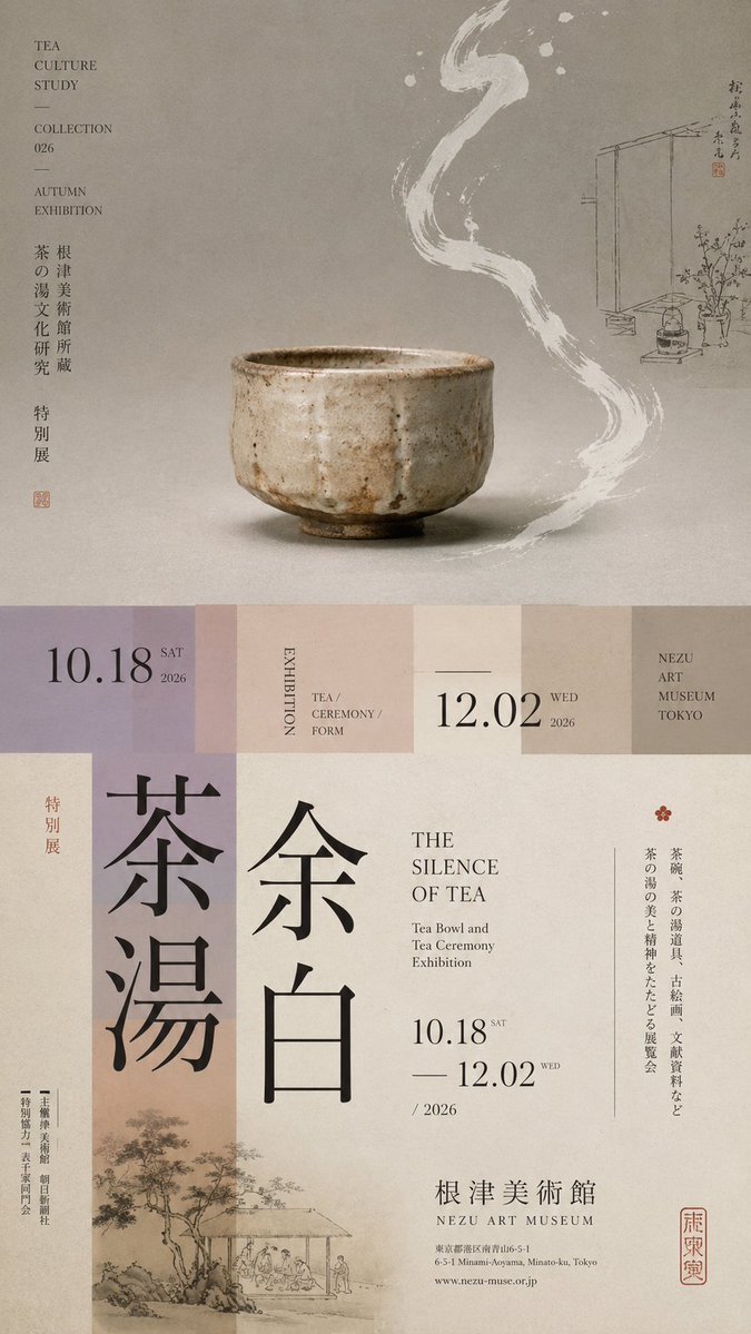
Yatay bölünmüş katmanlı yazılı sergi posteri
Eşit olmayan bölgelere ayrılmış, tek bir ana görsel, dar bir geçiş bandı ve büyük dikey yazılardan oluşan uzun 9:16 sergi posteri. Konu kesim çizgisini aşarak üst ve alt bölümlerin tek bir editoryal sayfa gibi okunmasını sağlar.

- Model
- GPT Image 2
- Tür
- 4 görsel
- En boy oranı
- 9:16
- Paylaşım
- 18 Ağu 2026
- X'teki beğeniler
- 80
Sergi temasıÇince başlıkİngilizce başlıkTarih ve mekân
Görsel promptu
1,789 karakterPrompt: 【Theme】: ____ 【Main visual】: ____ 【Chinese title】: ____ 【English title】: ____ 【Auxiliary visual】: ____ 【Main color】: ____ 【Secondary color】: ____ 【Date / Institution】: ____ 【Ratio】: 9:16 Generate a "horizontal-split" poster with a sophisticated Editorial Design and cultural-exhibition character. Don't simply make it "image on top, text on bottom." Divide the layout into 2–3 vertical zones of unequal proportions: main visual zone about 50%–65%, central transition cut about 8%–15%, lower information zone about 25%–40%. Keep only one primary visual core 【main visual】, then add a few low-weight details, such as line art, partial painting, patterns, study diagrams, small collection info, or vertical text, so the whitespace has design density without stealing focus from the subject. In the middle, use low-saturation color blocks, narrow color bands, or information modules to connect the upper and lower zones. The main title participates in the composition through enlargement, vertical setting, offset, or crossing zones; allow the subject to partially cross the cut boundary, creating front-back layers between the zones. Establish a clear text hierarchy: large Chinese title → English title / date → small subtitle → tiny institutional info. Group the small text together, don't scatter it. Keep colors to 3–5 tones, building hierarchy through zone proportions, visual weight, cross-zone relationships, and typography. Key point: the horizontal split is not about cutting the image into two blocks, but about giving the different zones clear roles while reconnecting them through the subject and the text. Museum Exhibition Poster × Editorial Graphic Design—rich but not chaotic, spacious but not empty, with the finish of a real museum poster and art catalogue.
Nasıl kullanılır
Şablondaki köşeli parantez alanlarını doldurarak başlayın; özellikle tema, ana görsel ve iki başlık önemli. Bu bir şablon olduğu için bölge oranlarını ve köşeli parantez yapısını koruyun, çünkü yerleşimi onlar taşır; konunun kesim sınırını aşmasına izin veren cümleyi de tutun. GPT Image 2 promptu olarak paylaşıldı. Sonuç, galeri ya da müze posteri maketi veya bir sergi kataloğu kapağı olarak iyi çalışır.
18 Ağu 2026 tarihinde X'te herkese açık olarak paylaşıldı. Bu prompt ve sonucunun tüm hakkı içerik üreticisine aittir. Bu sizin mi? Güncelleme veya kaldırma talep edin.