

Prompt stüdyosu
“El yapımı kâğıt kültür posteri, mikro atölye sahneli” promptunu kendinize göre uyarlayın
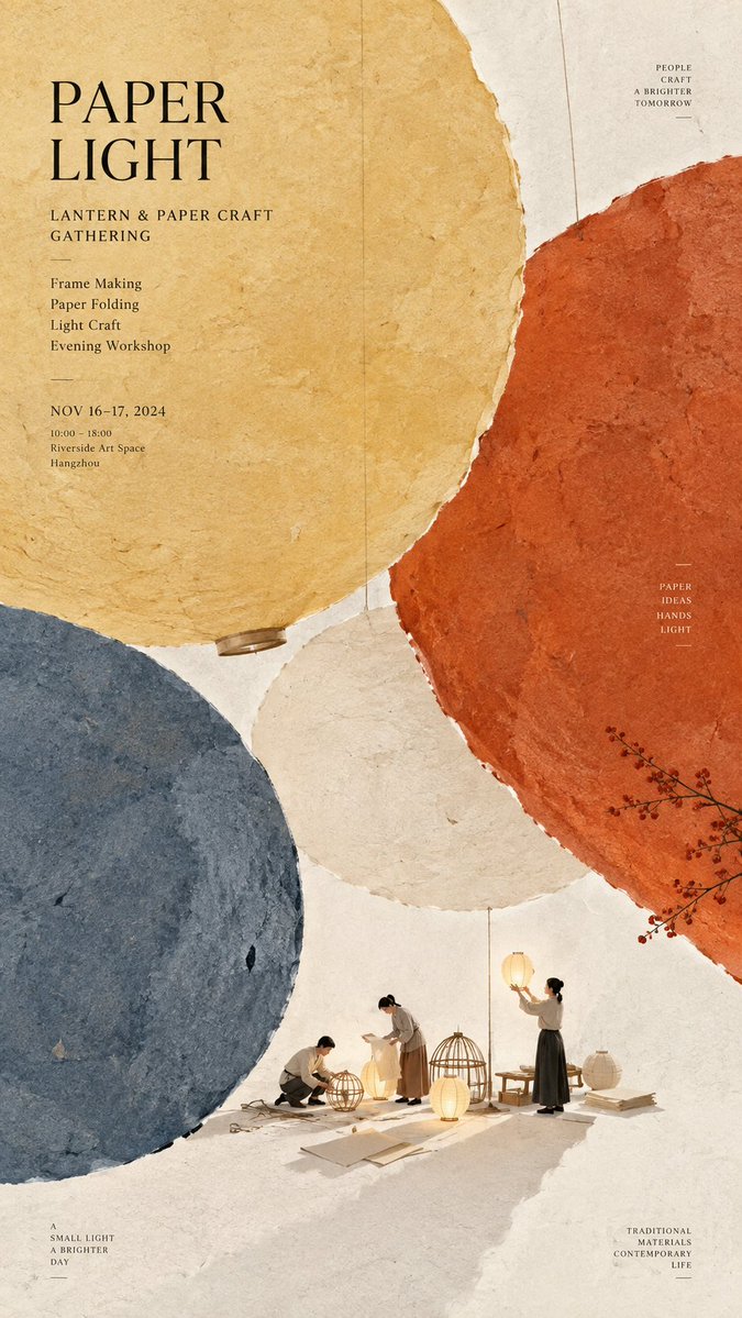
Sıcak fildişi rengi dikey bir yaprağı, birkaç mat renkte büyük dokulu kâğıt formları kaplıyor ve aralarında küçücük bir atölye sahnesi gizleniyor. Uzaktan bakıldığında sakin renk alanları gibi görünüyor; yakından bakınca lifler ve minik figürler ortaya çıkıyor.
 @MrLarus'in promptu
- Aşağıdaki boşlukları doldurun.
- Promptun sağ tarafta nasıl güncellendiğini izleyin.
- Kopyalayın ya da bir görsel aracında açın.
Görsel promptu
Theme: {paper craft, cultural activity, or workshop} Main palette: {2 to 4 colors} Large paper structure: {circles, woven bands, marbled fields, stitched sheets, folds, cutouts, etc.} Micro scene: {a tiny workshop or cultural activity} Title: {event title} Event details: {optional date, venue, activity} Aspect ratio: 9:16 Create a refined vertical cultural poster using paper fiber, large color fields, and micro scenes as the core visual language. Build the composition around a few large handmade paper forms using the selected palette. The paper should feel tactile and physical, with visible natural fibers, pulp texture, pigment absorption, subtle pressure marks, irregular edges, and gentle tonal variation. Keep the material matte, clean, sophisticated, and contemporary. Let the large paper forms define the composition before adding any text. They may float, overlap, weave, fold, flow, connect, open, or frame negative space depending on the selected structure. Avoid regular grids and generic poster layouts. From a distance, the image should read as a strong arrangement of large color fields. Inside or around the large paper composition, add one very small micro scene related to the theme. Include two or three adult figures naturally performing the activity, with only a few relevant tools or objects. The entire scene should occupy roughly 3% to 5% of the image, so it becomes a detail discovered after the main composition. Use generous warm ivory negative space to keep the poster breathable. Add only one small accent color when needed. Typography should remain restrained and secondary. Use a refined editorial serif for the main title and small uppercase sans serif for supporting information. Keep the title relatively small and place it in a quiet area of negative space. Use meaningful event information only. The visual reading order should be: large paper color fields first, material texture second, micro scene third, title and event information last. The final result should feel tactile, editorial, artistic, contemporary, and carefully crafted. From a distance it should be visually simple and strong. Up close it should reveal paper fibers, subtle material details, tiny people, tools, and narrative.
Prompt, X'te @MrLarus tarafından paylaşıldı. Tüm hakkı içerik üreticisine aittir.
Özelleştirebileceğiniz diğer promptlar
 Nordic tarzı Japon web stüdyosu tasarım panosu
 Çizgi sanatı tarzında tek çizgili şehir sokağı seyahat posteri
 Tokyo sokak hayatı çizgi sanatı seyahat posteri
 Siyah-beyaz yüz güzelliği raporu düzeni
 Siyah beyazda avuç içi okuma rehberi taslağı
 Fotoğrafını ekleKoyu arka planda marka kimliği sistemi posteri
 Fotoğrafını ekleLogo tabanlı marka kimliği panosu: renk paleti ve maketlerle
 Renk vurgulu minimal çizgi illüstrasyonu