Prompt stüdyosu
“Geometrik Çince karakter tipografi posteri” promptunu kendinize göre uyarlayın
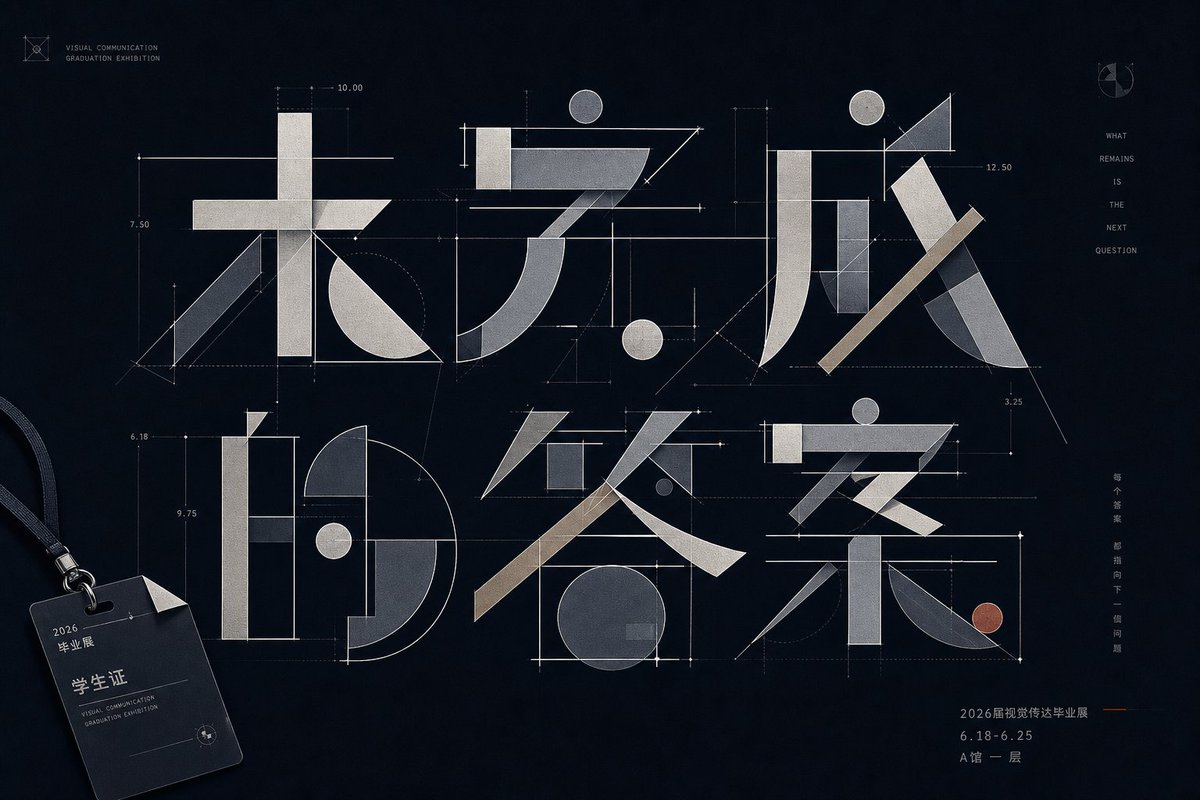
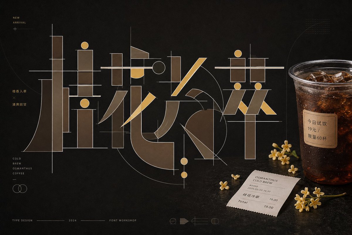
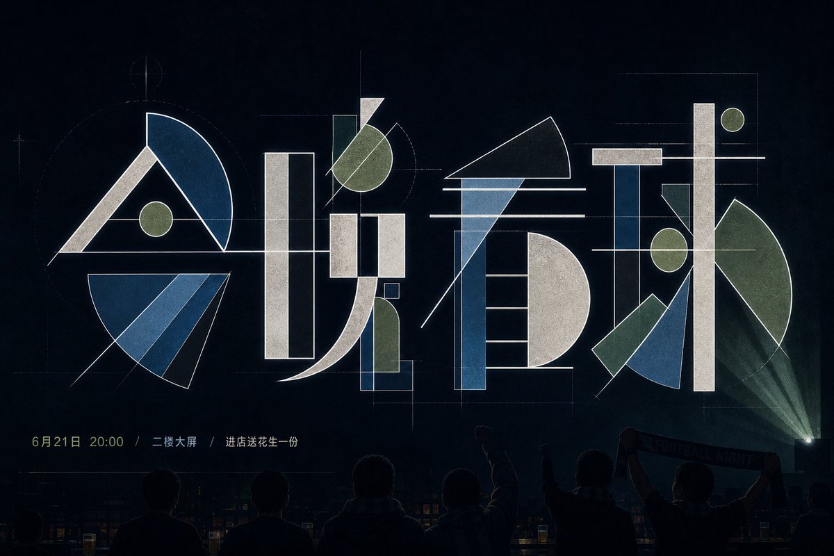
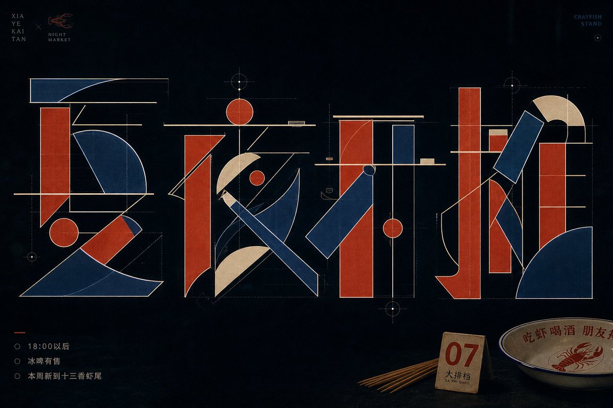
Çince karakterler kalın dikdörtgen çubuklara, ince çizgilere, yuvarlak noktalara ve yelpaze biçimli yaylara ayrılır, ardından bir mühendislik çizimi gibi yeniden kurulur. Harfler sessiz, koyu bir zeminde üst üste biner ve birbiriyle kesişir; sakin ve hassas bir poster ortaya çıkar.
 @xiaoxiaodong01'in promptu
- Aşağıdaki boşlukları doldurun.
- Promptun sağ tarafta nasıl güncellendiğini izleyin.
- Kopyalayın ya da bir görsel aracında açın.
Görsel promptu
Around a specific themed text, generate an experimental typographic image that deconstructs the Chinese characters into legible yet abstract geometric components: thick rectangular vertical strokes, ultra-thin horizontal beams, diagonally cut long bars, round dots, semicircular arcs, and large fan-shaped sectors interlocking to form a glyph skeleton measured like an engineering drawing. Each character keeps a clear center of gravity and stroke relationships, but avoids conventional calligraphic brushwork; simulate stroke entries and exits with straight lines, arcs, chamfers, and empty space, letting negative space carry breaks, turns, and crossings. The main glyphs hold the primary visual weight, with obvious overlaps, crossings, and alignments between components: thin horizontal beams pass through the thick blocks at the top or middle, round dots echo the axis of long verticals, large curved masses produce a sense of speed and tension, and the outer contour uses a clean, bright stroke to separate layers. The background is a quiet, low-brightness field with large breathing room; colors are extracted from the theme's own material, mood, and cultural meaning, mapped into a clean low-brightness base, a mid-to-high brightness main structural color, and a few highlight edge lines and information colors, maintaining light-dark contrast, restrained low saturation, clear tonal steps, and a calm, precise mood, without copying fixed color codes. The overall finish looks like a font studio's concept sheet—sharp edges, flat fills, stable line weights, with faint layered transparency and print texture in places; small text serves only as quiet markers kept away from the subject and must not steal the dominance of the geometric glyphs. —————— Personal wallpaper: portrait 9:16, for a phone lock screen, with the main text reading "Don't rush, take it slow." Restrained text: place only a tiny date "2026 / SUMMER" at the bottom, leaving the rest uncluttered. Fitting object: a key, a subway ticket, or an earphone cord set close to the glyph's edge, like something casually put down in daily life.
Prompt, X'te @xiaoxiaodong01 tarafından paylaşıldı. Tüm hakkı içerik üreticisine aittir.
Özelleştirebileceğiniz diğer promptlar
 Fotoğrafını ekleFotoğraf ve kâğıt izometrik minyatürlü bölünmüş poster
 Katmanlı 26 Dünya Kupası futbol posteri
 Sarı ve siyah anime moda dergisi illüstrasyonu
 Minimalist Japon moda dergisi kapak illüstrasyonu
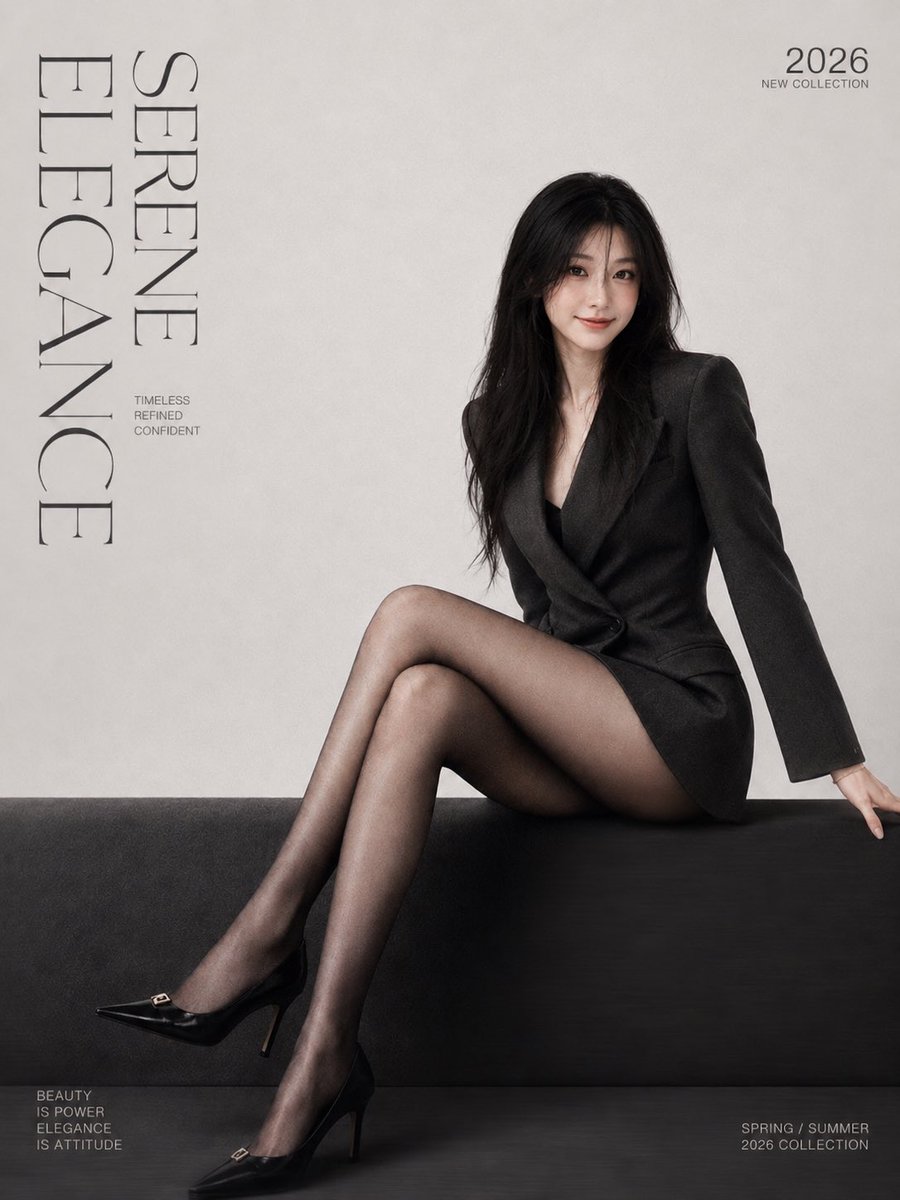 Fotoğrafını ekleMinimalist moda dergisi kapak posteri, serif yazı tipiyle
 Fotoğrafını ekleMorandi serigrafi tonlarında gestalt siluetli bölünmüş poster
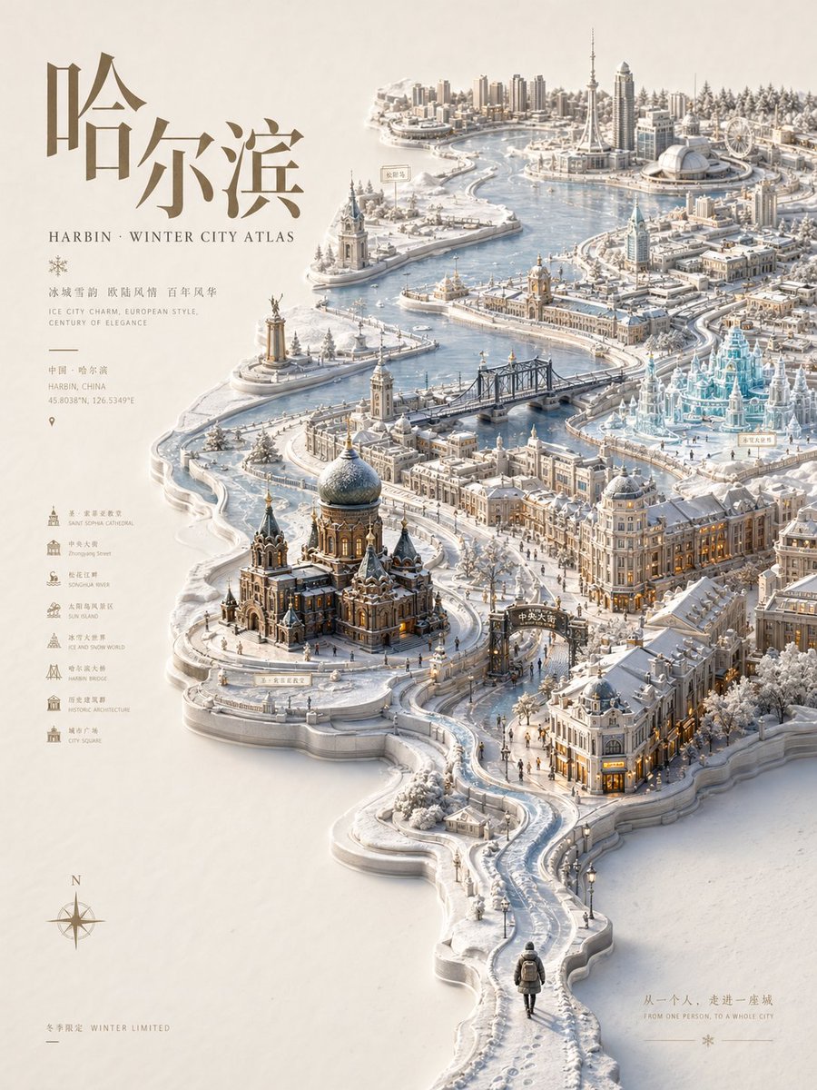 Kabartmalı şehir atlası posteri, mevsimlik minyatür harita
 Pastel risograf baskı poster stili