Görsel promptu Yiyecek ve içecek Özelleştirilebilir
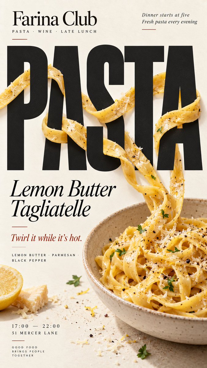
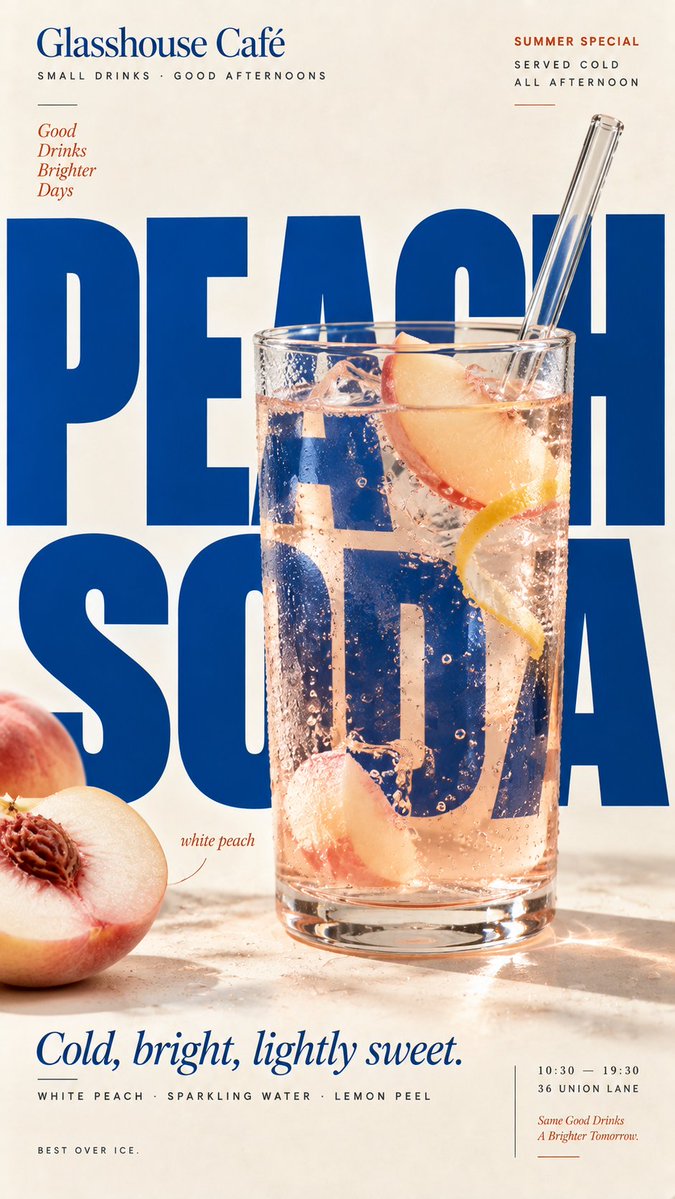
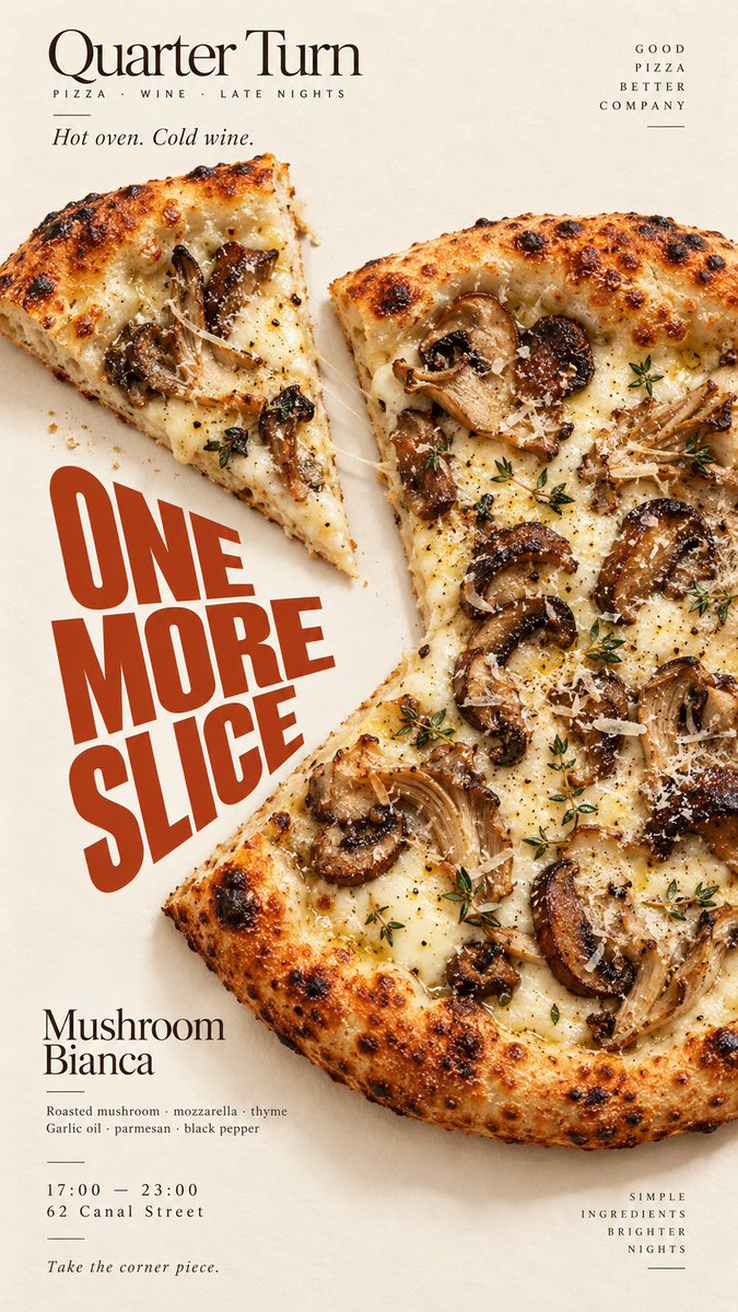
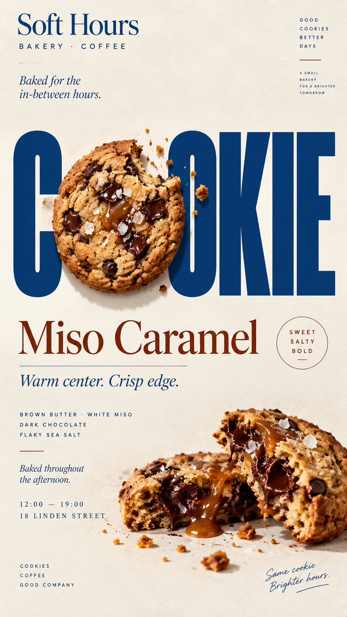
Tipografiyle etkileşen yiyecek posteri
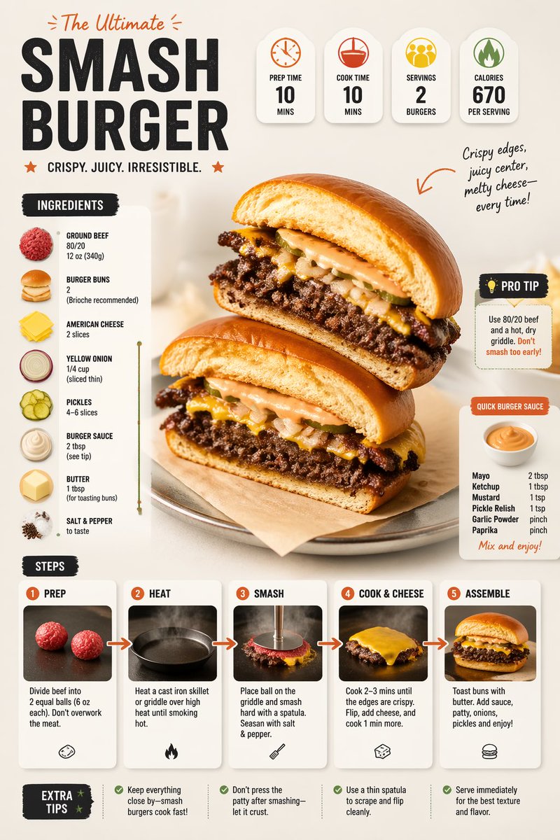
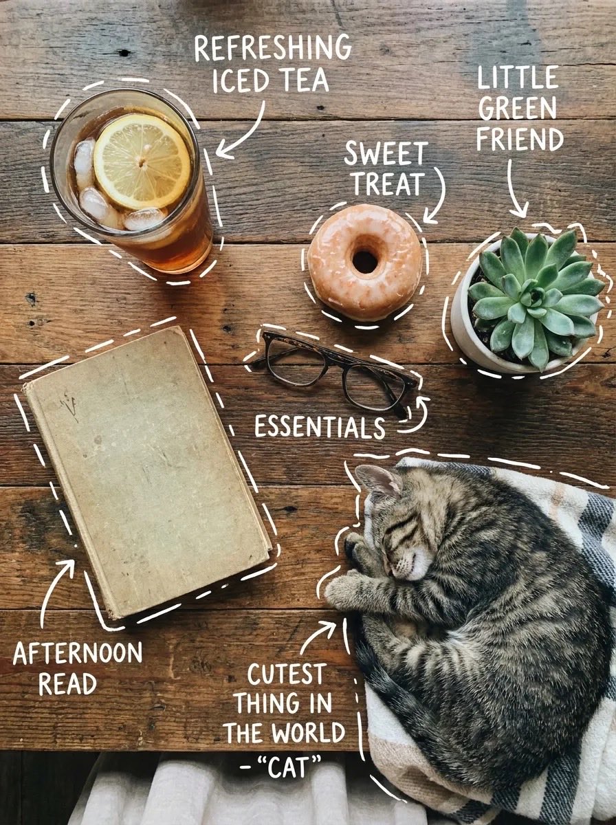
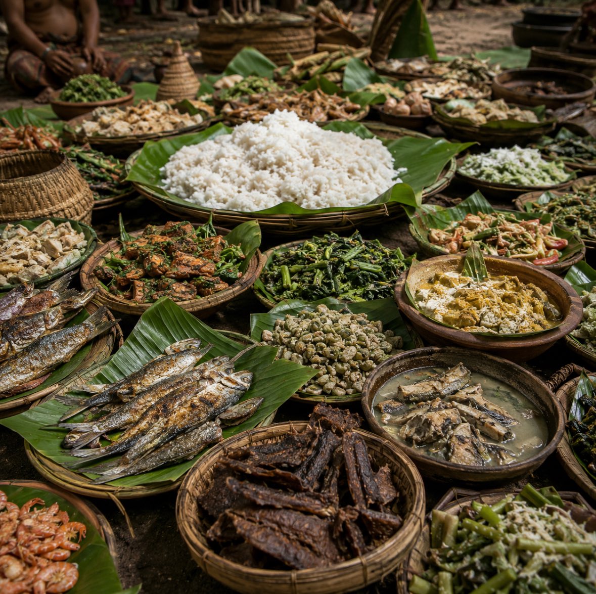
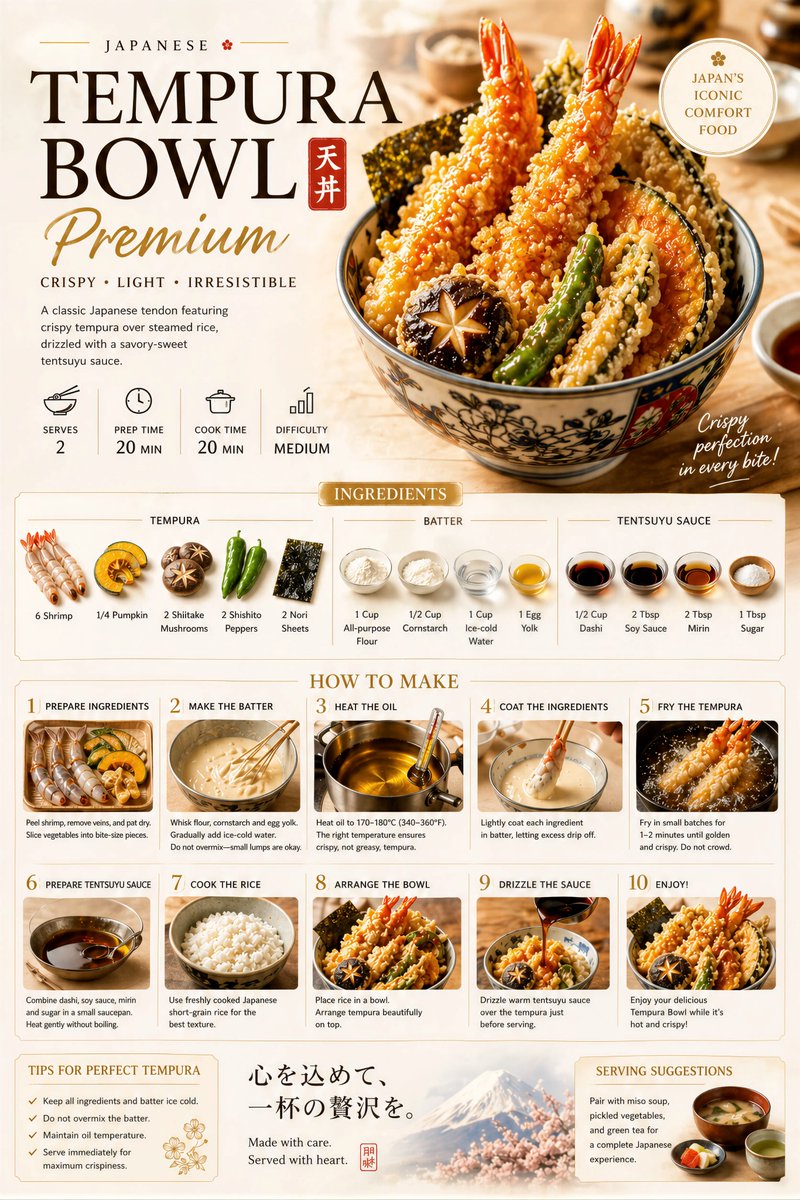
Gerçekçi yiyeceklerin iri harflerin içinde yer aldığı, öğelerin büyük harflerin önünde ve arkasında hareket ettiği dikey bir editoryal poster. Sonuç, yemek ile başlığın birbirine bağlı olduğu bir kafe ya da restoran kampanyası gibi okunuyor.

- Model
- GPT Image 2
- Tür
- 4 görsel
- En boy oranı
- 9:16
- Paylaşım
- 6 Eyl 2026
- X'teki beğeniler
- 22
MarkaMarka adıYiyecek / içecekAna ürünBaşlık+5 daha fazla
Görsel promptu
2,299 karakter[BRAND]: {brand name} [FOOD / DRINK]: {main product} [HEADLINE]: {main word or short title} [INTERACTION]: {weave through type / refract type / create negative space / replace a letter} [ACCENT COLOR]: {main typography color} [DETAILS]: {ingredients / short copy / hours / address} Create a 9:16 vertical food editorial poster combining highly realistic food photography with bold, expressive typography. Use a warm cream or ivory paper background with subtle natural texture. Keep the food or drink realistic, appetizing and materially believable, with natural highlights, shadows, texture and proportions. Avoid CGI, plastic surfaces, floating cutouts or overly polished commercial rendering. The key concept is that the food must physically interact with the typography according to [INTERACTION], rather than simply sitting beside the text. For “weave through type,” let a few continuous food elements move naturally in front of and behind large letters with clear, believable depth. For “refract type,” place transparent glass or liquid in front of the headline so only the letters seen through it are naturally shifted, enlarged or distorted by real optical refraction. For “create negative space,” let the shape or missing portion of the food create a clean empty area where the headline naturally fits. For “replace a letter,” use the food itself as one recognizable letter inside the headline while keeping the full word immediately readable. Make [HEADLINE] one of the strongest visual elements using bold editorial typography. Integrate type and food into the same composition with clear hierarchy, strong negative space and intentional cropping. Add only a few useful brand details such as [BRAND], ingredients, flavor notes, opening hours or address. Keep all copy short and meaningful. Use [ACCENT COLOR] as the main typographic accent alongside cream, natural food colors and dark neutrals. Keep the palette controlled. Avoid numbered labels, 01/02, Vol., sparkles, generic filler copy, unnecessary decoration, UI-style cards or template-like layouts. The final poster should feel like a real café, bakery or restaurant campaign: visually striking at thumbnail size, detailed up close, and built around one clear idea where food and typography genuinely affect each other.
Nasıl kullanılır
Marka adınızı, ana yemeğinizi ya da içeceğinizi, başlık kelimenizi ve vurgu renginizi yerleştirin; yiyeceğin tipografiyle nasıl buluştuğuna karar veren etkileşim satırını olduğu gibi bırakın. Sıcak krem kâğıt dokusunu ve gerçekçi ışık detaylarını koruyun, çünkü bunlar görüntünün render edilmiş bir maket gibi durmasını engeller. GPT Image 2 için paylaşılmış bir prompt olup sonuç bir kafe ya da fırın için menü panosu, vitrin posteri ya da sosyal medya paylaşımına uygun.
6 Eyl 2026 tarihinde X'te herkese açık olarak paylaşıldı. Bu prompt ve sonucunun tüm hakkı içerik üreticisine aittir. Bu sizin mi? Güncelleme veya kaldırma talep edin.