

Prompt stüdyosu
“Kafeler ve fırınlar için yemek editoryal poster şablonu” promptunu kendinize göre uyarlayın
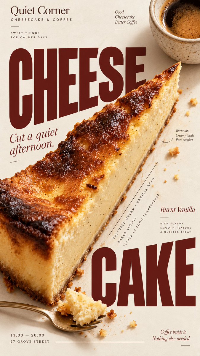
Gerçekçi yemek fotoğrafçılığını cesur, dergi tarzı tipografiyle buluşturan dikey bir poster. Yemeğin kendisi düzeni şekillendirir; başlık, fotoğraf ve detaylar bir şablona yerleştirilmiş gibi değil, birlikte tasarlanmış gibi görünür.
 @MrLarus'in promptu
- Aşağıdaki boşlukları doldurun.
- Promptun sağ tarafta nasıl güncellendiğini izleyin.
- Kopyalayın ya da bir görsel aracında açın.
Görsel promptu
[BRAND]: {brand name} [FOOD / DRINK]: {main product} [HEADLINE]: {main headline} [SUBHEAD]: {short supporting line} [DETAILS]: {ingredients / flavor / hours / address / short brand copy} [ACCENT COLOR]: {burgundy / forest green / cobalt blue / etc.} [LAYOUT]: {diagonal split / annotated flat lay / circular typography / oversized type / other editorial composition} Create a 9:16 vertical food editorial poster that combines highly realistic food photography with expressive magazine-style typography. Use a warm ivory or cream paper background with subtle natural paper texture. The food or drink should be the main visual anchor, photographed with realistic texture, natural highlights, contact shadows, appetizing materials and believable proportions. Avoid CGI, plastic-looking surfaces, overly polished commercial rendering or floating cutout objects. Build the composition around the actual shape, direction or arrangement of the food rather than placing the product in a fixed template. Let the selected [LAYOUT] determine how photography and typography interact. The subject may crop beyond the frame, overlap with type, divide the page, create a circular structure, form a diagonal axis, or leave intentional negative space for editorial information. Typography should be a major part of the composition. Use one expressive display typeface for the main [HEADLINE] and one restrained supporting typeface for secondary information. Allow changes in scale, orientation, cropping and placement so the text feels integrated with the food rather than simply placed above or below it. Keep a clear visual hierarchy: large headline and food first, short supporting copy second, then a few useful details such as ingredients, flavor notes, opening hours or address. Use [ACCENT COLOR] sparingly alongside cream, food-derived natural colors and dark neutral typography. Keep the palette controlled and cohesive. Small editorial elements such as thin rules, dots, curved lines or subtle annotations may be added when useful, but avoid decorative clutter, numbered labels, 01/02, Vol., four-point sparkles, generic filler copy or meaningless microtext. The final image should feel like a real café, bakery or food brand campaign: visually bold at thumbnail size, detailed when viewed closely, practical enough for branding or menu use, and designed as a complete poster rather than a reusable-looking template.
Prompt, X'te @MrLarus tarafından paylaşıldı. Tüm hakkı içerik üreticisine aittir.
Özelleştirebileceğiniz diğer promptlar
 Alçak açılı, ürün tutan model reklam fotoğrafı
 Fotoğrafını ekle3x3 ızgarada ürün marka storyboard'u
 Holografik marka logolu vinil etiket ürün görseli
 Fotoğrafını ekleFutbol forması streetwear kampanya posteri, lüks editoryal stilde
 Restoran marka temas noktası matrisi maketi
 Bold yazılı kulaklık kutusu reklam infografiği
 Dokuz nesne: Dokulu yüzeyde üstten çekim ürün fotoğrafı
 Fotoğrafını ekleGökkuşağı ışık hüzmeli altın saat ürün portresi