Görsel promptu Ürün ve reklam Özelleştirilebilir
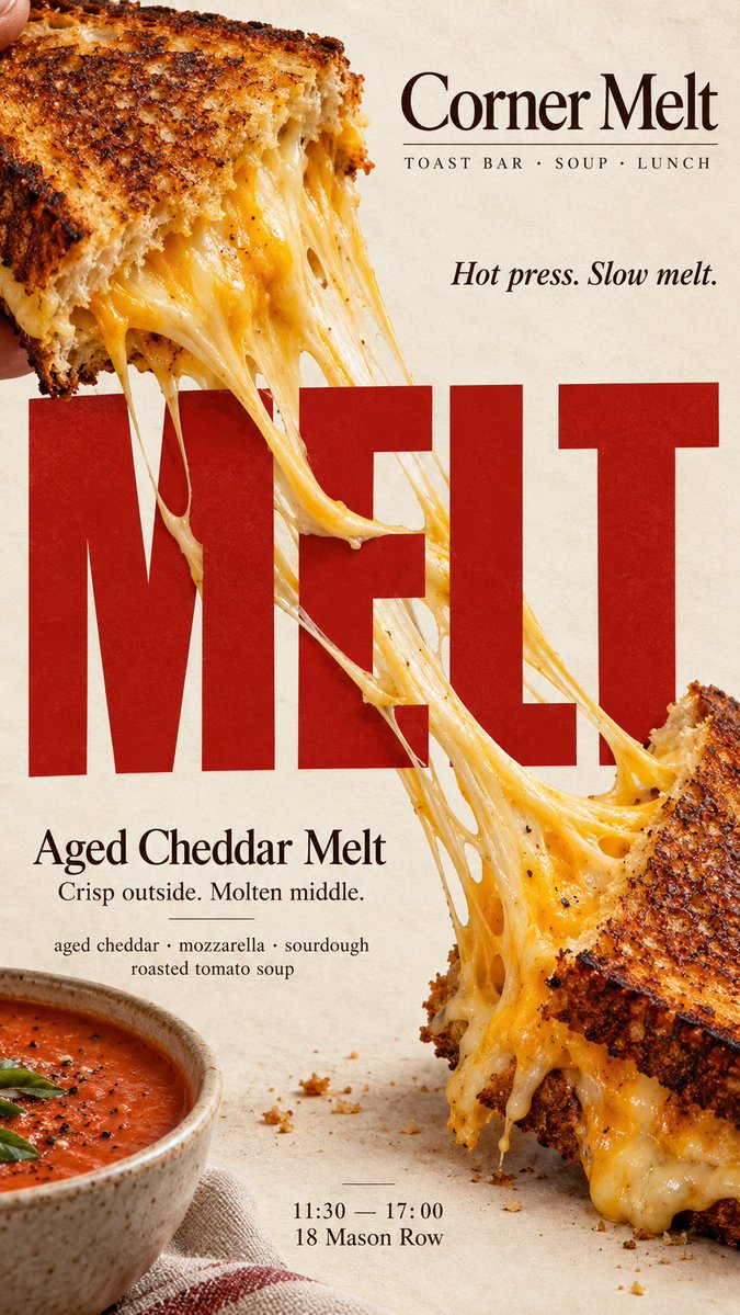
Erimiş peynirli yemek ve tipografi editoryal posteri
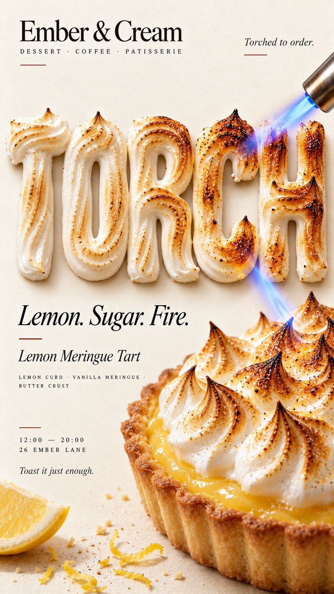
Dikey bir yemek posteri; erimiş peynirin sürekli bir şeridi iri harflerin üzerinde uzanarak başlık ile yemeği fiziksel olarak buluşturuyor. Görsel tek bakışta okunuyor ve gerçek bir fırın ya da kafe kampanyası gibi hissettiriyor.

- Model
- GPT Image 2
- Tür
- 4 görsel
- En boy oranı
- 9:16
- Paylaşım
- 7 Eyl 2026
- X'teki beğeniler
- 119
MarkaMarka adıÜrünBaşlıkKısa vurgulu kelime+4 daha fazla
Görsel promptu
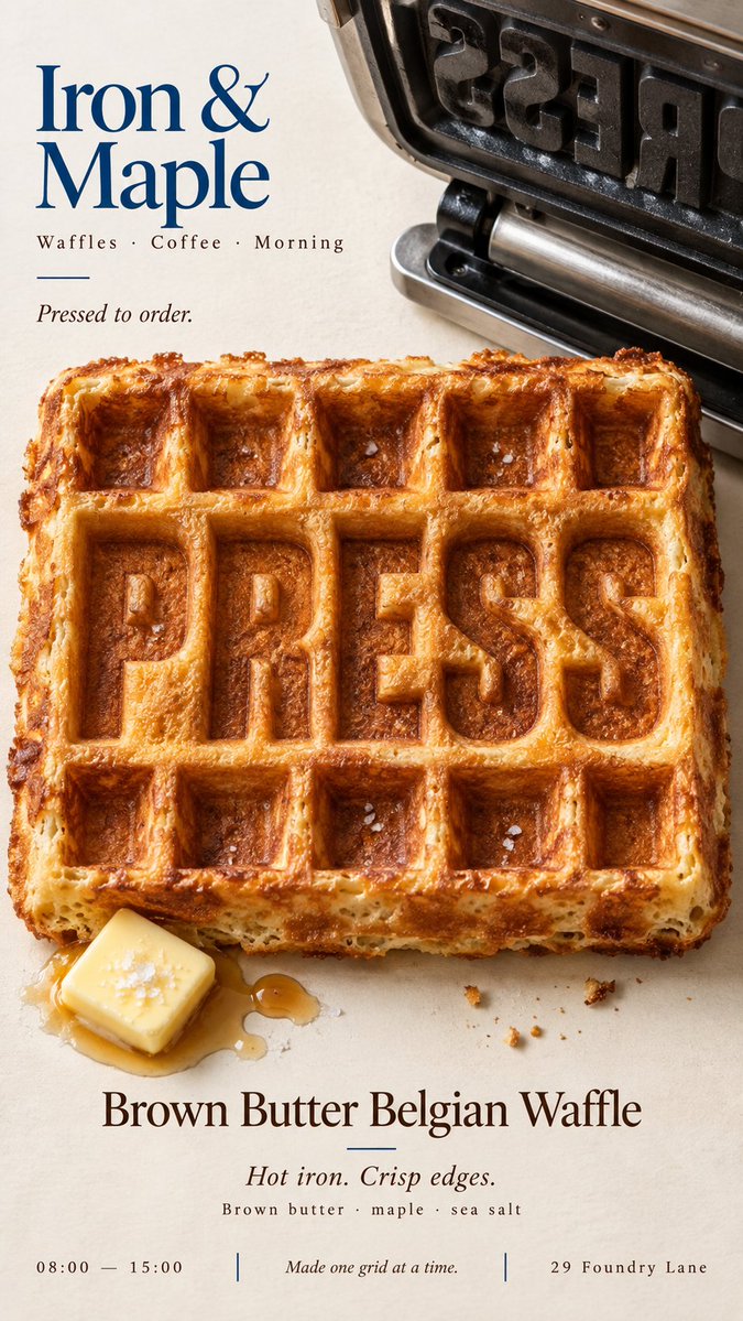
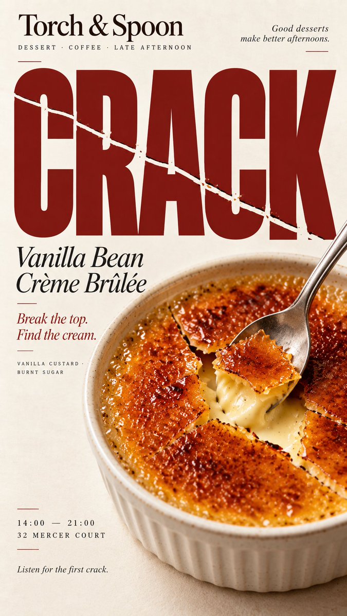
2,205 karakter[BRAND]: {brand name} [PRODUCT]: {food / dish / dessert} [HEADLINE]: {short bold word} [INTERACTION]: {stretch across type / heat transforms type / type imprints food / food fractures type} [ACCENT COLOR]: {main accent color} [DETAILS]: {ingredients / short copy / hours / address} Create a 9:16 vertical food editorial poster combining highly realistic food photography with bold typography through one clear physical interaction. Use a warm cream or ivory background, subtle paper texture, realistic food materials, natural light and clean editorial composition. The result should feel like a real café, bakery or restaurant campaign. The food and typography must physically affect each other according to [INTERACTION], not simply sit beside each other. For “stretch across type,” let a continuous edible material such as melted cheese bridge across large letters with believable tension, gravity and depth. For “heat transforms type,” make the headline from an edible material such as meringue and let real heat create a continuous toasted gradient across both the letters and the food. For “type imprints food,” press the headline directly into the food surface so the original texture physically reshapes around the letters. For “food fractures type,” let a real crack or break in the food establish one clear direction and continue that same fracture through the headline while keeping it readable. Make [HEADLINE] large, simple and immediately readable at thumbnail size. The physical interaction should be understandable within the first second. Use [ACCENT COLOR] sparingly with cream, natural food colors and dark neutrals. Add only a few useful details such as [BRAND], product name, ingredients, one short line of copy, opening hours or address. Keep props minimal. Avoid CGI food, plastic textures, generic 3D type, digital glitch, fake burn effects, random cracks, excessive decoration, numbered labels, 01/02, Vol. or sparkles. The final poster should work as a stop-scroll image: one bold headline, one clear food action, and one surprising but physically believable Food × Typography interaction. Do not decorate the type with food — let the food physically reshape the type.
Nasıl kullanılır
Önce markayı, yemeği ve başlığı doldurun, ardından yemeğe uygun etkileşimi seçin: uzama, ısı, baskı ya da çatlama. Görünümü taşıyan krem arka planı, doğal ışığı ve tek fiziksel eylemi koruyun; vurgu rengi küçük kalmalı. GPT Image 2 promptu olarak paylaşılmış; tek bir cesur başlık ve kısa bir detay satırının yeterli olduğu poster, menü kapağı ya da sosyal medya hikâyesi için kullanın.
7 Eyl 2026 tarihinde X'te herkese açık olarak paylaşıldı. Bu prompt ve sonucunun tüm hakkı içerik üreticisine aittir. Bu sizin mi? Güncelleme veya kaldırma talep edin.












