Prompt stüdyosu
“Markalar ve etkinlikler için editoryal poster düzeni” promptunu kendinize göre uyarlayın
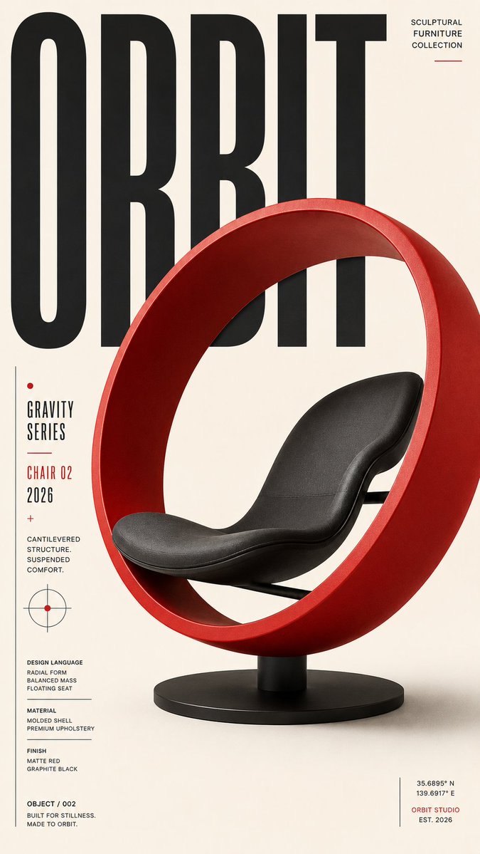
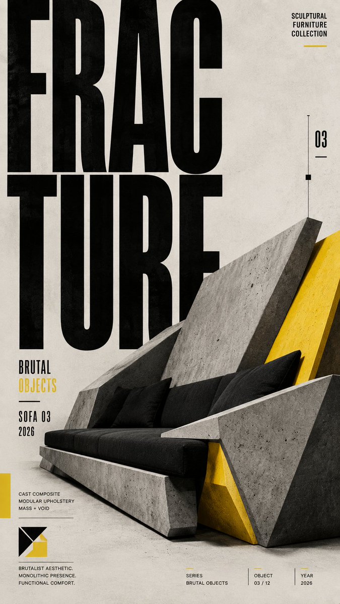
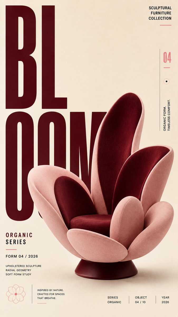
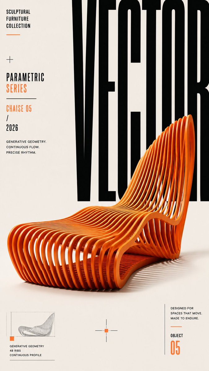
Disiplinli bir ızgara üzerine kurulu, uzun formatlı bir editoryal poster. Büyük boyutlu başlık yazısı ve tek bir baskın odak noktasıyla öne çıkar. Ölçek kontrastı ve bilinçli boşluk kullanımı, başlığın küçük bir önizlemede bile bir bakışta okunmasını sağlar.
 @ShamsAmin56'in promptu
- Aşağıdaki boşlukları doldurun.
- Promptun sağ tarafta nasıl güncellendiğini izleyin.
- Kopyalayın ya da bir görsel aracında açın.
Görsel promptu
Create a premium, highly engaging editorial poster for [SUBJECT / BRAND / EVENT / PRODUCT], designed around strong visual hierarchy, intentional composition, and immediate 2–3 second readability. **ART DIRECTION** Style: [Swiss / Brutalist / Bauhaus / Minimal / Editorial / Futuristic / Architectural / Luxury] Create a sophisticated contemporary graphic-design aesthetic rather than a generic advertising layout. Every element must have a clear compositional purpose. **01 — VISUAL HIERARCHY** Establish a clear viewing sequence: 1. Primary: "[MAIN HEADLINE]" 2. Secondary: "[HERO SUBJECT / IMAGE / OBJECT]" 3. Tertiary: "[SUBHEAD / DATE / DETAILS / CTA]" The main message must remain recognizable even when viewed as a small thumbnail. **02 — TYPOGRAPHY** Use typography as an active visual element rather than simple text placement. Use: - Oversized display typography - Strong differences in scale - Tight, intentional kerning - Controlled line spacing - Strategic cropping - Stacking and vertical alignment - Selective text/subject overlaps - Typographic masking where appropriate Use maximum 1–2 complementary typefaces. Primary typography: [BOLD CONDENSED / GROTESK / SERIF / CUSTOM] Secondary typography: clean neutral sans-serif. Keep all important text accurately spelled, readable, and professionally typeset. **03 — COMPOSITION** Build the poster using a disciplined editorial grid. Create: - One dominant focal point - Strong alignment - Clear margins - Asymmetrical balance where appropriate - Controlled tension - Intentional negative space - One or two elements subtly breaking the grid Avoid placing every element in the center. Balance visual weight across the entire canvas. **04 — HERO VISUAL** Feature [SUBJECT] as the primary visual. Presentation: "[FULL-BLEED / CUTOUT / 3D / PHOTOGRAPHIC / ILLUSTRATED / PAPER-CUT / ABSTRACT]" Integrate the subject with the typography using layering, masking, foreground/background relationships, or controlled overlap. The subject and headline should feel like one unified composition, not an image with text placed on top. **05 — SCALE** Use dramatic scale contrast: Huge: main headline or hero element Medium: secondary information Small: supporting copy Micro: technical/editorial details Avoid using similar sizes for every element. **06 — COLOR** Palette: Background: "[COLOR]" Primary: "[COLOR]" Accent: "[COLOR]" Use a restrained 2–4 color system with one dominant accent. Prioritize strong tonal contrast and readability. **07 — DEPTH & LAYERING** Hierarchy > Typography > Subject > Contrast > Negative Space > Details **AVOID** Generic centered layouts, excessive text, random decorative shapes, weak hierarchy, equal-sized elements, excessive fonts, unnecessary gradients, clutter, illegible typography, arbitrary placement, excessive effects, oversaturation, cheap advertising aesthetics, fake logos, watermarks, duplicated objects, malformed typography, and meaningless micro-text. **OUTPUT** Aspect ratio: "[4:5 / 2:3 / 3:4 / 9:16 / 16:9]" Quality: ultra-high-resolution, print-quality finish Layout: balanced from all edges with deliberate margins and professional spacing.
Prompt, X'te @ShamsAmin56 tarafından paylaşıldı. Tüm hakkı içerik üreticisine aittir.
Özelleştirebileceğiniz diğer promptlar
 Nordic tarzı Japon web stüdyosu tasarım panosu
 Çizgi sanatı tarzında tek çizgili şehir sokağı seyahat posteri
 Tokyo sokak hayatı çizgi sanatı seyahat posteri
 Siyah-beyaz yüz güzelliği raporu düzeni
 Siyah beyazda avuç içi okuma rehberi taslağı
 Fotoğrafını ekleKoyu arka planda marka kimliği sistemi posteri
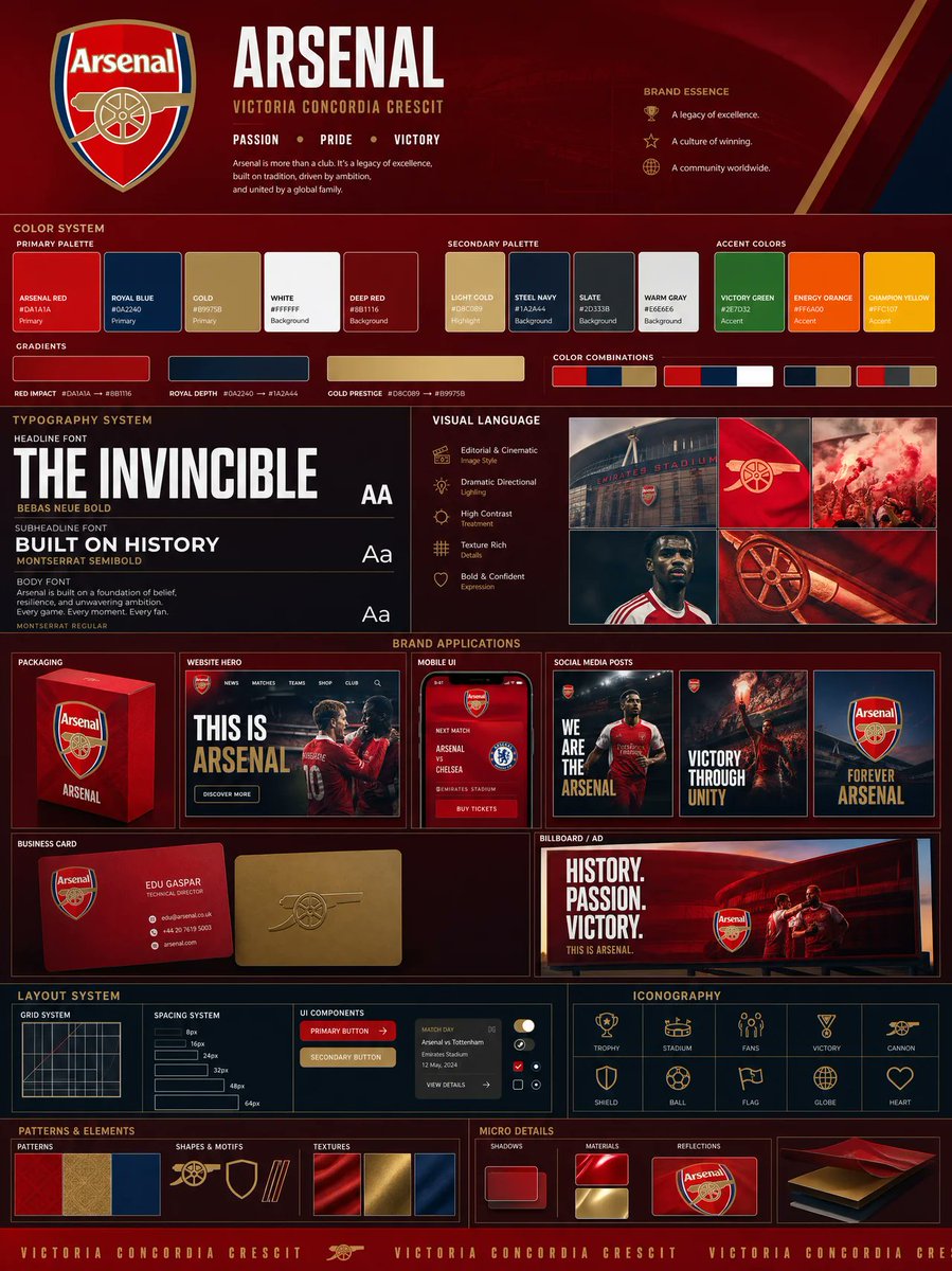 Fotoğrafını ekleLogo tabanlı marka kimliği panosu: renk paleti ve maketlerle
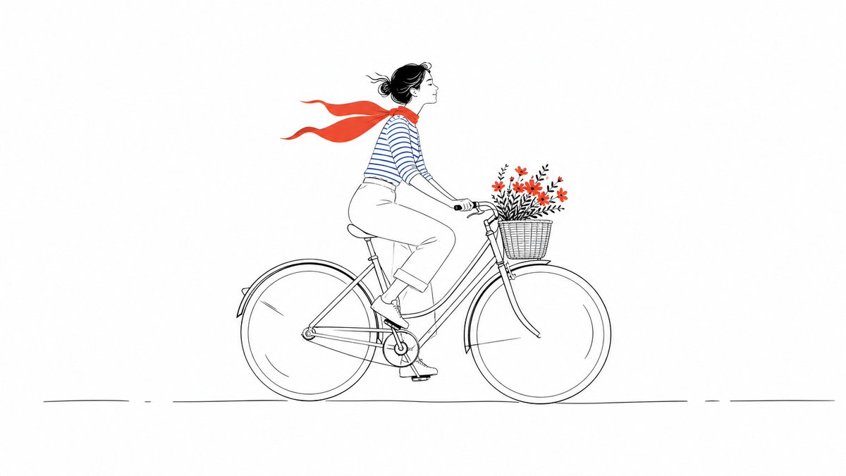 Renk vurgulu minimal çizgi illüstrasyonu