Prompt stüdyosu
“Tam ekran videolu animasyonlu açılış sayfası kahraman bölümü” promptunu kendinize göre uyarlayın
Tam ekran arka plan videosunun sabit üst çubuğun ve alt kısma sabitlenmiş başlık ile iki düğmenin arkasında yer aldığı bir React açılış sayfası. Video yavaşça belirirken metinler birer birer yukarı kayarak gelir ve sakin, editoryal bir ilk ekran ortaya çıkar.
 @viktoroddy'in promptu
- Aşağıdaki boşlukları doldurun.
- Promptun sağ tarafta nasıl güncellendiğini izleyin.
- Kopyalayın ya da bir görsel aracında açın.
Görsel promptu
Create a full-screen hero section landing page using React, Vite, and Framer Motion (`motion` package). Use plain CSS (no Tailwind). The font is Inter (weights 300, 400, 500, 600) from Google Fonts. The design is minimal black-and-white with a full-viewport background video. **Stack:** React 19, Vite, `motion` (framer-motion), `lucide-react` (for the Plus icon). **Layout:** - Full viewport height (`min-height: 100vh`), white background, flex column with `justify-content: space-between` - Fixed navbar at top (z-index 50, pointer-events none on the nav itself, auto on children) - Absolutely positioned full-screen video behind everything (z-index 0) - Footer content pinned to bottom (z-index 30) with a white gradient fade-up background **Navbar (fixed, top):** - Left side contains: 1. Logo: custom SVG icon (two rotated rounded rectangles at -35deg, black fill) + brand text "NeuralKinetics" (hidden on mobile, shown on desktop 768px+) 2. Menu button: black pill with white circle containing a Plus icon (lucide, size 12, strokeWidth 3) + "Menu" text (11px, white) 3. Tags pill: light gray (#F4F4F6) rounded-full container with two text labels "Advanced Bionics" and "Cognitive AI" (hidden on mobile, shown on desktop) - Right side contains: - A light gray pill with a black circle button (containing a 4-dot grid SVG icon) + label "Adaptive Systems" (hidden on mobile) **Background Video:** - autoPlay, muted, playsInline, object-fit: cover - On mobile: video wrapper is 80% width and 80% height (centered) - On desktop (768px+): video wrapper is 100% width and 100% height **Footer content (bottom, over gradient):** - Background: `linear-gradient(to top, #ffffff 0%, rgba(255,255,255,0.8) 50%, transparent 100%)` - On mobile: stacks vertically. On desktop: row layout, items aligned to bottom. - Left block: 1. Subtitle line: small black dot (8px circle) + "Best digital banking card 2026" (13px, 55% opacity black) 2. Heading: "One Card, Zero / Limits. Worldwide." on two lines. Font-weight 300, clamp(2rem, 8vw, 4.5rem) on mobile, clamp(2.5rem, 5.5vw, 4.5rem) on desktop, letter-spacing -0.03em, line-height 1 3. Two buttons: "See Features" (black pill, white text, 13px) and "How It Works" (transparent with dark border rgba(0,0,0,0.35), 13px) - Right block: Three tag pills "Neuromorphic", "AGI", "Cybernetics" (white bg, light border rgba(0,0,0,0.12), 11px, rounded-full) **Animations (using `motion` from 'motion/react'):** - Navbar: slides down from y:-16, opacity 0 to visible. Duration 0.8s, ease [0.16, 1, 0.3, 1] - Video: fades in from opacity 0 + scale 1.05 to opacity 1 + scale 1. Duration 1.8s - Footer wrapper: slides up from y:20, delay 0.5s, duration 1s - Subtitle: slides up from y:16, delay 0.6s, duration 0.8s - Heading: slides up from y:20, delay 0.8s, duration 0.8s - Buttons: slides up from y:16, delay 1.0s, duration 0.8s - All use ease: [0.16, 1, 0.3, 1] **Responsive (mobile-first, breakpoint at 768px):** - Mobile: navbar padding 16px, smaller buttons (28px circles), brand text hidden, tags hidden, right label hidden, footer stacks vertically, video at 80% size - Desktop (768px+): navbar padding 24px 32px, larger buttons (32px circles), all text/tags visible, footer is row layout, video fills 100%
Prompt, X'te @viktoroddy tarafından paylaşıldı. Tüm hakkı içerik üreticisine aittir.
Özelleştirebileceğiniz diğer promptlar
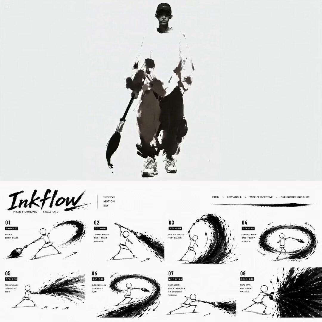 Siyah beyaz mürekkep fırçası hip-hop dans videosu
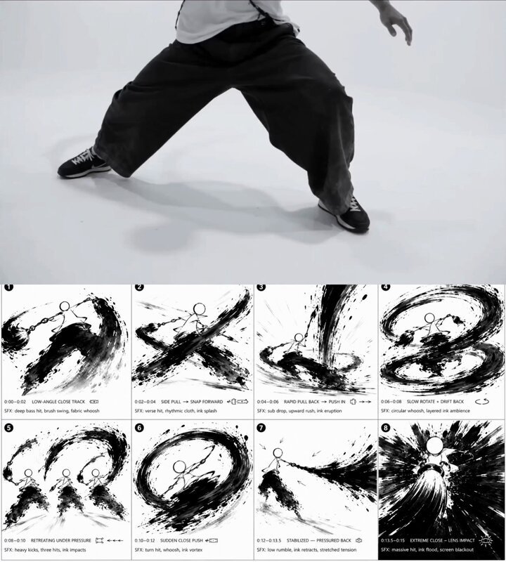 Mürekkep fırçalı hip-hop dansçısı storyboard'u siyah beyaz
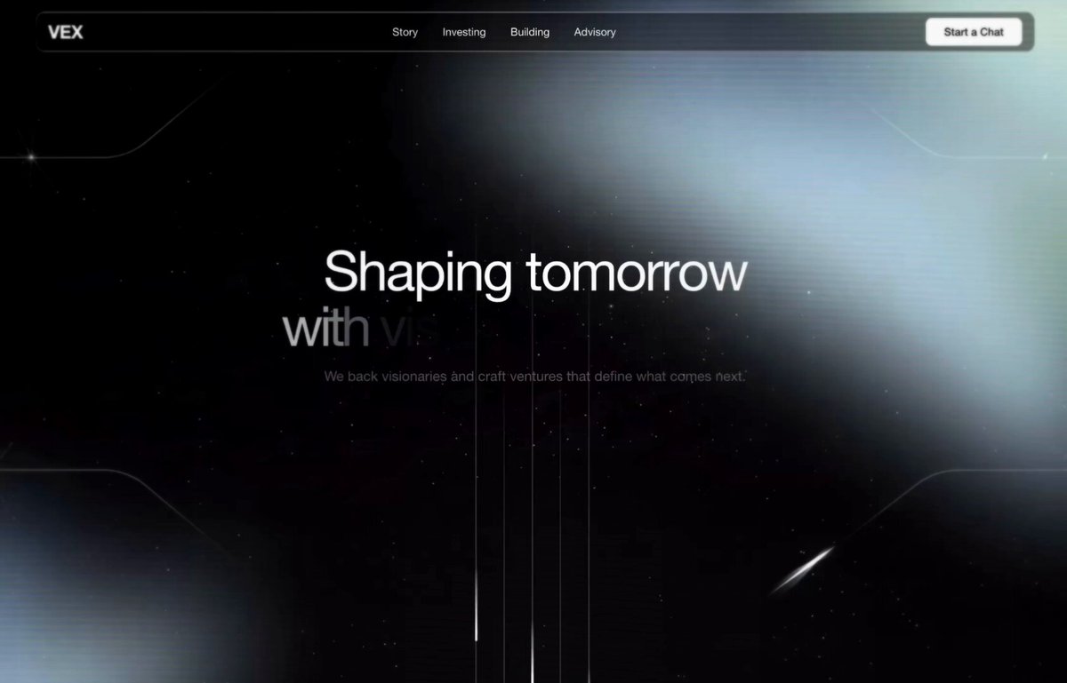 Cam navbar'lı hero bölümü video arka plan kodu
 Minimal siyah beyaz hareketli kimlik videosu
 Fotoğrafını ekle15 saniyelik marka tanıtımı için logo morph video promptu
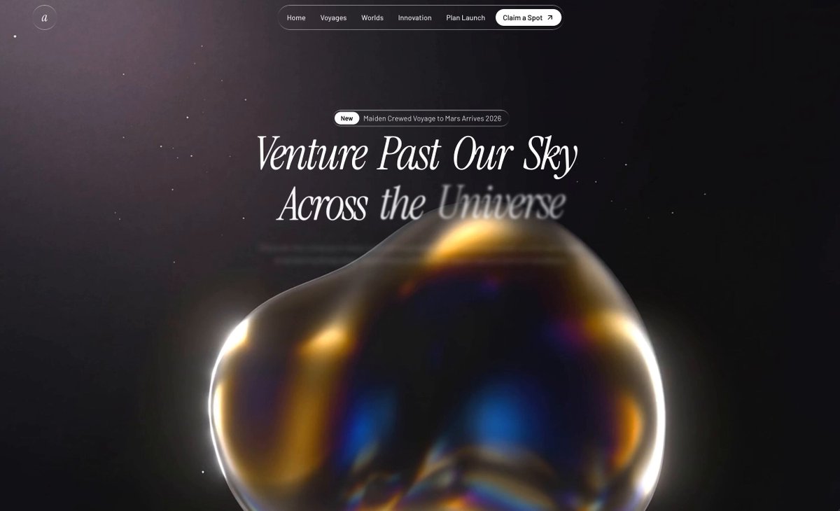 Sinematik uzay yolculuğu açılış sayfası tasarımı
 Siyah beyaz morfing UI hareket döngüsü
 Ofiste süzülen siyah üçgen