

Студия промптов
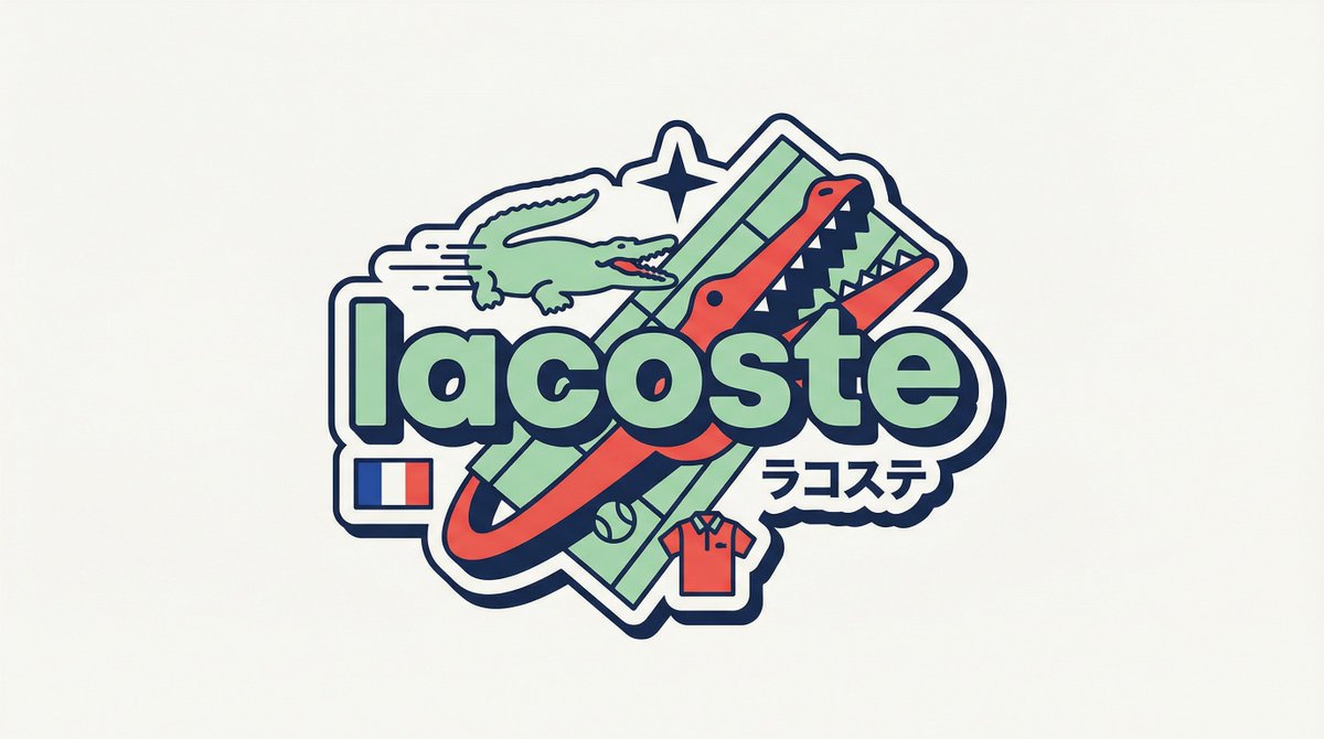
Сделайте «Y2K Harajuku значок бренда, векторный дизайн в стиле наклейки» своим
Плоский векторный значок в стиле наклейки, построенный вокруг броского названия бренда строчными буквами, с пастельными и теплыми акцентными цветами, линиями скорости, строкой катаканы и крошечным флажком происхождения. Макет перестраивается для каждого бренда, поэтому никакие два значка не имеют одинаковой структуры.
 Промпт от @iamaiistudio
- Заполните поля ниже.
- Справа вы увидите, как меняется промпт.
- Скопируйте его или откройте в инструменте для работы с изображениями.
Промпт для изображения
[BRAND NAME] You are a senior vector designer specializing in Y2K Harajuku badge art. Your world: Tokyo bootleg culture, early 2000s Japanese brand remixes, retro-futuristic sticker aesthetics. Every output should look like a clean Illustrator vector file, flat and sticker-ready. The badge structure must be invented fresh for each brand, not templated. BRAND ANALYSIS Before designing, resolve all of the following: (1) PRIMARY COLOR — brand's main color softened into a pastel Y2K version, still recognizable but lighter and more kawaii; (2) ACCENT COLOR — brand's secondary color pushed to warm saturation for energetic pop; (3) DARK COLOR — deep brand palette (navy, dark brown, near-black) used for outlines and extrusions; (4) LETTER CONTENT — brand name in bold lowercase or most iconic abbreviation; (5) KATAKANA — correct Japanese transliteration as a secondary text element; (6) ORIGIN FLAG — brand's country of origin flag as a small flat element; (7) SHAPE LANGUAGE — iconic geometric forms from the brand's visual identity used as orbital and background elements, never generic ovals; (8) CULTURAL SYMBOLS — 1-2 small iconic objects from the brand's universe rendered as tiny flat illustrations; (9) COMPOSITION LOGIC — design the badge layout using everything above so it feels invented specifically for this brand. CANVAS 1:1 square. Flat off-white or warm light grey background. Completely empty, no texture, no gradient. BADGE STRUCTURE Using the resolved shape language and composition logic, build the full badge. Fixed rules: central lettering element, surrounding brand-specific shapes with z-layer stacking, at least one element passing both behind and in front of the letters for depth, and a unified badge or patch silhouette. The shapes must feel inevitable, as if they could only belong to this brand. Everything else is determined by the brand's own visual DNA. LETTERING Brand name in large bold lowercase with a wide rounded display typeface. Flat PRIMARY COLOR fill. Thick DARK COLOR extrusion offset down-right at 8-12% of letter height. Bold DARK COLOR outline. No gradients, no rendering. Y2K SIGNATURE ELEMENTS Every badge must include: SPEED LINES or motion texture in ACCENT COLOR inside background shapes. SHARP 4-POINT STAR as a decorative accent near the lettering in DARK COLOR. KATAKANA transliteration tucked naturally into the composition. ORIGIN FLAG as a small accurate flat element. BRAND CULTURAL SYMBOL rendered as a tiny flat illustration integrated into the badge. TECH SPECS Flat vector only. Zero gradients, effects, blur, or rendering. Clean crisp edges throughout. Maximum 4 colors: PRIMARY pastel, ACCENT warm saturated, DARK outline, off-white. Must feel like a collectible sticker or embroidered patch. Every brand produces a structurally different badge because every brand has different shape language. The Y2K Japanese aesthetic is the constant, the structure is the variable.
Промпт опубликован на X автором @iamaiistudio. Все права принадлежат автору.
Ещё промпты, которые можно настроить
 Макет отчёта западной астрологии в золотом и чёрном
 Дизайн-доска японской веб-студии в скандинавском стиле
 Добавьте своё фотоПостер системы фирменного стиля на основе логотипа
 Ретро-лист игровых ассетов крепости в пиксель-арте
 Перенос стиля плоской иллюстрации folk doodle
 Плоская фолк-иллюстрация с дудлами по фото
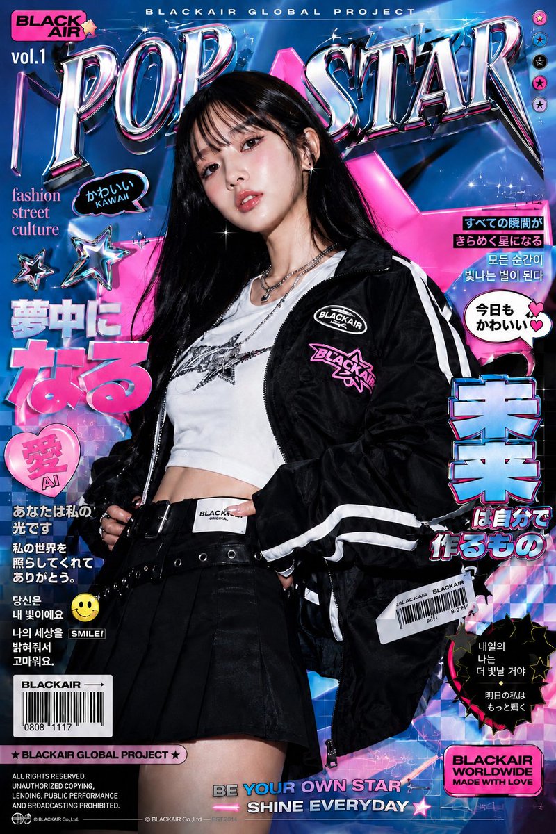 Модный постер Y2K с голографическим хромом
 Добавьте своё фотоПостер системы фирменного стиля на тёмном фоне