

Промпт для изображения Продукт и реклама Настраиваемые
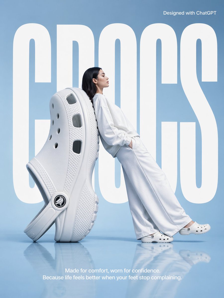
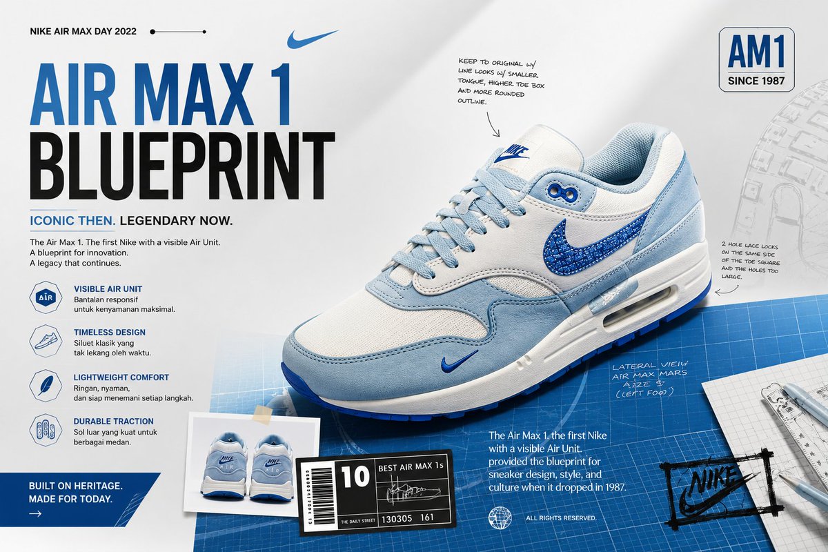
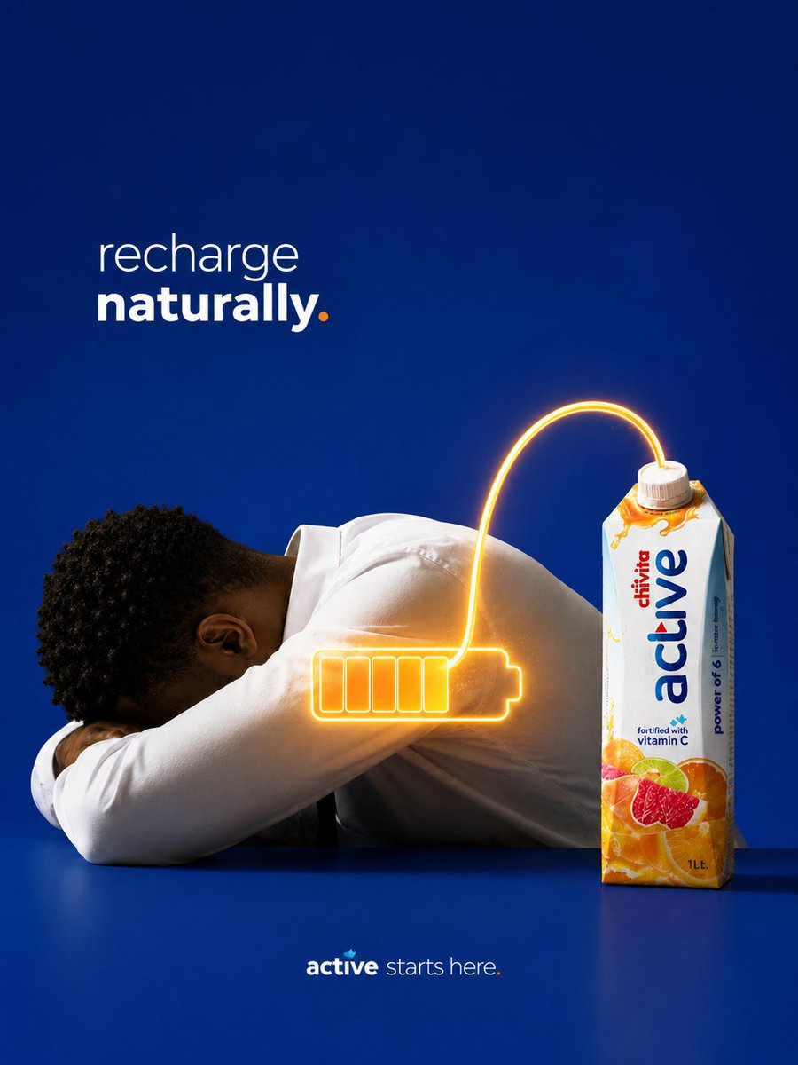
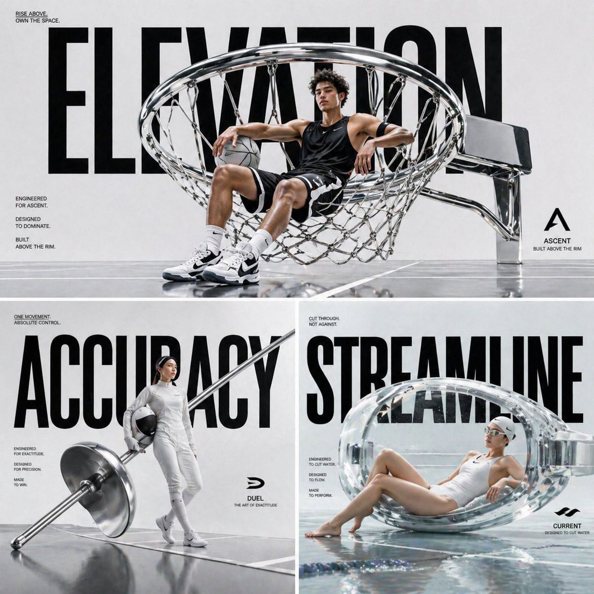
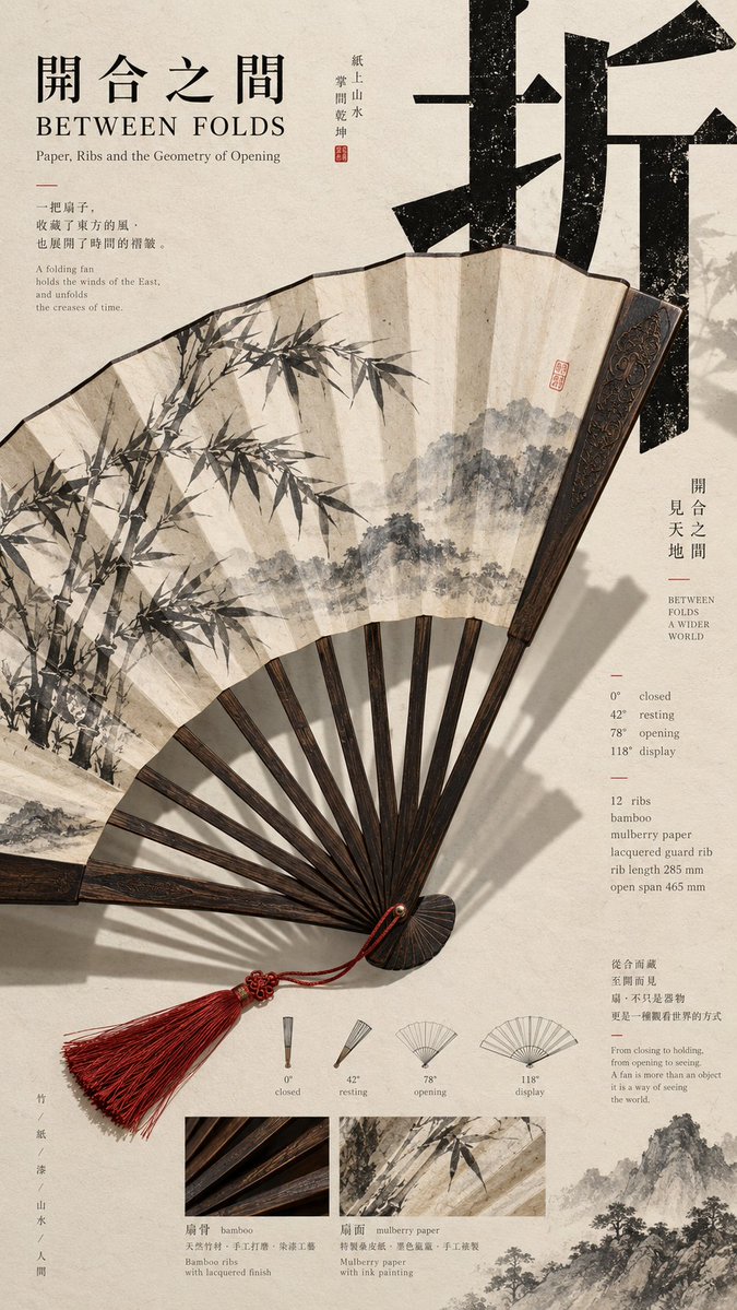
Редакционный постер в три зоны с пересекающим объектом
Вертикальный редакционный постер, в котором один гигантский объект проходит через изображение, заголовок и архивный текст. Тени и складки ведут взгляд от зоны к зоне, поэтому композиция воспринимается как единое непрерывное движение, а не как три отдельных блока.

- Модель
- GPT Image 2
- Тип
- Изображений: 4
- Соотношение сторон
- 9:16
- Опубликован
- 10 сент. 2026
- Лайки на X
- 71
Главный объектОсновной персонажАнглийский заголовокЦвет темы
Промпт для изображения
Символов: 3,498【Theme】: 【Main visual object】: 【Chinese core character】: 【Chinese title】: 【English title】: 【Subject characteristic】: unfold / drape / curl / layer / vibration / shadow / reflection / other 【Archive information】: structure / material / dimensions / process / local sample / other 【Theme color】: 【Image ratio】: 9:16 Generate a vertical poster with the mature texture of East Asian Editorial Design, Museum Poster, and cultural publications. Use an "unbalanced three-thirds composition" in which the image carries the main visual, the title text, and the auxiliary archive information respectively, but do not cut it into three equal areas or create obvious columns. First analyze the most recognizable real physical or material characteristic of the 【main visual object】, then let that characteristic directly determine the composition. For example, unfolding produces radiation, draping and curling fabric creates depth, a material cross-section reveals inner layers, string vibration forms continuous trajectories. Do not apply cases mechanically; find the most suitable visual action for the current object anew. The subject must carry substantial visual weight and span at least two areas. Connect the main visual, Typography, and information zone through occlusion, interpenetration, shadow, curling, cross-section, extension, vibration, or other real spatial relationships, rather than placing the three parts separately. Set a striking 【Chinese core character】 using a modern high-contrast Song / Mincho typeface, so that the text itself becomes part of the composition. Allow the subject to pass through the text, the text to invert black and white as it crosses different materials, shadows to cover the text, or structural lines to enter the negative space of the glyphs, but always keep the core character clearly legible. Use warm ivory uncoated art paper as the base, paired with ink-black text and one primary 【theme color】. Keep only one strong accent color per work if possible; the paper has slight fiber and a matte print texture, stays clean, without heavy aging. Add 【archive information】 genuinely related to the theme, such as material, structural cross-section, production process, dimensions, motion state, local macro, or time record. Small info in Grotesk / Monospace, English title in Serif. All text should serve the work's theme, without template placeholder words like Design Study, Visual System, Vol., Case. Keep information density medium-high, but do not fill everything evenly. The main visual forms a high-density zone, structure and archive form a medium-density zone, while keeping about 20%–30% effective white space, creating a clear rhythm of dense and sparse. Final reading order: first the huge subject and the core Chinese character; second the spatial or motion relationship created by the subject crossing zones; third understanding the structure, material, or production process; fourth reading the work's title and archive details. Within the same series, unify the paper, type system, information hierarchy, and editorial temperament, but for each piece redesign the direction of the thirds, the visual momentum, and the crossing method according to each different 【subject characteristic】, without merely reskinning a template. Avoid: three equal columns, PPT feel, ordinary product shots, full-bleed image with a headline, random small text, meaningless English, tech HUD, excessive aging, logos, QR codes, numbering, and copyright marks.
Как использовать
Перед началом замените поля шаблона в квадратных скобках на свою тему, главный объект, основного персонажа и цвет. Сохраните бумажную фактуру, текст цвета чернил и один акцентный цвет, чтобы работа оставалась согласованной с остальной серией. Промпт был опубликован для GPT Image 2, соотношение сторон задано 9:16 для постера или обоев телефона.
Опубликовано в открытом доступе на X: 10 сент. 2026. Все права на этот промпт и его результат принадлежат автору. Это ваш промпт? Попросите обновить или удалить его.