Промпт для изображения Брендинг и UI Настраиваемые
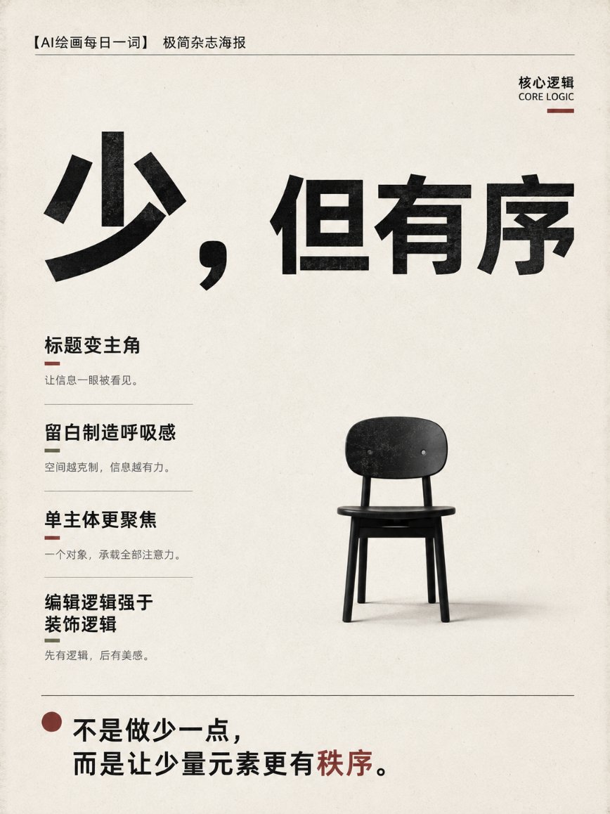
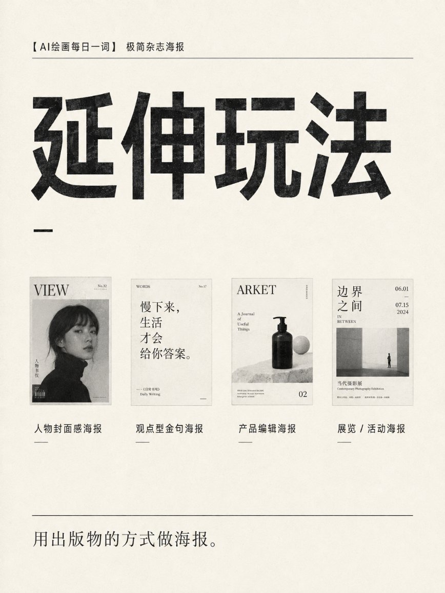
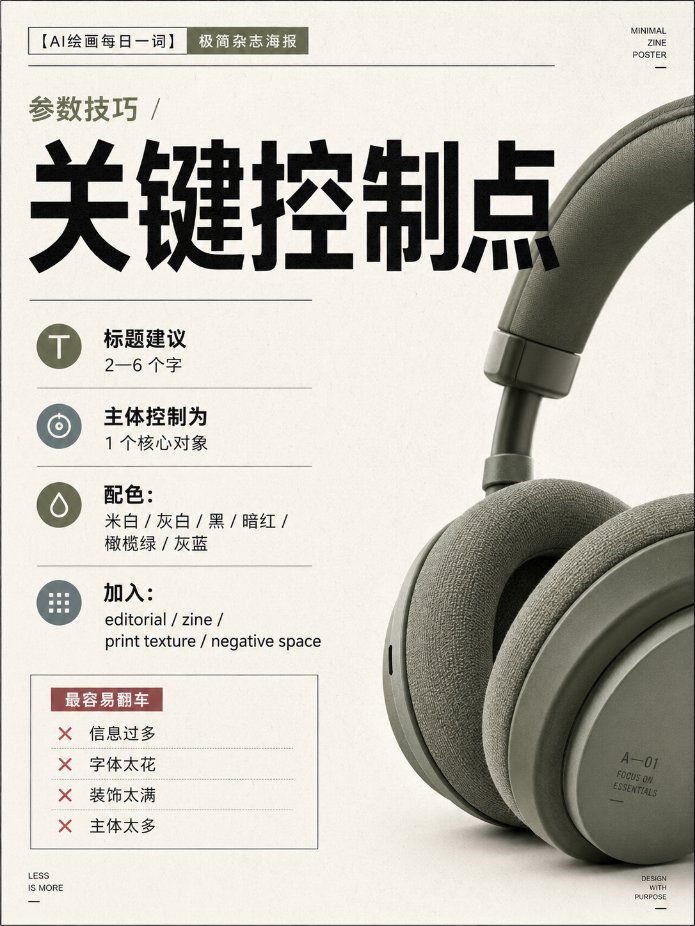
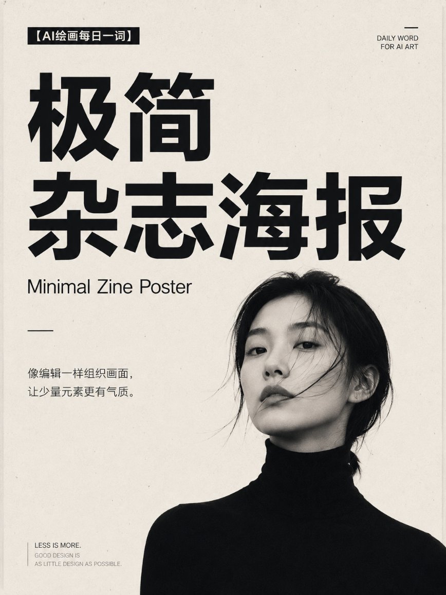
Редакционный постер-обложка в швейцарской сетке для печати
Один объект стоит на тёплой белой бумаге рядом с огромным шрифтом без засечек, который становится визуальным якорем. Небольшие нейтральные подписи несут детали выпуска, а один приглушённый акцентный цвет делает обложку спокойной и продуманной.

- Модель
- GPT Image 2
- Тип
- Изображений: 4
- Соотношение сторон
- 3:4
- Опубликован
- 6 авг. 2026
- Лайки на X
- 65
ОбъектОсновной объект
Промпт для изображения
Символов: 1,896Design a 3:4 vertical "minimalist magazine poster" for [person / product / concept / exhibition theme]. Use an independent design publication cover-style layout, overall restrained, quiet, avant-garde, with a contemporary editorial design feel. The background uses warm white, grayish white, or a low-saturation solid color, preserving large areas of clean white space. Place only one core subject: [person / product / architecture / object / abstract shape]. The subject may be shown in full, or use bold partial cropping, bleeding off the edge, or asymmetric placement, but must keep a clear visual focus. The title uses an oversized bold sans-serif font, becoming the main visual anchor. The title should be 2–6 characters; part of the text may be covered by the subject, extend to the edge, or be arranged asymmetrically, but must remain clearly legible. Auxiliary information uses a small neutral sans-serif font, like a magazine cover's issue number, date, section name, and short description. The information hierarchy is limited to: level 1: giant main title; level 2: the single core subject; level 3: a small amount of auxiliary information. Use a strict Swiss grid system and asymmetric editorial layout. The main color is limited to black, white, gray, and one low-saturation accent color, for example: dark red, olive green, gray-blue, or earthy brown. Add slight paper fiber, ink grain, and print registration offset, but do not over-age it. The image should look like the cover of a limited-edition publication made by an independent design studio, not an ordinary promotional poster. Avoid: stacked elements, complex backgrounds, multiple figures, fancy fonts, gradient glow, metallic effects, cheap tech feel, dense text, decorative stickers, and meaningless graphics. Core formula: one subject + one strong title + large white space + strict information hierarchy.
Как использовать
Опубликован как промпт для GPT Image 2. Замените квадратные скобки на свой объект, например продукт, здание или тему выставки, а название держите в пределах двух–шести символов, чтобы оно оставалось ярким и разборчивым. Сохраните швейцарскую сетку, большое белое пространство и единственный акцентный цвет: именно они создают ощущение независимого издания. Результат хорошо подходит для постера, мокапа обложки зина или фирменной шапки для небольшой студии.
Опубликовано в открытом доступе на X: 6 авг. 2026. Все права на этот промпт и его результат принадлежат автору. Это ваш промпт? Попросите обновить или удалить его.