Промпт для изображения Брендинг и UI Настраиваемые
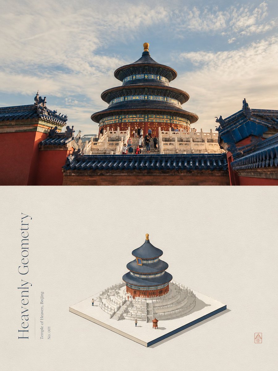
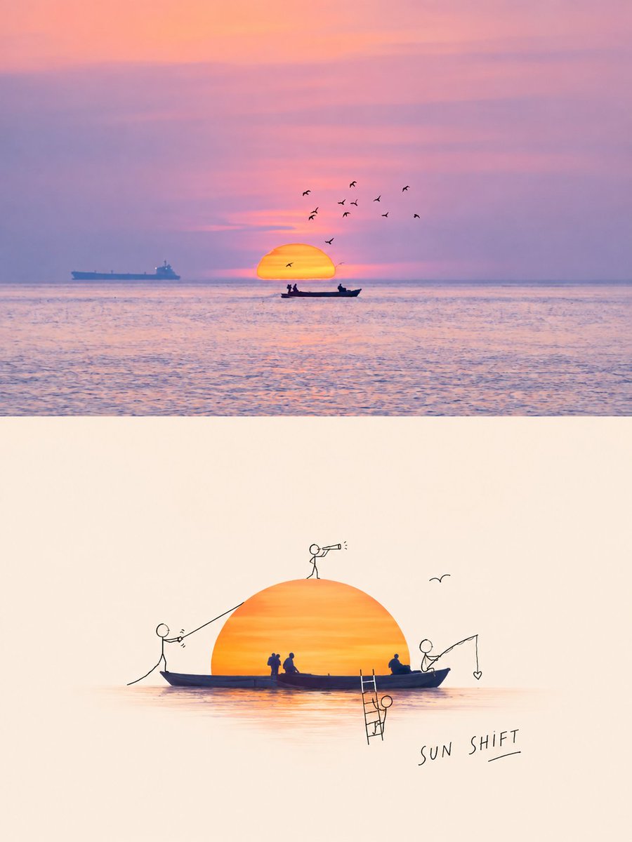
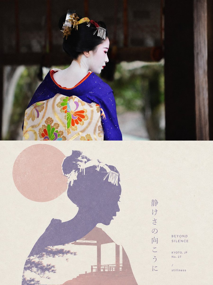
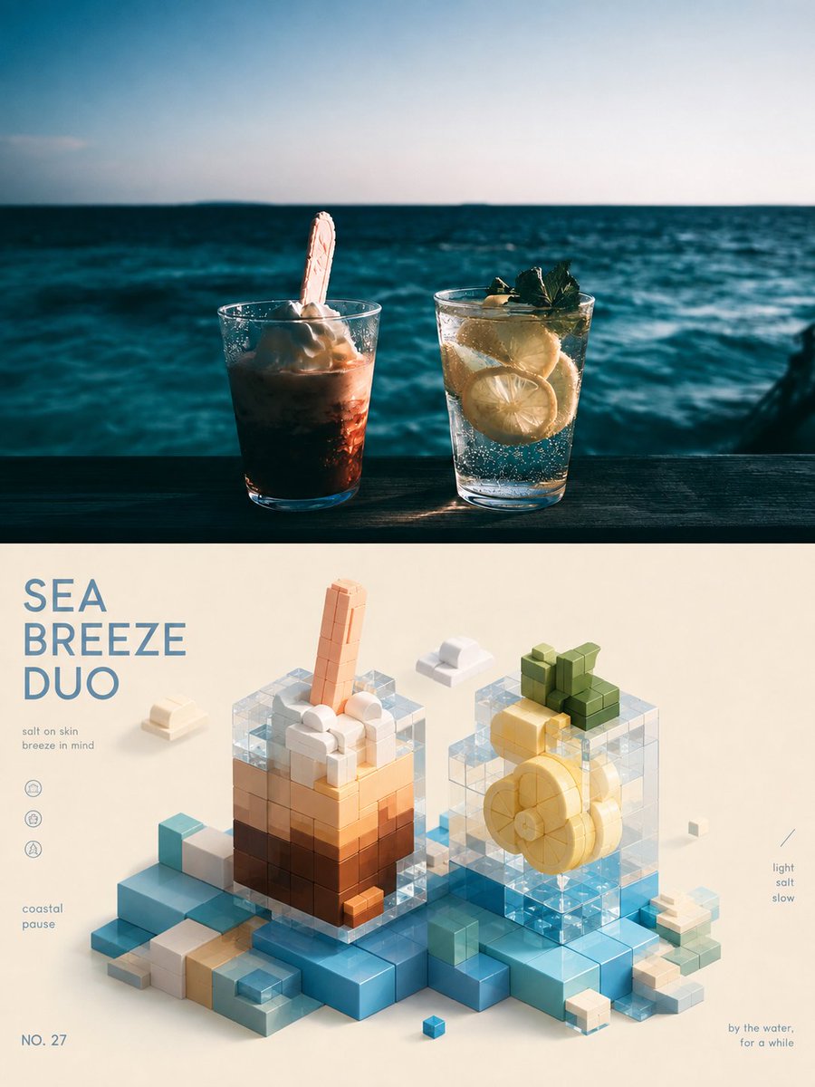
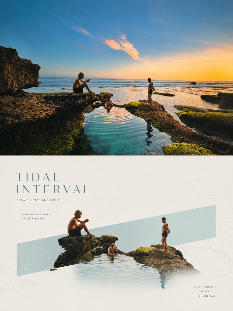
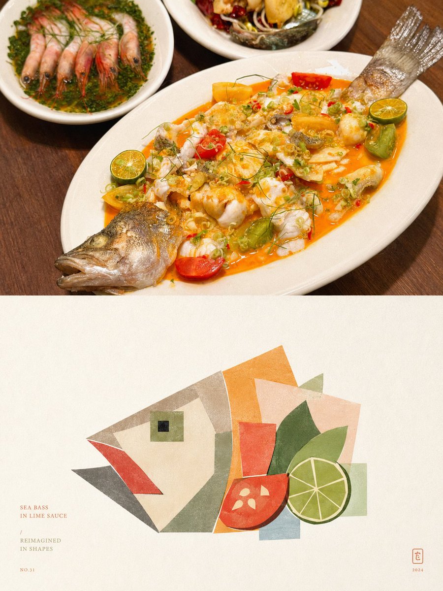
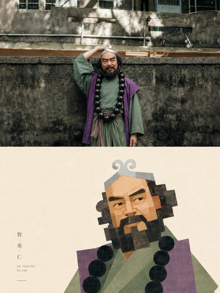
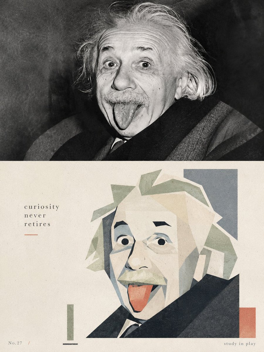
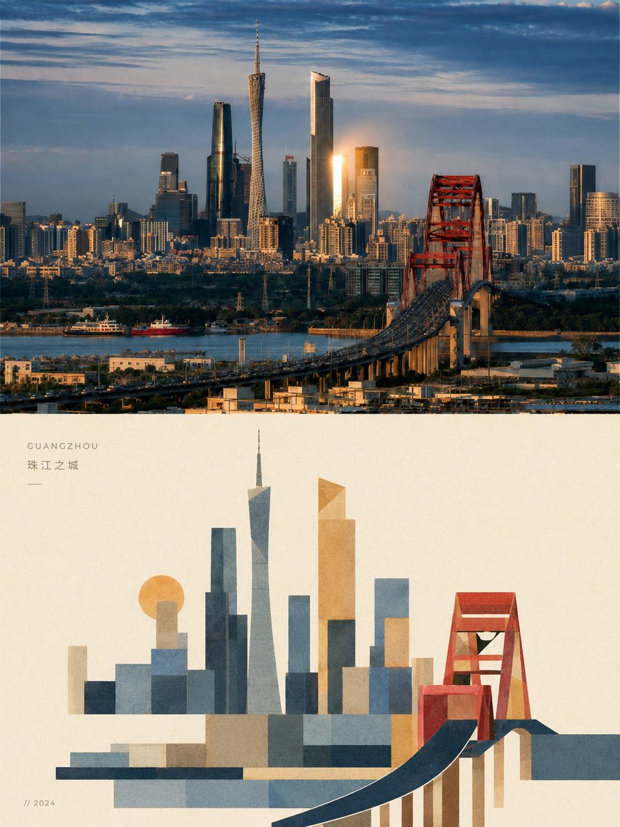
Фото, разделённое на модернистский коллаж из блоков
Верхняя половина кадра сохраняет вашу фотографию с лёгкой журнальной обработкой, а нижняя заново строит тот же сюжет из крупных плоских цветовых блоков, похожих на бумагу. Обе половины воспринимаются как единый портрет одного момента.

- Модель
- GPT Image 2
- Тип
- Изображений: 4
- Соотношение сторон
- 3:4
- Опубликован
- 3 сент. 2026
- Лайки на X
- 287
Загруженное фото
Промпт для изображения
Символов: 4,899Turn each photo I upload into a separate high-end design poster, no multi-image montage; output each photo individually. Use an overall 3:4 vertical composition, with the upper and lower areas strictly 1:1 in height, each taking 50% of the frame. The upper half keeps the original photo, preserving the subject's identity, structure, pose, real texture, natural light and shadow, and original color mood, applying only a light high-end color grade to give it the quality of an art magazine, independent publication, and exhibition image. To fit the frame, the environmental background may be naturally extended, but the subject must not be stretched, distorted, or changed. The lower half extracts the most recognizable subject, outline, structure, pose, and narrative relationships from the photo and reconstructs them into a blocky, modular geometric deconstruction illustration. Do not fully copy the photo or render it realistically; remove irrelevant details and keep only the visual memory points that best represent the original's identity and character, rebuilding the image through geometric summarization, shape overlap, and collage-style recomposition, so its correspondence to the photo above is recognizable at a glance. The overall form emphasizes blockiness, modularity, geometric division, and complete large planes. Do not fragment too much; do not cut into many small scattered blocks, but organize the subject with fewer, larger, more complete rectangles, squares, rounded blocks, ellipses, triangles, and irregular planes. People can be shown with a square face, clear jawline, and blocky features; buildings can be turned into rectangular volumes, facade divisions, opening rhythm, and structural transitions; animals, plants, objects, and landscapes should also be reduced to geometric forms with block order and modular relationships. Moderate exaggeration and deformation are allowed, but the whole must be mature, restrained, and simple, avoiding fragmentation, childishness, and overly scattered composition. The overall form uses flat color blocks + collage composition + modernist geometric language. The color blocks are reassembled like paper pieces, creating a crisp but orderly cutout feel; complex backgrounds are actively removed, keeping only a few necessary shapes or auxiliary planes, without forming a second visual center. The composition keeps the relationship of small-scale subject / large white space, freely positioning according to the subject's own direction, proportion, visual center of gravity, and structural flow, which may be off-center, edge-hugging, or partially cropped, while always keeping clear hierarchy, density rhythm, and editorial balance. The whole values positive and negative shapes, the weight of planes, the breathing of white space, and layout order, giving the lower half both artistry and the character of a high-end publication. The material presents gentle paper grain and slight printmaking texture: over the geometric color blocks, keep fine paper texture, soft noise, and a slight print quality, bringing the image closer to a paper collage or art print work. Avoid smooth vectors, 3D rendering, photo filters, and excessive retouching. The colors extract from the photo above 2–4 of the most recognizable, pleasing, and character-expressing colors of the subject, reorganized into a more high-end color system. The whole can be moderately brightened, purified, and de-grayed, converted into lighter, more modern, more enduring color block relationships such as cream white, apricot, peach pink, coral orange, mist blue, grayish green, sage green, warm brown, and soft purple. The main color is vivid but not glaring, the auxiliary colors soft and layered, with an overall clean, warm, stylish, and approachable character, avoiding ochre, dirty gray, dark brown, fluorescent colors, cheap candy feel, and messy color schemes. Text intervenes in small amounts, with no language restriction. Based on the subject's identity, location, emotion, character, or symbolic meaning, freely extract a short title, small annotations, numbering, or caption fragments. The text should be small, light, and restrained, naturally landing in white space areas or layout corners, forming a refined text-image relationship with the graphics, without piling up commercial titles. The whole presents a visual effect composed of geometric deconstruction of complete large planes, restrained collage, soft high-end colors, paper grain, large white space, and editorial layout. Whether the subject is a person, building, animal, plant, object, or natural landscape, keep clear identity, modular geometric order, and a unified artistic language. Avoid realistic depiction, overly fragmented cutting, childish collage, complex perspective, overly dense details, cartoon feel, 3D feel, template poster feel, and cheap cultural-product feel.
Как использовать
Загрузите одну фотографию, так как промпт написан для обработки каждого изображения отдельно. Он был опубликован как промпт для GPT Image 2. Сохраните предложения о разделении 50/50, крупных простых плоскостях и зернистости бумаги, так как именно они задают редакционный стиль. Замените описания палитры цветами, подходящими вашему сюжету, и добавьте короткую подпись, если хотите журнальную деталь.
Опубликовано в открытом доступе на X: 3 сент. 2026. Все права на этот промпт и его результат принадлежат автору. Это ваш промпт? Попросите обновить или удалить его.